The Morningstar Design System is a collection of brand, visual, UX, and technical standards built into a central library so that teams can quickly build high-quality, consistent experiences.
The System is organized into three primary sections: Visual Language, Libraries, and About MDS. Exploring these sections will help familiarize you with Morningstar design principles and patterns, and show you which existing components you can use in your product.
Visual Language contains the critical building blocks of the look and feel of Morningstar products. Here, you will find details and guidelines on Color, Typography, Iconography, and Space, defined as reusable variables called Constants. Constants are threaded throughout MDS components to maintain a consistent visual style.
Libraries are collections of pre-built components, concepts, and guidelines that solve common design challenges in Morningstar products. To ensure consistency and reusability, components are built using Constants defined in the Visual Language section, and are accompanied by detailed documentation and guidelines for use.
About MDS includes a plethora of useful information on topics like Accessibility, Contributing to MDS, Reporting Bugs, and the MDS team’s Development Process.
How to Use the Craft Library
1. Download and unzip the MDS Craft Library, and place the MDS Craft Library v1.1.library folder in a directory that won't change or move in the future.
2. Download and install the Craft by InVision plugin.
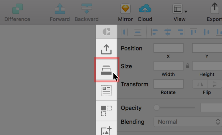
3. In Sketch, open the Library pane in the Craft toolbar.
 Library pane in the Craft toolbar.
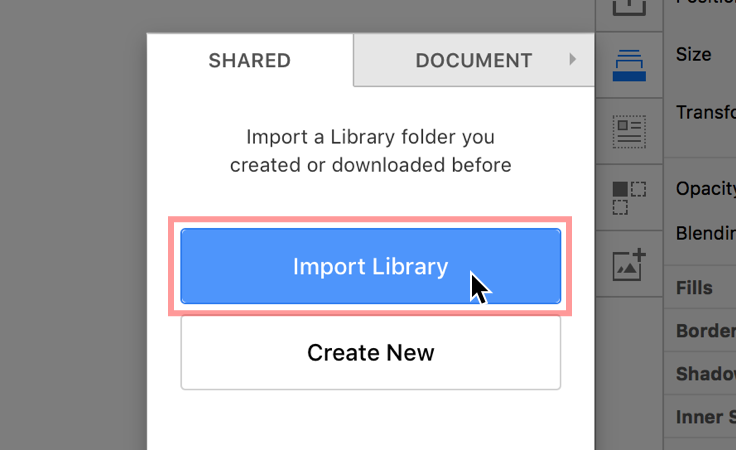
4. Click Import Library, and navigate to where you stored the MDS Craft Library v1.1.library folder. Select the folder, and click Open.
 Finding and imporing the MDS Craft Library.
If you experience issues or bugs when using the Craft library, updating Craft and restarting Sketch will almost always solve the problem. To update Craft, search your machine for the Craft Manager application, and click Update. You will be prompted to restart Sketch after the update is complete.
The System provides a unified language between design and engineering teams, and it enables developers to quickly implement consistent user interface components across Morningstar web user interfaces. It also exposes a set of variable tokens that allow engineers to style custom-built application components that adhere to the Morningstar-branded style definitions within MDS.
We encourage MDS consumers to use the Node package to install the library code within your environment.
npm install morningstar-design-system --save
bower install morningstar-design-system --save
Building MDS locally enables you to configure which components you would like to include in your application.
The MDS repo is located on our Morningstar Tech Standards Bitbucket server.
You can use the YAML configuration file to choose which components to include in a local build of MDS. The configuration is located in mds/src/library/component_config.yaml. Setting the true/false flags per component will either include or exclude the given component inside of the compiled CSS file.
mds/ run npm install.gulp.dist/assets/styles/mds_library.cssdist/assets/styles/mds_library_print.css (optional)The latest MDS release can be found at http://designsystem.morningstar.com/release-history.html.
To add a dependency to MDS as an NPM package, follow these steps:
package.json file, add mds to your dependencies list, for example:"dependencies": {
"mds": "^1.0.0",
...
}npm install to pull MDS into your node_modules directory.If your product does not use NPM, you’ll need to manually manage upgrading the library by downloading a ZIP file containing the MDS library package from the MDS site or from the code repository.
If you are planning on bringing in a select number of components, and potentially overriding some styles more systematically, you should isolate overrides per component to better maintain your library use as your product – and MDS – change over time.
@import 'node_modules/morningstar-design-system/src/styles/auto_generated/constants';

@import 'node_modules/morningstar-design-system/src/styles/shared/utils';
@import 'node_modules/morningstar-design-system/src/styles/shared/fonts';
@import 'node_modules/morningstar-design-system/src/styles/shared/accessibility';
@import 'node_modules/morningstar-design-system/src/styles/shared/animation';
@import 'node_modules/morningstar-design-system/src/styles/shared/space';
@import 'node_modules/morningstar-design-system/src/styles/shared/bubbles';
@import 'node_modules/morningstar-design-system/src/styles/shared/typography';

@import 'node_modules/morningstar-design-system/src/styles/icon/icon';
@import 'node_modules/morningstar-design-system/src/styles/button/button';
@import 'my_apps_path_to/styles/my_apps_button_overrides';
@import 'node_modules/morningstar-design-system/src/styles/container/container';
@import 'node_modules/morningstar-design-system/src/styles/data_table/data_table';
@import 'my_apps_path_to/styles/my_apps_data_table_overrides';
@import 'node_modules/morningstar-design-system/src/styles/form/form';
@import 'my_apps_path_to/styles/my_apps_form_overrides';
@import 'node_modules/morningstar-design-system/src/styles/tooltip/tooltip';
@import 'node_modules/morningstar-design-system/src/styles/form/form';

@import 'my_apps_path_to/styles/my_apps_custom_sass';You can use a limited set of MDS components, such as icons, buttons, and tooltips, and decalare any overrides in a single file. This limits the overall download weight of MDS styles, however, it generalizes your overrides into a single catch-all file which might be sub-optimal.
@import 'node_modules/morningstar-design-system/src/styles/auto_generated/constants';

@import 'node_modules/morningstar-design-system/src/styles/shared/utils';
@import 'node_modules/morningstar-design-system/src/styles/shared/fonts';
@import 'node_modules/morningstar-design-system/src/styles/shared/accessibility';
@import 'node_modules/morningstar-design-system/src/styles/shared/animation';
@import 'node_modules/morningstar-design-system/src/styles/shared/space';
@import 'node_modules/morningstar-design-system/src/styles/shared/bubbles';
@import 'node_modules/morningstar-design-system/src/styles/shared/typography';

@import 'node_modules/morningstar-design-system/src/styles/icon/icon';
@import 'node_modules/morningstar-design-system/src/styles/button/button';
@import 'node_modules/morningstar-design-system/src/styles/tooltip/tooltip';

@import 'my_apps_path_to/styles/my_apps_icon-button-tooltip_overrides_sass';
@import 'my_apps_path_to/styles/my_apps_custom_sass';Bring in the complete MDS library, and override everything with a single override file. With this approach, you might include more than you need and your catch-all override file could be difficult to maintain.
@import 'node_modules/morningstar-design-system/src/styles/mds_library';
@import 'my_apps_path_to/styles/mds_library_overrides';
@import 'my_apps_path_to/styles/my_apps_custom_sass';
To @import the entire mds_library.scss file, add the following import path to your SCSS compiler:
node_modules/morningstar-design-system/src/styles/auto_generatedThere is a shortcut helper path that is exposed if you are referencing MDS .scss files in your build. You may have a need to include MDS .scss files into your application’s build process if you want to run a linter on the MDS code, for example.
In mds/index.js you will find libraryComponentStylePath and libraryBaseStylePath these can be used in place of node_modules/morningstar-design-system/src/styles and node_modules/morningstar-design-system/src/styles to more quickly target the Sass files that you want to pull in from MDS.
When using MDS Scss you can override the font asset path. The default is ../fonts/. Set the $mds-font-asset-path variable before importing the MDS fonts Scss file to override the path:
$mds-font-asset-path: 'my/path/to/fonts/';
@import 'node_modules/morningstar-design-system/src/styles/shared/fonts';/dist/assets/styles/mds_library.css) the compiled CSS library file.<head> your application.<link rel="stylesheet" href="/assets/styles/mds_library.css">mds_library.css reference.<link rel="stylesheet" href="/assets/styles/mds_library_overrides.css"><head>
<title>My App Title</title>
<link rel="stylesheet" href="/assets/styles/mds_library.css">
<link rel="stylesheet" href="/assets/styles/mds_library_overrides.css"> </head>You’ll need to build MDS locally in order to compile a custom set of included components. Once you’ve customized your component list and you've built locally, you can then copy the output CSS file and include it in your own app. See the instructions for building MDS locally.
MDS uses a set of global variables, or constants, that are threaded throughout the system to facilitate visual consistency across components.
The constants are declared in a .yaml file found at mds/src/library/constants/constants.yaml. At build time, the .yaml file is used to generate the name-spaced SASS variables here: /src/library/styles/auto_generated/_constants.scss. (This is a compiled file not committed to repo). These auto-generated variables are used throughout the component scss files found in /src/library/components.
Any adjustments, overrides, or extensions to the constants must be done in the .yaml file.
In addition to the SASS file, a .json file is generated at build time. It can be found at: /src/library/data/mds_constants.json. (This is also a compiled file, not checked into the repo.) This file exposes the system site to all of the constant variable names via .json. The .json object follows the same nested structure declared in the .yaml file with the parent object named constants.
When building locally, MDS uses a run-time-generated icon sprite to handle the use of icons throughout the system. The sprite is generated from a set of SVG files found at /src/library/icons.
As with constants, there is a .json file containing an array with all of the icon names generated at build time. The .json object is exposed for use within this site. The file is saved to /src/library/data/icons.json.
Please see the Iconography page to reference the recommended implementation approach for icons.
Some components have their own Sass mixins scoped within their individual .scss file which are located in /src/library/components.
There are a number of shared mixins found in /src/library/styles/shared. These mixins are shared across two or more components in the system.
Importing the MDS Sass into your own app’s .scss file will enable you to use all of the MDS mixins within your own application’s Sass.
Details for implementing the HTML and CSS for components can be found on the individual component pages.
General Rules for Implementations
The Morningstar Design System has no external stylesheet dependencies. All the styles required to render UI Components are contained in mds.css.
A Sass compiler is required when using the style constants available in The System. See the Using MDS Sass section for information about using .scss files in your project.
JavaScript provided as part of the Morningstar Design System is intended for demonstration purposes only. The Morningstar Design System team cannot provide technical support for issues arising from the use of mds.js.
All component markup and styles provided are intended for production use, and the MDS core team expects that any JavaScript necessary to create or manipulate components will be provided by product teams.
Three System UI Components require third-party JavaScript libraries in order to function:
^2.1.4.^9.2.0^4.0.3.