Buttons trigger interactions throughout the experience.
Use for highest-priority actions that are required to complete the user’s task.
<button class="mds-button mds-button--primary" type="button" role="button"> Button Text </button><button class="mds-button mds-button--primary" type="button" disabled role="button"> Button Text </button>Use for non-critical actions.
<button class="mds-button mds-button--secondary" type="button" role="button"> Button Text </button><button class="mds-button mds-button--secondary" type="button" disabled role="button"> Button Text </button>Deprecated, to be removed in v2.0.0.
Use Flat, No Background variation instead.
Use for tertiary actions.
<button class="mds-button mds-button--flat-no-background" type="button" role="button"> Button Text </button><button class="mds-button mds-button--flat-no-background" type="button" disabled role="button"> Button Text </button>Use Icons to provide additional affordance to a button.
<button class="mds-button mds-button--primary" type="button" role="button">
    <svg class="mds-icon mds-button__icon mds-button__icon--left" aria-hidden="true">
        <use xlink:href="/assets/icons/mds_icons.svg#open-new--s"> </use>
    </svg>
    <span class="mds-button__text"> Copy Document </span>
</button>
<button class="mds-button mds-button--secondary" type="button" role="button">
    <svg class="mds-icon mds-button__icon mds-button__icon--left" aria-hidden="true">
        <use xlink:href="/assets/icons/mds_icons.svg#open-new--s"> </use>
    </svg>
    <span class="mds-button__text"> Copy Document </span>
</button>
<button class="mds-button mds-button--flat-no-background" type="button" role="button">
    <svg class="mds-icon mds-button__icon mds-button__icon--left" aria-hidden="true">
        <use xlink:href="/assets/icons/mds_icons.svg#open-new--s"> </use>
    </svg>
    <span class="mds-button__text"> Copy Document </span>
</button>--s icons.<button class="mds-button mds-button--primary" type="button" role="button">
<span class="mds-button__text"> Continue </span>
<svg class="mds-icon mds-button__icon mds-button__icon--right" aria-hidden="true">
<use xlink:href="/assets/icons/mds_icons.svg#caret-right--s"> </use>
</svg>
</button>
<button class="mds-button mds-button--secondary" type="button" role="button">
<span class="mds-button__text"> Continue </span>
<svg class="mds-icon mds-button__icon mds-button__icon--right" aria-hidden="true">
<use xlink:href="/assets/icons/mds_icons.svg#caret-right--s"> </use>
</svg>
</button>
<button class="mds-button mds-button--flat-no-background" type="button" role="button">
<span class="mds-button__text"> Continue </span>
<svg class="mds-icon mds-button__icon mds-button__icon--right" aria-hidden="true">
<use xlink:href="/assets/icons/mds_icons.svg#caret-right--s"> </use>
</svg>
</button><button class="mds-button mds-button--primary" type="button" role="button">
<svg class="mds-icon mds-button__icon mds-button__icon--left" aria-hidden="true">
<use xlink:href="/assets/icons/mds_icons.svg#upload--s"> </use>
</svg>
<span class="mds-button__text"> Upload Changes </span>
<svg class="mds-icon mds-button__icon mds-button__icon--right" aria-hidden="true">
<use xlink:href="/assets/icons/mds_icons.svg#caret-down--s"> </use>
</svg>
</button>
<button class="mds-button mds-button--secondary" type="button" role="button">
<svg class="mds-icon mds-button__icon mds-button__icon--left" aria-hidden="true">
<use xlink:href="/assets/icons/mds_icons.svg#upload--s"> </use>
</svg>
<span class="mds-button__text"> Upload Changes </span>
<svg class="mds-icon mds-button__icon mds-button__icon--right" aria-hidden="true">
<use xlink:href="/assets/icons/mds_icons.svg#caret-down--s"> </use>
</svg>
</button>
<button class="mds-button mds-button--flat-no-background" type="button" role="button">
<svg class="mds-icon mds-button__icon mds-button__icon--left" aria-hidden="true">
<use xlink:href="/assets/icons/mds_icons.svg#upload--s"> </use>
</svg>
<span class="mds-button__text"> Upload Changes </span>
<svg class="mds-icon mds-button__icon mds-button__icon--right" aria-hidden="true">
<use xlink:href="/assets/icons/mds_icons.svg#caret-down--s"> </use>
</svg>
</button>--s icons.<button class="mds-button mds-button--small mds-button--secondary" type="button" role="button"> Sign Up </button>
Do use a small button for secondary actions, like creating a rule.
Do use a small button to apply an action to a dataset.
Use for toolbars and compact displays.
<button class="mds-button mds-button--icon-only" type="button" role="button">
    <svg class="mds-icon mds-button__icon mds-button__icon--right">
        <use xlink:href="/assets/icons/mds_icons.svg#person-padless">
            <title>User</title>
        </use>
    </svg>
</button><button class="mds-button mds-button--icon-only mds-button--hover" type="button" disabled role="button">
<svg class="mds-icon mds-button__icon mds-button__icon--right">
<use xlink:href="/assets/icons/mds_icons.svg#person-padless">
<title>User</title>
</use>
</svg>
</button><button class="mds-button mds-button--icon-only mds-button--small" type="button" role="button">
<svg class="mds-icon mds-button__icon mds-button__icon--right" aria-hidden="true">
<use xlink:href="/assets/icons/mds_icons.svg#heart--s"> </use>
</svg>
</button>aria-label attribute to describe the button’s intent. <button aria-label="Close" onclick="myDialog.close()">X</button>remove or remove--s to close Modals, Notifications, and Tooltip prompts.remove or remove--s to remove an item from a list. Icon-only Button paired with a tooltip.
$mds-space-inline-left-xl space and vertically align middle the icon-only button. Icon-only Button alignment paired with a button.
Do place all icon-only buttons to the left or right of paired buttons.
Don‘t place icon-only buttons between paired buttons.
Do use the same button size for adjacent buttons.

Don‘t display normal and small buttons together in the same row.
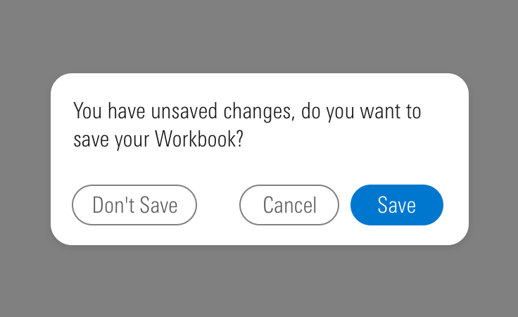
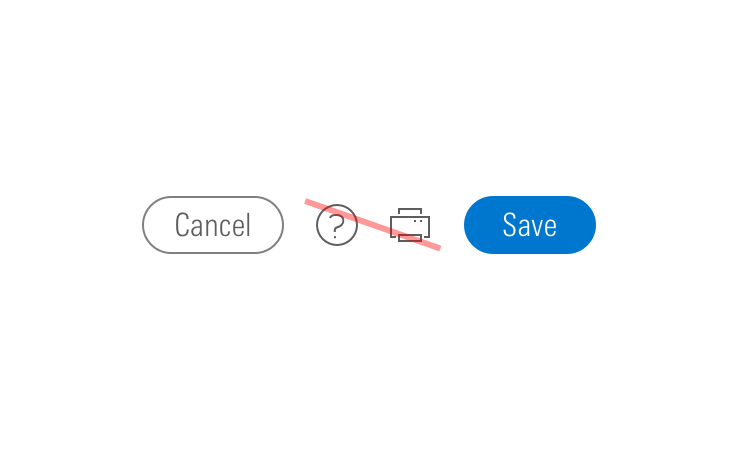
Do place primary buttons to the right within a group of buttons.
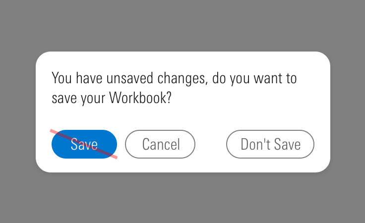
Don‘t place primary buttons to the left within a group of buttons.
<button> element type when displaying buttons.role="button" attribute, although <button> and <input type="button"/> elements do not require this attribute. This declaration can make any HTML element appear as a button to a screen reader.<div role="button"> or <span role="button"> without a tabindex attribute will not receive a tabbed focus state.<div role="button"> or <span role="button"> cannot be triggered from a keyboard without JavaScript.<a> element cannot be triggered from a spacebar press, only from an enter or return press.spacebar, enter, or return.aria-label attribute on an icon-only button or a button with a label that doesn't explicitly describe its intent.<button aria-label="Close" onclick="myDialog.close()">X</button>| Class | Applies to | Outcome |
|---|---|---|
|
|
|
Applies base button styles to an element. Always couple with a variant for semantics, though a standalone |
|
|
|
Shows primary button, to be coupled with |
|
|
|
Shows secondary button, to be coupled with |
|
|
|
Shows tertiary button, to be coupled with |
|
|
|
Adjusts styling to render a small button. |
|
|
|
Adjusts styling to render a large button. |
|
|
|
Applies the icon-only styles to a button element. Specifically, it removes the border strokes and background treatments found on primary and secondary buttons. |