Switches
Switches afford a choice between one of two opposing states or options.
Variations
With Label
<div class="mds-switch">
    <label class="mds-switch__label" for="--33711">
        <input id="--33711" type="checkbox" role="switch" class="mds-switch__input">
        <span class="mds-switch__text"> Logic Mode </span>
    </label>
</div><div class="mds-switch mds-switch--disabled">
<label class="mds-switch__label" for="--77636">
<input id="--77636" type="checkbox" role="switch" class="mds-switch__input" disabled>
<span class="mds-switch__text"> Logic Mode </span>
</label>
</div>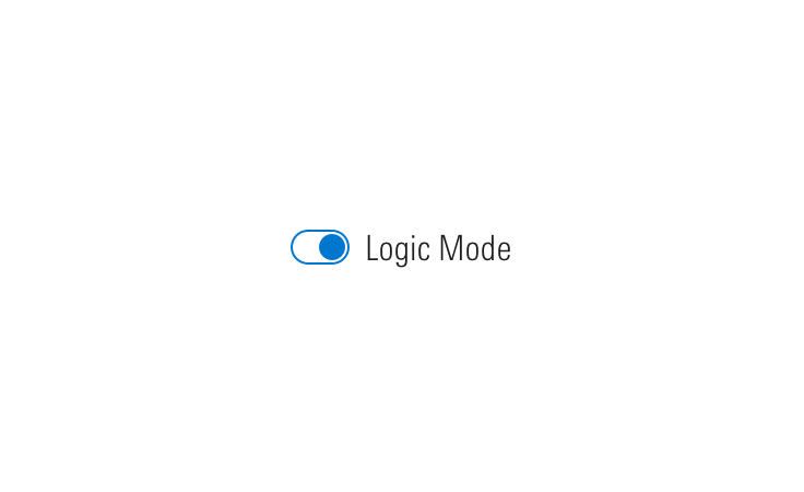
Without Label
<div class="mds-switch mds-switch--standalone">
    <label class="mds-switch__label" for="--42228">
        <input id="--42228" type="checkbox" role="switch" class="mds-switch__input">
        <span class="mds-switch__text"> Logic Mode </span>
    </label>
</div><div class="mds-switch mds-switch--disabled mds-switch--standalone">
<label class="mds-switch__label" for="--7445">
<input id="--7445" type="checkbox" role="switch" class="mds-switch__input" disabled>
<span class="mds-switch__text"> Logic Mode </span>
</label>
</div>Switch Group
<fieldset class="mds-switch__group" role="group">
    <legend class="mds-switch__group-label"> Select all days that apply: </legend>
    <div class="mds-switch">
        <label class="mds-switch__label" for="--93946">
            <input id="--93946" type="checkbox" role="switch" class="mds-switch__input">
            <span class="mds-switch__text"> Monday </span>
        </label>
    </div>
    <div class="mds-switch">
        <label class="mds-switch__label" for="--73517">
            <input id="--73517" type="checkbox" role="switch" class="mds-switch__input">
            <span class="mds-switch__text"> Tuesday </span>
        </label>
    </div>
    <div class="mds-switch">
        <label class="mds-switch__label" for="--74969">
            <input id="--74969" type="checkbox" role="switch" class="mds-switch__input">
            <span class="mds-switch__text"> Wednesday </span>
        </label>
    </div>
    <div class="mds-switch">
        <label class="mds-switch__label" for="--55035">
            <input id="--55035" type="checkbox" role="switch" class="mds-switch__input">
            <span class="mds-switch__text"> Thursday </span>
        </label>
    </div>
    <div class="mds-switch">
        <label class="mds-switch__label" for="--32725">
            <input id="--32725" type="checkbox" role="switch" class="mds-switch__input">
            <span class="mds-switch__text"> Friday </span>
        </label>
    </div>
</fieldset>
Guidelines
Use When
- Presenting a choice between two opposite options, i.e., “On/Off”, “Yes/No”, “Show/Hide”.
- Turning functionality on and off.
Don’t Use When
- Requiring user action, such as accepting Terms of Service. Instead, use a Form checkbox.
- Requesting multiple choices from a group of options. Instead, use a Form checkbox group.
Editorial
- Avoid acronyms.
- Aim for 2 to 5 words.
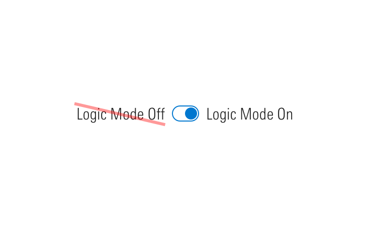
- When using a switch to control a “Mode”, make sure your modifier is specific and maps well to a user’s expectation once the switch is turned on.
- Do: Data Mode, Logic Mode
- Don't: Beast Mode
Accessibility
- Include a
role="switch"ARIA attribute to represent “On/Off” rather than checked/unchecked states. - Include
role="group"for grouped switches. - The switch can be triggered by pressing
spacebar. - Always include an associated label even if it is hidden from the screen.
- If hiding label text, add
aria-labelto an element (i.e., section title) to further enhance accessibility.
Code Reference
CSS Class References
|
Class |
Applies to |
Outcome |
|---|---|---|
|
|
|
At parent level, this applies base-switch styles to an element. |
|
|
|
Applies hover state. |
|
|
|
Applies active state. |
|
|
|
Applies focus state. |
|
|
|
Applies disabled state. To properly disable interaction with the switch, add |
|
|
|
Hides label text although text is still readable by screen readers. |
|
|
|
Semantically structures a group of switches. Always include |
|
|
|
Apply to a parent wrapper of a fieldset to convert switches layout from vertical to horizontal. |