Switches
Switches afford a choice between one of two opposing states or options.
Variations
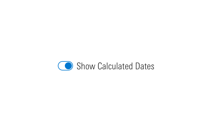
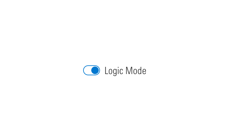
With Label
<div class="mds-switch">
    <label class="mds-switch__label" for="--61991">
        <input id="--61991" type="checkbox" role="switch" class="mds-switch__input">
        <span class="mds-switch__text"> Logic Mode </span>
    </label>
</div><div class="mds-switch mds-switch--disabled">
<label class="mds-switch__label" for="--19035">
<input id="--19035" type="checkbox" role="switch" class="mds-switch__input" disabled>
<span class="mds-switch__text"> Logic Mode </span>
</label>
</div>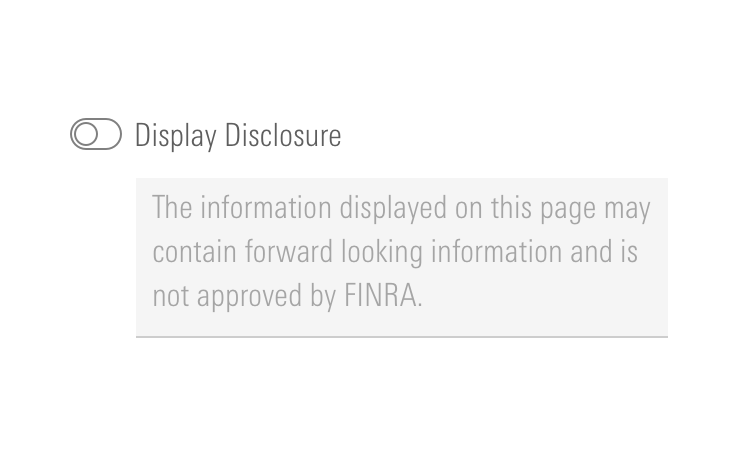
Without Label
Use when the purpose of a switch is clearly implied by its proximity to other content and controls.
<div class="mds-switch mds-switch--hide-label">
    <label class="mds-switch__label" for="--25535">
        <input id="--25535" type="checkbox" role="switch" class="mds-switch__input">
        <span class="mds-switch__text"> Logic Mode </span>
    </label>
</div><div class="mds-switch mds-switch--disabled mds-switch--hide-label">
<label class="mds-switch__label" for="--11720">
<input id="--11720" type="checkbox" role="switch" class="mds-switch__input" disabled>
<span class="mds-switch__text"> Logic Mode </span>
</label>
</div>Switch Group
<fieldset class="mds-switch__group" role="group">
    <legend class="mds-switch__group-label"> Client Configuration Options </legend>
    <div class="mds-switch">
        <label class="mds-switch__label" for="--33235">
            <input id="--33235" type="checkbox" role="switch" class="mds-switch__input">
            <span class="mds-switch__text"> Display Overview/Investment </span>
        </label>
    </div>
    <div class="mds-switch">
        <label class="mds-switch__label" for="--61266">
            <input id="--61266" type="checkbox" role="switch" class="mds-switch__input">
            <span class="mds-switch__text"> Display Account Details </span>
        </label>
    </div>
    <div class="mds-switch">
        <label class="mds-switch__label" for="--15333">
            <input id="--15333" type="checkbox" role="switch" class="mds-switch__input">
            <span class="mds-switch__text"> Display Benchmark Returns </span>
        </label>
    </div>
    <div class="mds-switch">
        <label class="mds-switch__label" for="--59801">
            <input id="--59801" type="checkbox" role="switch" class="mds-switch__input">
            <span class="mds-switch__text"> Allow Clients to Generate Reports </span>
        </label>
    </div>
    <div class="mds-switch">
        <label class="mds-switch__label" for="--54329">
            <input id="--54329" type="checkbox" role="switch" class="mds-switch__input">
            <span class="mds-switch__text"> Display Document Manager </span>
        </label>
    </div>
</fieldset>
Sizing
Sizing affects the switch size, text size, and internal spacing. The default size is medium, and you can use a modifier class to make the switch smaller (mds-switch--small) or larger (mds-switch--large).
<div class="mds-switch mds-switch--small">
    <label class="mds-switch__label" for="--50487">
        <input id="--50487" type="checkbox" role="switch" class="mds-switch__input" checked>
        <span class="mds-switch__text"> Logic Mode </span>
    </label>
</div>
<br/>
<div class="mds-switch mds-switch--small mds-switch--hide-label">
    <label class="mds-switch__label" for="--20673">
        <input id="--20673" type="checkbox" role="switch" class="mds-switch__input" checked>
        <span class="mds-switch__text"> Logic Mode </span>
    </label>
</div>- When pairing switches and Forms, use the same size.
Guidelines
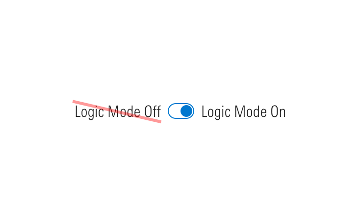
Use When
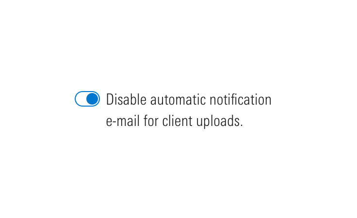
- Turning on and off a feature, mode, or functionality.
- Toggling elicits an immediate change in the UI.
- Toggling elicits a change in background behavior without affecting the UI.
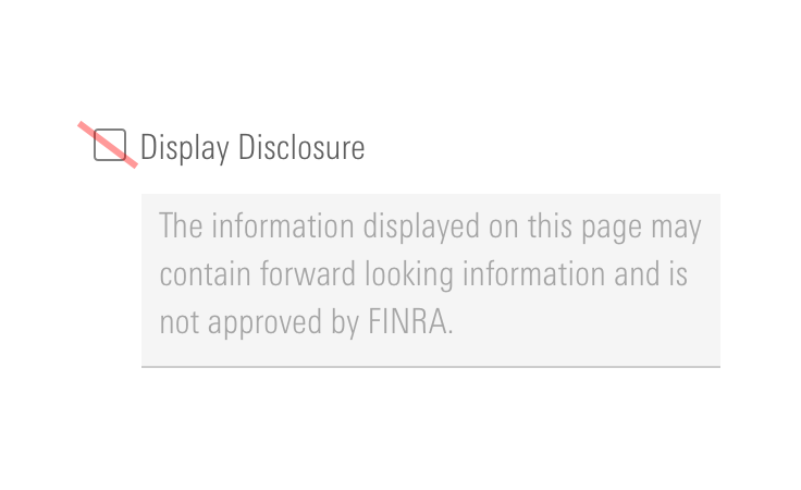
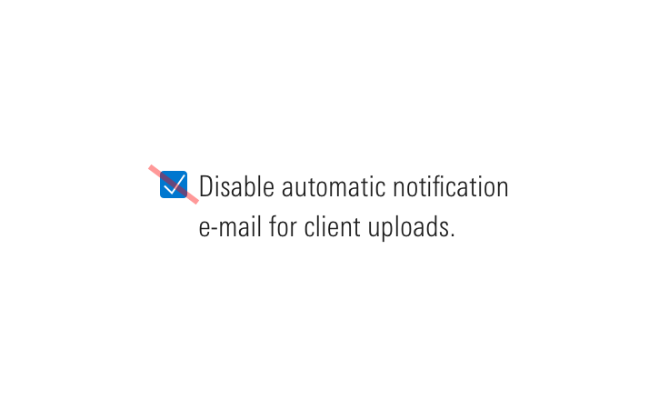
Don’t Use When
- Requiring user action consent, such as accepting terms and conditions. Instead, use a Form checkbox.
- Requesting multiple choices from a group of options. Instead, use a Form checkbox group.
Visual Language
Behaviors
Editorial
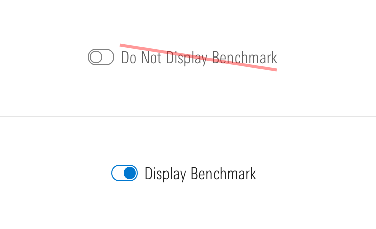
- Avoid acronyms.
- Aim for 2 to 5 words.
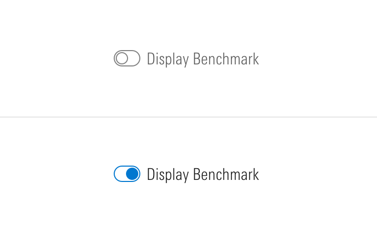
- When using a switch to control a “Mode”, make sure your modifier is specific and maps well to a user’s expectation once the switch is turned on.
- Do: Logic Mode
- Don't: Beast Mode
Accessibility
- Include a
role="switch"ARIA attribute to represent “On/Off” rather than checked/unchecked states. - Include
role="group"for grouped switches. - The switch can be triggered by pressing
spacebar. - Always include an associated label even if it is hidden from the screen.
- If hiding label text, add
aria-labelto an element (i.e., section title) to further enhance accessibility.
Code Reference
CSS Class References
|
Class |
Applies to |
Outcome |
|---|---|---|
|
|
|
At parent level, this applies base-switch styles to an element. |
|
|
|
Adjusts styling to render a small switch. |
|
|
|
Adjusts styling to render a large switch. |
|
|
|
Applies hover state. |
|
|
|
Applies active state. |
|
|
|
Applies focus state. |
|
|
|
Applies disabled state. To properly disable interaction with the switch, add |
|
|
|
Hides label text although text is still readable by screen readers. |
|
|
|
Semantically structures a group of switches. Always include |
|
|
|
Apply to a parent wrapper of a fieldset to convert switches layout from vertical to horizontal. |