Checkboxes
Checkboxes
updated
- HTML/CSS Available
- Web Component Beta
- Last Updated
2.14.0
Checkboxes afford one or more selection from a set of options.
See Forms for guidance on composing full forms.
Variations
Default
Use when affording a binary selection.
<label class="mds-form__checkbox" for="i-accept-the-terms-and-conditions.--62794">
    <input id="i-accept-the-terms-and-conditions.--62794" type="checkbox" class="mds-form__checkbox-input" />
    <span class="mds-form__checkbox-visible-wrap">
        <span class="mds-form__checkbox-visual">
            <svg class="mds-icon mds-form__checkbox-checked-icon" aria-hidden="true">
                <use xlink:href="/icons/mds.svg#check--s">
                </use>
            </svg>
            <svg class="mds-icon mds-form__checkbox-indeterminate-icon" aria-hidden="true">
                <use xlink:href="/icons/mds.svg#minus--s">
                </use>
            </svg>
        </span>
        <span class="mds-form__checkbox-text"> I accept the terms and conditions. </span>
    </span>
</label>
<mds-checkbox>I accept the terms and conditions.</mds-checkbox><label class="mds-form__checkbox mds-form__checkbox--disabled" for="i-accept-the-terms-and-conditions.--72570">
<input id="i-accept-the-terms-and-conditions.--72570" type="checkbox" class="mds-form__checkbox-input" disabled />
<span class="mds-form__checkbox-visible-wrap">
<span class="mds-form__checkbox-visual">
<svg class="mds-icon mds-form__checkbox-checked-icon" aria-hidden="true">
<use xlink:href="/icons/mds.svg#check--s">
</use>
</svg>
<svg class="mds-icon mds-form__checkbox-indeterminate-icon" aria-hidden="true">
<use xlink:href="/icons/mds.svg#minus--s">
</use>
</svg>
</span>
<span class="mds-form__checkbox-text"> I accept the terms and conditions. </span>
</span>
</label><mds-checkbox disabled>I accept the terms and conditions.</mds-checkbox><label class="mds-form__checkbox" for="i-accept-the-terms-and-conditions.--68114">
<input id="i-accept-the-terms-and-conditions.--68114" type="checkbox" class="mds-form__checkbox-input" checked />
<span class="mds-form__checkbox-visible-wrap">
<span class="mds-form__checkbox-visual">
<svg class="mds-icon mds-form__checkbox-checked-icon" aria-hidden="true">
<use xlink:href="/icons/mds.svg#check--s">
</use>
</svg>
<svg class="mds-icon mds-form__checkbox-indeterminate-icon" aria-hidden="true">
<use xlink:href="/icons/mds.svg#minus--s">
</use>
</svg>
</span>
<span class="mds-form__checkbox-text"> I accept the terms and conditions. </span>
</span>
</label><mds-checkbox checked>I accept the terms and conditions.</mds-checkbox><label class="mds-form__checkbox mds-form__checkbox--disabled" for="i-accept-the-terms-and-conditions.--48194">
<input id="i-accept-the-terms-and-conditions.--48194" type="checkbox" class="mds-form__checkbox-input" checked disabled />
<span class="mds-form__checkbox-visible-wrap">
<span class="mds-form__checkbox-visual">
<svg class="mds-icon mds-form__checkbox-checked-icon" aria-hidden="true">
<use xlink:href="/icons/mds.svg#check--s">
</use>
</svg>
<svg class="mds-icon mds-form__checkbox-indeterminate-icon" aria-hidden="true">
<use xlink:href="/icons/mds.svg#minus--s">
</use>
</svg>
</span>
<span class="mds-form__checkbox-text"> I accept the terms and conditions. </span>
</span>
</label><mds-checkbox checked disabled>I accept the terms and conditions.</mds-checkbox>Without Label
Use when enabling selection of an object such as a Card.
<label class="mds-form__checkbox mds-form__checkbox--hide-label" for="i-accept-the-terms-and-conditions--83320">
    <input id="i-accept-the-terms-and-conditions--83320" type="checkbox" class="mds-form__checkbox-input" />
    <span class="mds-form__checkbox-visible-wrap">
        <span class="mds-form__checkbox-visual">
            <svg class="mds-icon mds-form__checkbox-checked-icon" aria-hidden="true">
                <use xlink:href="/icons/mds.svg#check--s">
                </use>
            </svg>
            <svg class="mds-icon mds-form__checkbox-indeterminate-icon" aria-hidden="true">
                <use xlink:href="/icons/mds.svg#minus--s">
                </use>
            </svg>
        </span>
        <span class="mds-form__checkbox-text"> I accept the terms and conditions </span>
    </span>
</label>
<mds-checkbox hidden-text="true">I accept the terms and conditions.</mds-checkbox>- Always include an associated
<label>element, even if it is hidden from the screen. - Position the checkbox without label in the upper left corner of an object.
- Distinguish the selected state of the overall object (such as a card) by changing the object’s visual style, such as altering the background or border color.
- Omit margins from the checkbox element to prevent focused and active states from appearing as larger than the checkbox itself.
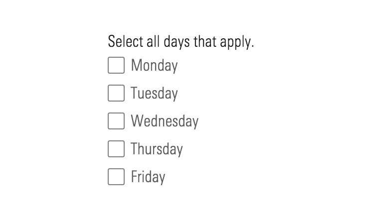
Checkbox Group
Use when affording multiple selections from a set of options.
<form class="mds-form mds-form--medium-layout" method="post" action="form/processor">
    <div class="mds-form__field-group">
        <fieldset class="mds-form__checkbox-group" role="group">
            <legend class="mds-form__checkbox-group-label"> Select statistics to view. </legend>
            <label class="mds-form__checkbox" for="average--58977">
                <input id="average--58977" type="checkbox" class="mds-form__checkbox-input" name="statistics-id-21179" />
                <span class="mds-form__checkbox-visible-wrap">
                    <span class="mds-form__checkbox-visual">
                        <svg class="mds-icon mds-form__checkbox-checked-icon" aria-hidden="true">
                            <use xlink:href="/icons/mds.svg#check--s">
                            </use>
                        </svg>
                        <svg class="mds-icon mds-form__checkbox-indeterminate-icon" aria-hidden="true">
                            <use xlink:href="/icons/mds.svg#minus--s">
                            </use>
                        </svg>
                    </span>
                    <span class="mds-form__checkbox-text"> Average </span>
                </span>
            </label>
            <label class="mds-form__checkbox" for="minimum--89193">
                <input id="minimum--89193" type="checkbox" class="mds-form__checkbox-input" name="statistics-id-21179" />
                <span class="mds-form__checkbox-visible-wrap">
                    <span class="mds-form__checkbox-visual">
                        <svg class="mds-icon mds-form__checkbox-checked-icon" aria-hidden="true">
                            <use xlink:href="/icons/mds.svg#check--s">
                            </use>
                        </svg>
                        <svg class="mds-icon mds-form__checkbox-indeterminate-icon" aria-hidden="true">
                            <use xlink:href="/icons/mds.svg#minus--s">
                            </use>
                        </svg>
                    </span>
                    <span class="mds-form__checkbox-text"> Minimum </span>
                </span>
            </label>
            <label class="mds-form__checkbox" for="maximum--61272">
                <input id="maximum--61272" type="checkbox" class="mds-form__checkbox-input" name="statistics-id-21179" />
                <span class="mds-form__checkbox-visible-wrap">
                    <span class="mds-form__checkbox-visual">
                        <svg class="mds-icon mds-form__checkbox-checked-icon" aria-hidden="true">
                            <use xlink:href="/icons/mds.svg#check--s">
                            </use>
                        </svg>
                        <svg class="mds-icon mds-form__checkbox-indeterminate-icon" aria-hidden="true">
                            <use xlink:href="/icons/mds.svg#minus--s">
                            </use>
                        </svg>
                    </span>
                    <span class="mds-form__checkbox-text"> Maximum </span>
                </span>
            </label>
            <label class="mds-form__checkbox" for="median--13766">
                <input id="median--13766" type="checkbox" class="mds-form__checkbox-input" name="statistics-id-21179" />
                <span class="mds-form__checkbox-visible-wrap">
                    <span class="mds-form__checkbox-visual">
                        <svg class="mds-icon mds-form__checkbox-checked-icon" aria-hidden="true">
                            <use xlink:href="/icons/mds.svg#check--s">
                            </use>
                        </svg>
                        <svg class="mds-icon mds-form__checkbox-indeterminate-icon" aria-hidden="true">
                            <use xlink:href="/icons/mds.svg#minus--s">
                            </use>
                        </svg>
                    </span>
                    <span class="mds-form__checkbox-text"> Median </span>
                </span>
            </label>
        </fieldset>
    </div>
</form>
<form class="mds-form mds-form--medium-layout" method="post" action="form/processor">
<div class="mds-form__field-group">
<mds-checkbox-group label="Select statistics to view.">
<mds-checkbox id="checkbox-1" value="average">Average</mds-checkbox>
<mds-checkbox id="checkbox-2" value="minimum">Minimum</mds-checkbox>
<mds-checkbox id="checkbox-3" value="maximum">Maximum</mds-checkbox>
<mds-checkbox id="checkbox-4" value="median">Median</mds-checkbox>
</mds-checkbox-group>
</div>
</form><form class="mds-form mds-form--medium-layout" method="post" action="form/processor">
<div class="mds-form__field-group mds-form__field-group--horizontal">
<fieldset class="mds-form__checkbox-group" role="group">
<legend class="mds-form__checkbox-group-label"> Select statistics to view. </legend>
<label class="mds-form__checkbox" for="average--35984">
<input id="average--35984" type="checkbox" class="mds-form__checkbox-input" name="statistics-id-21179" />
<span class="mds-form__checkbox-visible-wrap">
<span class="mds-form__checkbox-visual">
<svg class="mds-icon mds-form__checkbox-checked-icon" aria-hidden="true">
<use xlink:href="/icons/mds.svg#check--s">
</use>
</svg>
<svg class="mds-icon mds-form__checkbox-indeterminate-icon" aria-hidden="true">
<use xlink:href="/icons/mds.svg#minus--s">
</use>
</svg>
</span>
<span class="mds-form__checkbox-text"> Average </span>
</span>
</label>
<label class="mds-form__checkbox" for="minimum--80927">
<input id="minimum--80927" type="checkbox" class="mds-form__checkbox-input" name="statistics-id-21179" />
<span class="mds-form__checkbox-visible-wrap">
<span class="mds-form__checkbox-visual">
<svg class="mds-icon mds-form__checkbox-checked-icon" aria-hidden="true">
<use xlink:href="/icons/mds.svg#check--s">
</use>
</svg>
<svg class="mds-icon mds-form__checkbox-indeterminate-icon" aria-hidden="true">
<use xlink:href="/icons/mds.svg#minus--s">
</use>
</svg>
</span>
<span class="mds-form__checkbox-text"> Minimum </span>
</span>
</label>
<label class="mds-form__checkbox" for="maximum--68050">
<input id="maximum--68050" type="checkbox" class="mds-form__checkbox-input" name="statistics-id-21179" />
<span class="mds-form__checkbox-visible-wrap">
<span class="mds-form__checkbox-visual">
<svg class="mds-icon mds-form__checkbox-checked-icon" aria-hidden="true">
<use xlink:href="/icons/mds.svg#check--s">
</use>
</svg>
<svg class="mds-icon mds-form__checkbox-indeterminate-icon" aria-hidden="true">
<use xlink:href="/icons/mds.svg#minus--s">
</use>
</svg>
</span>
<span class="mds-form__checkbox-text"> Maximum </span>
</span>
</label>
<label class="mds-form__checkbox" for="median--14449">
<input id="median--14449" type="checkbox" class="mds-form__checkbox-input" name="statistics-id-21179" />
<span class="mds-form__checkbox-visible-wrap">
<span class="mds-form__checkbox-visual">
<svg class="mds-icon mds-form__checkbox-checked-icon" aria-hidden="true">
<use xlink:href="/icons/mds.svg#check--s">
</use>
</svg>
<svg class="mds-icon mds-form__checkbox-indeterminate-icon" aria-hidden="true">
<use xlink:href="/icons/mds.svg#minus--s">
</use>
</svg>
</span>
<span class="mds-form__checkbox-text"> Median </span>
</span>
</label>
</fieldset>
</div>
</form><form class="mds-form mds-form--medium-layout" method="post" action="form/processor">
<div class="mds-form__field-group mds-form__field-group--horizontal">
<mds-checkbox-group label="Select statistics to view.">
<mds-checkbox id="checkbox-1" value="average">Average</mds-checkbox>
<mds-checkbox id="checkbox-2" value="minimum">Minimum</mds-checkbox>
<mds-checkbox id="checkbox-3" value="maximum">Maximum</mds-checkbox>
<mds-checkbox id="checkbox-4" value="median">Median</mds-checkbox>
</mds-checkbox-group>
</div>
</form>- Include a label to describe the options within the group.
- Options can be selected independently.
Indeterminate
Use when affording a “Select All” option. After selecting all items, the indeterminate state is triggered once an option is deselected.
<label class="mds-form__checkbox" for="indeterminate-checkbox--46793">
    <input id="indeterminate-checkbox--46793" type="checkbox" class="mds-form__checkbox-input" checked />
    <span class="mds-form__checkbox-visible-wrap">
        <span class="mds-form__checkbox-visual">
            <svg class="mds-icon mds-form__checkbox-checked-icon" aria-hidden="true">
                <use xlink:href="/icons/mds.svg#check--s">
                </use>
            </svg>
            <svg class="mds-icon mds-form__checkbox-indeterminate-icon" aria-hidden="true">
                <use xlink:href="/icons/mds.svg#minus--s">
                </use>
            </svg>
        </span>
        <span class="mds-form__checkbox-text"> Indeterminate checkbox </span>
    </span>
</label>
<!-- Something like the following Javascript would be required to set an indeterminate state on a checkbox -->
<script>
    document.getElementById("indeterminate-checkbox--46793").indeterminate = true;
</script>
<mds-checkbox checked indeterminate="true">Indeterminate checkbox</mds-checkbox>Sizing
Sizing affects checkbox size and text size. The default size is medium, and you can use modifier classes or props to make the checkbox smaller or larger.
<label class="mds-form__checkbox mds-form__checkbox--small" for="small-checkbox">
    <input id="small-checkbox" type="checkbox" class="mds-form__checkbox-input" />
    <span class="mds-form__checkbox-visible-wrap">
        <span class="mds-form__checkbox-visual">
            <svg class="mds-icon mds-form__checkbox-checked-icon" aria-hidden="true">
                <use xlink:href="/icons/mds.svg#check--s">
                </use>
            </svg>
            <svg class="mds-icon mds-form__checkbox-indeterminate-icon" aria-hidden="true">
                <use xlink:href="/icons/mds.svg#minus--s">
                </use>
            </svg>
        </span>
        <span class="mds-form__checkbox-text"> Checkbox Label </span>
    </span>
</label>
<br>
<label class="mds-form__checkbox mds-form__checkbox--hide-label mds-form__checkbox--small" for="small-checkbox-without-label">
    <input id="small-checkbox-without-label" type="checkbox" class="mds-form__checkbox-input" />
    <span class="mds-form__checkbox-visible-wrap">
        <span class="mds-form__checkbox-visual">
            <svg class="mds-icon mds-form__checkbox-checked-icon" aria-hidden="true">
                <use xlink:href="/icons/mds.svg#check--s">
                </use>
            </svg>
            <svg class="mds-icon mds-form__checkbox-indeterminate-icon" aria-hidden="true">
                <use xlink:href="/icons/mds.svg#minus--s">
                </use>
            </svg>
        </span>
        <span class="mds-form__checkbox-text"> Checkbox Label </span>
    </span>
</label>
<mds-checkbox size="small" id="small-wc-checkbox">Checkbox Label</mds-checkbox>
<br>
<mds-checkbox hidden-text="true" id="small-checkbox-wc-without-label">Checkbox Label</mds-checkbox>- Use the
mds-form__checkbox-without-labelclass in conjunction with checkbox sizing modifier classes to render different sizes of the Without Label variation.
Use When
- Affording a binary selection, like accepting terms and conditions.
- Affording multiple selections from a set of options.
- Enabling selection of an object, such as a Card.
- Affording selection of a row within a Data Table.
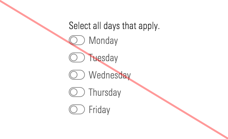
Don’t Use When
- Turning a feature, mode, or functionality on and off. Instead, use a Switch.
- Checking or unchecking elicits an immediate change in the UI or functionality, such as enabling a disabled field or revealing more controls. Instead, use a Switch.
- Checking or unchecking elicits a change in background functionality without affecting the UI, like disabling an email notification. Instead, use a Switch.
Visual Language
- Uses the same
:hoverand:activestyles as the primary Button when checked.
Behaviors
- Reflects the affirmative (“yes” or “true”) of its label when checked.
- Choices made via checkbox should always be submitted or saved using a Button.
- A checkbox’s label is included in the clickable target area.
Editorial
Default
- Use full sentences with punctuation.
- If user is consenting to something, start the sentence with “I”, and also run the phrasing you choose by compliance.
Groups
- Use full sentences with punctuation for the checkbox group label.
- Try to keep checkbox labels brief and start them with verbs.
Related UI Components
Related UX Patterns
CSS
Class References
|
Class
|
Applies to
|
Outcome
|
|---|---|---|
|
|
|
Adjusts styling to render a small checkbox. |
|
|
|
Adjusts styling to render a large checkbox. |
|
|
|
Hides label text, although screen readers can still access it. |
|
|
|
Adjusts styling to render a small checkbox group label. |
|
|
|
Adjusts styling to render a large checkbox group label. |
Web Component
Checkboxes are comprised of two separate web components, each with a dedicated API:
- Checkbox - Renders the checkbox component and offers props for all available configurations.
- Checkbox Group - Wraps multiple
<mds-checkbox>elements to present them as a group.
Checkbox
Props
|
Prop
|
Type
|
Validation
|
Default
|
Description
|
|---|---|---|---|---|
|
|
Boolean |
— |
|
Sets the checked value of the checkbox. |
|
|
String |
— |
— |
A space-separated list of class names that will be appended to the default |
|
|
Boolean |
— |
|
If |
|
|
Boolean |
— |
|
When true, hides the checkbox's label. |
|
|
String |
Required |
— |
The |
|
|
Boolean |
— |
|
If |
|
|
String |
Enum: |
|
Alters the size of the checkbox. |
|
|
String |
Required |
— |
The checkbox label text. |
|
|
String |
Required |
— |
The checkbox value. |
- Use kebab-case when setting props in HTML. For example,
hiddenLabelwould be written ashidden-label.
Slots
Default Slot
Any text passed in between <mds-checkbox></mds-checkbox> tags will be used as the checkbox’s label. This slot can accept plain text, or a combination of text and link where appropriate. If no content is passed in via the slot and the text prop is empty, the checkbox label content will be empty.
Usage Examples
Setting size, checked status, and label text:
<!-- Using Props -->
<mds-checkbox size="small" text="I accept" checked></mds-checkbox>
<!-- Using Slots -->
<mds-checkbox size="small" checked> I accept </mds-checkbox>
Creating a checkbox with a hidden label:
<!-- Using Props -->
<mds-checkbox hidden-label="true" text="Portfolio 1"></mds-checkbox>
<!-- Using Slots -->
<mds-checkbox hidden-label="true"> Portfolio 1 </mds-checkbox>
Checkbox Group
Props
|
Prop
|
Type
|
Validation
|
Default
|
Description
|
|---|---|---|---|---|
|
|
String |
— |
“Please select an option.” |
Sets the checkbox group label’s required indicator |
|
|
String |
— |
— |
A space-separated list of class names that will be appended to the default |
|
|
String |
— |
— |
Checkboxes to display within the group. Can also be passed using the default slot. |
|
|
String |
— |
— |
The |
|
|
String |
Required |
— |
Label for the checkbox group. |
|
|
Boolean |
— |
|
If true, adds the optional indicator to the right of the label with a default text of “(Optional)”. |
|
|
String |
— |
“(Optional)” |
Use to override the default optional indicator text. |
|
|
Boolean |
— |
|
If true, adds the required field indicator to the right of the label. |
|
|
String |
Enum: |
|
Alters the size of the checkbox group label. |
- Use kebab-case when setting props in HTML. For example,
optionalTextwould be written asoptional-text.
Slots
Default Slot
Pass two or more <mds-checkbox> elements between the <mds-checkbox-group></mds-checkbox-group> to set the content of the checkbox group. This slot can be overridden using the content prop.
Usage Examples
Creating a required checkbox group:
<!-- Using Props -->
<mds-checkbox-group required label="Choose your options." content='<mds-checkbox text="Option 1" id="checkbox-option-1" value="option-1"></mds-checkbox> <mds-checkbox text="Option 2" id="checkbox-option-2" value="option-2"></mds-checkbox>'></mds-checkbox-group>
<!-- Using Slots -->
<mds-checkbox-group required label="Choose your options.">
    <mds-checkbox id="checkbox-option-1" value="option-1"> Option 1 </mds-checkbox>
    <mds-checkbox id="checkbox-option-2" value="option-2"> Option 2 </mds-checkbox>
</mds-checkbox-group>Implementation
- Use
fieldsetandlegendfor checkbox groups. See the form structure guidelines in the Forms composition section for more information.