Links
- HTML/CSS Available
- Web Component Beta
- Last Updated
2.17.0
Links navigate to other pages or additional information.
Variations
Default
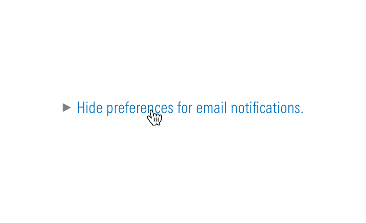
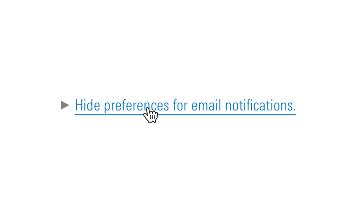
Use in most cases.
<a href="#" class="mds-link">Link Text</a><mds-link href="#">Link Text</mds-link>- Use in body text, ordered, and unordered lists.
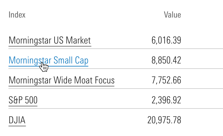
- Never use when horizontal borders separate multiple links, e.g., Data Tables. Instead, use either No Underline or In Data Table variation.
No Underline
Use to avoid visual clutter.
<a href="#" class="mds-link mds-link--no-underline">Link Text</a><mds-link href="#" underline="false">Link Text</mds-link>- No-underline links do not meet all accessibility benchmarks and should be used only in cases where the interactivity of a link is strongly implied by its context.
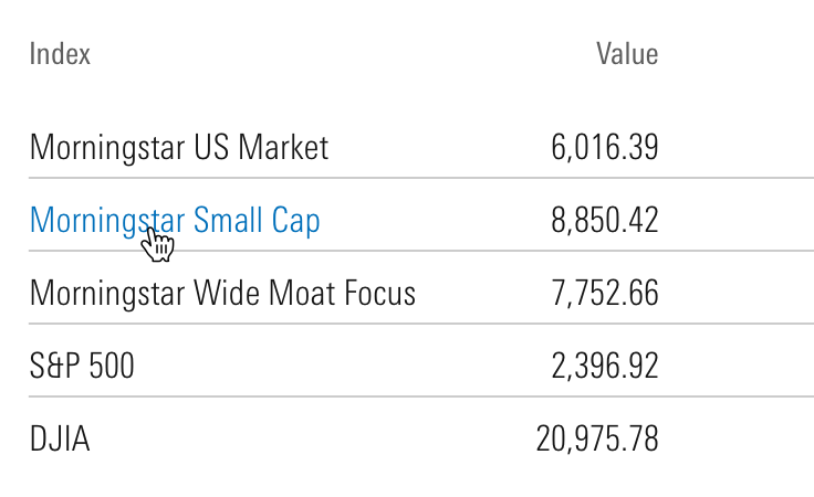
- Use in cases where horizontal rules separate multiple links. For example, the List Group uses this variation to create its links.
- Use for links within Data Tables when the interactivity of the link is implied by its context.
In Data Table
Use to highlight links within Data Tables.
<a href="#" class="mds-link mds-link--data-table">Link Text</a><mds-link href="#" in-data-table>Link Text</mds-link>- Avoid using this variation outside of Data Tables.
- Meets all accessibility benchmarks.
- Use when the interactivity of links within a Data Table may not be immediately apparent to a user.
Use When
- Leading a user to another page.
- Signaling email functionality by styling the address itself.
Don’t Use When
- Submitting or confirming an action. Instead, use a Button.
Visual Language


Behaviors
- Always open links in the same window unless requirements dictate otherwise, for example:
- Opening a PDF document.
- When opening a link in the same window will interrupt a user’s workflow.
Editorial
- Link copy should convey what we will deliver once the link is clicked, for example:
- Links can be questions that we will answer, or they can be declarative, for example:
- When a link opens a Modal or secondary workspace, consider using the words in the link as the header for the modal.
- Underline just the relevant words in a sentence or paragraph, for example:
- Want to see our Privacy Policy?
- Don’t use “click here,” “tap this link,” etc., inside link copy. Link copy should be device agnostic—a user may not have a mouse with which to click or the capability to tap.
CSS
Class References
|
Class
|
Applies to
|
Outcome
|
|---|---|---|
|
|
Any link element |
Adds default, visited, hover, and focus styles to a link. |
|
|
|
Removes the underline from link styles. |
|
|
|
Prevents visited styles from being applied after a link is visited. |
|
|
|
Removes the underline and swaps the link's default and hover styles. |
Mixin Reference
Use this mixin to add link styles to any element. Set $underline to false to hide underlines. Set $visited-styles to false to prevent a color change after a link is visited.
@include mds-link($underline: true, $visited-styles: true)When combining header typography heading and link mixins, always include the link mixin mds-link first. This avoids conflicting line-height declarations.
[.my-custom-style] {
    @include mds-link;
    @include mds-level-1-heading;
}
Web Component
Props
When setting props as attributes on a custom HTML element, use kebab-case instead of camelCase.
|
Prop
|
Type
|
Validation
|
Default
|
Description
|
|---|---|---|---|---|
|
|
String |
— |
— |
A space-separated list of class names that will be appended to the default |
|
|
String |
— |
— |
Sets the aria-label for the link. |
|
|
String |
— |
— |
If |
|
|
String |
Required |
— |
Destination for the link. If the link opens in a new window, use the |
|
|
Boolean |
— |
|
If |
|
|
String |
— |
— |
If set, adds |
|
|
String |
Required |
— |
The text of the link. Can also be passed in via the default slot. |
|
|
Boolean |
— |
|
If |
|
|
Boolean |
— |
|
If |
Slots
Default Slot
Pass text in between the <mds-link></mds-link> tags to set the link’s text content. This can be overridden with the text prop.
Usage Examples
Setting href and visited-styling via props. Using the default slot for text content:
<mds-link href="contact-us.html" visited-styling="false"> Contact Us </mds-link>Implementation
- Always include an
hrefattribute for a link. - Always include an
aria-labelattribute to describe the intent of a link.- For links that activate a download, explicitly state this action within the
aria-label, including the file-type and file-size. - For links that force the user to leave the current window or tab, explicitly state this action within the
aria-label.
- For links that activate a download, explicitly state this action within the
- Combine adjacent image and text links into the same
<a>element. - Don't embed critical information within CSS. Screen readers do not recognize CSS.
Best Practices
- Never apply the
mds-linkclass or mixin to an element other than<a>. - Never suppress focus styles for a link.
Editorial
- An
aria-labelshould be clear and concise, using fewer than 100 characters will increase user comprehension. - An
aria-labelshould make sense out of context and clearly inform a user of what action will be taken if the link is selected. Don't rely on surrounding context to inform link content. - Don't use redundant wording within ARIA labels. An
aria-labelon an anchor tag automatically informs the user an element is a link. Words such as, “link”, “links”, or “go to” are repetitive and unnecessary. - Don't write
aria-labeltext in all caps. Most screen readers read all cap text one letter at a time. - Never use URLs in link text, screen readers dictate URLs letter by letter. Instead of including developer.morningstar.com in the
aria-label, include “Morningstar Developer Site”. - Never use dashes, mathematical characters or emoticons in place of the actual word within an
aria-label. These symbols are not recognized by most assistive technology.
<a href="#" aria-label="Opportunity plus Instinct equals Profit"></a>
<a href="#" aria-label="Opportunity + Instinct = Profit"></a>
<a href="#" aria-label="16 to 17 years"></a>
<a href="#" aria-label="16 – 17 years"></a>
<a href="#" aria-label="Portfolio Report Information from January 1st, 2018 to April 30th, 2018">Portfolio Report Information 1/1/18–4/30/18</a>
<a href="#" aria-label="Portfolio Report Information 1/1/18–4/30/18">Portfolio Report Information 1/1/18–4/30/18</a>

