Loaders
updated
- HTML/CSS Available
- Web Component Beta
- Last Updated
2.19.0
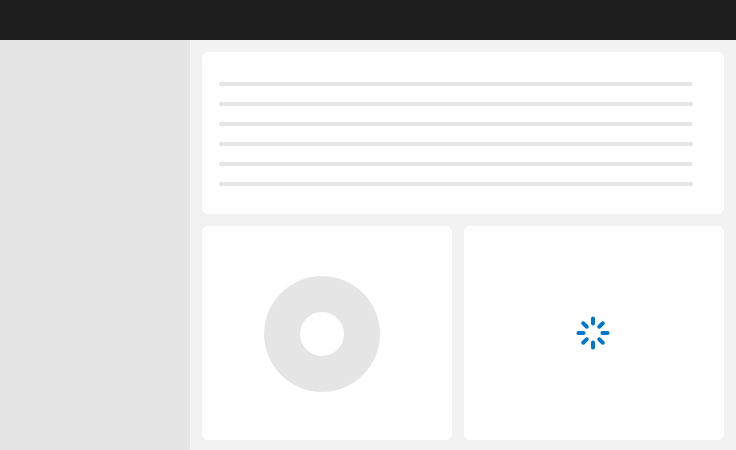
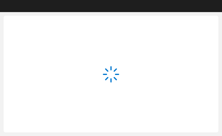
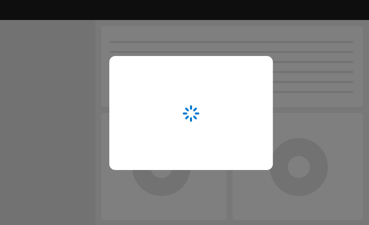
Loaders indicate that content will process for an indeterminate amount of time.
Variations
Default
Default
Default
Press Ctrl + C to copy
<div class="mds-loader" role="progressbar" aria-valuetext="Please wait, page is loading...">
    <div class="mds-loader__item mds-loader__item--1"></div>
    <div class="mds-loader__item mds-loader__item--2"></div>
    <div class="mds-loader__item mds-loader__item--3"></div>
    <div class="mds-loader__item mds-loader__item--4"></div>
    <div class="mds-loader__item mds-loader__item--5"></div>
    <div class="mds-loader__item mds-loader__item--6"></div>
    <div class="mds-loader__item mds-loader__item--7"></div>
    <div class="mds-loader__item mds-loader__item--8"></div>
</div><mds-loader></mds-loader>Sizing
Small
Medium (Default)
Large
Small
Medium (Default)
Large
Press Ctrl + C to copy
<div class="mds-loader mds-loader--small" role="progressbar" aria-valuetext="Please wait, page is loading...">
    <div class="mds-loader__item mds-loader__item--1"></div>
    <div class="mds-loader__item mds-loader__item--2"></div>
    <div class="mds-loader__item mds-loader__item--3"></div>
    <div class="mds-loader__item mds-loader__item--4"></div>
    <div class="mds-loader__item mds-loader__item--5"></div>
    <div class="mds-loader__item mds-loader__item--6"></div>
    <div class="mds-loader__item mds-loader__item--7"></div>
    <div class="mds-loader__item mds-loader__item--8"></div>
</div>
<mds-loader size="small"></mds-loader>- Use the small loader with components smaller than ¼ of the viewport.
- Use the medium loader when loading a full page or a component that takes up more than ¼ of the viewport, which will be most cases.
- Use the large loader when loading a full page at mobile breakpoints.
Use When
- Loading content for an entire page.
- Loading content inside of a component.
- Loading content inside of a Modal.
- Loading the next step of a workflow.
Visual Language

Behaviors
- For load times longer than 10 seconds, consider including a notification with explanatory text.
CSS
Class References
|
Class
|
Applies to
|
Outcome
|
|---|---|---|
|
|
|
Makes the loader smaller. |
|
|
|
Makes the loader larger. |
|
|
|
Hides the loader when not in use. |
Web Component
Props
When setting props as attributes on a custom HTML element, use kebab-case instead of camelCase.
|
Prop
|
Type
|
Validation
|
Default
|
Description
|
|---|---|---|---|---|
|
|
String |
— |
— |
A space-separated list of class names that will be appended to the default |
|
|
String |
— |
Loading... |
Accessible text that describes what is happening while the loader is being displayed. |
|
|
String |
One of: |
|
Alters the size of the loader. |
Usage Examples
Setting size via props:
<mds-loader size="large"></mds-loader>Implementation
- Add
role=”progressbar”to.mds-loader. - If not active, apply
aria-hidden=”true”to.mds-loader, otherwise usearia-hidden=”false”. - Always include
aria-valuetext=”XXX”, whereXXXis a textual presentation of the loader, i.e., “Please wait, this data table is loading…”. - Add
aria-busy=”true”to a container or element to indicate the element is loading. Once loaded, change the value fromtruetofalse. For example:- If loading an entire page, add the attribute to
<body>or wrapper. - If loading a specific component (i.e., table), add the attribute to the container of that component.
- If loading content inside a Modal, add the attribute to the
.mds-modalcontainer.
- If loading an entire page, add the attribute to