Line
Line charts show an item or multiple items in sequence. They are the line chart to use if you wish to render only one value in each X-Axis interval.
Line
Invalid Combination
Press Ctrl + C to copy
Guidelines
Use When
- Representing items in a sequence, where there is only one value within each X-Axis interval.
- Comparing multiple items in a sequence, where there is only one value within each X-Axis interval.
Don′t Use When
- Displaying data where there are multiple values within each X-Axis interval. Instead, use a Time-Series Line chart.
- Displaying data with a timestamp which needs to be interpreted by the chart. Instead, use a Time-Series Line chart.
- Representing information that is intended for comparison, but not for comparing trends over time. Instead, use a Vertical Bar chart.
Visual Language
- Never use colors other than those defined in the visualization palette.
- Always use the relevant color orders and meanings from the visualization palette.
- Always use the dotted-line configuration to establish visual hierarchy. Solid lines are intended to represent primary items, while dotted lines can be used to represent secondary or tertiary items, i.e., benchmarks.
Legend
- At chart container widths of
600pxor less, the internal padding between elements tightens. This is the default width for this behavior to occur, the width can be adjusted by setting thebreakpointparameter. - When the legend is at the top and contains more items than fit in the available space, the full legend is accessible within a Popover triggered by an Icon-Only Button.
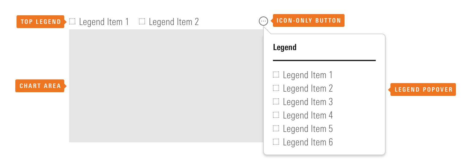 The Icon-Only Button provides access to the full legend within a Popover.
- The Popover containing the full legend includes logic to prevent it from overlapping the chart unless there is no space available to the right of, or above, the data visualization.
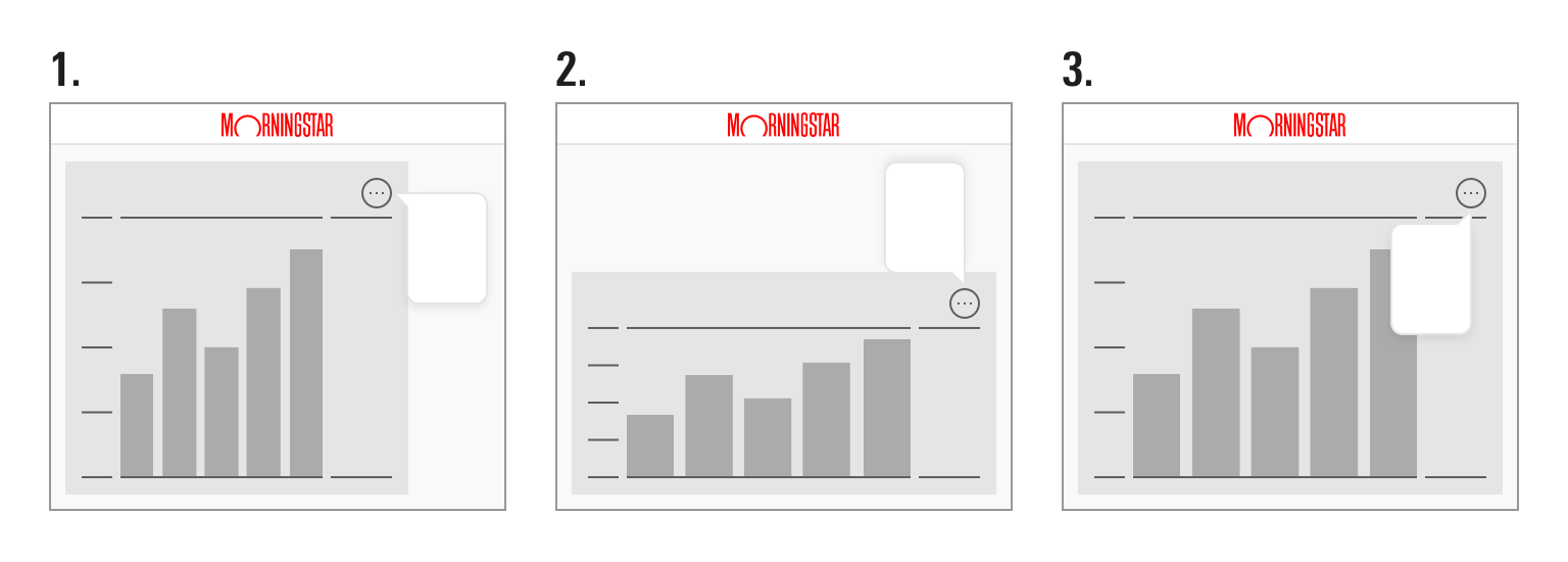 The Popover containing the full legend has three potential positions based on the space available to the right of, and above, the chart.
Responsiveness
- Line charts will resize to fill the available space. Avoid using them at widths below
200pxand heights below150pxto prevent axis value/label collision and clipping. - Set the
breakpointparameter to control the width of the chart container (in pixels) at which the X-axis shows only the first and last X-axis value. By default, it is set to600. - When displaying discrete categories teams should limit the number of categories and/or the length of labels to ensure adequate space.
Editorial
- Use the “Abbreviated” Y-axis Label ,
y1abbreviation, for things like currency abbreviations or other short labels, up to a maximum of 10 characters. Anything longer than that should use the “Full” Y-Axis Label,y1AxisLabel. - Include single characters, such as a “$”, at the beginning of the maximum Y-axis value. However, a “%” sign after the value should be moved to the “Abbreviated” Y-Axis label,
y1abbreviation, to avoid offsetting the alignment of the Y-Axis text. - Strive for short, succinct axis labels and legend items that clearly describe the data.
- Include the unit or increment in axis labels.
Code Reference
Necessary code documentation can be found in the MBC repository.