Search
Search is used to find or add objects, filter a list of results, or navigate to destinations within an app or website.

Problem Statement
It is essential that users are able to quickly find what they need or reach their intended destination. Search can make this process easy by clearly showing relevant results. Teams also need to understand what type of search to use depending on context.
Types
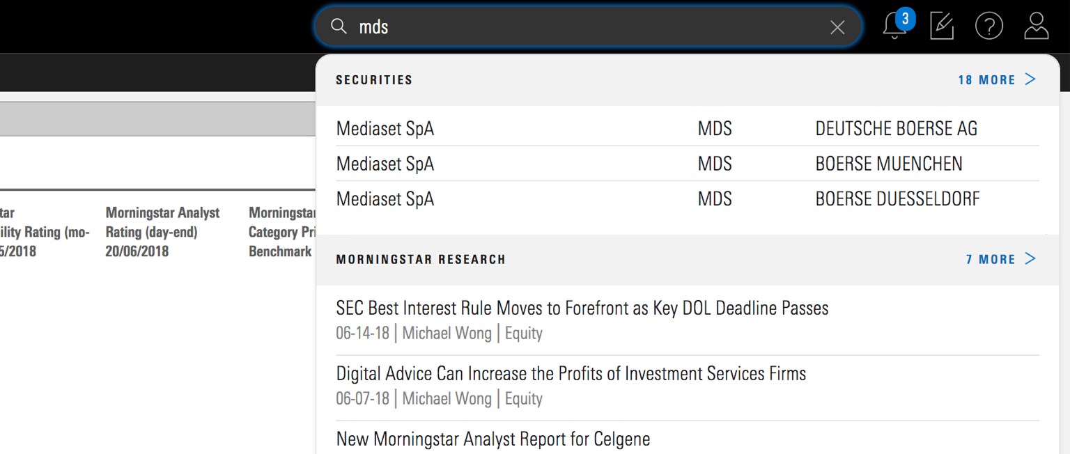
Global Search
Global Search is accessible from every page of an app or website. Users can perform broad searches to look for a wide variety of content. In many cases, global search serves as a starting point for a user to navigate where to go and what to do within the app/website.
 Morningstar.com uses global search.
Search should be visible and positioned where users expect to find it. Research suggests that users typically expect to see search to the right of the header, centered, or even placed to the left but this is less common.
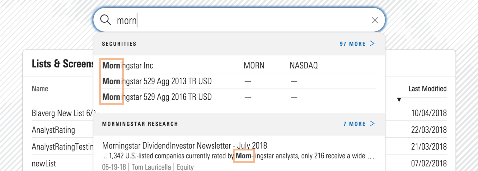
 Morningstar Direct positions its global search in the upper right-hand corner.
Contextual Search
Contextual search is specific to a location and embedded within features and tools. Depending on the need, contextual search can be used to find or filter objects, as well as add them to a list. The breadth of contextual search is more narrow than that of the global search; a user is only searching for objects specific to the job that they are doing.
Filtering
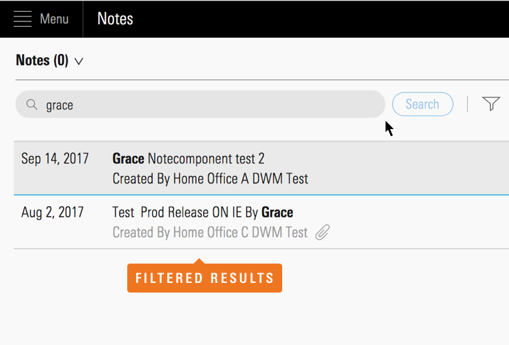
When search is used to filter a set of results in order to find an object, as a user types, the results should update in real-time. This helps users quickly find what they need.
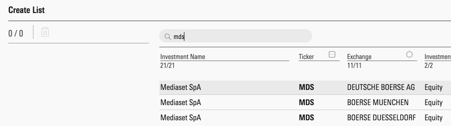
 A page offering a Search Field to perform real-time contextual search.
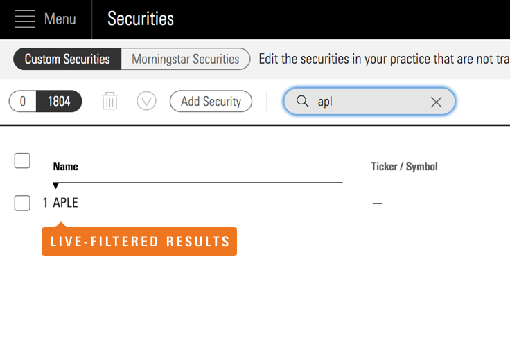 An example of real-time contextual search filtering a set of results.
If updating filter results in real time is not possible, search must be accompanied by a button to execute the query. This button is disabled by default and is active once a user types into the search field.
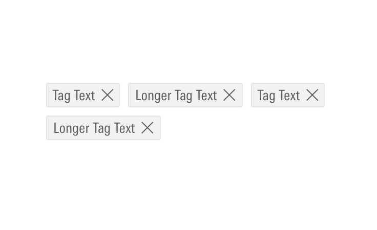
When adding multiple filters, display each as Tags below the search field. This way, a user can see their filters and remove them if they choose.
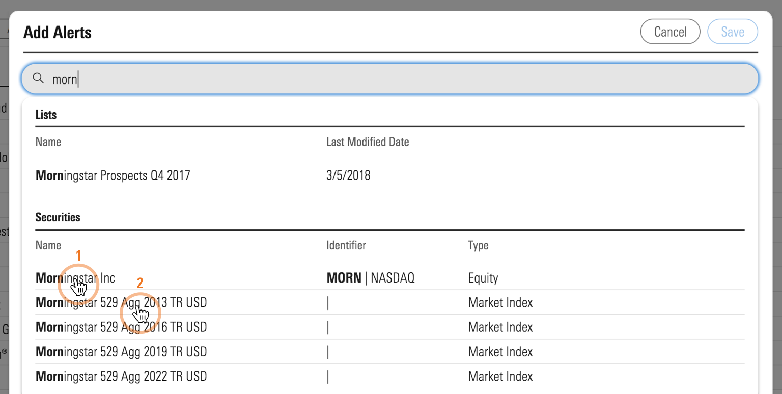 Choosing multiple search results as filters.
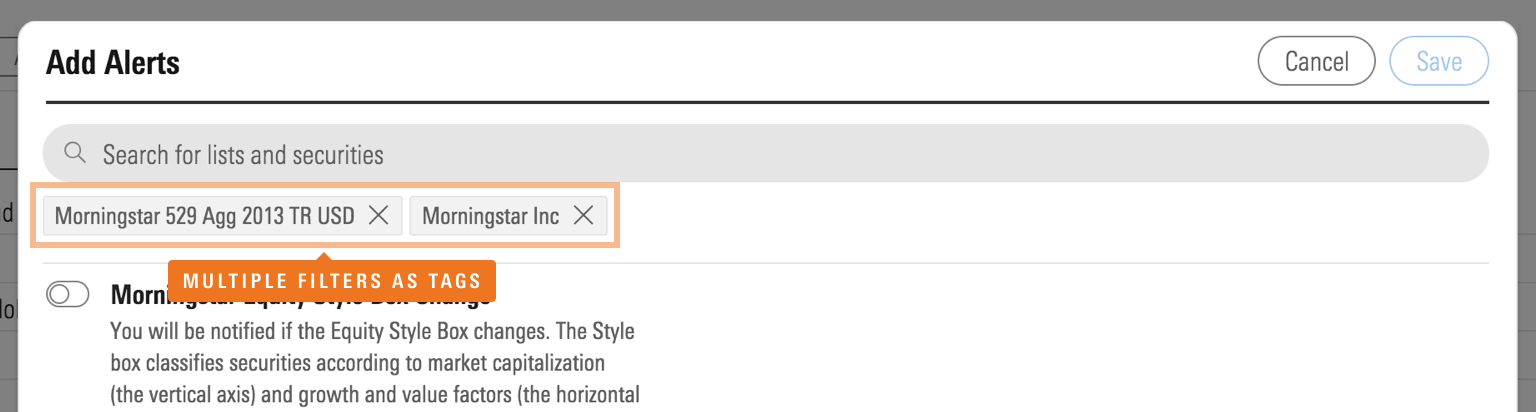 Displaying filters as Tags below the Search Field.
When used to add metadata to an object or multiple filters in the constrained space, the user’s selections appear as tags within the search field. Upon adding more than a single line of tags, display a “More” link to show all added tags.
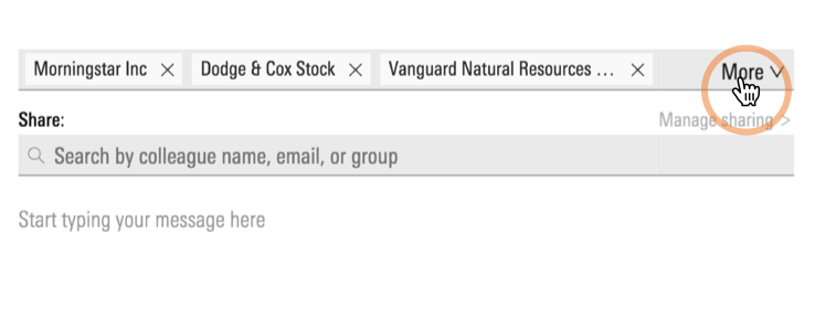 Addition of “More” link to display multiple lines of filters as Tags.
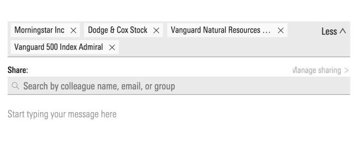 Link changes to “Less” when displaying the expanded view.
Adding
When the main use case is to add a single object, search closes upon selection of the object.
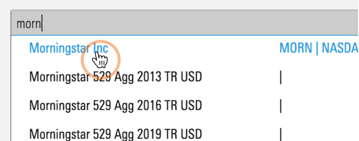 Selecting an object in the search results.
 Search results close on selection.
When used to add multiple objects, search results appear with checkboxes next to them to let users select as many objects as they’d like. Users must manually dismiss their search by clicking outside of the panel or on a done/cancel button.
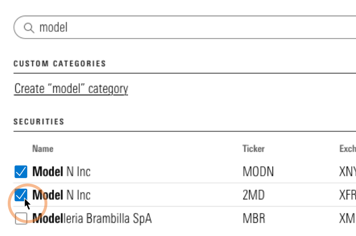 Selecting multiple objects using Checkboxes.
Search Field Behavior
Focus
If the main purpose of the page is to search for an object, focus the search field by default, so that a user does not need to activate it.
 Focused Search Field.
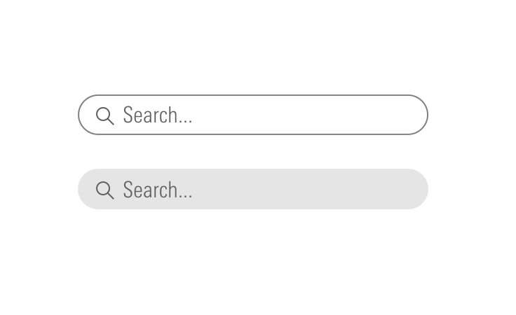
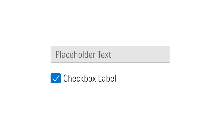
Placeholder Text
Use placeholder text in a search field. When using placeholder text, consistent language reduces cognitive friction and helps users quickly identify what types of content they can search for.
- Enable search query to execute on keystroke
Enter. - Enhance usability by enabling the user to quickly clear a search query, such as “clear” or “X” icon in the input field. See the Search Fields page for more guidelines.
- Research suggests that the size of the input field has an impact on search usability. A general rule of thumb is that the input, when active, should accommodate 27 characters.
 Placeholder text in Search Field.
Search Results
Depending on context, search results may appear in page or in a panel. When deciding between the two, think about the importance of the search to the page. If search is the primary action a user is supposed to take, it should appear in page. If searching is supplementary or only one of the many actions a user can take, search results may appear in a panel.
- Allow keyboard navigation to scroll through search results. Once users moves past the last result, the focus state loops back to the first result.
- Never reload results as a user types the query. Have a
.5second idle time before executing the search. This way, search results will not reload on every keystroke but only when a user stops typing. - If it takes more than one second to load results, show a Loader and loading message.
In Page
Use when:
- The whole page is primarily designed to search and add objects.
 Search results in page.
- Search is used to filter a longer list of items that are displayed on a page.
In-page unfiltered list.
In-page filtered list.
In Panel
Search results appear in a panel when search is supplementary and is only one functionality among many that a user can perform on the page.
 Search results in a panel.
Highlight Results
When possible, highlight a match and show the number of results.
 Highlighting matches in search results.
No Results
Clearly state that there were no results found. Make the message visible by prominently placing it where results would appear.
- Offer ways for the user to move forward.
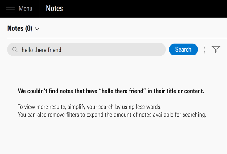 Offering ways for a user to move forward when a search has no results.