
Matt Schragal
Developer
Exploring how to add a hover flag and focused data to a visualization built with Morningstar Chart Elements
August 5, 2022—Morningstar Chart Elements (MCE) offer a modular approach to creating data visualizations, providing teams with the flexibility to tailor charts to solve unique challenges in Morningstar products.
Here we’ll explore building a simple donut chart component with Vue that combines multiple Morningstar Chart Elements and Morningstar Design System (MDS) components. Then we’ll enhance our component with the Hover Flag element.
For guidance on how to get started with MDS Chart Elements, see About Chart Elements.
For guidance on how to get started with MDS Components, see Getting Started for Engineers.
For a more thorough example, check out the Donut Chart Example CodePen.
Our goal is to build a component to help us visualize the asset allocation breakdown of a fund via a donut plot. This component should be in color and feature a legend alongside the visualization. In addition, the component should include a table of the input data to provide an accessible alternative to screen-readers.
NOTE: The Donut Plot is one of a few chart elements that does not implement a mouse prop to accept events from an <mce-pointer> element. Please keep that in mind if you’re following along with a different plot element.
You can see the final result and code for this exercise here: MCE Hover Flag Demo Final. In addition, you can follow along with each step of our progression via the CodePen link at the end of each section.
We’ll need some asset allocation data for our plot in the form of an Array. In the real world we’d likely get this data from an external API but we’ll hard code things for now. Here is an example of our initial schema:
const data = [
    {
        id: "AssetAllocCash",
        label: "Cash",
        value: 4.74688
    },
    {
        id: "AssetAllocNotClassified",
        label: "Not Classified",
        value: 1.53654
    },
    {
        id: "AssetAllocNonUSEquity",
        label: "Non-U.S. Equity",
        value: 27.24799
    },
    {
        id: "AssetAllocOther",
        label: "Other",
        value: 0.00000
    },
    {
        id: "AssetAllocUSEquity",
        label: "U.S. Equity",
        value: 37.11866
    },
    {
        id: "AssetAllocBond",
        label: "Fixed Income",
        value: 29.34991
    }
];
Each object in the array has a unique id, a label for display, and the underlying value as a Number.
Asset allocation types map to the Asset Allocation Named Palette in the MCE Color Utility. Let’s import that palette for later use:
import { assetAllocation } from '@mce/color';NOTE: If you’re using CodePen to follow along, the syntax will be slightly different:
const { assetAllocation } = window.utilities.color;We need a way to map our data to its respective color in the palette so we’ll create a color object and use the ids from our data as keys to create a mapping:
const chartColors = {
    AssetAllocCash: assetAllocation.cash,
    AssetAllocNotClassified: assetAllocation['not-classified'],
    AssetAllocNonUSEquity: assetAllocation.alternative,
    AssetAllocOther: assetAllocation.other,
    AssetAllocUSEquity: assetAllocation.equity,
    AssetAllocBond: assetAllocation['fixed-income'],
};We’re now ready to stub out the beginning of our component’s data model.
The Donut Plot adds a 3px gap between slices to maintain an accessible color contrast ratio. Knowing this, we don’t want data items with a value of zero taking up empty space in our plot. However, we do want to show them in our legend and table.
We’ll use some computed properties to massage our data to account for this as well as map our data types to their respective colors:
import { assetAllocation } from '@mce/color';
import { format } from 'd3-format';

const data = [
    // see above
    // {}, {}, {}...
];

const app = new Vue({
    el: "#app",
    data() {
        return {
            // Descriptive Labels
            chartAriaLabel:
                "Vanguard Global Wellington Fund Admiral Shares (VGWAX)",
            chartAriaDescription:
                "The allocation breakdown across asset classes for the Vanguard Global Wellington Fund Admiral Shares (VGWAX) fund. The fund is well diversified across asset classes with 37% allocated to U.S. Equity, 29% Fixed Income, 27% Non-U.S. Equity, and around 5% Cash."
            // Dimensions
            plotHeight: 350,
            plotWidth: 350,
            legendRightWidth: 170,
            chartColors,
        };
    },
    computed: {
        fullData() {
            // Include zero values in the legend
            return data.sort((a, b) => b.value - a.value);
        },
        chartData() {
            // Ignore zero values to avoid unwanted pie padAngle slices
            return this.fullData.filter((d) => d.value > 0);
        },
    },
    filters: {
        formatPercent(value) {
            return format(",.2%")(value / 100);
        }
    },
});We’ll wrap our content in an MDS Section component to give it a nice styled title and some padding.
We’ll place an MDS Layout element inside, and then provide an MCE Donut Plot and MCE Legend to its default and legend-right slots respectively.
<div id="app">
    <div>
        <mds-section
            bold
            :title="chartAriaLabel"
            :aria-label="chartAriaLabel"
            aria-describedby="aria-description"
        >
            <span id="aria-description"> {{ chartAriaDescription }}</span>
            <div class="wrapper">
                <mce-layout
                    :plot-width="plotWidth"
                    :plot-height="plotHeight"
                    :legend-right-width="legendRightWidth"
                >
                    <template #legend-right>
                        <mce-legend>
                            <mce-legend-group title="Asset Allocation">
                                <mce-legend-item
                                    v-for="row in fullData"
                                    :key="row.id"
                                    :label="row.label"
                                    :value="row.value | format"
                                    :color="chartColors[row.id]"
                                    key-type="donut"
                                >
                                </mce-legend-item>
                            </mce-legend-group>
                        </mce-legend>
                    </template>

                    <!-- Main plot (default slot) -->
                    <mce-donut-plot
                        :color="chartColors"
                        :data="chartData"
                        :height="plotHeight"
                        :width="plotWidth"
                    >
                    </mce-donut-plot>
                </mce-layout>
            </div>
        </mds-section>
    </div>
</div>Let’s add a table for our chart data to provide an accessible alternative to the visualization. We’ll use an MDS Data Table for consistent styling and add it after our <mds-section>:
<div>
<!-- ... -->
<mds-section>
<!-- ... -->
</mds-section>
<!-- provide an accessible alternative for screen-readers -->
<mds-table class="table">
<div class="accessibly-hidden">
{{
chartAriaDescription
}}
</div>
<mds-thead>
<mds-th>Asset Class</mds-th>
<mds-th right-aligned>Allocation %</mds-th>
</mds-thead>
<mds-tbody>
<mds-tr v-for="row in fullData" :key="row.id">
<mds-td> {{ row.label }} </mds-td>
<mds-td right-aligned> {{ row.value | format }} </mds-td>
</mds-tr>
</mds-tbody>
</mds-table>
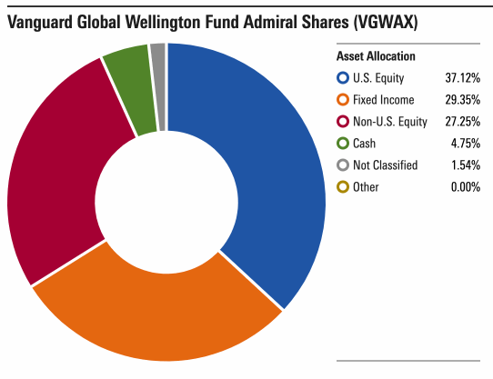
</div>At this point we should have a simple donut chart with a legend and a table:
You can visit the CodePen for MCE Donut with Hover Flag Example 1 to see/edit a live example.
Let’s enhance the interactivity of our chart by adding a focus effect to the hovered slice. We’ll add a new property, focusedData, to our data model. Then we’ll hook the mousemove-plot and mouseleave-plot events on our <mce-donut-plot> element.
The mousemove-plot event will fire repeatedly as the mouse moves over the plot and mouseleave-plot will fire when the mouse leaves the boundaries of the plot.
The event emitted on mouse move will provide us with the chart data that maps to the underlying slice we’re hovering. We’ll use it to get access to the hovered data item’s _itemId which we’ll use to drive our focus behavior.
The onMousemovePlot and onMousleavePlot methods will serve as our event handlers while focusedData will eventually be a single item Array to track the _itemId of our hovered slice:
data() {
    return {
        // ...
        focusedData: null,
    };
},
methods: {
    onMousemovePlot(e) {
        const { data } = e;

        this.focusedData = [data._itemId];
    },
    onMouseleavePlot() {
        this.focusedData = null;
    }
}
We’ll update our <mce-donut-plot> in the template to wire up the events and provide our focused data via the data-focused prop:
<mce-donut-plot
:color="chartColors"
:data="chartData"
:data-focused="focusedData"
:height="plotHeight"
:width="plotWidth"
@mousemove-plot="onMousemovePlot"
@mouseleave-plot="onMouseleavePlot"
>
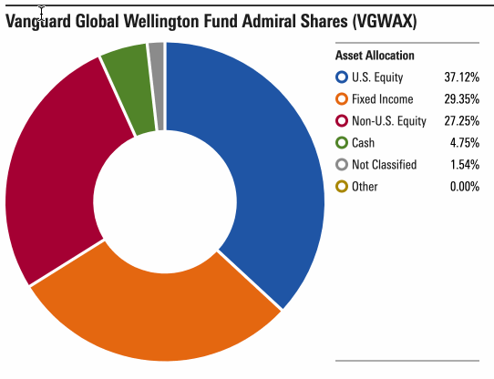
</mce-donut-plot>Hovering a slice should now lower the opacity of the others to provide a focused data effect:

You can visit the CodePen for MCE Donut with Hover Flag Example 2 to see/edit a live example.
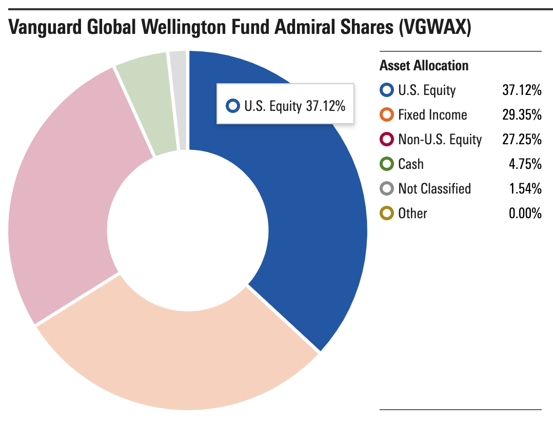
An MCE Hover Flag creates the container shown on hover of a chart plot.
First, we’ll add a Hover Flag with some basic content to our template, then we’ll eventually link it to the mouse position.
We need to keep our Hover Flag adjacent to the <mce-layout> element, so we’ll place it right before:
<!-- ... -->
<mce-hover-flag
    :x="0"
    :y="0"
>
    Hello from the Hover Flag
</mce-hover-flag>
<mce-layout
    :plot-width="plotWidth"
    :plot-height="plotHeight"
    :legend-right-width="legendRightWidth"
>
    <!-- ... -->
</mce-layout>
We should now see a static Hover Flag fixed at the top left (0, 0) of our plot:
To allow the Hover Flag to follow the position of the cursor, we’ll need to track some additional mouse information. We can add a new property, mousePosition to our data model and modify our onMousemovePlot handler to update it.
data() {
return {
// ...
focusedData: null,
mousePosition: {},
};
},
methods: {
onMousemovePlot(e) {
const { data, position } = e;
this.mousePosition = position;
this.focusedData = [data._itemId];
},
onMouseleavePlot() {
this.focusedData = null;
}
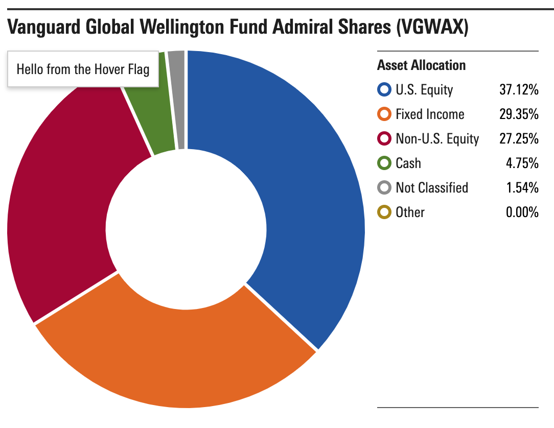
}Our Hover Flag should only be visible when we have focused data. Let’s add a v-if to our <mce-hover-flag>:
<mce-hover-flag
    v-if="focusedData"
    :x="0"
    :y="0"
>
    Hello from the Hover Flag
</mce-hover-flag>
We can then update the x and y props of the Hover Flag using our mousePosition to allow it to follow us around:
<mce-hover-flag
    v-if="focusedData"
    :x="mousePosition.pageX"
    :y="mousePosition.pageY"
>
    Hello from the Hover Flag
</mce-hover-flag>
We now have a Hover Flag that follows our mouse around when we’re over the plot:
You can visit the CodePen for MCE Donut with Hover Flag Example 3 to see/edit a live example.
We have our fancy Hover Flag but it isn’t doing much yet. Let’s enhance it to show us information relevant to the actual slice of the donut being hovered.
We can add a Legend Element inside our Hover Flag to give us a nice visual. We’ll also add a new property, mouseData to our data model and modify our onMousemovePlot handler to update it:
data() {
    return {
        // ...
        focusedData: null,
        mouseData: {},
        mousePosition: {},
    };
},
methods: {
    onMousemovePlot(e) {
        const { data, position } = e;

        this.mouseData = data;
        this.mousePosition = position;
        this.focusedData = [data._itemId];
    },
}
mouseData will provide us with the chart data that maps to the slice we’re hovering. We’ll get access to the data item’s label, type, and value, as well as the id of the item as rendered in the plot via _itemId.
Now that we have some mouseData, we’ll add <mce-legend> and <mce-legend-item> elements to our Hover Flag.
<mce-hover-flag
    v-if="focusedData"
    :x="mousePosition.pageX"
    :y="mousePosition.pageY"
>
    <mce-legend
        hide-top-border
        hide-bottom-border
    >
        <mce-legend-item
            :color="chartColors[mouseData._itemId]"
            :label="mouseData.label"
            :value="mouseData.value | format"
            key-type="donut"
        >
        </mce-legend-item>
    </mce-legend>
</mce-hover-flag>
At this point, our Hover Flag should update as we hover the donut slices and show a nice Legend Item relevant to the underlying data:
You can visit the CodePen for MCE Hover Flag Final to see/edit a live example.
Chart elements can be combined in many ways to created new visualizations for use in Morningstar applications. Be sure to try out Morningstar Chart Elements and see what you can create!