
Araceli (Chely) Martinez
Senior Designer
What’s in for the stepper this year
January 17, 2024—We’re kicking off the new year by launching the all-new version of the stepper component. Over the past year, we’ve consulted with multiple product teams to understand how to improve the stepper component. Here is an overview of what changed and, why, and best practices on implementing the latest stepper.
One of the main goals of this refactor was to put control back in the hands of product teams.
Steppers are most commonly used to guide a user through a complex workflow. But what happens when there are interruptions or changes to the data mid-flow? How does the user understand which step to navigate to as they update their previously entered data? How do we communicate any changes that have occurred to the user?
Designers at Morningstar have been asking the same questions as they design and build complex workflows. It became apparent that the stepper was due for an update. This prompted a discovery, which led us to interview and talk to 11 teams using the stepper in their products. Our findings led us to redesign the stepper to support the following goals:
Here’s a glance at the changes you can expect:
| In | Out |
|---|---|
| New Step Status Microcopy Non-linear Stepper |
Step Items Internalized Logic |
All previous features are still supported in the stepper version 3. Work with a designer to upgrade your product’s stepper from version 3 to 4, as it may require changes to the logic and design.
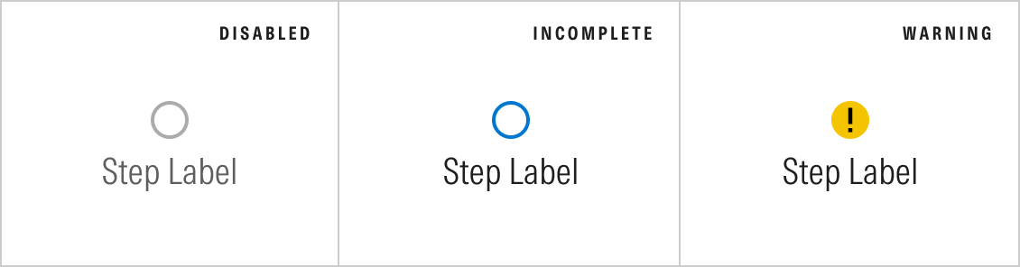
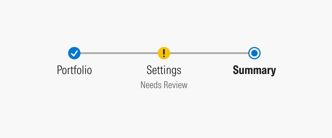
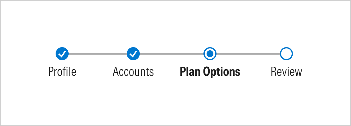
While steppers are a form of navigation, they also act as a visual indicator to show the status and progression of the workflow. The new step statuses allow the stepper to communicate with the user more efficiently by displaying which steps are interactive and which may need the user’s attention.
To learn more about when to use these types of steps, review the design guidelines for stepper.
The steps received a few design enhancements, which included updating the location of the step labels and adding a microcopy. The microcopy can be used to provide more context on the step or to provide a status on the step.
The microcopy is helpful when used within a warning step to let the user know they should review that step.
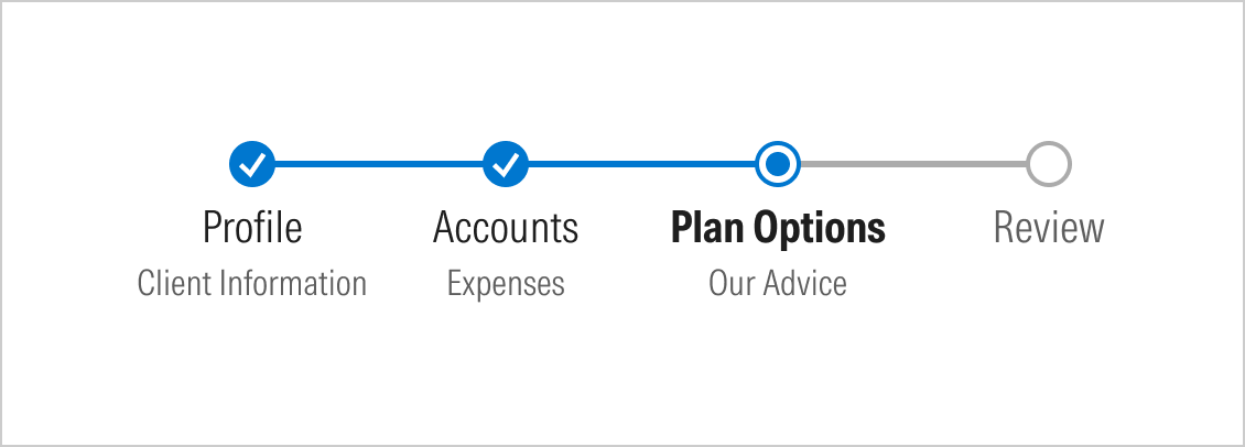
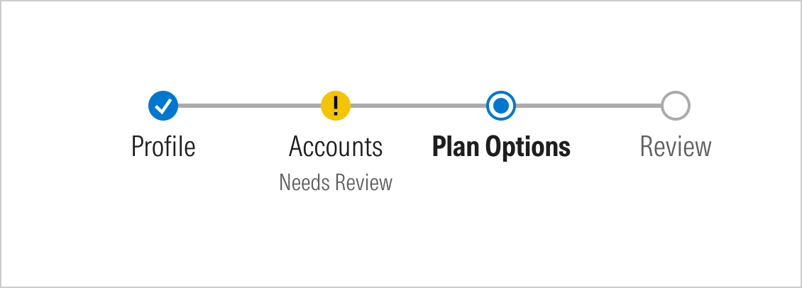
Our stepper has previously supported linear workflows and sequenced progression. We’re introducing a new variation to support a non-linear workflow.
Although a non-linear stepper looks very similar to a linear one, the most significant difference is that a non-linear stepper will not have the blue bar filled in as the user progresses. Given that steps may not be completed in order, the meaning of the blue progress bar is ambiguous. Some teams may prefer this variation to allow more flexibility for their user to complete their workflow but still encourage a “linear” format.
The linear stepper remains the default stepper in this version.
Step items are the sub-steps between steps and must be completed before moving to the next step. There are several reasons why we removed step items from the new stepper.
During our discovery, we observed that step items are used differently across products. It also felt redundant to only recommend a stepper have 3–7 steps but allow 7 step items within each step, which made the workflow longer. With the goal to make the stepper non-linear, step items also introduced another challenge for displaying their status in such a small area.
The stepper should have exactly 3–7 steps to keep workflows simple and reduce the number of user drop-offs. If your workflow requires more steps than a stepper can provide, the stepper component shouldn't be used.
Previously, MDS handled the logic of the stepper. With this new version, we’re maintaining the look and feel of the stepper, but product teams handle all the logic and click events. This gives teams more control to implement the stepper with their own custom logic to support their requirements and user needs.
The stepper component is now out in beta, which includes the new features we’ve mentioned in this blog post. The MDS Figma library has also been updated. We’d like to hear any feedback or issues you encounter with the recent changes. If you have any questions, please contact the MDS team in the MDS Teams Channel or reach out to Araceli Martinez.