Back to Blog

Plotting Time Series Data

When Should You Choose a Bar Chart Over a Line Chart?

March 8, 2023—One of the most common uses for data visualizations is to summarize change over time. Whether you are looking at interest rates, asset prices, revenues, weather, or something else, data visualizations are a powerful tool to understand how present conditions relate to the past, and to inform our understanding of what might happen in future.

This post compares two of the most common chart types used to show changes over time—line charts and bar charts. Other chart types such as histograms and area charts may be covered in future posts.

A Tale of Two Time Charts

Time series data is most often plotted using line charts, but bar charts are not uncommon. When should you choose one or the other? The answer hinges on the patterns you want to emphasize, and the structure of the underlying data.

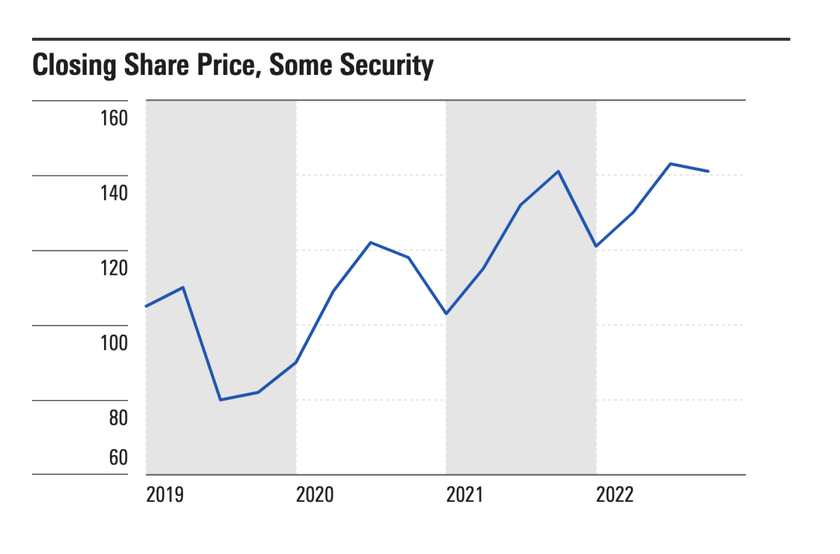
Broadly speaking, line charts emphasize trends, whereas bar charts show quantities. For example, consider the two charts shown below.

Example 1—Time Series Line Chart

A time series line chart plotting share price over a four-year time span from 2019 through 2022.

  • Each point represents a moment in time​, such as the closing share price on a specific date.
  • The use of a line plot emphasizes the trend or direction of change, as distinct from the overall quantity. This makes sense for use cases such as tracking market data, where traders may focus less on the actual price of a security than the trend up or down.
  • Line plots also emphasize the correlation between one value and the next. Even allowing for market fluctuations, today's share price is usually a good predictor of tomorrow's share price. In time series parlance, this is referred to as autocorrelation. For series that are not strongly autocorrelated, a bar chart may be a better choice.
  • X-axis labels show years even though points are plotted quarterly. Time series line charts are ideal for series where you have a lot of data, since you don't need to label every point.
  • Labels are left-aligned to mark the start of each year.
  • The x-axis uses a time scale. See the section on data below for more detail on what this means.
  • The y-axis ranges from 60—160. Limiting the axis to this range effectively "zooms in" the chart so that small changes in share price are easier to spot. If the y-axis were based at zero, smaller changes would be harder to see.
  • To see a version of this chart built using MDS Chart Elements, see the Time Series Line Example CodePen

Example 2—Bar Chart Summarizing Annual Sales

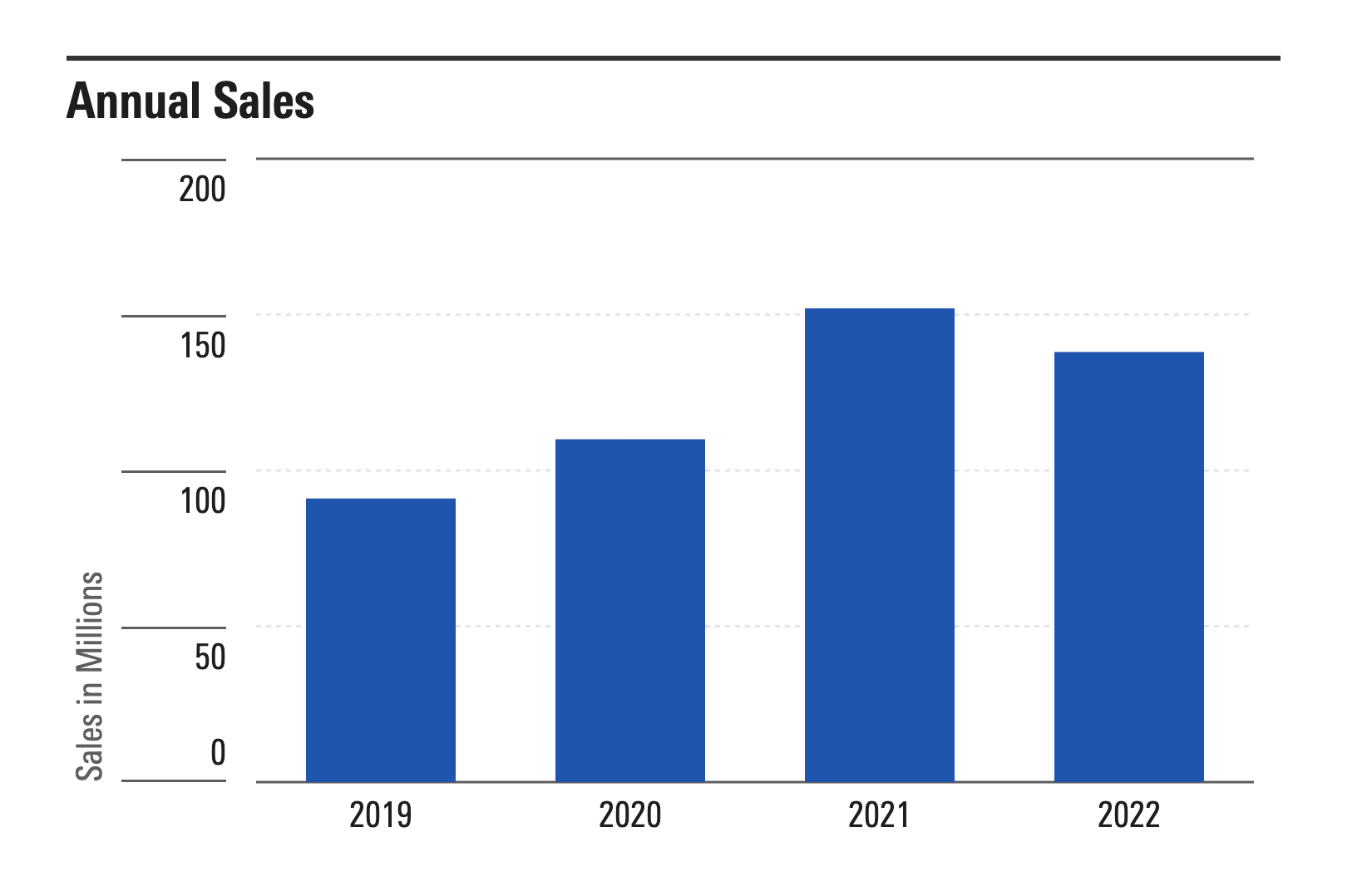
For comparison, see this bar chart which plots annual sales for the same four-year period:

A bar chart plotting share price over a four-year time span from 2019 through 2022.

  • Using a bar plot rather than a line plot puts more visual emphasis on the quantity sold each year, and less on the trend or correlation from one year to the next.
  • X-axis labels are centered below each bar to indicate that each bar represents total sales for that year, as distinct from a specific date within that year. This makes bar charts less practical for series where you have a lot of data points.
  • The x-axis uses a band scale. See the section on data below for more detail on what this means.
  • The y-axis is based at zero​. Because bar plots show quantities rather than trends, they must be drawn from zero to accurately represent the quantity. (If plotting negative values, bars would still start at zero, but would drop down from the origin line rather than up.)
  • To see a version of this chart built using MDS Chart Elements, see the Bar Chart—Annual Sales Example CodePen

A Tale Of Two Data Sets

To better understand the difference between these two charts, let's compare the data.

Time Series Line Chart Data

Here's what the data for the line chart looks like:

{ value: {x:new Date('January 1, 2019'), y: 105 },},
{ value: {x:new Date('April 1, 2019'), y: 110 },},
{ value: {x:new Date('July 1, 2019'), y: 80 },},
{ value: {x:new Date('October 1, 2019'), y: 82 },},

{ value: {x:new Date('January 1, 2020'), y: 90 },},
{ value: {x:new Date('April 1, 2020'), y: 109 },},
{ value: {x:new Date('July 1, 2020'), y: 122 },},
{ value: {x:new Date('October 1, 2020'), y: 118 },},

{ value: {x:new Date('January 1, 2021'), y: 103 },},
{ value: {x:new Date('April 1, 2021'), y: 115 },},
{ value: {x:new Date('July 1, 2021'), y: 132 },},
{ value: {x:new Date('October 1, 2021'), y: 141 },},

{ value: {x:new Date('January 1, 2022'), y: 121 },},
{ value: {x:new Date('April 1, 2022'), y: 130 },},
{ value: {x:new Date('July 1, 2022'), y: 143 },},
{ value: {x:new Date('October 1, 2022'), y: 141 },}

  • Each row in the dataset represents a moment in time. The X coordinate specifies the date, and the Y coordinate represents the closing share price for that date.
  • Since each row represents a date, this data can be plotted on a time scale. With a time scale, it is not necessary to label every point on the axis, because users can infer where each point falls on the scale. Labels can be responsively aggregated to fit the display. For example, the same chart might show quarterly labels or annual labels depending on the size of the window.
  • Since each data point represents a moment in time, the data set doesn't capture activity within each interval. For example if the share price surged upward after January 1st, then dropped back down before April 1st, that spike would not be reflected in the data.

Bar Chart Data

By contrast, the bar chart data looks like this:

{ label: "2019", value: 91 },
{ label: "2020", value: 110 },
{ label: "2021", value: 152 },
{ label: "2022", value: 138 }

  • In place of X and Y coordinates, we have a label and a single value representing annual sales for each year.
  • While the labels indicate calendar years, there is no date value for each row. Hence this data is plotted using a band scale rather than a time scale. This makes sense because the value for each row represents total sales for that year, rather than a specific date within that year.

Summing Up

To summarize the difference between these two examples:

Time Series Line Example Bar Chart Example
Line plot emphasizes trends Bar chart emphasizes quantities
Each point is a moment in time, eg closing price on January 1st Each bar summarizes an interval, eg total sales for all of 2019
X-axis uses a time scale X-axis uses a band scale
Y-axis range can vary by use case Y-axis must be zero-based

While these two simple examples will obviously not cover every use case, they are intended to demonstrate common patterns for plotting time series data, and illustrate some of the design and data considerations that apply. Future posts may focus on other chart types including histograms and area charts.

Further Resources