Modals
- HTML/CSS Available
- Web Component Deprecated
- Last Updated
2.36.0
Modals gather information, complete a subtask, or provide additional information without losing the context of an underlying page.
Variations
Default
Use when displaying information that does not require a user action, such as a read-only document or a supplemental video.
<div class="mds-modal">
    <div class="mds-modal__wrapper">
        <section role="dialog" aria-labelledby="title---52224" class="mds-modal__container" aria-hidden="true">
            <div class="mds-modal__inner">
                <header class="mds-modal__header">
                    <div class="mds-modal__actions">
                        <button class="mds-button mds-button--icon-only" type="button" data-mds-modal-close>
                            <svg class="mds-icon mds-button__icon mds-button__icon--left">
                                <use xlink:href="#remove">
                                    <title>Close</title>
                                </use>
                            </svg>
                        </button>
                    </div>
                    <h1 class="mds-modal__title" id="title---52224">
                        Dismissible Modal
                    </h1>
                </header>
                <div class="mds-modal__content">
                    <p>I am a dismissible modal that displays non-essential information.</p>
                </div>
            </div>
        </section>
    </div>
</div>
<!-- Modal must be appended at the end of the <body> -->
<mds-modal title="Dismissible Modal">
<p>I am a dismissible modal that displays non-essential information.</p>
<span slot="mds-modal-actions">
<mds-button type="button" variation="icon-only" icon="remove">Close</mds-button>
</span>
</mds-modal>- Always include an icon-only Button to close.
- Dissmissed by clicking the close button, pressing
escape, or clicking outside the modal.
No Title
<div class="mds-modal">
    <div class="mds-modal__wrapper">
        <section role="dialog" aria-labelledby="title---23360" class="mds-modal__container" aria-hidden="true">
            <div class="mds-modal__inner">
                <header class="mds-modal__header mds-modal__header--no-title">
                    <div class="mds-modal__actions">
                        <button class="mds-button mds-button--icon-only" type="button">
                            <svg class="mds-icon mds-button__icon mds-button__icon--left">
                                <use xlink:href="#remove">
                                    <title>Close</title>
                                </use>
                            </svg>
                        </button>
                    </div>
                    <h1 class="mds-modal__title" id="title---23360">
                        Dismissible Modal
                    </h1>
                </header>
                <div class="mds-modal__content">
                    <p>I am a modal that displays non-essential information and has no title.</p>
                </div>
            </div>
        </section>
    </div>
</div>
<!-- Modal must be appended at the end of the <body> -->
<mds-modal title="Dismissible Modal" title-hidden>
<p>I am a modal that displays non-essential information and has no title.</p>
<span slot="mds-modal-actions">
<mds-button type="button" variation="icon-only" icon="remove">Close</mds-button>
</span>
</mds-modal>- Always include an icon-only Button to close.
- Dissmissed by clicking the close button, pressing
escape, or clicking outside the modal.
Action Required
Use when a task must be completed, such as entering data and then saving or confirming.
<div class="mds-modal">
    <div class="mds-modal__wrapper">
        <section role="dialog" aria-labelledby="title---56219" class="mds-modal__container" aria-hidden="true">
            <div class="mds-modal__inner">
                <header class="mds-modal__header">
                    <div class="mds-modal__actions">
                        <button class="mds-button " type="button" data-mds-modal-close>
                            Cancel
                        </button>
                        <button class="mds-button mds-button--primary" type="button">
                            Save
                        </button>
                    </div>
                    <h1 class="mds-modal__title" id="title---56219">
                        Action Required Modal
                    </h1>
                </header>
                <div class="mds-modal__content">
                    <p>The user can’t close this modal by clicking outside of it. The user must select one of the button options inside the modal header to close it.</p>
                </div>
            </div>
        </section>
    </div>
</div>
<!-- Modal must be appended at the end of the <body> -->
<mds-modal title="Action Required Modal" action-required>
<p>The user can’t close this modal by clicking outside of it. The user must select one of the button options inside the modal header to close it.</p>
<span slot="mds-modal-actions">
<mds-button type="button" variation="secondary">Cancel</mds-button>
<mds-button type="button" variation="primary">Save</mds-button>
</span>
</mds-modal>- Use when a task requires intentional confirmation or cancellation; the modal cannot be dismissed by pressing
escapeor clicking outside the modal. - Always use a primary Button for the confirmation action and a secondary Button for the cancellation action.
Sizing
Modals are available at a single size, which uses a bold level 5 heading (20px) for the title text and medium Buttons.
Widths
Modals are available in three predefined widths: 600px, 900px (default), and 1200px. Width can be configured using modifier classes or props.
- Predefined widths use both a
max-widthand awidth: 90%rule, ensuring modals are responsive on narrow viewports.
Customizing Widths
Predefined widths are a starting point. If requirements call for a different modal width, work with a designer to create custom width styles in your product’s CSS.
Product CSS
[.my-custom-modal-width] .mds-modal__container {
    max-width: 1000px;
}
Product Markup
<!-- HTML -->
<div class="mds-modal [my-custom-modal-width] mds-modal--open mds-modal--active"> ... </div>
<!-- Web Component -->
<mds-modal class="[my-custom-modal-width]"> ... </mds-modal>- Use custom widths sparingly.
- Always follow typographic line length guidelines.
Use When
- Providing supplemental tasks required by the underlying page.
- Providing non-essential information related to the underlying page.
- Content requires full attention.
Don’t Use When
- Requesting a simple action, like saving changes. Instead, use a Dialog.
- Conveying brief thoughts or status changes. Instead, use a Notification.
- The modal content can be incorporated into the underlying page without complicating the page’s intent.
Visual Language
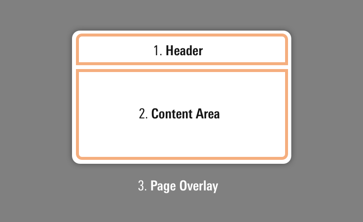
Modals consist of three elements:
- Header, which holds the title and controls.
- Content area, which holds the information being presented.
- Page overlay, which partially blocks out the underlying page to focus attention on the modal content.
 Anatomy of a modal.
- Controls, which are usually Buttons, are always placed on the right side of the modal header.
- Always use medium-sized Buttons in the modal header.
- Place icon-only buttons to the left of standard primary and secondary buttons.
 Place icon-only buttons to the left of standard buttons.
- When placing text in the content area element, define typography as custom styles within your product. The modal’s content area does not include any default text styling.
- Consider applying a custom
z-indexvalue when you compose this component with other layered components (e.g., Dialogs, Tooltips, Popovers or Notifications) to meet your product requirements.
Behaviors
- Action-required modals can only be closed by choosing an action provided (e.g., Save or Cancel). They cannot be dismissed by pressing
escapeor clicking outside of the modal. - Modals that do not require an explicit action of a user can be closed by:
- Clicking the close button
- Pressing the
escapekey - Clicking outside the modal
- Once a modal reaches its maximum height, the header will remain fixed and content will scroll within the container.
- Modals are centered horizontally and vertically in the viewport.
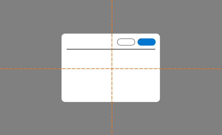 Modal alignment in viewport.
Editorial
Use title case for titles. (This means capitalize prepositions and conjunctions of four or more letters and all primary words.)
Dismissable Modals
- Titles should tell you what’s inside the modal. Consider using words from the link that launched the modal. Titles can also be questions.
- Content can scroll in the modal if need be, but the shorter, the better.
Action-is-Required Modals
- Titles should tell the user what they need to do. Consider starting with words from the link that launched the modal, and add other words to express a complete thought. Avoid questions.
- Content should tell users why they’re doing something, how to do it, and the consequences of not doing it, if applicable.
- Content can scroll in the modal if need be, but the shorter, the better.
CSS
Class References
|
Class
|
Applies to
|
Outcome
|
|---|---|---|
|
|
|
Renders a 600px wide modal. |
|
|
|
Renders a 900px wide modal. |
|
|
|
Renders a 1200px wide modal. |
|
|
|
Invokes overlay and triggers visibility of modal. |
|
|
|
Starts animation of the modal. |
|
|
|
Opacity increased to |
|
|
|
Removes header borders and margins. |
Web Component
Props
When setting props as attributes on a custom HTML element, use kebab-case instead of camelCase.
|
Prop
|
Type
|
Validation
|
Default
|
Description
|
|---|---|---|---|---|
|
|
String |
— |
— |
A space-separated list of class names that will be appended to the default |
|
|
String |
|
— |
A space-separated list of element |
|
|
String |
|
— |
The |
|
|
Boolean |
— |
— |
If |
|
|
String |
Required |
— |
Sets the title text. |
|
|
Boolean |
— |
|
If |
|
|
String |
Required |
— |
The |
|
|
Boolean |
— |
|
Sets the visibility of the modal. |
|
|
String |
One of: |
|
Alters the width of the modal. |
Slots
Default Slot
Pass content in between the <mds-modal></mds-modal> tags to set the modal’s content.
Named Slots
|
Slot Name
|
Description
|
|---|---|
|
|
Displays actions, usually Buttons, on the right side of the modal. |
Methods
|
Method Name
|
Description
|
|---|---|
|
|
Opens the modal. |
|
|
Dismisses the modal. |
Events
|
Event Name
|
Description
|
|---|---|
|
|
Triggers when the modal is dismissed. |
|
|
Triggers when the modal is initially launched. |
|
|
Triggers when the modal is opened. |
Additional Behaviors
Automatic Dismiss Behavior
If action-required is false:
- Any icon-only Button web component using the
removeicon placed in themds-modal-actionsslot will automatically call thedismiss()method. - Pressing the escape key or clicking the background overlay will call the
dismiss()method.
If action-required is true, you must set up the event handlers for the buttons in the mds-modal-actions slot yourself.
Usage Examples
Setting title, id, actions, and actionRequired via props. Using the default slot for modal content:
<!-- Modal must be appended at the end of the <body> -->
<mds-modal id="my-modal" title="My Modal Title" width="1200px" action-required>
    [Modal Content]
    <span slot="mds-modal-actions">
        <mds-button variation="secondary">Cancel</mds-button>
        <mds-button variation="primary">Save</mds-button>
    </span>
</mds-modal>Implementation
- By default, modals use the
dialogrole, ensuring screen readers properly announce the element. - Use the
aria-labelledbyattribute on the<section>element to reference theidassigned to the Modal’s title to provide screen readers with accessible text used to describe a modal’s purpose. - Optionally, to provide a more detailed description of a modal, add a
aria-describedbyattribute to the<section>element and reference theidof a body of text that further describes the modal’s purpose. - If a modal is visually hidden but present in the DOM, add
aria-hidden="true"to the modal’s<section>element to prevent it from being read by a screen reader. When the modal becomes visible, update this attribute tofalse, allowing a screen reader to access its content.
Best Practices
- Trap focus inside a modal when it’s open.
- When a modal is closed, return focus to the triggering element (typically a button) on the underlying page.