Tooltips provide a short description of a page element or control.
Use to provide a short description of an object without a label.
<div class="mds-tooltip__wrapper">
    <button class="mds-button mds-button--icon-only" type="button" aria-describedby="tooltip1" role="button">
        <svg class="mds-icon mds-button__icon mds-button__icon--right">
            <use xlink:href="/assets/icons/mds_icons.svg#person-padless">
                <title>User Account</title>
            </use>
        </svg>
    </button>
    <div id="tooltip1" class="mds-tooltip mds-tooltip--default mds-tooltip--width-s mds-tooltip--right-center mds-tooltip--sticky tooltip-doc-site-z-index" role="tooltip" aria-hidden="false" aria-labelledby="tooltiptext1">
        <div class="mds-tooltip__text" id="tooltiptext1"> Account </div>
    </div>
</div>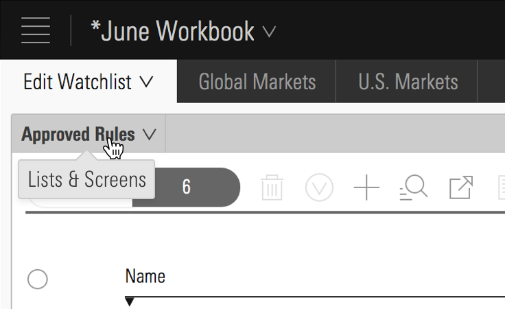 Lists & Screens menu inside Direct Cloud.
Use to temporarily direct attention to an object or functionality.
<div class="mds-tooltip__wrapper">
    <button class="mds-button mds-button--icon-only mds-tooltip__target mds-tooltip__target--block" type="button" aria-describedby="tooltip2" role="button">
        <svg class="mds-icon mds-button__icon mds-button__icon--right">
            <use xlink:href="/assets/icons/mds_icons.svg#plus">
                <title>Add list</title>
            </use>
        </svg>
    </button>
    <div id="tooltip2" class="mds-tooltip mds-tooltip--prompt mds-tooltip--width-l mds-tooltip--sticky mds-tooltip--closable mds-tooltip--right-center tooltip-doc-site-z-index" role="tooltip" aria-hidden="false" aria-labelledby="tooltiptext2">
        <div class="mds-tooltip__text" id="tooltiptext2"> Your list is empty. Add some investments to get started. </div>
        <div class=" mds-tooltip__close-button">
            <button class="mds-button mds-button--small mds-button--icon-only">
                <svg class="mds-icon mds-button__icon">
                    <use xlink:href="/assets/icons/mds_icons.svg#remove--s">
                        <title>Close</title>
                    </use>
                </svg>
            </button>
        </div>
    </div>
</div>remove--s. Use to direct attention to an error.
<div class="mds-tooltip__wrapper">
    <button class="mds-button mds-button--primary" type="button" disabled aria-describedby="tooltip3" role="button"> Submit </button>
    <div id="tooltip3" class="mds-tooltip mds-tooltip--error mds-tooltip--width-l mds-tooltip--sticky mds-tooltip--right-center tooltip-doc-site-z-index" role="tooltip" aria-hidden="false" aria-labelledby="tooltiptext3">
        <div class="mds-tooltip__text" id="tooltiptext3"> There is a problem. Please correct all errors before submitting. </div>
    </div>
</div>There are 12 possible positions. Choose one that keeps the tooltip’s content in the viewport. For all positioning options see CSS Class References.
<div class="mds-tooltip__wrapper">
    <button class="mds-button " type="button" aria-describedby="tooltip4" role="button"> Right Center </button>
    <div id="tooltip4" class="mds-tooltip mds-tooltip--default mds-tooltip--width-m mds-tooltip--right-center tooltip-doc-site-z-index" role="tooltip" aria-hidden="true" aria-labelledby="tooltiptext4">
        <div class="mds-tooltip__text" id="tooltiptext4"> Right Center </div>
    </div>
</div><div class="mds-tooltip__wrapper">
<button class="mds-button " type="button" aria-describedby="tooltip5" role="button"> Right Bottom </button>
<div id="tooltip5" class="mds-tooltip mds-tooltip--default mds-tooltip--width-m mds-tooltip--right-bottom tooltip-doc-site-z-index" role="tooltip" aria-hidden="true" aria-labelledby="tooltiptext4">
<div class="mds-tooltip__text" id="tooltiptext4"> Right Bottom </div>
</div>
</div>
Do center the tooltip’s tail on its associated object, even if the tooltip’s balloon is offset.
Don't offset the tooltip’s tail or orient and/or move the tooltip locked with the cursor.
.mds-text__anchor, or an .mds-button, the tip should show on focus and hide on blur.role=”” attributes on .mds-tooltip_target as appropriate.role=”tooltip” on the .mds-tooltip element.aria-hidden="true" to prevent screenreader from reading hidden tooltips. Change value to false when Tooltip is visible.aria-describedby attribute which references to the ID of the associated Tooltip.aria-labelledby to Tooltip to associate full content of a Tooltip.| Class | Applies to | Outcome |
|---|---|---|
|
|
|
This class initializes a |
|
|
|
This class is always applied to a |
|
|
Any block, or inline-block element, most likely a |
This class should be on the immediate parent of the tooltip’s target element, and it must wrap the target and the tooltip itself. If the tooltip is triggered on hover, this is the element on which that hover is triggered. |
|
|
Any inline, block, or inline-block element |
This is used to enable showing/hiding the tooltip on keyboard focus of a focusable tooltip target element. For example, if the tooltip target is an |
|
|
|
Sets background color, drop shadow and text styling for a default tooltip. |
|
|
|
Sets background color, drop shadow and text styling for a prompt tooltip. |
|
|
|
Sets background color, drop shadow and text styling for an error tooltip. |
|
|
|
Gives a tooltip padding space to account for a close button. |
|
|
|
This is the hook set onto an anchor inside of an |
|
|
Any block, inline-block, or inline element |
Changes cursor to (?) symbol on hover indicating help information. |
|
|
|
Aligns tooltip to the top center of the invoking element. |
|
|
|
Aligns tooltip to the top right of the invoking element. |
|
|
|
Aligns tooltip to the top left of the invoking element. |
|
|
|
Aligns tooltip to the bottom center of the invoking element. |
|
|
|
Aligns tooltip to the bottom right of the invoking element. |
|
|
|
Aligns tooltip to the bottom left of the invoking element. |
|
|
|
Aligns tooltip to the right center of the invoking element. |
|
|
|
Aligns tooltip to the right top of the invoking element. |
|
|
|
Aligns tooltip to the right bottom of the invoking element. |
|
|
|
Aligns tooltip to the left center of the invoking element. |
|
|
|
Aligns tooltip to the left top of the invoking element. |
|
|
|
Aligns tooltip to the left bottom of the invoking element. |
Engineers should use their own JavaScript libraries and implementations that most appropriately fit within the requirements for their applications and environments.