
Navigation
Navigation presents familiar UI components in a set of common configurations, helping users intuitively navigate within and interact with products across the Morningstar ecosystem.

Problem Statement
Users want to intuitively move about Morningstar products, easily accessing information and functionality with the help of concise, efficient navigation. Users want to recognize familiar, consistent navigation patterns as products scale and evolve and are viewed across multiple viewports.
Principles
Navigation should:
- Offer a user a consistent entry point to application features or website content.
- Group features or content into high-level main topics, from which a user can dig progressively deeper in to subsections.
- Visually indicate a user’s current location or progress through a workflow.
- Be scalable. Assume that content and functional offerings will continue to grow.
- Adapt to the content being displayed. This includes combining or changing navigation types at different moments of an experience, if appropriate.
- Display branding to identify an application or website as a Morningstar property.
Types
Hierarchal
Use to divide content and functionality in to multiple levels, consisting of a homepage, main topics, and subsections. Hierarchal navigation is useful for organizing large quantities of content by grouping similar subjects together in a predictable manner, and it is presentable in both horizontal and vertical formats.
Horizontal
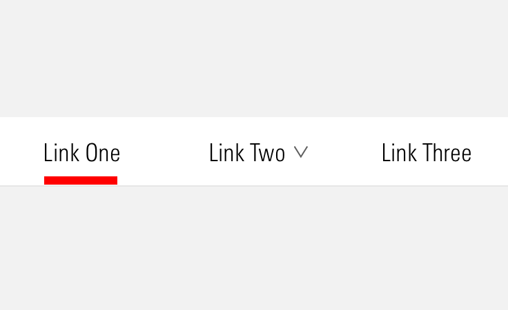
Use horizontal navigation to offer a fixed horizontal bar at the top of the page containing several clickable items. One of the main advantages: It doesn’t consume much vertical space, maximizing the height of the main content area or work space.
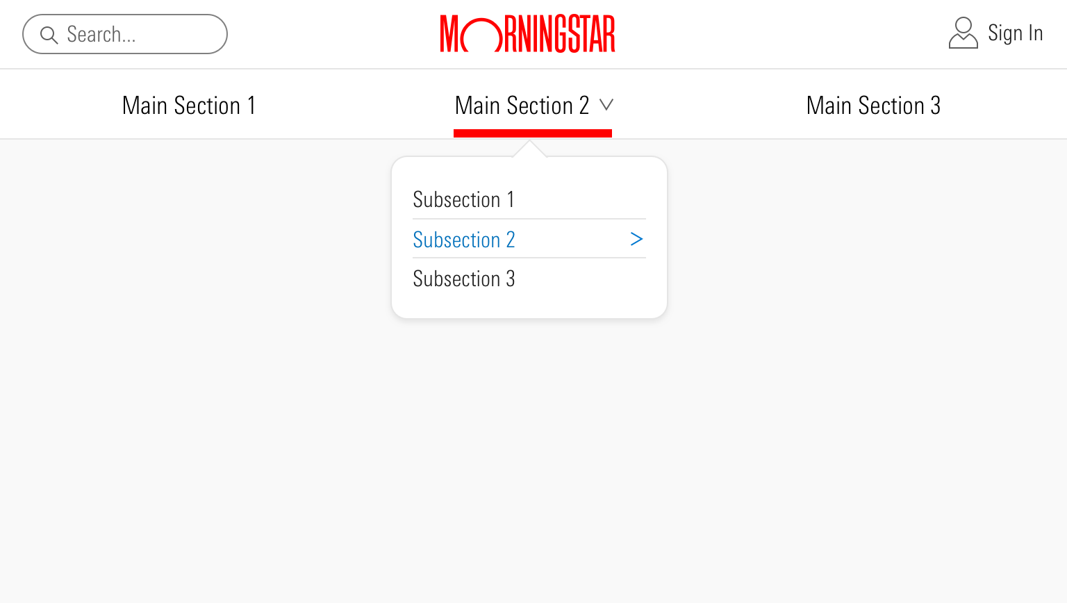 Horizontal hierarchal navigation commonly uses Mastheads, Site Navigation, Menus, and List Groups. A good example of this navigation type is the Morningstar.com site, which uses horizontal navigation to group content in to 5 main topics.
- Use when your content and/or functionality can be divided up in to a number of sections that fit comfortably in the available horizontal space.
- Use dropdown menus from main sections to show multiple levels of hierarchy.
- Avoid horizontal navigation if you expect the number of main sections to continue to grow beyond the available horizontal space.
Vertical
Use vertical navigation to divide a page in to at least two columns, and use the left-most column to hold several clickable items. Vertical navigation presents content and functionality as a table of contents, and it can scroll, enhancing scanability by allowing a large number of items to be visible at once.
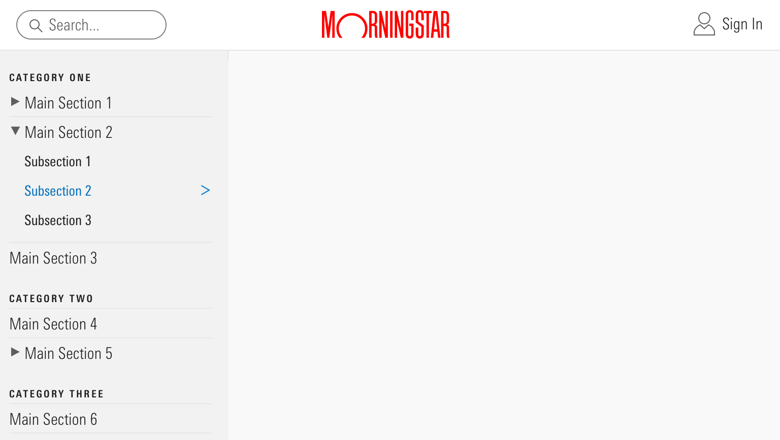 On a site with a relatively flat hierarchy and a large amount of content, like the MDS site, vertical navigation allows a user to scan the site’s full content and expand or collapse main sections. Vertical hierarchal navigation commonly uses Mastheads, Site Navigation, and List Groups.
- Use when your content and/or functionality has, or will grow to have, more sections than will fit comfortably in the horizontal navigation.
- Use headings to break the content and functionality into multiple sections.
- Use subsections to group content and functionality in expandable groups.
Sequenced
Use sequenced navigation to locate and guide a user through a workflow by breaking down complex tasks into easily completed actions. Use only when a flow must be completed in order.
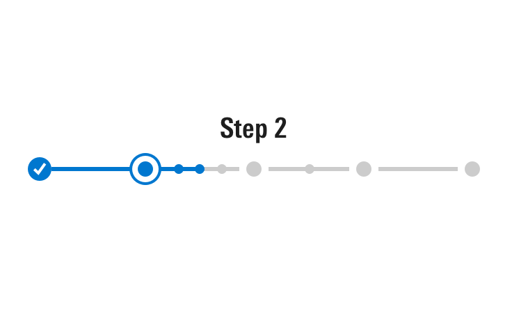
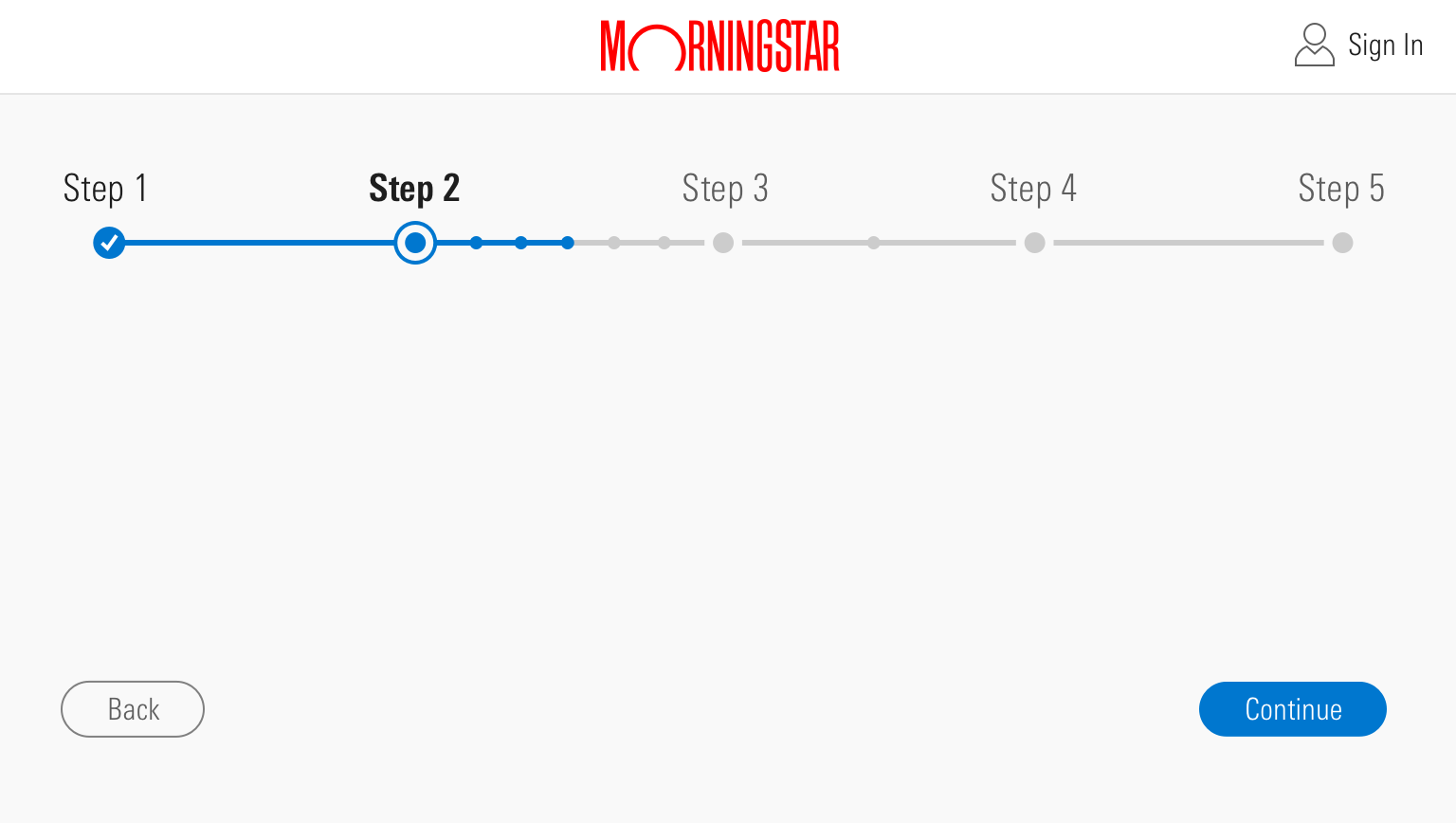 Sequenced navigation commonly uses Mastheads and Steppers. Retirement Manager employs this type of navigation.
- Use for non-experts completing a first-time or infrequent task.
- Use for complex processes that benefit from being broken down in to smaller tasks.
- Use when a workflow is seven or fewer large steps.
- If more than seven large steps exist, group related tasks as small steps within a large step.
- Place “Continue” and “Back” buttons at the bottom of each small and large step’s content.
- When moving to the next or previous step, automatically scroll the page back up so the Stepper is at the top of the viewport.
Faceted
Use faceted navigation to search large sets of content by using keyword search and content metadata to filter results. Also referred to as advanced search.
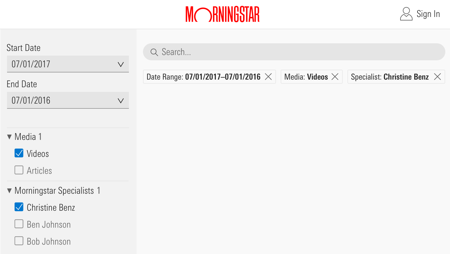 Faceted navigation commonly uses Mastheads, Search Fields, List Groups, Button Groups, Forms, and Pagination. Here is an example from Morningstar.com.
- Use to filter content by topic or category.
- Use to filter content by a date range.
- Use to select a single item from a large set of items.
Related Components
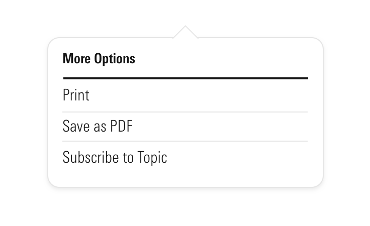
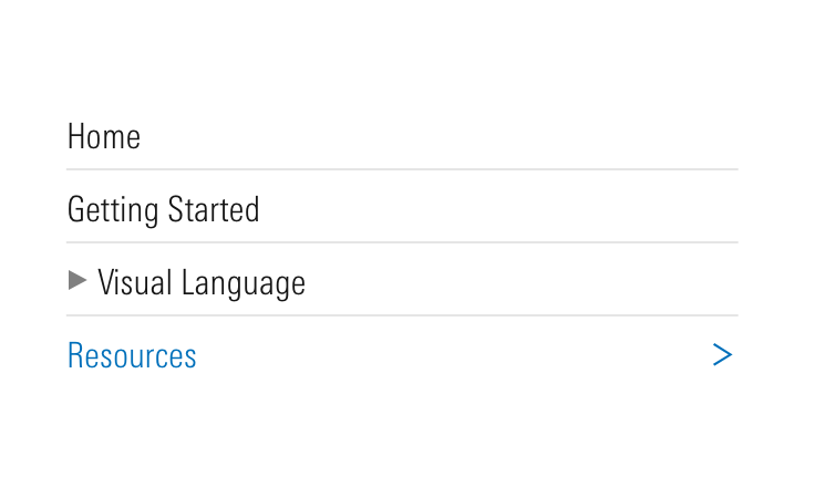
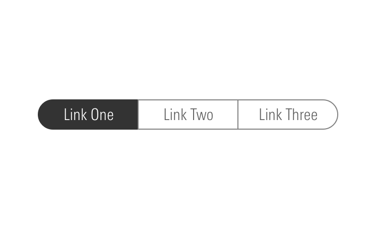
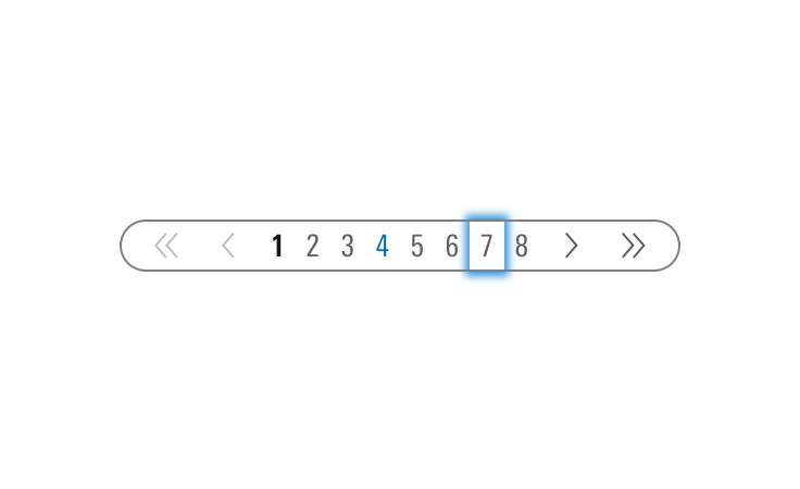
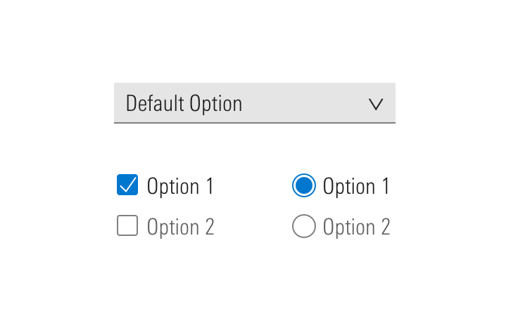
The System offers many components that can be combined to achieve different types of navigation.
Guidelines
Editorial
- When drafting navigation terms, work with a Content Strategist, User Researcher, or UX Designer to determine the jobs to be done by the user. Draft main topics accordingly, and verify your categorization through user testing.
- Use title case.
- No punctuation.
- Always follow the editorial guidelines for individual components when using them to construct navigation.
- Prize clarity over brevity.
- Each top-level navigation section should thematically represent its secondary nested menu items.
- Secondary nesting should only occur if there are two or more items in the secondary menu. If only one item, make it its own top-level navigation item, or find a way to adjust other top-level navigation terms to make the item fit in a different secondary menu.
- If your navigation terms are mostly verbs, try to make them all verbs. Same goes for nouns.
- For Sign In functionality, always use “Sign In” “Sign Out” not “Log In” “Log Out”.
- When a user is signed in, "Sign In" phrasing should update to "My Account".
- Display “Menu” next to the hidden menu icon when there is room.
Related Resources
- http://www.uxbooth.com/articles/the-rules-for-modern-navigation/
- https://alistapart.com/article/design-patterns-faceted-navigation
- https://www.uxmatters.com/mt/archives/2009/09/best-practices-for-designing-faceted-search-filters.php
- https://www.nngroup.com/articles/flat-vs-deep-hierarchy/
- http://asis.org/Bulletin/Aug-10/AugSep10_Brown.pdf
