Switches afford a choice between one of two opposing states or options.
<div class="mds-switch">
    <label class="mds-switch__label" for="--41270">
        <input id="--41270" type="checkbox" role="switch" class="mds-switch__input">
        <span class="mds-switch__text"> Logic Mode </span>
    </label>
</div><div class="mds-switch mds-switch--disabled">
<label class="mds-switch__label" for="--29054">
<input id="--29054" type="checkbox" role="switch" class="mds-switch__input" disabled>
<span class="mds-switch__text"> Logic Mode </span>
</label>
</div>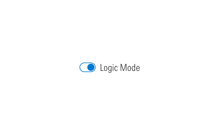
Do describe a switch’s functionality using a short label that doesn’t change regardless of state.
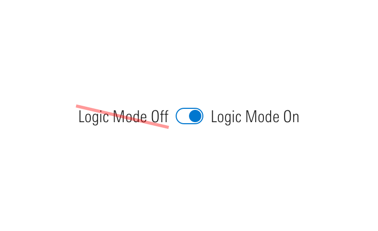
Don‘t pair two labels with a switch.
<div class="mds-switch mds-switch--standalone">
    <label class="mds-switch__label" for="--17116">
        <input id="--17116" type="checkbox" role="switch" class="mds-switch__input">
        <span class="mds-switch__text"> Logic Mode </span>
    </label>
</div><div class="mds-switch mds-switch--disabled mds-switch--standalone">
<label class="mds-switch__label" for="--87523">
<input id="--87523" type="checkbox" role="switch" class="mds-switch__input" disabled>
<span class="mds-switch__text"> Logic Mode </span>
</label>
</div><fieldset class="mds-switch__group" role="group">
<legend class="mds-switch__group-label"> Select all days that apply: </legend>
<div class="mds-switch">
<label class="mds-switch__label" for="--47133">
<input id="--47133" type="checkbox" role="switch" class="mds-switch__input">
<span class="mds-switch__text"> Monday </span>
</label>
</div>
<div class="mds-switch">
<label class="mds-switch__label" for="--95173">
<input id="--95173" type="checkbox" role="switch" class="mds-switch__input">
<span class="mds-switch__text"> Tuesday </span>
</label>
</div>
<div class="mds-switch">
<label class="mds-switch__label" for="--30637">
<input id="--30637" type="checkbox" role="switch" class="mds-switch__input">
<span class="mds-switch__text"> Wednesday </span>
</label>
</div>
<div class="mds-switch">
<label class="mds-switch__label" for="--68666">
<input id="--68666" type="checkbox" role="switch" class="mds-switch__input">
<span class="mds-switch__text"> Thursday </span>
</label>
</div>
<div class="mds-switch">
<label class="mds-switch__label" for="--36901">
<input id="--36901" type="checkbox" role="switch" class="mds-switch__input">
<span class="mds-switch__text"> Friday </span>
</label>
</div>
</fieldset>role="switch" ARIA attribute to represent “On/Off” rather than checked/unchecked states.role="group" for grouped switches.spacebar.aria-label to an element (i.e., section title) to further enhance accessibility.| Class | Applies to | Outcome |
|---|---|---|
|
|
|
At parent level, this applies base-switch styles to an element. |
|
|
|
Applies hover state. |
|
|
|
Applies active state. |
|
|
|
Applies focus state. |
|
|
|
Applies disabled state. To properly disable interaction with the switch, add |
|
|
|
Hides label text although text is still readable by screen readers. |
|
|
|
Semantically structures a group of switches. Always include |
|
|
|
Apply to a parent wrapper of a fieldset to convert switches layout from vertical to horizontal. |