Icons enhance Morningstar products by visually communicating actions, status, and feedback. The Morningstar Design System provides SVG icons to create user interfaces and controls.
width and height in CSS using the $mds-size-icon-m Constant.width and height of small icons using the $mds-size-icon-s Constant.small icons within components such as Buttons and Form text boxes to provide additional affordance to the action.MDS references icons via an svg icon sprite with the following syntax:
<svg class="mds-icon">
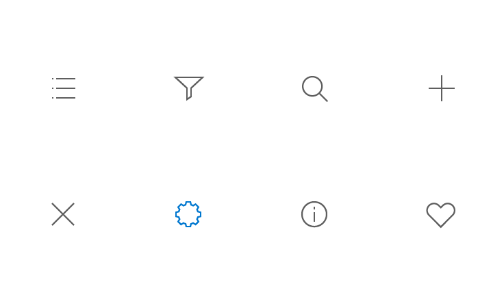
<use xlink:href="/assets/icons/mds_icons.svg#heart">
<title>heart</title>
</use>
</svg><title> if no text is provided in the same context level. For example, icon-only Button.aria-hidden=”true” attribute or omit <title> if relevant text is available. For example, Button with icon.Simple, clear, and consistent icons require the rigor of underlying grid.
Icons use simple geometric shapes and 1-pixel strokes.
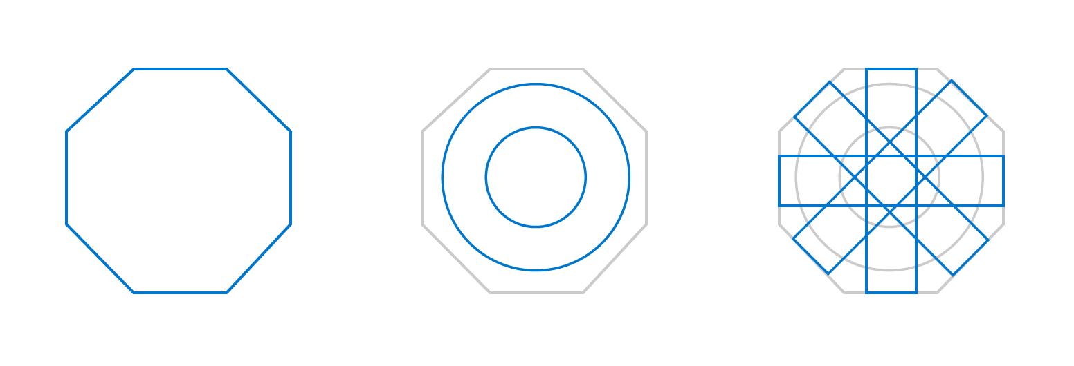
 Figure 1. Design process for the
 gear icon.
The gear icon is an excellent example of a complex icon that is derived from simple geometric shapes. The grid guides the positioning of the shapes. Once on the grid, those shapes are refined and combined. Removing what isn’t necessary allows the icon’s essential form to shine through.
When designing a new icon, always consider it in the context of the entire icon family. For example, the gear icon is more complex than others, but following our construction and style guidelines allow it to harmoniously pair with others.
Do use right angles, a consistent 1-pixel stroke, and square terminals.

Don‘t use an inconsistent stroke and rounded terminals.
Do use minimal detail to reduce the icon to its essential form.

Don‘t add superfluous detail to the icon from.
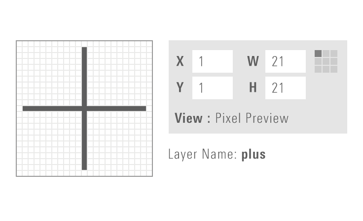
Do enable “Pixel Preview” and “Snap to Grid” when creating new icons.
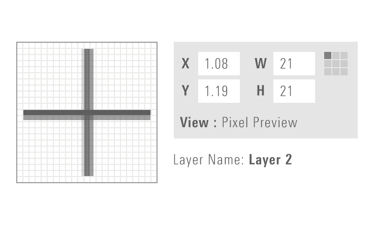
Don‘t place artwork off the pixel grid when creating new icons.
The MDS team has a JIRA process to track new icon requests. Please follow the instructions listed for Requesting a New Part.