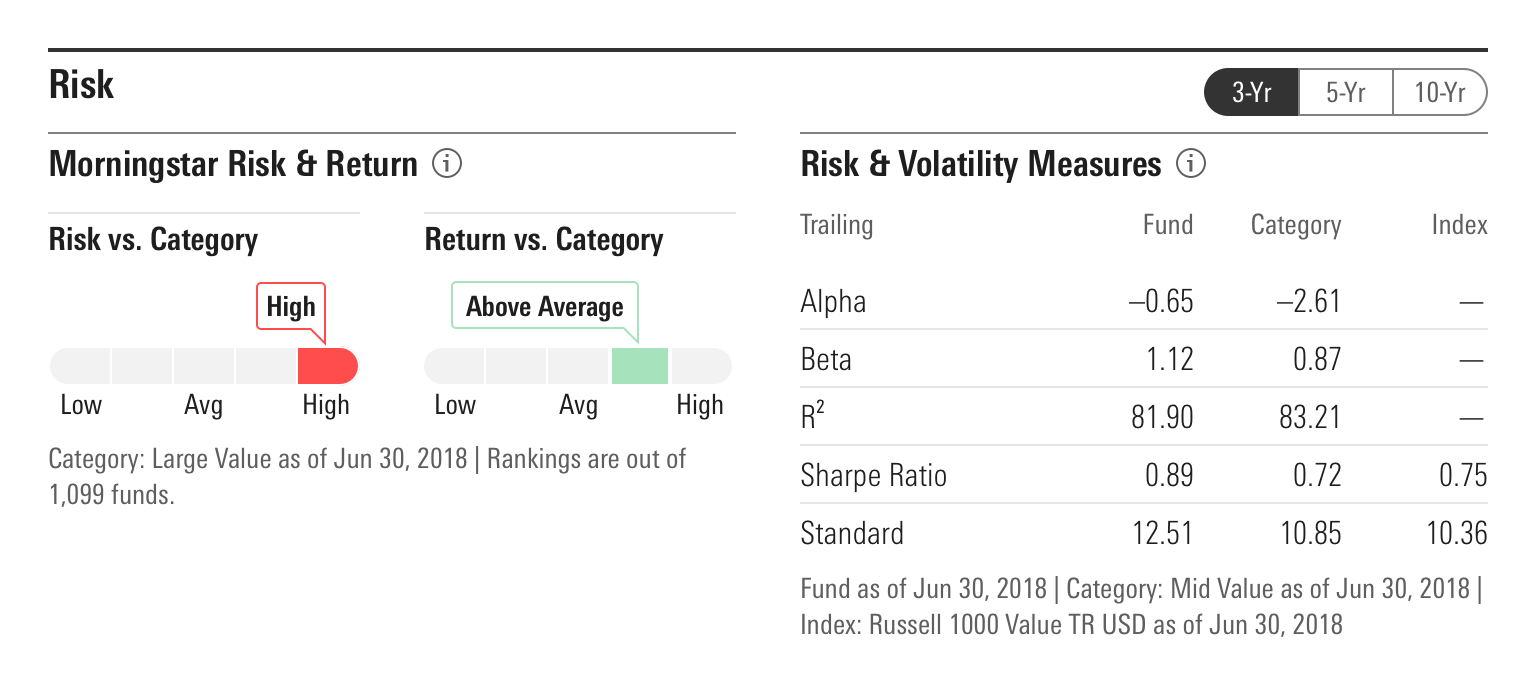
Headers
Headers combine a title, border, and–when appropriate–actions to introduce a group of information and/or functionality. They also help establish clear visual hierarchy, adding structure to a composition.
Header
Anatomy
Headers can be configured in a variety of ways to accomplish their intended goal. Implementing teams are encouraged to use the particular set of elements which best serve their use case.

|
Name |
Required |
Description |
|---|---|---|
|
Border |
Yes |
Visually defines the header’s space, dividing content into related groups, and helping to establish information hierarchy. |
|
Title |
Yes |
Briefly summarizes the content following the header. |
|
Title Description |
— |
Provides an Icon-only Button as an interaction point to surface additional information via a Tooltip or Popover. |
|
Action |
— |
Includes Buttons, Button Groups, or other UI components. |
Variations
Default
Use to pair typography and a border to create visual hierarchy. Headers can use the full range of Header borders to define their border-top.
Header Title
Header Title
Header Title
<div class="mds-header mds-header--primary">
    <h2 class="mds-header__title"> Header Title </h2>
</div>
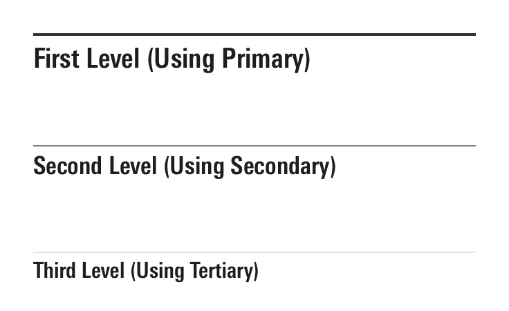
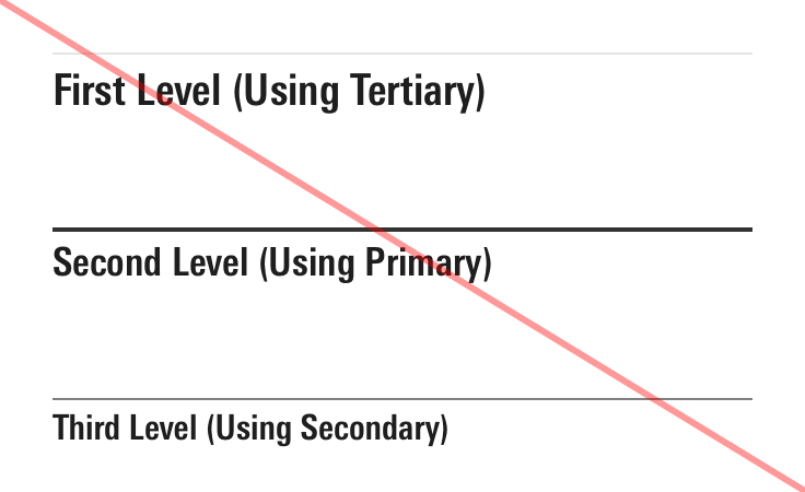
Nesting Headers
Headers can be nested to created layered hierarchies which clearly communicate the relationship between set of information.


- Use the headers which make sense within the visual hierarchy of a product. Products do not have to always use the full set of headers, e.g., a product can use just Secondary and Tertiary headers.
With Title Description
Use to include an Icon-only Button to provide an interaction point for surfacing additional information that clarifies the content introduced by the header, e.g., a data definition housed in a Tooltip or a Popover.
Header Title
<div class="mds-header mds-header--primary">
    <h2 class="mds-header__title"> Header Title
        <div class="mds-header__title-description">
            <button class="mds-button mds-button--icon-only" type="button">
                <svg class="mds-icon mds-button__icon mds-button__icon--left" aria-hidden="true">
                    <use xlink:href="/icons/mds.svg#question-circle"> </use>
                </svg>
            </button>
        </div>
    </h2>
</div>
With Actions
Use to provide functionality related to the elements grouped under a header.
Header Title
<div class="mds-header mds-header--primary">
    <h2 class="mds-header__title"> Header Title </h2>
    <div class="mds-header__actions">
        <div class="mds-button-group">
            <button class="mds-button mds-button--secondary mds-button--small mds-button--active" type="button"> Option 1 </button>
            <button class="mds-button mds-button--secondary mds-button--small" type="button"> Option 2 </button>
        </div>
    </div>
</div>- Actions should always relate to content directly contained by the header, or content nested within subsequent headers in a composition’s hierarchy.
Sizing
Sizing affects text size and internal padding. Modifier classes provide access to the full set of font sizes offered within the system.
Header Title
Header Title
Header Title
Header Title
Header Title
Header Title
Header Title
Header Title
Header Title
<div class="mds-header mds-header--primary mds-header--level-1">
    <h2 class="mds-header__title"> Header Title </h2>
</div>
Pairing UI Components with Heading Sizes
To maintain proper proportional relationships while providing flexibility, choose what size of UI Components to use within a With Actions header, and what size of Icon-only Button to use within the Info element, using the table below.
| Title | Text Size | Small Components | Medium Components | Large Components |
|---|---|---|---|---|
|
Level 1 Heading |
|
Can Use |
Can Use |
Can Use |
|
Level 2 Heading |
|
Can Use |
Can Use |
— |
|
Level 3 Heading |
|
Can Use |
Can Use |
— |
|
Level 4 Heading |
|
Can Use |
Can Use |
— |
|
Level 5 Heading |
|
Can Use |
Can Use |
— |
|
Level 6 Heading |
|
Can Use |
— |
— |
|
Level 7 Heading |
|
Can Use |
— |
— |
|
Level 8 Heading |
|
Can Use |
— |
— |
|
Level 9 Heading |
|
— |
— |
— |
Guidelines
Use When
- Pairing typography and a border to define a section of a composition.
- Creating visual and informational hierarchy on a page.
- Providing actions or controls for a section of content.
Don’t Use When
- Creating a vertical series of links or other elements, instead, use a List Group.
Visual Language
- At
level-6throughlevel-9, the internal padding tightens. - Header titles are bold by default. If requirements call for a different
font-weight, work with a designer to create custom styles within your product’s CSS, which utilize the MDS font weight constants.
Editorial
Actions
- Always follow the editorial guidelines for any included UI components.
Title
- Limit titles to five words to avoid wrapping.
- Always use title case.
Accessibility
- When creating the
mds-header__titleof a header component, teams should use the header tag (<h#>) which properly places the content within their product's information hierarchy. - When appropriate, add a unique ID to the
mds-header__titleto be referenced by its parent container through anaria-labelledbyattribute. This will clearly communicate their relationship.
Code Reference
CSS Class References
|
Class |
Applies to |
Outcome |
|---|---|---|
|
|
|
Applies a Primary Header Border to the |
|
|
|
Applies a Secondary Header Border to the |
|
|
|
Applies a Tertiary Header Border to the |
|
|
|
Sets the Title to |
|
|
|
Sets the Title to |
|
|
|
Sets the Title to |
|
|
|
Sets the Title to |
|
|
|
Sets the Title to |
|
|
|
Sets the Title to |
|
|
|
Sets the Title to |
|
|
|
Sets the Title to $mds-font-size-s and reduces the |
|
|
|
Sets the Title to |

