The Morningstar Design System is a collection of brand, visual, UX, and technical standards built into a central library so that teams can quickly build high-quality, consistent experiences.
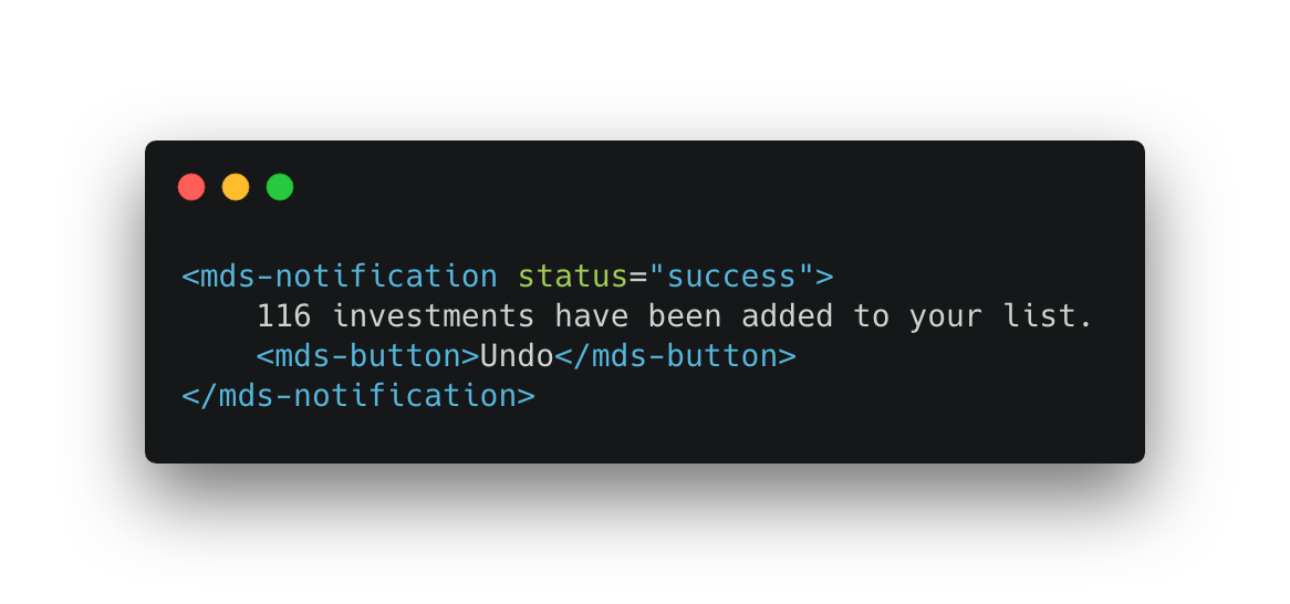
The MDS UI components you know and love, written in vanilla JavaScript, and now available for production use as custom elements with built-in support for interactions and behaviors.

New constants, new documentation, and updated UI component interactions provide the foundation for animation in the Morningstar Design System.

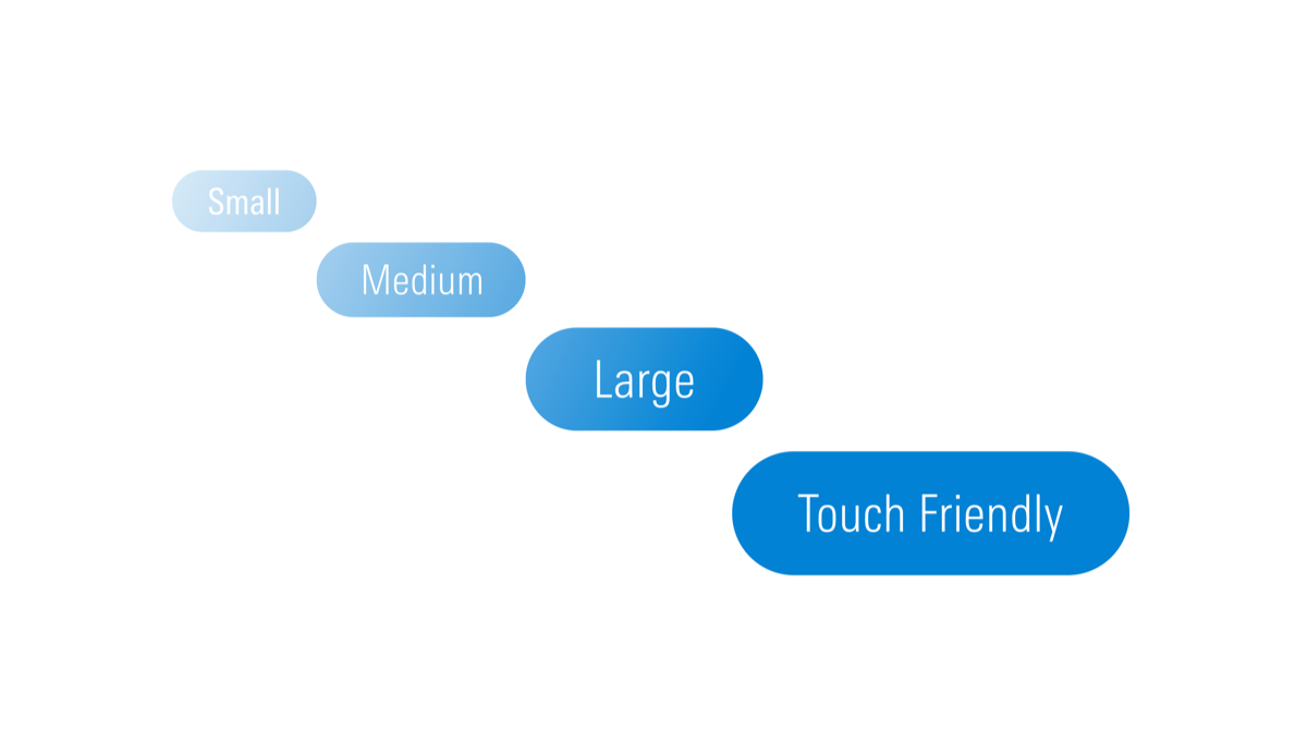
MDS now offers touch target-sized variations of many components—like Buttons, Forms, and List Groups—providing products with the parts to build accessible touch-screen experiences. See our release notes for a full list of supported components.

- Complete
- In Progress
- Upcoming
|
Status
|
Name
|
|---|---|
| Multi-Select Combo Box | |
| Search Results | |
| Empty State | |
| Data Tables | |
| Tabs |
|
Status
|
Name
|
|---|---|
| Office hours | |
| Self-service coverage tool | |
| MDS Tutorial |
|
Status
|
Name
|
|---|---|
| Establish repository | |
| Package components | |
| Encapsulate styles |
|
Status
|
Name
|
|---|---|
| Consolidate to single set of icons | |
| Refresh style (stroke width, etc.) | |
| Redesign selected icons |

The Morningstar Design System is powered and improved by the teams that use it. We’d love to hear your feedback.

