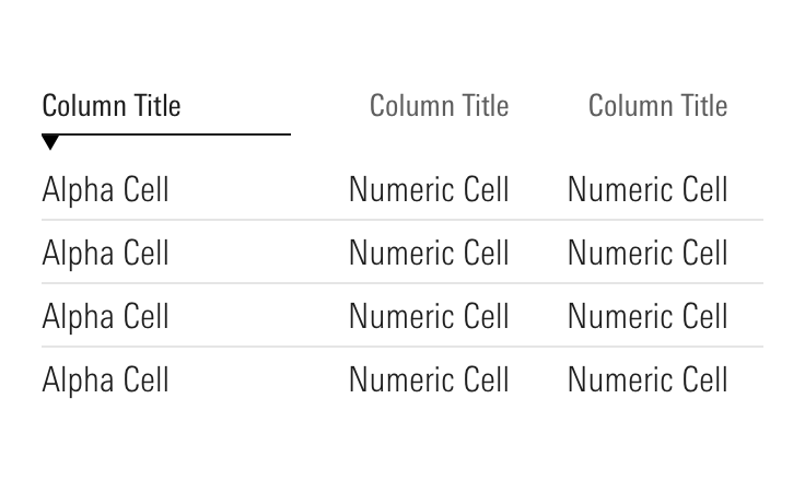
Responsive Data Tables
Responsive data tables provide our users access to complex tabular information regardless of the device they are using.
Problem Statement
When viewing a data table on a small screen or within a narrow container on a large screen, users need the table to provide the same value as it does at full size.
Approaches
There isn’t a one size fits all solution for responsive data tables. Your approach must always be defined by both the table’s underlying data as well as the job a user is seeking to complete when using the table. Across Morningstar products, we use three general approaches when designing responsive data tables:
You can also consider hiding less important columns to reduce the amount of content a user must navigate on a smaller screen.
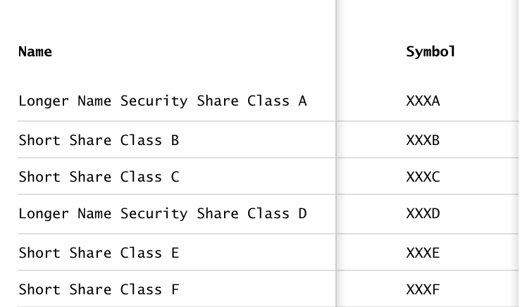
Horizontal Scroll
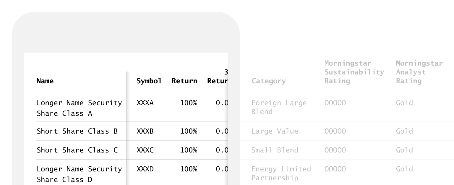
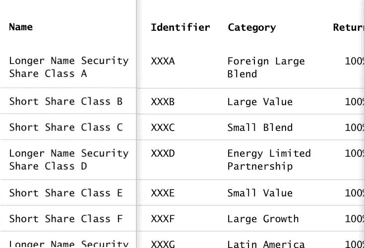
When a table is used for comparison—for example, market performance data—it is critical to maintain a traditional row and column-based layout that allows a user to compare cell values across multiple rows. By allowing a user to scroll horizontally through columns, this approach can scale to support as many columns as is needed.
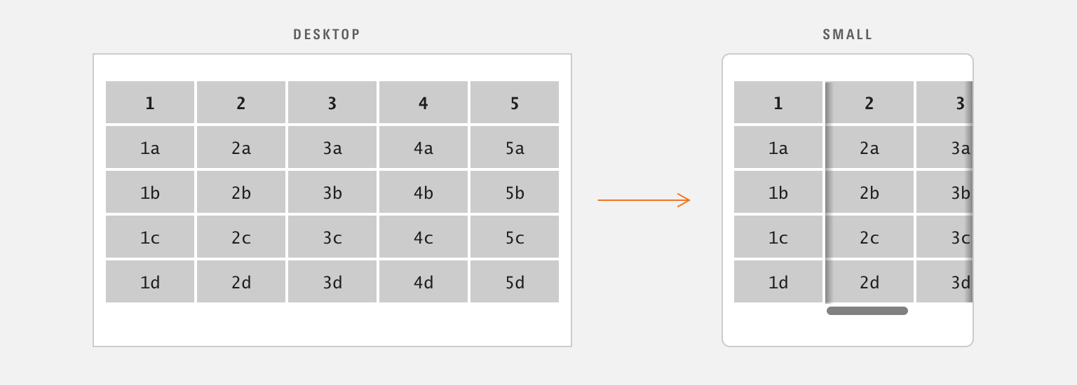
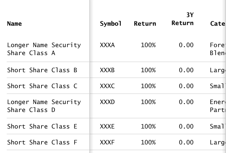
Locking the first column in place and allowing the table’s data to scroll behind that locked column provides a user with a consistent frame of reference as they scroll horizontally through columns.
Place drop shadows around the table’s scrollable area to provide a user with dimensionality that hints at additional content out of view, as well as the ability to scroll the table behind the locked column.
 A locked column and drop shadows add dimensionality to the table, hinting at the ability to scroll.
Set the locked column’s width to ensure that more than half of the table width is devoted to the scrollable area and make sure that multiple columns are visible within the table’s scrollable area. Don’t allow a single column to become so wide it occupies the full width of the scrollable area.
If a table is taller than the viewport, consider locking the column headers in place so a user can always tell which columns they are seeing.
 Locking headers in place ensure columns can be identified as you scroll through the table.
Additional Scroll Affordances
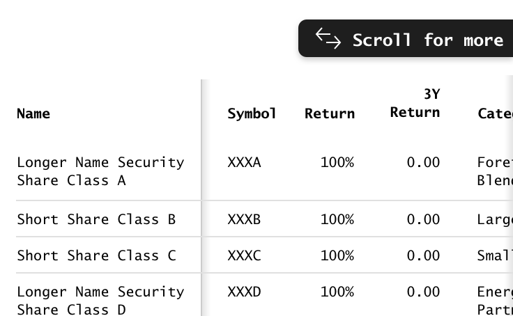
One of the challenges of the horizontal scroll approach is making sure that a user understands they can scroll within the table. In addition to the locked column styling, there are additional ways to ensure they know that more content is available.
Use a subtle animation on the table’s content to draw attention to the scrollability of a table. Consider triggering this animation automatically when a table enters the viewport.
 A subtle animation on a table’s scrollable area draws a users attention to the ability to scroll the content.
Place additional affordances, like a label or animated icon above the table to draw a attention to the scrollable content.
Once a user scrolls the table, consider fading out these elements so as not to distract from the table’s content.
 Additional descriptive affordances can be used to reinforce the scroll functionality to a user.
Pros
- Allows for easy comparison across many rows of data.
- Maintains the traditional tabular display users are already familiar with.
- Features like sorting, row selection, and table actions are consistent with large screen experiences.
Cons
- Requires horizontal scrolling to display all columns, so a user must understand that they can scroll within the table.
- Viewable area for the table content is small.
- Can result in simultaneous horizontal and vertical scroll bars.
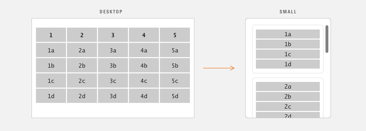
Stack
When a table presents a set of unique objects—for example, client contact information—you can make bigger structural changes to avoid horizontal scrolling. The stack approach takes all of the cells in a row and stacks them vertically with their label, usually wrapping them in a Module Container.
Sorting
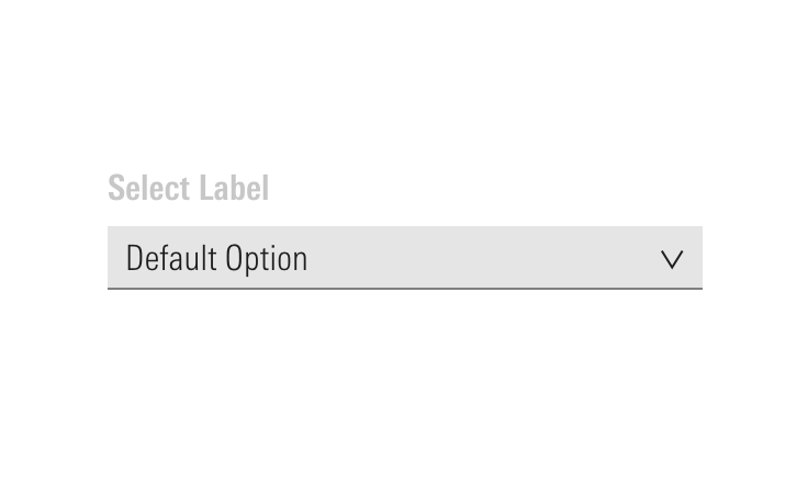
Since the table no longer contains columns, the approach for applying sorting must be adapted. Consider moving the sorting function in to Selects above the table.
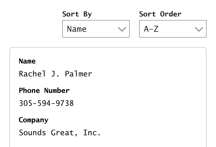 Sorting actions can be placed above a stacked table as Selects.
Pros
- Completely avoids horizontal scrolling.
- Provides a clear grouping for a related set of information.
- Provides more flexibility to improve touch target sizes and adjust a design to account for smaller screens.
Cons
- Not suited for performing comparisons. Don’t use when analysis and comparison is a user’s primary job.
- Adds significant height to a table.
- In the absence of column headers, the sorting actions need to be moved to a different location.
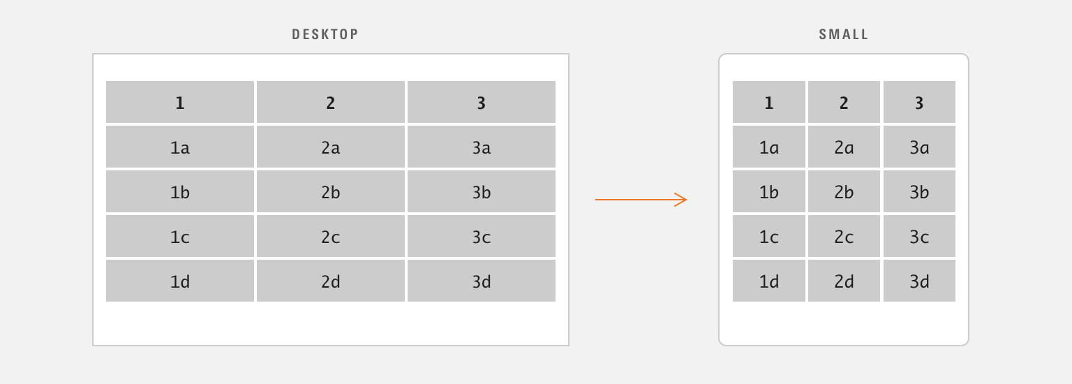
Fluid
When a data table contains only two or three columns you may not need to do anything additional to account for responsiveness. The Data Table component will respond fluidly to the viewport, with each column retaining its proportional size.
Text Wrap
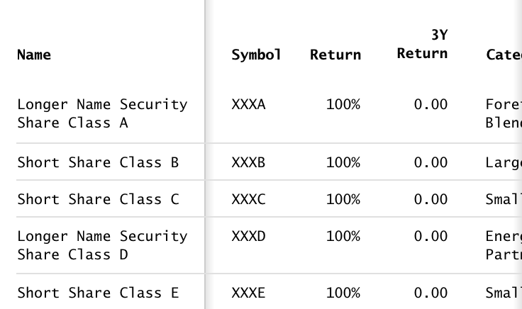
For longer data points, consider allowing content to wrap to multiple lines rather than employing truncation. Since touch screens do not support hover actions, revealing a Tooltip with the full version of truncated data is not possible in those cases.
 Letting text in cells wrap to multiple lines ensure they can be read without needing a Tooltip.
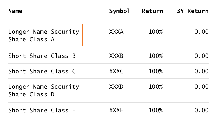
If truncation is your best approach, remember to stay conscious of which part of the truncated data is most important to a user. If the information at the end of the string is critical for a user to see, consider truncating data points at the beginning or in the middle of the string.
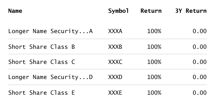 When truncating, make sure the most important aspects of your content is visible.
Pros
- Doesn’t require any additional development work.
- Maintains parity with experiences on larger screens.
Cons
- Not suited for tables that contain more than two or three columns.
Hiding Non-Essential Content
When designing a table that will be responsive, work with your product team to determine if there are any non-essential columns in the table that can be hidden on smaller screens. Minimizing the amount of scrolling required will allow a user to more quickly find what they are looking for.
When possible, always ask your users directly what is most important to them. Consider working with the User Research team to discover which content matters most to your users.
Toggle to View Full Table
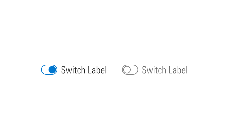
By defining smart defaults, you can provide a user with a simplified view of a table but give the ability to toggle the table to its full view.
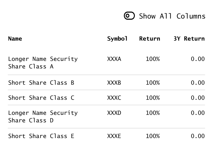 Use a switch to allow a user to toggle between a simple and full version of a table.
User Customization
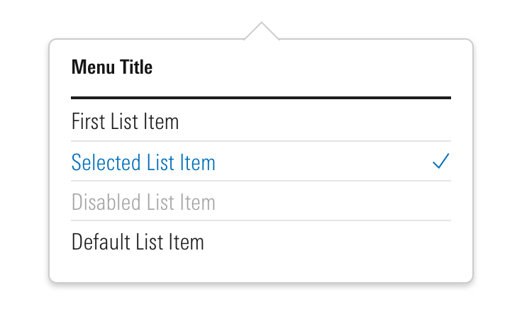
Consider allowing a user to customize the columns displayed in a responsive table.
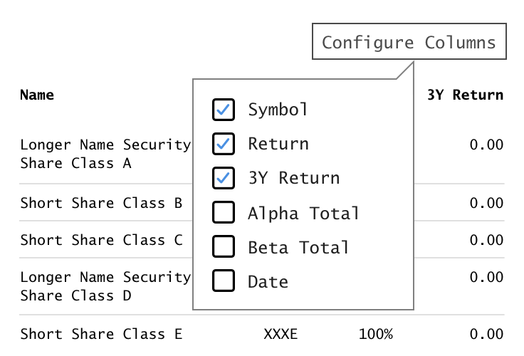 Use a menu to allow a user to customize a table to their needs.