Forms
Forms gather information from users via inputs, such as text boxes, text areas, selects, checkboxes, and radio buttons. Labels sit atop these inputs.
Variations
Label
Use to describe a form input and indicate whether the input is required or optional.
<label class="mds-form__label"> First Name </label><label class="mds-form__label"> First Name
<abbr class="mds-form__label-required-indicator" title="This field is required." aria-hidden="true">*</abbr>
<span class="mds-form__label-required-indicator-label">Required Field.</span>
</label><label class="mds-form__label"> First Name
<span class="mds-form__label-optional"> (Optional) </span>
</label>Editorial
- Use title case.
- Clearly written labels should eliminate the need for placeholder text in text boxes and text areas.
Text Box
Use to solicit a short, single line of text or a number.
<input class="mds-form__input" type="text"><input class="mds-form__input" type="text" disabled><input class="mds-form__input" type="text" placeholder="First Name">- Use when the user must enter a name, email address, phone number, street address, age, salary, etc.
- Never use for multiple lines of text. Instead, use a text area.
- Never use to perform a search. Instead, use a Search Field.
- Avoid using placeholder text by making sure the label above the text box is clear. If you still need additional instructional context, consider a Tooltip next to the label header or microcopy under the label, so the helper content doesn’t disappear when a user starts typing.
- Placeholder text disappears when a user types in the input. If a user doesn’t enter a value and moves to another part of a form, the placeholder text should reappear in the former text box.
- In IE11, placeholder text is cleared on
focus. This is default IE11 behavior and a known issue, teams are still encouraged to use text boxes in production.
Editorial
- Placeholder text should be active. Start the text with a verb.
- Don’t end placeholder text in text boxes with a period.
- Use title case for placeholder text.
Text Area
Use when soliciting multiple lines of text.
<textarea class="mds-form__textarea"></textarea><textarea class="mds-form__textarea" disabled></textarea><textarea class="mds-form__textarea" placeholder="Tell us more here..."></textarea>- Never use for short, single lines of text. Instead, use a text box.
- Include placeholder text to indicate what information belongs in the text area. Placeholder text disappears when the user types in the text area. If the user doesn’t enter a value and moves to another part of a form, the placeholder text should reappear in the former text box.
- In IE11, placeholder text is cleared on
focus. This is default IE11 behavior and a known issue, teams are still encouraged to use text areas in production.
Editorial
- Placeholder text in text areas should be full sentences with punctuation.
- Don’t use title case here.
Select (Dropdown)
Use when affording a single selection from a predefined list of options.
<div class="mds-form__select">
    <select class="mds-form__select-input">
        <option class="mds-form__select-option" value="">Select an Expense Type</option>
        <option class="mds-form__select-option" value="vacation">Vacation</option>
        <option class="mds-form__select-option" value="public_college">Public College</option>
        <option class="mds-form__select-option" value="private_college">Private College</option>
        <option class="mds-form__select-option" value="medical">Medical</option>
    </select>
    <div class="mds-form__select-visual-wrap"></div>
    <span class="mds-form__select-open-indicator">
        <svg class="mds-icon mds-form__select-open-icon" aria-hidden="true">
            <use xlink:href="/icons/mds.svg#caret-down--s"> </use>
        </svg>
    </span>
</div><div class="mds-form__select">
<select class="mds-form__select-input" disabled>
<option class="mds-form__select-option" value="">Select an Expense Type</option>
<option class="mds-form__select-option" value="vacation">Vacation</option>
<option class="mds-form__select-option" value="public_college">Public College</option>
<option class="mds-form__select-option" value="private_college">Private College</option>
<option class="mds-form__select-option" value="medical">Medical</option>
</select>
<div class="mds-form__select-visual-wrap"></div>
<span class="mds-form__select-open-indicator">
<svg class="mds-icon mds-form__select-open-icon" aria-hidden="true">
<use xlink:href="/icons/mds.svg#caret-down--s"> </use>
</svg>
</span>
</div>- Always display a user’s selected option after a choice is made.
- Never use for a list of options exceeding 10 items. Instead, use a Combo Box.
- Never use for a list of only two options. Instead, use a radio group or a Switch.
Editorial
- Display either “Select an Option” or no text at all as the default selected option.
- Start the text with a verb.
- Don’t end text in a select with a period.
- Keep option names as brief as possible - aim for under 5 words.
- Use title case.
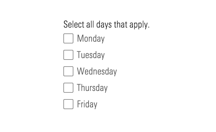
Checkbox
Use when affording a binary selection.
<label class="mds-form__checkbox" for="i-accept-the-terms-and-conditions.--93015">
    <input id="i-accept-the-terms-and-conditions.--93015" type="checkbox" class="mds-form__checkbox-input" />
    <span class="mds-form__checkbox-visible-wrap">
        <span class="mds-form__checkbox-visual">
            <svg class="mds-icon mds-form__checkbox-checked-icon" aria-hidden="true">
                <use xlink:href="/icons/mds.svg#check--s"> </use>
            </svg>
            <svg class="mds-icon mds-form__checkbox-indeterminate-icon" aria-hidden="true">
                <use xlink:href="/icons/mds.svg#minus--s"> </use>
            </svg>
        </span>
        <span class="mds-form__checkbox-text"> I accept the terms and conditions. </span>
    </span>
</label><label class="mds-form__checkbox mds-form__checkbox--disabled" for="i-accept-the-terms-and-conditions.--99068">
<input id="i-accept-the-terms-and-conditions.--99068" type="checkbox" class="mds-form__checkbox-input" disabled />
<span class="mds-form__checkbox-visible-wrap">
<span class="mds-form__checkbox-visual">
<svg class="mds-icon mds-form__checkbox-checked-icon" aria-hidden="true">
<use xlink:href="/icons/mds.svg#check--s"> </use>
</svg>
<svg class="mds-icon mds-form__checkbox-indeterminate-icon" aria-hidden="true">
<use xlink:href="/icons/mds.svg#minus--s"> </use>
</svg>
</span>
<span class="mds-form__checkbox-text"> I accept the terms and conditions. </span>
</span>
</label><label class="mds-form__checkbox" for="i-accept-the-terms-and-conditions.--93809">
<input id="i-accept-the-terms-and-conditions.--93809" type="checkbox" class="mds-form__checkbox-input" checked />
<span class="mds-form__checkbox-visible-wrap">
<span class="mds-form__checkbox-visual">
<svg class="mds-icon mds-form__checkbox-checked-icon" aria-hidden="true">
<use xlink:href="/icons/mds.svg#check--s"> </use>
</svg>
<svg class="mds-icon mds-form__checkbox-indeterminate-icon" aria-hidden="true">
<use xlink:href="/icons/mds.svg#minus--s"> </use>
</svg>
</span>
<span class="mds-form__checkbox-text"> I accept the terms and conditions. </span>
</span>
</label><label class="mds-form__checkbox mds-form__checkbox--disabled" for="i-accept-the-terms-and-conditions.--51728">
<input id="i-accept-the-terms-and-conditions.--51728" type="checkbox" class="mds-form__checkbox-input" checked disabled />
<span class="mds-form__checkbox-visible-wrap">
<span class="mds-form__checkbox-visual">
<svg class="mds-icon mds-form__checkbox-checked-icon" aria-hidden="true">
<use xlink:href="/icons/mds.svg#check--s"> </use>
</svg>
<svg class="mds-icon mds-form__checkbox-indeterminate-icon" aria-hidden="true">
<use xlink:href="/icons/mds.svg#minus--s"> </use>
</svg>
</span>
<span class="mds-form__checkbox-text"> I accept the terms and conditions. </span>
</span>
</label>- Reflects the affirmative (“yes” or “true”) of its label when checked.
- Choices made via checkbox should always be submitted or saved using a Button.
- Follows the same
:hoverand:activeconventions as the primary Button when checked. - Include the label in the checkbox's clickable target area.
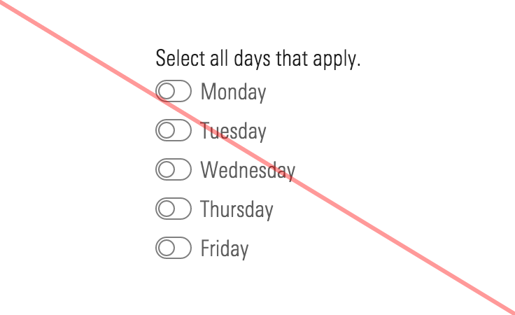
Don't Use When
- Turning a feature, mode, or functionality on and off. Instead, use a Switch.
- Checking or unchecking elicits an immediate change in the UI or functionality, such as enabling a disabled field or revealing more controls. Instead, use a Switch.
- Checking or unchecking elicits a change in background functionality without affecting the UI, like disabling an email notification. Instead, use a Switch.
Editorial
- Use full sentences with punctuation.
- If user is consenting to something, start the sentence with “I”, and also run the phrasing you choose by compliance.
Checkbox Without Label
Use when enabling selection of an object such as a card.
<label class="mds-form__checkbox mds-form__checkbox--hide-label" for="i-accept-the-terms-and-conditions--7833">
    <input id="i-accept-the-terms-and-conditions--7833" type="checkbox" class="mds-form__checkbox-input" />
    <span class="mds-form__checkbox-visible-wrap">
        <span class="mds-form__checkbox-visual">
            <svg class="mds-icon mds-form__checkbox-checked-icon" aria-hidden="true">
                <use xlink:href="/icons/mds.svg#check--s"> </use>
            </svg>
            <svg class="mds-icon mds-form__checkbox-indeterminate-icon" aria-hidden="true">
                <use xlink:href="/icons/mds.svg#minus--s"> </use>
            </svg>
        </span>
        <span class="mds-form__checkbox-text"> I accept the terms and conditions </span>
    </span>
</label>- Always include an associated
<label>element, even if it is hidden from the screen. - Position the checkbox without label in the upper left corner of an object.
- Distinguish the selected state of the overall object (such as a card) by changing the object's visual style, such as altering the background or border color.
- Omit margins from the checkbox element to prevent focused and active states from appearing as larger than the checkbox itself.
Checkbox Group
<form class="mds-form mds-form--medium-layout" method="post" action="form/processor">
    <div class="mds-form__field-group">
        <fieldset class="mds-form__checkbox-group" role="group">
            <legend class="mds-form__checkbox-group-label"> Select statistics to view. </legend>
            <label class="mds-form__checkbox" for="average--99493">
                <input id="average--99493" type="checkbox" class="mds-form__checkbox-input" />
                <span class="mds-form__checkbox-visible-wrap">
                    <span class="mds-form__checkbox-visual">
                        <svg class="mds-icon mds-form__checkbox-checked-icon" aria-hidden="true">
                            <use xlink:href="/icons/mds.svg#check--s"> </use>
                        </svg>
                        <svg class="mds-icon mds-form__checkbox-indeterminate-icon" aria-hidden="true">
                            <use xlink:href="/icons/mds.svg#minus--s"> </use>
                        </svg>
                    </span>
                    <span class="mds-form__checkbox-text"> Average </span>
                </span>
            </label>
            <label class="mds-form__checkbox" for="minimum--10442">
                <input id="minimum--10442" type="checkbox" class="mds-form__checkbox-input" />
                <span class="mds-form__checkbox-visible-wrap">
                    <span class="mds-form__checkbox-visual">
                        <svg class="mds-icon mds-form__checkbox-checked-icon" aria-hidden="true">
                            <use xlink:href="/icons/mds.svg#check--s"> </use>
                        </svg>
                        <svg class="mds-icon mds-form__checkbox-indeterminate-icon" aria-hidden="true">
                            <use xlink:href="/icons/mds.svg#minus--s"> </use>
                        </svg>
                    </span>
                    <span class="mds-form__checkbox-text"> Minimum </span>
                </span>
            </label>
            <label class="mds-form__checkbox" for="maximum--38359">
                <input id="maximum--38359" type="checkbox" class="mds-form__checkbox-input" />
                <span class="mds-form__checkbox-visible-wrap">
                    <span class="mds-form__checkbox-visual">
                        <svg class="mds-icon mds-form__checkbox-checked-icon" aria-hidden="true">
                            <use xlink:href="/icons/mds.svg#check--s"> </use>
                        </svg>
                        <svg class="mds-icon mds-form__checkbox-indeterminate-icon" aria-hidden="true">
                            <use xlink:href="/icons/mds.svg#minus--s"> </use>
                        </svg>
                    </span>
                    <span class="mds-form__checkbox-text"> Maximum </span>
                </span>
            </label>
            <label class="mds-form__checkbox" for="medium--8565">
                <input id="medium--8565" type="checkbox" class="mds-form__checkbox-input" />
                <span class="mds-form__checkbox-visible-wrap">
                    <span class="mds-form__checkbox-visual">
                        <svg class="mds-icon mds-form__checkbox-checked-icon" aria-hidden="true">
                            <use xlink:href="/icons/mds.svg#check--s"> </use>
                        </svg>
                        <svg class="mds-icon mds-form__checkbox-indeterminate-icon" aria-hidden="true">
                            <use xlink:href="/icons/mds.svg#minus--s"> </use>
                        </svg>
                    </span>
                    <span class="mds-form__checkbox-text"> Medium </span>
                </span>
            </label>
        </fieldset>
    </div>
</form><form class="mds-form mds-form--medium-layout" method="post" action="form/processor">
<div class="mds-form__field-group mds-form__field-group--horizontal">
<fieldset class="mds-form__checkbox-group" role="group">
<legend class="mds-form__checkbox-group-label"> Select statistics to view. </legend>
<label class="mds-form__checkbox" for="average--5546">
<input id="average--5546" type="checkbox" class="mds-form__checkbox-input" />
<span class="mds-form__checkbox-visible-wrap">
<span class="mds-form__checkbox-visual">
<svg class="mds-icon mds-form__checkbox-checked-icon" aria-hidden="true">
<use xlink:href="/icons/mds.svg#check--s"> </use>
</svg>
<svg class="mds-icon mds-form__checkbox-indeterminate-icon" aria-hidden="true">
<use xlink:href="/icons/mds.svg#minus--s"> </use>
</svg>
</span>
<span class="mds-form__checkbox-text"> Average </span>
</span>
</label>
<label class="mds-form__checkbox" for="minimum--61901">
<input id="minimum--61901" type="checkbox" class="mds-form__checkbox-input" />
<span class="mds-form__checkbox-visible-wrap">
<span class="mds-form__checkbox-visual">
<svg class="mds-icon mds-form__checkbox-checked-icon" aria-hidden="true">
<use xlink:href="/icons/mds.svg#check--s"> </use>
</svg>
<svg class="mds-icon mds-form__checkbox-indeterminate-icon" aria-hidden="true">
<use xlink:href="/icons/mds.svg#minus--s"> </use>
</svg>
</span>
<span class="mds-form__checkbox-text"> Minimum </span>
</span>
</label>
<label class="mds-form__checkbox" for="maximum--85738">
<input id="maximum--85738" type="checkbox" class="mds-form__checkbox-input" />
<span class="mds-form__checkbox-visible-wrap">
<span class="mds-form__checkbox-visual">
<svg class="mds-icon mds-form__checkbox-checked-icon" aria-hidden="true">
<use xlink:href="/icons/mds.svg#check--s"> </use>
</svg>
<svg class="mds-icon mds-form__checkbox-indeterminate-icon" aria-hidden="true">
<use xlink:href="/icons/mds.svg#minus--s"> </use>
</svg>
</span>
<span class="mds-form__checkbox-text"> Maximum </span>
</span>
</label>
<label class="mds-form__checkbox" for="medium--75355">
<input id="medium--75355" type="checkbox" class="mds-form__checkbox-input" />
<span class="mds-form__checkbox-visible-wrap">
<span class="mds-form__checkbox-visual">
<svg class="mds-icon mds-form__checkbox-checked-icon" aria-hidden="true">
<use xlink:href="/icons/mds.svg#check--s"> </use>
</svg>
<svg class="mds-icon mds-form__checkbox-indeterminate-icon" aria-hidden="true">
<use xlink:href="/icons/mds.svg#minus--s"> </use>
</svg>
</span>
<span class="mds-form__checkbox-text"> Medium </span>
</span>
</label>
</fieldset>
</div>
</form>- Include a label to describe the options within the group.
- Options can be selected independently.
<label class="mds-form__checkbox" for="indeterminate-checkbox--17517">
    <input id="indeterminate-checkbox--17517" type="checkbox" class="mds-form__checkbox-input" checked />
    <span class="mds-form__checkbox-visible-wrap">
        <span class="mds-form__checkbox-visual">
            <svg class="mds-icon mds-form__checkbox-checked-icon" aria-hidden="true">
                <use xlink:href="/icons/mds.svg#check--s"> </use>
            </svg>
            <svg class="mds-icon mds-form__checkbox-indeterminate-icon" aria-hidden="true">
                <use xlink:href="/icons/mds.svg#minus--s"> </use>
            </svg>
        </span>
        <span class="mds-form__checkbox-text"> Indeterminate checkbox </span>
    </span>
</label>
<!-- Something like the following Javascript would be required to set an indeterminate state on a checkbox -->
<script>
    document.getElementById("indeterminate-checkbox--17517").indeterminate = true;
</script>- Use the indeterminate variation when affording a “Select All” option. After selecting all items, the indeterminate state is triggered once an option is deselected.
Editorial
- Use full sentences with punctuation for the checkbox group label.
- Try to keep checkbox labels brief and start them with verbs.
Radio Button
Use to afford a single selection from two or more options.
<label class="mds-form__radio-button" for="peer-group--45284">
    <input id="peer-group--45284" name="undefined-basic-example" value="blue" type="radio" class="mds-form__radio-button-input" />
    <span class="mds-form__radio-button-visible-wrap">
        <span class="mds-form__radio-button-visual"></span>
        <span class="mds-form__radio-button-text "> Peer Group </span>
    </span>
</label><label class="mds-form__radio-button mds-form__radio-button--disabled" for="peer-group--89157">
<input id="peer-group--89157" name="undefined-basic-example" value="blue" type="radio" class="mds-form__radio-button-input" disabled />
<span class="mds-form__radio-button-visible-wrap">
<span class="mds-form__radio-button-visual"></span>
<span class="mds-form__radio-button-text "> Peer Group </span>
</span>
</label><label class="mds-form__radio-button" for="choose-this-one--90515">
<input id="choose-this-one--90515" name="radio-example-1" value="blue" type="radio" class="mds-form__radio-button-input" checked />
<span class="mds-form__radio-button-visible-wrap">
<span class="mds-form__radio-button-visual"></span>
<span class="mds-form__radio-button-text "> Choose this one </span>
</span>
</label><label class="mds-form__radio-button mds-form__radio-button--disabled" for="peer-group--21378">
<input id="peer-group--21378" name="undefined-basic-example-checked" value="blue" type="radio" class="mds-form__radio-button-input" checked disabled />
<span class="mds-form__radio-button-visible-wrap">
<span class="mds-form__radio-button-visual"></span>
<span class="mds-form__radio-button-text "> Peer Group </span>
</span>
</label>Radio Group
<form class="mds-form mds-form--medium-layout" method="post" action="form/processor">
    <div class="mds-form__field-group">
        <fieldset class="mds-form__radio-button-group" role="radiogroup">
            <legend class="mds-form__radio-button-group-label"> Rank Within </legend>
            <label class="mds-form__radio-button" for="id-98358-basic-example-checked">
                <input id="id-98358-basic-example-checked" name="id-98358" value="blue" type="radio" class="mds-form__radio-button-input" checked />
                <span class="mds-form__radio-button-visible-wrap">
                    <span class="mds-form__radio-button-visual"></span>
                    <span class="mds-form__radio-button-text "> Your List </span>
                </span>
            </label>
            <label class="mds-form__radio-button" for="id-98358-basic-example">
                <input id="id-98358-basic-example" name="id-98358" value="blue" type="radio" class="mds-form__radio-button-input" />
                <span class="mds-form__radio-button-visible-wrap">
                    <span class="mds-form__radio-button-visual"></span>
                    <span class="mds-form__radio-button-text "> Peer Group </span>
                </span>
            </label>
        </fieldset>
    </div>
</form><form class="mds-form mds-form--medium-layout" method="post" action="form/processor">
<div class="mds-form__field-group mds-form__field-group--horizontal">
<fieldset class="mds-form__radio-button-group" role="radiogroup">
<legend class="mds-form__radio-button-group-label"> Rank Within </legend>
<label class="mds-form__radio-button" for="id-30242-basic-example-checked">
<input id="id-30242-basic-example-checked" name="id-30242" value="blue" type="radio" class="mds-form__radio-button-input" checked />
<span class="mds-form__radio-button-visible-wrap">
<span class="mds-form__radio-button-visual"></span>
<span class="mds-form__radio-button-text "> Your List </span>
</span>
</label>
<label class="mds-form__radio-button" for="id-30242-basic-example">
<input id="id-30242-basic-example" name="id-30242" value="blue" type="radio" class="mds-form__radio-button-input" />
<span class="mds-form__radio-button-visible-wrap">
<span class="mds-form__radio-button-visual"></span>
<span class="mds-form__radio-button-text "> Peer Group </span>
</span>
</label>
</fieldset>
</div>
</form>- Use when seeing all available options is critical. If the options are secondary in importance, consider using the select form element.
- When possible, use the stacked variation. Options are harder to differentiate within the horizontal group.
- If selecting no option is a viable choice, include a radio button within the group with an appropriate label, i.e. “None”.
- A selected radio button follows the same
:hoverand:activeconventions as the primary Button. - A radio button’s label is part of the clickable area of the control.
- Add
nameattribute for Radio Group to group radio buttons together and ensures that a single selection is achieved. - Generally, the first option in the radio group should be selected by default. If preselection of an option can result in incorrect assumptions, i.e., “Male” or “Female”, then no option should be selected by default.
Editorial
- For the radio group label, use full sentences with punctuation.
- Try to keep radio button labels brief and start them with verbs.
Required-Fields Key
Use to describe the required-field indicator symbol.
<form class="mds-form" method="post" action="form/processor">
    <span class="mds-form__required-fields-key">Required fields</span>
    <div class="mds-form__field-group"> </div>
</form>
Errors
Use to indicate form elements with invalid or missing entries, including a description of the error.
<form class="mds-form mds-form--medium-layout" method="post" action="form/processor">
    <div class="mds-form__field-group mds-form--error">
        <label class="mds-form__label" for="error-first-name"> First Name
            <abbr class="mds-form__label-required-indicator" title="This field is required." aria-hidden="true">*</abbr>
            <span class="mds-form__label-required-indicator-label">Required Field.</span>
        </label>
        <input class="mds-form__input" type="text" id="error-first-name" aria-describedby="first-name-error" aria-invalid="true">
        <span class="mds-form__field-error" id="first-name-error" role="alert">
            <span class="mds-form__field-error-text"> This is placeholder error messaging. </span>
        </span>
    </div>
</form><form class="mds-form mds-form--medium-layout" method="post" action="form/processor">
<div class="mds-form__field-group mds-form--error">
<label class="mds-form__label" for="error-textarea"> Comments
<abbr class="mds-form__label-required-indicator" title="This field is required." aria-hidden="true">*</abbr>
<span class="mds-form__label-required-indicator-label">Required Field.</span>
</label>
<textarea class="mds-form__textarea" id="error-textarea" aria-describedby="textarea-error" aria-invalid="true"></textarea>
<span class="mds-form__field-error" id="textarea-error" role="alert">
<span class="mds-form__field-error-text"> This is placeholder error messaging. </span>
</span>
</div>
</form><form class="mds-form mds-form--medium-layout" method="post" action="form/processor">
<div class="mds-form__field-group mds-form--error">
<label class="mds-form__label" for="error-select"> Expense Type
<abbr class="mds-form__label-required-indicator" title="This field is required." aria-hidden="true">*</abbr>
<span class="mds-form__label-required-indicator-label">Required Field.</span>
</label>
<div class="mds-form__select">
<select class="mds-form__select-input" id="error-select" aria-invalid="true">
<option class="mds-form__select-option" value="">Select an Expense Type</option>
<option class="mds-form__select-option" value="vacation">Vacation</option>
<option class="mds-form__select-option" value="public_college">Public College</option>
<option class="mds-form__select-option" value="private_college">Private College</option>
<option class="mds-form__select-option" value="medical">Medical</option>
</select>
<div class="mds-form__select-visual-wrap"></div>
<span class="mds-form__select-open-indicator">
<svg class="mds-icon mds-form__select-open-icon" aria-hidden="true">
<use xlink:href="/icons/mds.svg#caret-down--s"> </use>
</svg>
</span>
</div>
<span class="mds-form__field-error" role="alert">
<span class="mds-form__field-error-text"> This field is required </span>
</span>
</div>
</form><form class="mds-form mds-form--medium-layout" method="post" action="form/processor">
<div class="mds-form__field-group mds-form--error">
<fieldset class="mds-form__checkbox-group" role="group">
<legend class="mds-form__checkbox-group-label"> Select one or more statistics to view.
<abbr class="mds-form__label-required-indicator" title="Please select at least one option." aria-hidden="true">*</abbr>
<span class="mds-form__label-required-indicator-label">Required Field.</span>
</legend>
<label class="mds-form__checkbox" for="average--42048">
<input id="average--42048" type="checkbox" class="mds-form__checkbox-input" aria-describedby="checkbox-error" aria-invalid="true" />
<span class="mds-form__checkbox-visible-wrap">
<span class="mds-form__checkbox-visual">
<svg class="mds-icon mds-form__checkbox-checked-icon" aria-hidden="true">
<use xlink:href="/icons/mds.svg#check--s"> </use>
</svg>
<svg class="mds-icon mds-form__checkbox-indeterminate-icon" aria-hidden="true">
<use xlink:href="/icons/mds.svg#minus--s"> </use>
</svg>
</span>
<span class="mds-form__checkbox-text"> Average </span>
</span>
</label>
<label class="mds-form__checkbox" for="minimum--50272">
<input id="minimum--50272" type="checkbox" class="mds-form__checkbox-input" aria-describedby="checkbox-error" aria-invalid="true" />
<span class="mds-form__checkbox-visible-wrap">
<span class="mds-form__checkbox-visual">
<svg class="mds-icon mds-form__checkbox-checked-icon" aria-hidden="true">
<use xlink:href="/icons/mds.svg#check--s"> </use>
</svg>
<svg class="mds-icon mds-form__checkbox-indeterminate-icon" aria-hidden="true">
<use xlink:href="/icons/mds.svg#minus--s"> </use>
</svg>
</span>
<span class="mds-form__checkbox-text"> Minimum </span>
</span>
</label>
<label class="mds-form__checkbox" for="maxiumum--1097">
<input id="maxiumum--1097" type="checkbox" class="mds-form__checkbox-input" aria-describedby="checkbox-error" aria-invalid="true" />
<span class="mds-form__checkbox-visible-wrap">
<span class="mds-form__checkbox-visual">
<svg class="mds-icon mds-form__checkbox-checked-icon" aria-hidden="true">
<use xlink:href="/icons/mds.svg#check--s"> </use>
</svg>
<svg class="mds-icon mds-form__checkbox-indeterminate-icon" aria-hidden="true">
<use xlink:href="/icons/mds.svg#minus--s"> </use>
</svg>
</span>
<span class="mds-form__checkbox-text"> Maxiumum </span>
</span>
</label>
<label class="mds-form__checkbox" for="medium--38347">
<input id="medium--38347" type="checkbox" class="mds-form__checkbox-input" aria-describedby="checkbox-error" aria-invalid="true" />
<span class="mds-form__checkbox-visible-wrap">
<span class="mds-form__checkbox-visual">
<svg class="mds-icon mds-form__checkbox-checked-icon" aria-hidden="true">
<use xlink:href="/icons/mds.svg#check--s"> </use>
</svg>
<svg class="mds-icon mds-form__checkbox-indeterminate-icon" aria-hidden="true">
<use xlink:href="/icons/mds.svg#minus--s"> </use>
</svg>
</span>
<span class="mds-form__checkbox-text"> Medium </span>
</span>
</label>
<span class="mds-form__field-error" id="checkbox-error" role="alert">
<span class="mds-form__field-error-text"> You must select at least one statistic. </span>
</span>
</fieldset>
</div>
</form><form class="mds-form mds-form--medium-layout" method="post" action="form/processor">
<div class="mds-form__field-group mds-form--error">
<fieldset class="mds-form__radio-button-group" role="radiogroup">
<legend class="mds-form__radio-button-group-label"> Select what you would like to rank within.
<abbr class="mds-form__label-required-indicator" title="Please select an option." aria-hidden="true">*</abbr>
<span class="mds-form__label-required-indicator-label">Required Field.</span>
</legend>
<label class="mds-form__radio-button" for="your-list--34912">
<input id="your-list--34912" name="group-name" value="blue" type="radio" class="mds-form__radio-button-input" aria-describedby="radio-button-error-message" aria-invalid="true" />
<span class="mds-form__radio-button-visible-wrap">
<span class="mds-form__radio-button-visual"></span>
<span class="mds-form__radio-button-text "> Your List </span>
</span>
</label>
<label class="mds-form__radio-button" for="peer-group--80805">
<input id="peer-group--80805" name="group-name" value="blue" type="radio" class="mds-form__radio-button-input" aria-describedby="radio-button-error-message, invalid=true" />
<span class="mds-form__radio-button-visible-wrap">
<span class="mds-form__radio-button-visual"></span>
<span class="mds-form__radio-button-text "> Peer Group </span>
</span>
</label>
<span class="mds-form__field-error" id="radio-button-error-message" role="alert">
<span class="mds-form__field-error-text"> You must choose an option. </span>
</span>
</fieldset>
</div>
</form>- Never account for the space an error message may occupy in your layout. Instead, the error message should push the elements below down to make room.
Editorial
- Use full sentences with punctuation for error description.
- Acknowledge what is keeping a user from proceeding, but don’t make them feel like they did something wrong.
- If we are the reason they can’t proceed, apologize.
- Provide a user at least one way to resolve the problem.
- If an error has the potential to repeat, tell a user what they should do, i.e., “If the site continues to not recognize your account, email us at [email protected].”
Microcopy
Augment a label to describe a form element in greater detail.
<div class="mds-form__field-group">
    <span class="mds-form__microcopy" id="password-help-text"> Your password must contain a letter and a number. </span>
</div>
Editorial
- Use full sentences with punctuation.
- Aim for no more than two sentences.
Sizing
Sizing affects element size, text size and internal spacing. The default size is medium, and you can use a modifier class to make each form element smaller (mds-form__[element name]--small) or larger (mds-form__[element name]--large).
This is example error text.
This is example microcopy text.
This is example error text.
This is example microcopy text.
This is example error text.
This is example microcopy text.
<span class="mds-form__required-fields-key mds-form__required-fields-key--small">Required fields</span>
<br>
<br>
<label class="mds-form__label mds-form__label--small"> Label
    <abbr class="mds-form__label-required-indicator" title="This field is required." aria-hidden="true">*</abbr>
    <span class="mds-form__label-required-indicator-label">Required Field.</span>
</label>
<br>
<input class="mds-form__input mds-form__input--small" type="text" id="small-text-box" placeholder="Text Box">
<br>
<br>
<textarea class="mds-form__textarea mds-form__textarea--small" id="small-textarea" placeholder="Text Area"></textarea>
<br>
<br>
<div class="mds-form__select mds-form__select--small">
    <select class="mds-form__select-input" id="small-select">
        <option class="mds-form__select-option" value="">Select an option</option>
        <option class="mds-form__select-option" value="option_1">Option 1</option>
        <option class="mds-form__select-option" value="option_2">Option 2</option>
    </select>
    <div class="mds-form__select-visual-wrap"></div>
    <span class="mds-form__select-open-indicator">
        <svg class="mds-icon mds-form__select-open-icon" aria-hidden="true">
            <use xlink:href="/icons/mds.svg#caret-down--s"> </use>
        </svg>
    </span>
</div>
<br>
<br>
<label class="mds-form__checkbox mds-form__checkbox--small" for="small-checkbox">
    <input id="small-checkbox" type="checkbox" class="mds-form__checkbox-input" />
    <span class="mds-form__checkbox-visible-wrap">
        <span class="mds-form__checkbox-visual">
            <svg class="mds-icon mds-form__checkbox-checked-icon" aria-hidden="true">
                <use xlink:href="/icons/mds.svg#check--s"> </use>
            </svg>
            <svg class="mds-icon mds-form__checkbox-indeterminate-icon" aria-hidden="true">
                <use xlink:href="/icons/mds.svg#minus--s"> </use>
            </svg>
        </span>
        <span class="mds-form__checkbox-text"> Checkbox Label </span>
    </span>
</label>
<br>
<label class="mds-form__radio-button mds-form__radio-button--small" for="small-radio-button">
    <input id="small-radio-button" name="group-name" value="blue" type="radio" class="mds-form__radio-button-input" />
    <span class="mds-form__radio-button-visible-wrap">
        <span class="mds-form__radio-button-visual"></span>
        <span class="mds-form__radio-button-text "> Radio Button Label </span>
    </span>
</label>
<br>
<span class="mds-form__field-error mds-form__field-error--small" role="alert">
    <span class="mds-form__field-error-text"> This is example error text. </span>
</span>
<br>
<span class="mds-form__microcopy mds-form__microcopy--small"> This is example microcopy text. </span>- Use the
mds-form__checkbox-without-labelclass in conjunction with checkbox sizing modifier classes to render different sizes of the checkbox without label.
Examples
Address Form
This example combines many form elements wrapped with a mds-form--medium-layout modifier class to apply margin-based spacing. It uses a required fields key, labels (default and required), text boxes, select, text area, and a Button.
MDS Features
- Uses the
mds-form--medium-layoutmodifier class to apply medium form margins to all contained elements. See the spacing elements guidelines in the composition section for more information. - Uses the
mds-form__field-group--horizontalmodifier class to create a horizontal group of three inputs. See the grouping elements guidelines in the composition section for more information.
Customizations
Some custom styles are required to ensure the proper display of elements within a mds-form__field-group using the mds-form__field-group--horizontal modifier class:
- A
flex-grow: 1;property is required for each contained element—e.g.mds-form__label,mds-form__input—to ensure they expand to fill their available space. mds-form__selectneed awidth: 100%;property applied to ensure they expand to fill their available space.
<form class="mds-form mds-form--medium-layout" method="post" action="form/processor">
    <fieldset class="mds-form__fieldset">
        <legend class="mds-form__legend">Address</legend>
        <span class="mds-form__required-fields-key">Required fields</span>
        <div class="mds-form__field-group">
            <label class="mds-form__label" for="full-form-first-name"> First Name
                <abbr class="mds-form__label-required-indicator" title="This field is required." aria-hidden="true">*</abbr>
                <span class="mds-form__label-required-indicator-label">Required Field.</span>
            </label>
            <input class="mds-form__input" type="text" id="full-form-first-name"> </div>
        <div class="mds-form__field-group">
            <label class="mds-form__label" for="full-form-last-name"> Last Name
                <abbr class="mds-form__label-required-indicator" title="This field is required." aria-hidden="true">*</abbr>
                <span class="mds-form__label-required-indicator-label">Required Field.</span>
            </label>
            <input class="mds-form__input" type="text" id="full-form-last-name"> </div>
        <div class="mds-form__field-group">
            <label class="mds-form__label" for="full-form-address"> Address </label>
            <input class="mds-form__input" type="text" id="full-form-adress"> </div>
        <div class="mds-form__field-group mds-form__field-group--horizontal">
            <div class="mds-form__field-group demo-flex-grow-1">
                <label class="mds-form__label" for="full-form-city"> City </label>
                <input class="mds-form__input" type="text" id="full-form-city"> </div>
            <div class="mds-form__field-group demo-flex-grow-1">
                <label class="mds-form__label" for="full-form-state"> State </label>
                <div class="mds-form__select demo-width-100">
                    <select class="mds-form__select-input" id="full-form-state">
                        <option class="mds-form__select-option" value="default">Select your state</option>
                        <option class="mds-form__select-option" value="just">Just</option>
                        <option class="mds-form__select-option" value="kidding">Kidding</option>
                    </select>
                    <div class="mds-form__select-visual-wrap"></div>
                    <span class="mds-form__select-open-indicator">
                        <svg class="mds-icon mds-form__select-open-icon" aria-hidden="true">
                            <use xlink:href="/icons/mds.svg#caret-down--s"> </use>
                        </svg>
                    </span>
                </div>
            </div>
            <div class="mds-form__field-group demo-flex-grow-1">
                <label class="mds-form__label" for="full-form-zip"> Zip </label>
                <input class="mds-form__input" type="text" id="full-form-zip"> </div>
        </div>
        <div class="mds-form__field-group">
            <label class="mds-form__label" for="full-form-comments"> Comments </label>
            <textarea class="mds-form__textarea" id="full-form-comments"></textarea>
        </div>
    </fieldset>
    <div class="demo-button-container">
        <button class="mds-button mds-button--primary" type="button" disabled> Submit </button>
    </div>
</form>
Sign Up Form
This example uses large form elements wrapped with a mds-form--large-layout modifier class to apply margin-based spacing. It uses a required fields key, labels (default, optional, and required), text boxes, microcopy, radio group, and a Button.
MDS Features
- Uses the
mds-form--large-layoutmodifier class to apply large form margins to all contained elements. See the spacing elements guidelines in the composition section for more information. - Uses
--largemodifier classes on all form elements to render their large sizes. See the sizing section for more information. - Radio group sizing modifier classes must apply to the
mds-form__radio-button-groupelement.
<form class="mds-form mds-form--large-layout" method="post" action="form/processor">
    <fieldset class="mds-form__fieldset">
        <legend class="mds-form__legend">Sign Up</legend>
        <span class="mds-form__required-fields-key mds-form__required-fields-key--large">Required fields</span>
        <div class="mds-form__field-group">
            <label class="mds-form__label mds-form__label--large" for="full-form-first-name"> First Name
                <abbr class="mds-form__label-required-indicator" title="This field is required." aria-hidden="true">*</abbr>
                <span class="mds-form__label-required-indicator-label">Required Field.</span>
            </label>
            <input class="mds-form__input mds-form__input--large" type="text" id="full-form-first-name"> </div>
        <div class="mds-form__field-group mds-form--error">
            <label class="mds-form__label mds-form__label--large" for="full-form-last-name"> Last Name
                <abbr class="mds-form__label-required-indicator" title="This field is required." aria-hidden="true">*</abbr>
                <span class="mds-form__label-required-indicator-label">Required Field.</span>
            </label>
            <input class="mds-form__input mds-form__input--large" type="text" id="full-form-last-name" aria-describedby="full-form-last-name__error">
            <span class="mds-form__field-error mds-form__field-error--large" id="full-form-last-name__error" role="alert">
                <span class="mds-form__field-error-text"> Please provide your last name. </span>
            </span>
        </div>
        <div class="mds-form__field-group">
            <label class="mds-form__label mds-form__label--large" for="full-form-email__input"> Email
                <span class="mds-form__label-optional"> (Optional) </span>
            </label>
            <span class="mds-form__microcopy mds-form__microcopy--large" id="full-form-email__microcopy"> We’ll never share your email with third parties. </span>
            <input class="mds-form__input mds-form__input--large" type="text" id="full-form-email__input" aria-describedby="full-form-email__microcopy"> </div>
        <div class="mds-form__field-group">
            <fieldset class="mds-form__radio-button-group mds-form__radio-button-group--large" role="radiogroup">
                <legend class="mds-form__radio-button-group-label"> Would you like to sign up for our newsletter? </legend>
                <span class="mds-form__microcopy mds-form__microcopy--large" id="full-form-newsletter__microcopy"> We won’t send you more than one email a week. </span>
                <label class="mds-form__radio-button mds-form__radio-button--large" for="yes,-please.--69481">
                    <input id="yes,-please.--69481" name="undefined-newsletter" value="blue" type="radio" class="mds-form__radio-button-input" checked aria-describedby="full-form-newsletter__microcopy" />
                    <span class="mds-form__radio-button-visible-wrap">
                        <span class="mds-form__radio-button-visual"></span>
                        <span class="mds-form__radio-button-text "> Yes, please. </span>
                    </span>
                </label>
                <label class="mds-form__radio-button mds-form__radio-button--large" for="no,-thanks.--4750">
                    <input id="no,-thanks.--4750" name="undefined-newsletter" value="blue" type="radio" class="mds-form__radio-button-input" aria-describedby="full-form-newsletter__microcopy" />
                    <span class="mds-form__radio-button-visible-wrap">
                        <span class="mds-form__radio-button-visual"></span>
                        <span class="mds-form__radio-button-text "> No, thanks. </span>
                    </span>
                </label>
            </fieldset>
        </div>
    </fieldset>
    <div class="demo-button-container">
        <button class="mds-button mds-button--primary mds-button--large" type="button" disabled> Sign Up </button>
    </div>
</form>
Guidelines
Composition
Form Structure
- Always wrap form elements within a
<form>using themds-formclass. - Use semantic HTML form elements, e.g.,
<fieldset>,<legend>,<label>, and<input>.
Grouping Elements
When constructing forms it is critical to utilize a container with the mds-form__field-group class to group related elements. For example, when pairing a label with an input:
<form class="mds-form">
    <div class="mds-form__field-group">
        <label class="mds-form__label" for="input-01">[Label text]</label>
        <input class="mds-form__input" id="input-01"> </div>
</form>
If a form field includes microcopy and/or an error, always place these elements within the mds-form__field-group container wrapping the relevant field. For example:
<form class="mds-form">
    <div class="mds-form__field-group">
        <label class="mds-form__label" for="input-01">[Label text]</label>
        <span class="mds-form__microcopy" id="input-01-microcopy">[Microcopy text]</span>
        <input class="mds-form__input" id="input-01" aria-describedby="input-01-microcopy input-01-error">
        <span class="mds-form__field-error" id="input-01-error" role="alert">[Error text]</span>
    </div>
</form>- Multiple pieces of descriptive text, like microcopy and an error, can be linked to a single element by placing multiple
idin an element'saria-describedbyattribute. See accessibility guidelines for more information.
To create a horizontal group of form elements, wrap multiple mds-form__field-group containers within a parent mds-form__field-group container and apply the mds-form__field-group--horizontal modifier class. For example:
<form class="mds-form">
    <div class="mds-form__field-group mds-form__field-group--horizontal">
        <div class="mds-form__field-group">[Label, input and other elements.]</div>
        <div class="mds-form__field-group">[Label, input and other elements.]</div>
        <div class="mds-form__field-group">[Label, input and other elements.]</div>
    </div>
</form>
If multiple elements within a form are deeply related, like fields for entering an address, always wrap them in a container with the mds-form__fieldset class and include a descriptive legend using mds-form__legend. For example:
<form class="mds-form">
    <fieldset class="mds-form__fieldset">
        <legend class="mds-form__legend">[Description of fieldset content for screen readers.]</legend>
        <div class="mds-form__field-group">[Address]</div>
        <div class="mds-form__field-group">[City]</div>
        <div class="mds-form__field-group">[State]</div>
        <div class="mds-form__field-group">[Zip Code]</div>
    </fieldset>
</form>mds-form__fieldsetandmds-form__legendare non-visible elements that play a critical role in making forms accessible for those using assistive technologies, like screen readers. See accessibility guidelines for more information.<fieldset>elements may be nested with another<fieldset>, for example, if using the radio group or checkbox group.
Spacing Elements
By default, form elements do not include any margins. To assist with the composition of many individual form elements in a complete form, MDS provides layout modifier classes which automatically apply margin-based spacing to all elements contained within a form.
Form layout modifier classes are available for all three sizes of form elements, mds-form--small-layout, mds-form--medium-layout, and mds-form--large-layout. Always apply these modifier classes to the block level of a <form> element, for example:
<form class="mds-form mds-form--medium-layout"> [Insert medium form element markup here.] </form>Layout modifier classes only apply spacing to elements, you must still apply sizing modifier classes to each individual element within the form. For example, to use the mds-form--large-layout modifier class:
<form class="mds-form mds-form--large-layout">
    <div class="mds-form__field-group">
        <label class="mds-form__label mds-form__label--large" for="first-name">First Name</label>
        <input class="mds-form__input mds-form__input--large" id="first-name"> </div>
    <div class="mds-form__field-group">
        <label class="mds-form__label mds-form__label--large" for="last-name">Last Name</label>
        <input class="mds-form__input mds-form__input--large" id="last-name"> </div>
    <div class="mds-form__field-group">
        <label class="mds-form__label mds-form__label--large" for="email">Email</label>
        <span class="mds-form__microcopy mds-form__microcopy--large" id="email-microcopy">[Microcopy text]</span>
        <input class="mds-form__input mds-form__input--large" id="email" aria-describedby="email-microcopy"> </div>
</form>- Layout modifier classes apply
margin-rightto elements contained within an.mds-form__field-group--horizontalcontainer. - Always use form elements of the same size as the layout modifier class used to avoid undesirable spacing.
Related UX Patterns
Accessibility
- Always include a
labelwith each form element. - Include a
forattribute on eachlabelwith a value matching theidattribute on the correspondinginput,textareaorselect. - Use
placeholdertext to provide an example of the type of input you need from the user. For example, if you need a phone number in a certain format, includexxx-xxx-xxxxas placeholder text. - Never use
placeholdertext in place of alabel. - Include an
aria-describedbyattribute on eachinput,textarea, orselectthat has an.mds-form__microcopyor an.mds-form__field-errorcomponent providing additional information. The value of thearia-describedbyattribute must match theidattribute on the.mds-form__microcopyor.mds-form__field-errorcomponent. - Always include
role=alerton.mds-form__field-errorcomponents. - Form labels must always be visible.
- Add
aria-invalid="true"to an element where a validation error has occurred. - Ensure all form elements are keyboard accessible.
- Use
fieldsetandlegendfor grouped form elements, such as radio buttons and checkboxes.
Code Reference
- Always wrap grouped form elements in a
mds-form__field-groupcontainer.
<div class="mds-form__field-group">
    <label class="mds-form__label" id="first-name">First Name</label>
    <input class="mds-form__input" type="text" id="first-name" placeholder="First Name" /> </div>
CSS Class References
|
Class |
Applies to |
Outcome |
|---|---|---|
|
|
|
Applies margin-based spacing to all contained form elements. |
|
|
|
Applies margin-based spacing to all contained form elements. |
|
|
|
Applies margin-based spacing to all contained form elements. |
|
|
|
Changes the layout of form fields from vertical to horizontal. |
|
|
|
Applies error styles to form elements. |
|
|
|
Adjusts styling to render a small text box (input). |
|
|
|
Adjusts styling to render a large text box (input). |
|
|
|
Adjusts styling to render a small text area. |
|
|
|
Adjusts styling to render a large text area. |
|
|
|
Adjusts styling to render a small select. |
|
|
|
Adjusts styling to render a large select. |
|
|
|
Adjusts styling to render a small checkbox. |
|
|
|
Adjusts styling to render a large checkbox. |
|
|
|
Adjusts styling to render a small radio button. |
|
|
|
Adjusts styling to render a large radio button. |
|
|
|
Hides label text, although screen readers can still access it. |