Mastheads
Mastheads provide a shared foundation for Morningstar web properties by presenting branding and key functionality in a set of standard responsive configurations.
See the Navigation pattern for more information.


Below 768px


Variations
Mastheads consist of one required and two optional elements:

- Branding (required).
- Left controls (optional), which contain a Flat Button to trigger a hidden menu and a Search Field.
- Right controls (optional), which contain calls to action and sign in/user account menu access.
Default
Use to establish the foundation of a product masthead.

<header class="mds-masthead">
    <div class="mds-masthead__inner">
        <div class="mds-masthead__left"> </div>
        <div class="mds-masthead__logo-wrap"> <img class="mds-masthead__logo--wide" src="/images/mastheads/logos/Mstar-Product-logo-50px.svg" alt="Product Name"> <img class="mds-masthead__logo" src="/images/mastheads/logos/Mstar-logo-50px.svg" alt="Product Name"> </div>
        <div class="mds-masthead__right"> </div>
    </div>
</header>- Always include Morningstar branding.
- Never create your own lockups for use in production. Instead, request a product logo lockup from the brand team.
Left Controls
Use to contain, at most, a Flat Button to trigger a hidden menu and a Search Field.


<header class="mds-masthead">
    <div class="mds-masthead__inner">
        <div class="mds-masthead__left">
            <button class="mds-button mds-button--icon-only mds-masthead--hide-wide mds-page-shell--show-off-canvas-navigation" type="button">
                <svg class="mds-icon mds-button__icon mds-button__icon--left" aria-hidden="true">
                    <use xlink:href="/icons/mds.svg#menu-padless"> </use>
                </svg>
            </button>
            <button class="mds-button mds-button--flat mds-masthead--show-wide mds-page-shell--show-off-canvas-navigation" type="button">
                <svg class="mds-icon mds-button__icon mds-button__icon--left" aria-hidden="true">
                    <use xlink:href="/icons/mds.svg#menu-padless"> </use>
                </svg>
                <span class="mds-button__text"> Menu </span>
            </button>
            <button class="mds-button mds-button--icon-only mds-masthead--hide-wide" type="button">
                <svg class="mds-icon mds-button__icon mds-button__icon--left" aria-hidden="true">
                    <use xlink:href="/icons/mds.svg#search-padless"> </use>
                </svg>
            </button>
            <div class="mds-search-field mds-masthead--show-wide" role="search">
                <input type="text" class="mds-search-field__input" aria-label="Search" placeholder="Search...">
                <svg class="mds-icon mds-search-field__search-icon" aria-hidden="true">
                    <use xlink:href="/icons/mds.svg#search--s"> </use>
                </svg>
                <span class="mds-search-field__input-focus-outline"></span>
            </div>
        </div>
        <div class="mds-masthead__logo-wrap"> <img class="mds-masthead__logo--wide" src="/images/mastheads/logos/Mstar-Product-logo-50px.svg" alt="Product Name"> <img class="mds-masthead__logo" src="/images/mastheads/logos/Mstar-logo-50px.svg" alt="Product Name"> </div>
        <div class="mds-masthead__right"> </div>
    </div>
</header>- If your product uses a hidden menu at desktop breakpoints, always use the Flat Button to put the word “Menu” to the right of the
menu-padlessicon. - Only include Primary Search Fields in the masthead’s left control area.
Right Controls
Use to contain, at most, one call to action and a sign in functionality.


<header class="mds-masthead">
    <div class="mds-masthead__inner">
        <div class="mds-masthead__left"> </div>
        <div class="mds-masthead__logo-wrap"> <img class="mds-masthead__logo--wide" src="/images/mastheads/logos/Mstar-Product-logo-50px.svg" alt="Product Name"> <img class="mds-masthead__logo" src="/images/mastheads/logos/Mstar-logo-50px.svg" alt="Product Name"> </div>
        <div class="mds-masthead__right">
            <button class="mds-button mds-button--primary mds-masthead--show-wide" type="button"> Contact Us </button>
            <button class="mds-button mds-button--flat" type="button">
                <svg class="mds-icon mds-button__icon mds-button__icon--left" aria-hidden="true">
                    <use xlink:href="/icons/mds.svg#person-padless"> </use>
                </svg>
                <span class="mds-button__text"> Sign In </span>
            </button>
            <button class="mds-button mds-button--icon-only mds-masthead--hide-wide" type="button">
                <svg class="mds-icon mds-button__icon mds-button__icon--left" aria-hidden="true">
                    <use xlink:href="/icons/mds.svg#person-padless"> </use>
                </svg>
            </button>
            <button class="mds-button mds-button--flat mds-button--flat-icon-m mds-masthead--show-wide" type="button">
                <svg class="mds-icon mds-button__icon mds-button__icon--left" aria-hidden="true">
                    <use xlink:href="/icons/mds.svg#person-padless"> </use>
                </svg>
                <span class="mds-button__text"> Sign In </span>
            </button>
        </div>
    </div>
</header>- Always use a Flat Button to put the words “Sign In” to the right of the
person-padlessicon. - Always use a Primary Button for the call to action.

<header class="mds-masthead">
    <div class="mds-masthead__inner">
        <div class="mds-masthead__left"> </div>
        <div class="mds-masthead__logo-wrap"> <img class="mds-masthead__logo--wide" src="/images/mastheads/logos/Mstar-Product-logo-50px.svg" alt="Product Name"> <img class="mds-masthead__logo" src="/images/mastheads/logos/Mstar-logo-50px.svg" alt="Product Name"> </div>
        <div class="mds-masthead__right">
            <button class="mds-button mds-button--primary mds-masthead--show-wide" type="button"> Contact Us </button>
            <button class="mds-button mds-button--flat mds-button--flat-icon-m" type="button">
                <svg class="mds-icon mds-button__icon mds-button__icon--left" aria-hidden="true">
                    <use xlink:href="/icons/mds.svg#person-padless"> </use>
                </svg>
                <span class="mds-button__text"> My Account </span>
            </button>
        </div>
    </div>
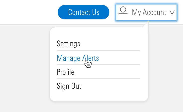
</header>- When a user is signed in, “Sign In” phrasing should update to “My Account”.
- Always place a
caret-down--sicon to the right of “My Account” if the button triggers a Menu.
Tall

<header class="mds-masthead mds-masthead--tall">
    <div class="mds-masthead__inner">
        <div class="mds-masthead__left"> </div>
        <div class="mds-masthead__logo-wrap"> <img class="mds-masthead__logo--wide" src="/images/components/mastheads/logos/Mstar-logo-70px.svg" alt="Product Name"> <img class="mds-masthead__logo" src="/images/mastheads/logos/Mstar-logo-50px.svg" alt="Product Name"> </div>
        <div class="mds-masthead__right"> </div>
    </div>
</header>- Only use for the Morningstar.com website.
Responsiveness
Responsive states are triggered at viewports 768px wide and below.
Default & Tall


<header class="mds-masthead">
    <div class="mds-masthead__inner">
        <div class="mds-masthead__left"> </div>
        <div class="mds-masthead__logo-wrap"> <img class="mds-masthead__logo--wide" src="/images/mastheads/logos/Mstar-Product-logo-50px.svg" alt="Product Name"> <img class="mds-masthead__logo" src="/images/mastheads/logos/Mstar-logo-50px.svg" alt="Product Name"> </div>
        <div class="mds-masthead__right"> </div>
    </div>
</header>- Always use the default size of the Morningstar logo at small viewports, never use a product logo lockup.
- Default and Tall mastheads use the same style at small viewports.
Controls


<header class="mds-masthead">
    <div class="mds-masthead__inner">
        <div class="mds-masthead__left">
            <button class="mds-button mds-button--icon-only mds-masthead--hide-wide mds-page-shell--show-off-canvas-navigation" type="button">
                <svg class="mds-icon mds-button__icon mds-button__icon--left" aria-hidden="true">
                    <use xlink:href="/icons/mds.svg#menu-padless"> </use>
                </svg>
            </button>
            <button class="mds-button mds-button--icon-only mds-masthead--hide-wide" type="button">
                <svg class="mds-icon mds-button__icon mds-button__icon--left" aria-hidden="true">
                    <use xlink:href="/icons/mds.svg#search-padless"> </use>
                </svg>
            </button>
            <div class="mds-search-field mds-masthead--show-wide" role="search">
                <input type="text" class="mds-search-field__input" aria-label="Search" placeholder="Search...">
                <svg class="mds-icon mds-search-field__search-icon" aria-hidden="true">
                    <use xlink:href="/icons/mds.svg#search--s"> </use>
                </svg>
                <span class="mds-search-field__input-focus-outline"></span>
            </div>
        </div>
        <div class="mds-masthead__logo-wrap"> <img class="mds-masthead__logo--wide" src="/images/mastheads/logos/Mstar-Product-logo-50px.svg" alt="Product Name"> <img class="mds-masthead__logo" src="/images/mastheads/logos/Mstar-logo-50px.svg" alt="Product Name"> </div>
        <div class="mds-masthead__right"> </div>
    </div>
</header>- At
768pxand below, reduce menu Flat Button to use themenu-padlessIcon-Only Button. - At
768pxand below, reduce Search field to use thesearch-padlessIcon-Only Button.


<header class="mds-masthead">
    <div class="mds-masthead__inner">
        <div class="mds-masthead__left"> </div>
        <div class="mds-masthead__logo-wrap"> <img class="mds-masthead__logo--wide" src="/images/mastheads/logos/Mstar-Product-logo-50px.svg" alt="Product Name"> <img class="mds-masthead__logo" src="/images/mastheads/logos/Mstar-logo-50px.svg" alt="Product Name"> </div>
        <div class="mds-masthead__right">
            <button class="mds-button mds-button--icon-only mds-masthead--hide-wide" type="button">
                <svg class="mds-icon mds-button__icon mds-button__icon--left" aria-hidden="true">
                    <use xlink:href="/icons/mds.svg#envelope"> </use>
                </svg>
            </button>
            <button class="mds-button mds-button--icon-only mds-masthead--hide-wide" type="button">
                <svg class="mds-icon mds-button__icon mds-button__icon--left" aria-hidden="true">
                    <use xlink:href="/icons/mds.svg#person-padless"> </use>
                </svg>
            </button>
            <button class="mds-button mds-button--primary mds-masthead--show-wide" type="button"> Contact Us </button>
            <button class="mds-button mds-button--secondary mds-masthead--show-wide" type="button"> Sign In </button>
        </div>
    </div>
</header>- Use the
person-padlessIcon-Only Button regardless of sign-in status. - At
768pxand below, reduce the call to action to an Icon-Only Button.- If the desktop breakpoint contains a call to action that does not have an appropriate icon analog, then remove that button and consider placing the call to action in the page content, hidden menu, or user’s account menu.
Examples
Default
The Morningstar Design System uses the default masthead with no left or right controls. At the 768px breakpoint, the masthead switches to the responsive variation, left controls are added, consisting of a Flat Button that will trigger the Site Navigation hidden menu.
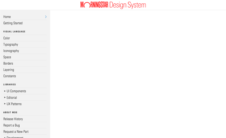 Morningstar Design System above 768px wide.
Default With Controls
Morningstar Credit Ratings uses the default masthead with a persistent hidden menu Flat Button and Primary Search Field in the left controls, and a sign in Flat Button in the right controls. The masthead switches to the responsive variation at the 768px breakpoint.
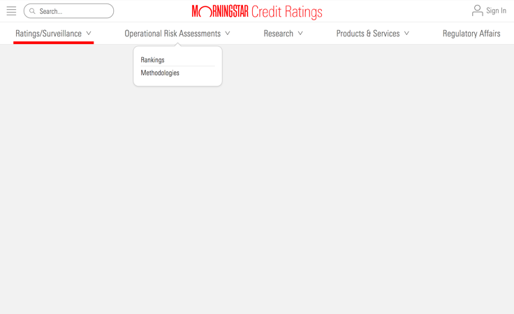 Morningstar Credit Ratings above 768px wide.
Tall With Controls
Morningstar.com uses the tall masthead with a Primary Search Field in the left controls, and call to action and sign in Buttons in the right controls. At the 768px breakpoint, the masthead switches to the responsive variation, and a Icon Only Button is added to the left controls that will trigger the Site Navigation hidden menu.
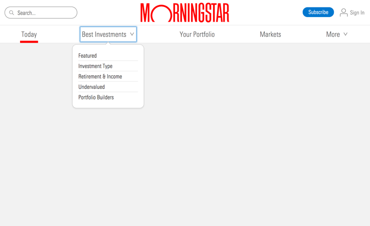 Morningstar.com above 768px wide.
Guidelines
Use When
- Establishing a website or application as a Morningstar property by using approved branding elements.
- Setting the foundation for Site Navigation.
- Providing a user access points for global functionality, like Search and sign in.
Don’t Use When
- Your website or application exists within another navigation wrapper, such as an
<iframe>. A masthead should always be at the top-most level of your site or app structure.
Visual Language
- Always place the masthead at the top-most level of your site or app structure, it should be attached to the top edge of the viewport.
Behaviors
- When paired with the Site Navigation component, the masthead holds the menu icon used to trigger the hidden site navigation at viewports
768pxand below.
Editorial
- When using UI components, like Buttons and Search Fields, within a masthead, always follow those components’ editorial guidelines.
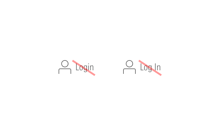
- Use “Sign In” “Sign Out” not “Log In” “Log Out”.
- Put “Menu” next to the hidden menu icon when there is room.
- Refer to Search Fields editorial guidelines for default placeholder text.
- Keep calls to action brief, as the longer they are, the more they will distract from branding.
Related UX Patterns
Accessibility
- Always use a
<header>element for the top level wrapper of masthead as shown in the code examples.
Code Reference
CSS Class References
|
Class |
Applies to |
Outcome |
|---|---|---|
|
|
|
Uses a taller-than-default size at the widest breakpoint. |
|
|
|
By default, |
|
|
Any element within |
Hides elements with this class for viewports 768px wide or greater. |
|
|
Any element within |
Shows elements with this class for viewports 768px wide or greater. |
|
|
Any element within |
Hides elements with this class for viewports 1024px wide or greater. |
|
|
Any element within |
Shows elements with this class for viewports 1024px wide or greater. |
