Module Containers
Module containers structure content by grouping various elements to provide cohesive sets of information and functionality.
These variations are deprecated and will be removed in v3.0.
Please use the enhanced Module Containers component for all new development.
Module Container
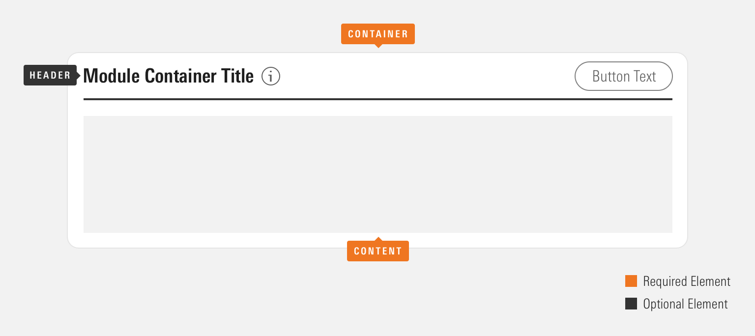
Anatomy
Module containers can be configured in a variety of ways to accomplish their intended goal. Implementing teams are encouraged to use the particular set of elements which best serve their use case.

|
Name |
Required |
Description |
|---|---|---|
|
Container |
Yes |
Visually defines the module container’s dimensions. |
|
Content |
Yes |
Displays a defined composition of elements. |
|
Header |
No |
Includes a Header component. |
Module Container Title
<div class="mds-module-container">
    <div class="mds-header mds-header--primary mds-header--border-bottom">
        <h2 class="mds-header__title"> Module Container Title </h2>
        <div class="mds-header__actions">
            <button class="mds-button mds-button--secondary" type="button"> Action </button>
        </div>
    </div>
    <section class="mds-module-container__content">
        <div>[Your content here.]</div>
    </section>
</div>- See the Headers documentation for all available variations and additional guidelines.
Without Header
Use to compose a set of content and/or functionality.
<div class="mds-module-container">
    <section class="mds-module-container__content">
        <div>[Your content here.]</div>
    </section>
</div>- Consider creating visual hierarchy inside of a without-header module container through the use of typography and borders.
Sizing
Module containers come in a single size. However, they can consume any size of Header.
Module Container Title
Module Container Title
Module Container Title
<div class="mds-module-container">
    <div class="mds-header mds-header--primary mds-header--level-4 mds-header--border-bottom">
        <h2 class="mds-header__title"> Module Container Title </h2>
        <div class="mds-header__actions">
            <button class="mds-button mds-button--secondary" type="button"> Action </button>
        </div>
    </div>
    <section class="mds-module-container__content">
        <div>[Your content here.]</div>
    </section>
</div>- Always follow Headers sizing guidelines when implementing a Header inside of module containers.
Guidelines
Use When
- Creating a discrete set of content and functionality.
- Grouping a large set of related information.
- Organizing multiple sets of content to compose a full page.
Don't Use When
- Constructing a set of content and functionality layered on top of an underlying page. Instead, use a Modal.
- Providing a set of content which acts as an entry point to more detailed information. Instead, use a Card.
- Grouping information within another module container.
Visual Language
- Module Container dimensions are based on its content and the container in which it resides.
- Apply customs heights and widths to meet product requirements.
- Module containers always use
$mds-background-color-whiteas their background color. If requirements call for a different background color, work with a designer to create custom styles within your product’s CSS, which utilize the MDS background color constants.
Behaviors
- Ensure functionality within a module container’s Header directly relates to the contents contained by the component.
Editorial
- Follow the Header component editorial guidelines when implementing a Header within a module container.
Accessibility
- If a module container includes a Header, add a unique ID to the
mds-header__titleand reference it in themds-module-container__contentelement using thearia-labelledbyattribute.
<div class="mds-module-container">
    <div class="mds-header mds-header--primary">
        <h2 class="mds-header__title" id="title-header-1"> [Module Container Title]
            <div class="mds-header__title-description">
                <button class="mds-button mds-button--icon-only" type="button">
                    <svg class="mds-icon mds-button__icon mds-button__icon--left" aria-hidden="true">
                        <use xlink:href="/icons/mds.svg#question-circle"> </use>
                    </svg>
                </button>
            </div>
        </h2>
        <div class="mds-header__actions">
            <button class="mds-button mds-button--secondary" type="button"> Action </button>
        </div>
    </div>
    <section class="mds-module-container__content" aria-labelledby="title-header-1">
        <div>[Your content here.]</div>
    </section>
</div>- Follow all Header component accessibility guidelines.
Code Reference
CSS Class References
- See the Headers page for modifier class documentation.

