Top Hats
Top Hats display a system-level message above a page’s masthead. There are three types: error, warning, or informational.
Top Hat
Anatomy
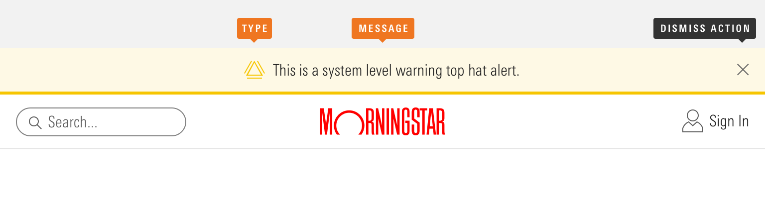
|
Name |
Required |
Description |
|---|---|---|
|
Message |
Yes |
Top hat content. |
|
Type |
Yes |
Affects the color and icon associated with the top hat. Choose from error, warning, or informational. |
|
Dismiss Action |
No |
Enables the user to remove the top hat from view. |
Variations
Error
Use for system-level errors that prohibit work, such as a critical browser incompatibility or an internet-connectivity issue.
<diV class="mds-top-hat mds-top-hat--error" role="alert">
    <div class="mds-top-hat__body">
        <svg class="mds-icon mds-top-hat__icon" aria-hidden="true">
            <use xlink:href="/icons/mds.svg#alert"> </use>
        </svg>
        <span class="mds-top-hat__message">No internet connection. Please check your local network.</span>
    </div>
</diV>- Don’t allow an error to be dismissed. Instead, help a user understand how to fix the problem and dismiss the error automatically once it’s resolved.
Warning
Use to provide a system-level warning, such as a permissions or data issue, planned outages, or a non-critical browser incompatibility.
<diV class="mds-top-hat mds-top-hat--warning mds-top-hat--dismissible" role="alert">
    <div class="mds-top-hat__body">
        <svg class="mds-icon mds-top-hat__icon" aria-hidden="true">
            <use xlink:href="/icons/mds.svg#alert"> </use>
        </svg>
        <span class="mds-top-hat__message">Service will be unavailable on Sunday, December 10th from 5–7 PM CST for scheduled maintenance.
            <a href='#'>More information</a>
        </span>
    </div>
    <button class="mds-button mds-button--small mds-button--icon-only mds-top-hat__dismiss-button" type="button">
        <svg class="mds-icon mds-button__icon mds-button__icon--right" aria-hidden="true">
            <use xlink:href="/icons/mds.svg#remove--s"> </use>
        </svg>
    </button>
</diV>- Optionally, omit the dismiss action, and persist the warning until it is resolved.
Informational
Use to provide system-level information, such as an announcement about a new feature.
<diV class="mds-top-hat mds-top-hat--dismissible" role="alert">
    <div class="mds-top-hat__body">
        <svg class="mds-icon mds-top-hat__icon" aria-hidden="true">
            <use xlink:href="/icons/mds.svg#info-circle"> </use>
        </svg>
        <span class="mds-top-hat__message">Welcome to the new Morningstar.com.
            <a href='#'>See What’s New</a>
        </span>
    </div>
    <button class="mds-button mds-button--small mds-button--icon-only mds-top-hat__dismiss-button" type="button">
        <svg class="mds-icon mds-button__icon mds-button__icon--right" aria-hidden="true">
            <use xlink:href="/icons/mds.svg#remove--s"> </use>
        </svg>
    </button>
</diV>
Sizing
Sizing affects text size, icon size, and internal padding. Use small top hats when vertical space is limited or information density is desired.
<diV class="mds-top-hat mds-top-hat--small mds-top-hat--dismissible" role="alert">
    <div class="mds-top-hat__body">
        <svg class="mds-icon mds-top-hat__icon" aria-hidden="true">
            <use xlink:href="/icons/mds.svg#info-circle--s"> </use>
        </svg>
        <span class="mds-top-hat__message">Top hat message, including
            <a href='#'>a link</a>.</span>
    </div>
    <button class="mds-button mds-button--small mds-button--icon-only mds-top-hat__dismiss-button" type="button">
        <svg class="mds-icon mds-button__icon mds-button__icon--right" aria-hidden="true">
            <use xlink:href="/icons/mds.svg#remove--s"> </use>
        </svg>
    </button>
</diV>
Guidelines
Use When
- Providing a user system-level errors, warnings and information.
Don’t Use When
- Providing a user with a message related to a page-level or out-of-view event, like completion of a report generation. Instead, use a Notification.
- Providing a user with a message related to a specific element on the current page, like a summary of errors in a form. Instead, use an Alert.
Visual Language
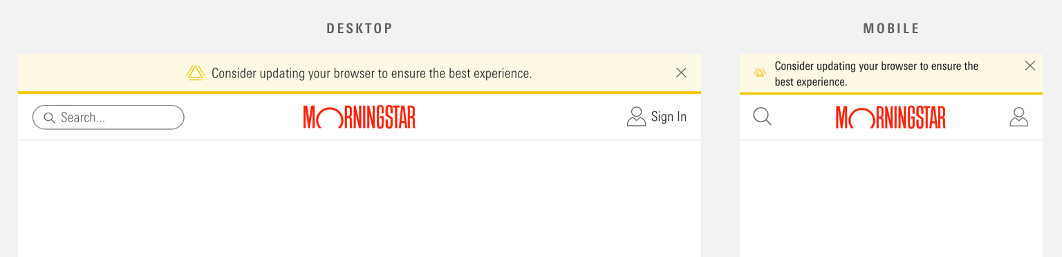 Top hat placement stays the same regardless of page width.
- Place above the page’s Masthead.
- Stretches horizontally to fill 100% of viewport width.
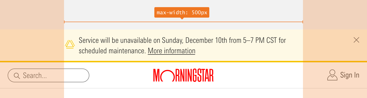 A maximum width for top hat message and icon is 500px. The top hat background spans the width of the page.
- To ensure content doesn’t exceed Typography line-length guidelines, top hats limit the maximum width of the message and icon to
500px.- The dismiss action can fall outside of this maximum content width.
Behaviors
- Never include a dismiss action in Errors. Instead, dismiss automatically once the error is resolved.
- When applicable, dismiss by clicking the Icon-Only Button with a close icon,
remove--s. - The top hat stays on the Masthead. If the Masthead sticks as a user scrolls down the page, then the top hat goes along for the ride.
- A page can only wear one kind of top hat at a time.
- When dismissed or resolved, top hats slide up and fade out, relinquishing their space.
Editorial
- Keep it brief—aim for fewer than 10 words.
- Use full sentences and punctuation. Use sentence case.
- Use figures instead of spelling out numbers.
- Top hats can include links. Don’t use “click here,” “tap this link,” etc., inside link copy. Link copy should be device agnostic—a user may not have a mouse with which to click or the capability to tap.
- Use “!” sparingly, as it conflicts with the informational icon, and is generally unnecessary.
Related UX Patterns
Accessibility
- Include the
role="alert"attribute on themds-top-hatelement.
Code Reference
CSS Class References
|
Class |
Applies to |
Outcome |
|---|---|---|
|
|
|
Reduces text size, icon size, and internal padding. |
|
|
|
Adds padding to the right side of the body of the top hat to accommodate the close icon. |
|
|
|
Dismisses the top hat by animating fade-out and slide-up effects. |
|
|
|
Applies the yellow color to the component’s background, bottom border, and icon. |
|
|
|
Applies the red color to the component’s background, bottom border, and icon. |