Navigation Containers
Navigation containers are full-width menus attached to a Masthead or Site Navigation.
<header class="mds-masthead" style="position:relative; ">
<div class="mds-masthead__inner">
<div class="mds-masthead__left">
<button class="mds-button mds-button--flat-no-background mds-button--icon-m" type="button" role="button" data-mds-navigation-container-target="masthead-navigation-container">
<svg class="mds-icon mds-button__icon mds-button__icon--left" aria-hidden="true">
<use xlink:href="/assets/icons/mds_icons.svg#menu-padless"> </use>
</svg>
<span class="mds-button__text"> Menu </span>
</button>
</div>
<div class="mds-masthead__logo-wrap"> <img class="mds-masthead__logo--wide" src="/assets/images/components/mastheads/logos/Mstar-Product-logo-50px.svg" alt="Product Name"> <img class="mds-masthead__logo" src="/assets/images/components/mastheads/logos/Mstar-logo-50px.svg" alt="Product Name"> </div>
<div class="mds-masthead__right"> </div>
</div>
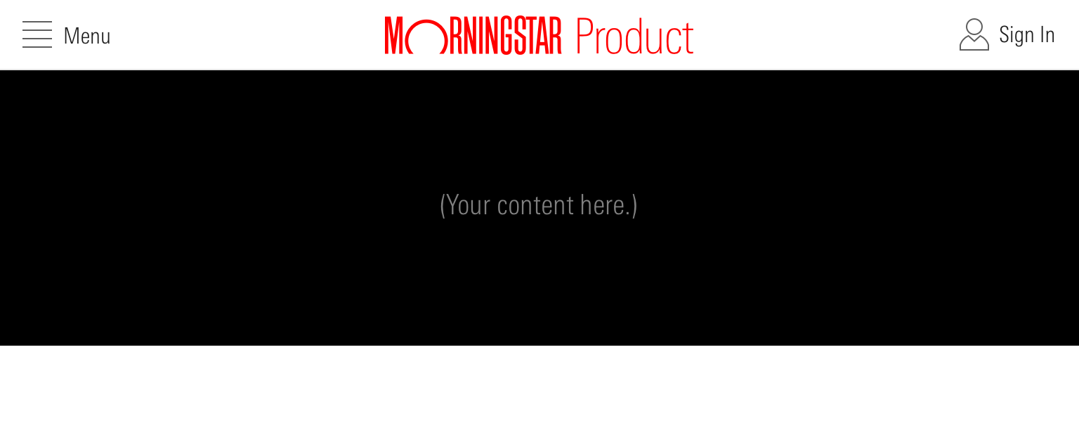
<div id="masthead-navigation-container" class="mds-navigation-container mds-container--black">
<p>(Your content here.)</p>
</div>
</header>- Height is dictated by the container’s content and padding.
- Trigger using a menu Button in the Masthead left controls.
- When the navigation container is open, consider updating the button’s
menu-padlessicon and “Menu” label to aremoveicon and “Close” label.
- When the navigation container is open, consider updating the button’s
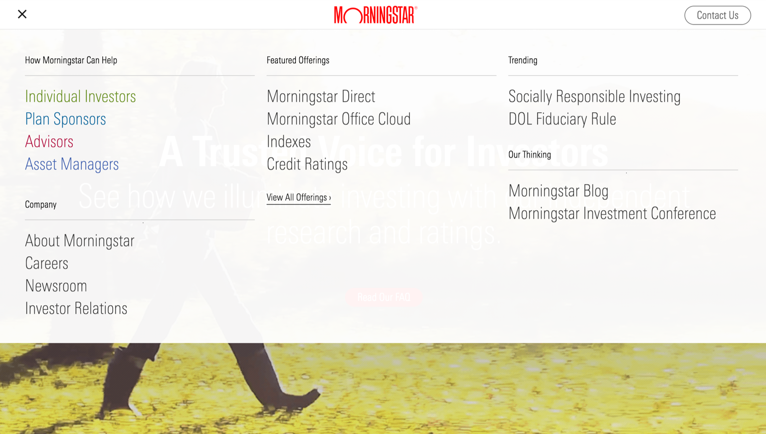 Navigation container attached to a Masthead on the Morningstar company site.
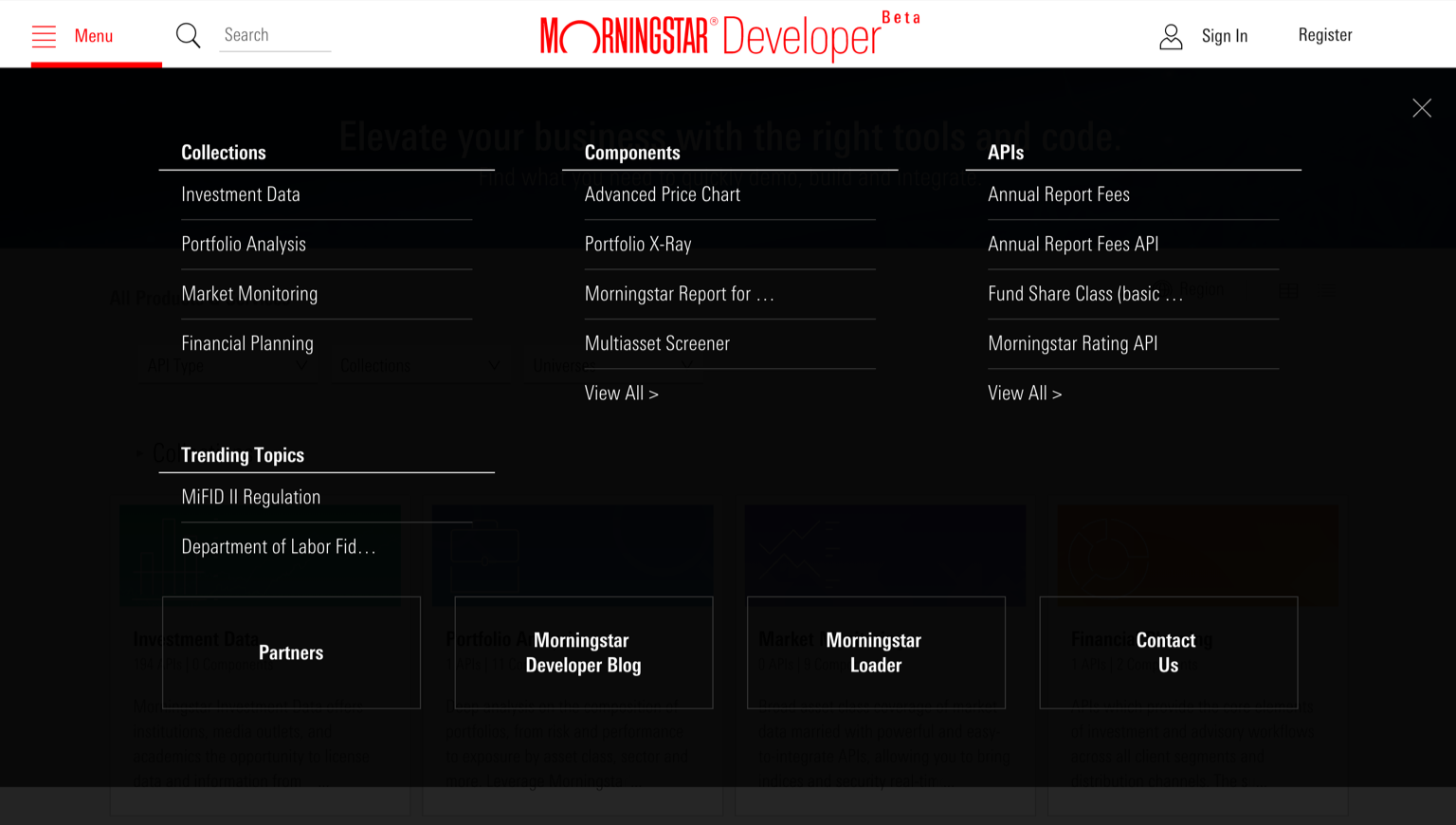 Navigation container attached to a Masthead on the Morningstar Developer site.
Responsiveness
The navigation container’s width scales responsively with the viewport.
<header class="mds-masthead" style="position:relative; ">
<div class="mds-masthead__inner">
<div class="mds-masthead__left">
<button class="mds-button mds-button--flat-no-background mds-button--icon-m" type="button" role="button" data-mds-navigation-container-target="masthead-navigation-container">
<svg class="mds-icon mds-button__icon mds-button__icon--left" aria-hidden="true">
<use xlink:href="/assets/icons/mds_icons.svg#menu-padless"> </use>
</svg>
<span class="mds-button__text"> Menu </span>
</button>
</div>
<div class="mds-masthead__logo-wrap"> <img class="mds-masthead__logo--wide" src="/assets/images/components/mastheads/logos/Mstar-Product-logo-50px.svg" alt="Product Name"> <img class="mds-masthead__logo" src="/assets/images/components/mastheads/logos/Mstar-logo-50px.svg" alt="Product Name"> </div>
<div class="mds-masthead__right"> </div>
</div>
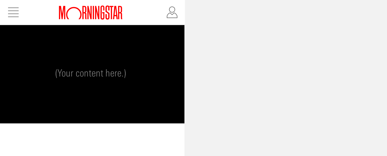
<div id="masthead-navigation-container" class="mds-navigation-container mds-container--black">
<p>(Your content here.)</p>
</div>
</header>- Height is dictated by the container’s content and padding.
- At small viewports, consider presenting content as a single, scrollable column within a full-height navigation container.
- The Morningstar company site organizes navigation links vertically in collapsible categories.
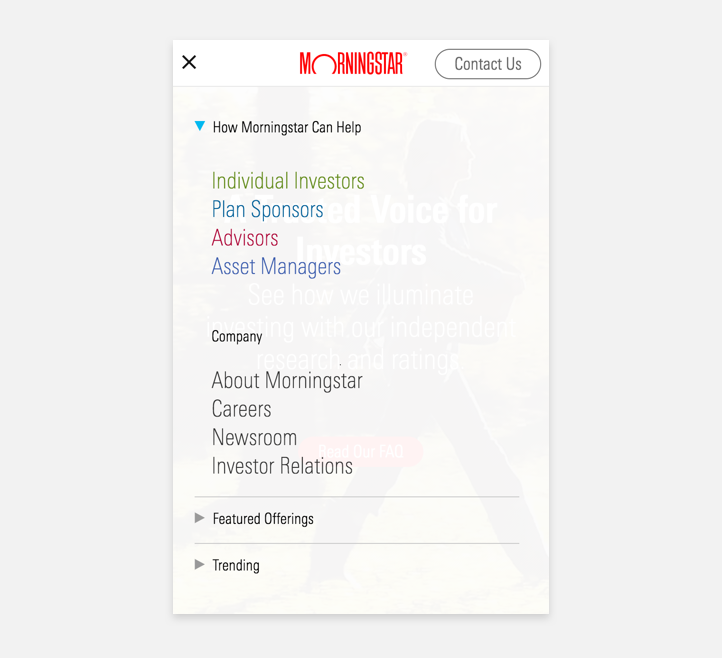 Navigation container on the Morningstar company site at a mobile breakpoint.
With Site Navigation
Use to attach a navigation container to Site Navigation, triggered by a navigation link.
<nav class="mds-site-navigation" style="position: relative;">
    <ul class="mds-site-navigation__list">
        <li class="mds-site-navigation__list-item">
            <div class="mds-site-navigation__list-item-inner">
                <a class="mds-button mds-button--large mds-button--flat-no-background mds-site-navigation__button" href="#" role="button"> Link 1 </a>
            </div>
        </li>
        <li class="mds-site-navigation__list-item">
            <div class="mds-site-navigation__list-item-inner">
                <button class="mds-button mds-button--large mds-button--flat-no-background mds-site-navigation__button" type="button" data-mds-navigation-container-target="site-nav-navigation-container-1" role="button">
                    <span class="mds-button__text"> Link 2 </span>
                    <svg class="mds-icon mds-button__icon mds-button__icon--right" aria-hidden="true">
                        <use xlink:href="../../assets/icons/mds_icons.svg#caret-down--s"> </use>
                    </svg>
                </button>
            </div>
        </li>
        <li class="mds-site-navigation__list-item">
            <div class="mds-site-navigation__list-item-inner">
                <a class="mds-button mds-button--large mds-button--flat-no-background mds-site-navigation__button" href="#" role="button"> Link 3 </a>
            </div>
        </li>
        <li class="mds-site-navigation__list-item">
            <div class="mds-site-navigation__list-item-inner">
                <a class="mds-button mds-button--large mds-button--flat-no-background mds-site-navigation__button" href="#" role="button"> Link 4 </a>
            </div>
        </li>
    </ul>
    <div id="site-nav-navigation-container-1" class="mds-navigation-container mds-container--black">
        <p>(Your content here.)</p>
    </div>
</nav>- Always include a right
caret-down--sicon in a navigation item triggering a navigation container. - Height is dictated by the container’s content and padding.
- Use to present a collection of links thematically represented by the invoking Site Navigation link.
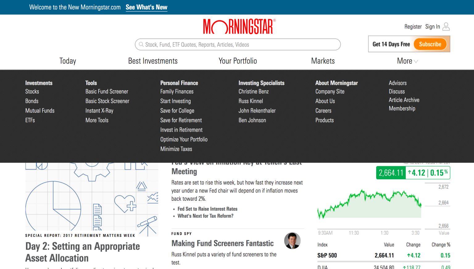 Navigation container attached to Site Navigation on Morningstar.com.
Responsiveness
At small viewports, the navigation container should hide, and links should move in to the Site Navigation hidden menu.
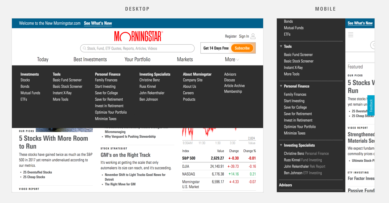 Navigation container content shifts in to the Site Navigation hidden menu component at the mobile breakpoint on Morningstar.com.
Examples
With Masthead
An example of a navigation container, using mds-container--dark, triggered from a menu Button in the Masthead left controls.
With Site Navigation
An example of a navigation container with, using mds-container--light, triggered from a link in a Site Navigation.
Guidelines
Use When
- Displaying categories of navigational links.
- Creating a mega menu.
Don’t Use When
- Offering only a few navigational links. Instead, consider using a standard Site Navigation dropdown menu.
Visual Language
- Set background color using any Primary or Secondary Background color.
- Use
$mds-space-inset-2-xto set an internal padding of16px.
Behaviors
- Consider whether to trigger on
clickorhoverof the invoking element. - Consider multiple methods to close a navigation container, including:
- Clicking or tapping outside of the navigation container
- Re-clicking or tapping the invoking element
- Pressing
escape
Editorial
- When drafting navigation terms, work with a Content Strategist or UX designer to determine the jobs to be done by the user. Navigation containers are often a kitchen sink of items that don’t have natural homes amid the larger navigation scheme. If there’s a better way to organize this content, please consider it.
- Include a label of “Menu” (when closed) and “Close” (when open) next to the icon when there is room.
Accessibility
- When applying an opacity to the navigation container’s background, ensure that primary and secondary text colors meet or exceed accessibility color contrast requirements.
Code Reference
CSS Class References
|
Class |
Applies to |
Outcome |
|---|---|---|
|
|
|
Makes the navigation container visible. |