Notifications
Notifications float in front of page content and provide information about page-level or out-of-view events. There are four types: error, warning, success, or informational.
(Note: Notifications have been enhanced. The legacy Notifications are still supported, but are deprecated and will be removed in v2.0.)
Notification
Anatomy

|
Name |
Required |
Description |
|---|---|---|
|
Message |
Yes |
Includes the core, most important notification content. |
|
Type |
Yes |
Affects the color and icon associated with the notification. Choose from error, warning, success or informational. |
|
Title |
— |
Briefly summarizes notification content. |
|
List |
— |
Helps structure content below a message element. |
|
Custom Action |
— |
Offers a follow-up action via secondary Button. |
|
Dismiss Action |
— |
Enables the user to remove the notification from view. |
Variations
Error
Use for page-level errors and malfunctions, such as a file import failure or insufficient permissions to view content, or for errors that occur off of the page, such as failure to generate a report that was being created in the background.
Import Failure
Import Failure
<div class="mds-notification-enhanced ">
    <div role="alertdialog" class="mds-notification-enhanced__item mds-notification-enhanced__item--error mds-notification-enhanced__item--dismissible">
        <div class="mds-notification-enhanced__status">
            <svg class="mds-icon mds-notification-enhanced__icon">
                <use xlink:href="/assets/icons/mds_icons.svg#alert">
                    <title>Error</title>
                </use>
            </svg>
        </div>
        <div class="mds-notification-enhanced__body">
            <div class="mds-notification-enhanced__content">
                <h4 class="mds-notification-enhanced__title">Import Failure</h4>
                <p class="mds-notification-enhanced__message">We‘re sorry, the file you are importing timed out. Please try your import again. If your import continues to time out, please email
                    <a href='#'>[email protected]</a>.</p>
                <button class="mds-button mds-button--small mds-button--secondary" type="button" role="button"> Try Again </button>
            </div>
        </div>
        <button class="mds-button mds-notification-enhanced__dismiss-button mds-button--small mds-button--icon-only" type="button" role="button">
            <svg class="mds-icon mds-button__icon mds-button__icon--right">
                <use xlink:href="/assets/icons/mds_icons.svg#remove--s">
                    <title>Close</title>
                </use>
            </svg>
        </button>
    </div>
</div>- Consider tinting to add extra emphasis or to increase contrast with page content. Apply tint by adding the
mds-notification-enhanced--tintedmodifier class. - Optionally, omit the dismiss action, and persist the error until it’s resolved.
Warning
Use for a message requiring attention but not resolution in order to continue, such as sharing a file with someone who does not have permissions to view it.
Permissions Issue
Permissions Issue
<div class="mds-notification-enhanced ">
    <div role="alert" class="mds-notification-enhanced__item mds-notification-enhanced__item--warning mds-notification-enhanced__item--dismissible">
        <div class="mds-notification-enhanced__status">
            <svg class="mds-icon mds-notification-enhanced__icon">
                <use xlink:href="/assets/icons/mds_icons.svg#alert">
                    <title>Warning</title>
                </use>
            </svg>
        </div>
        <div class="mds-notification-enhanced__body">
            <div class="mds-notification-enhanced__content">
                <h4 class="mds-notification-enhanced__title">Permissions Issue</h4>
                <p class="mds-notification-enhanced__message">The user you are attempting to share a file with doesn‘t have permission to view it. Please contact your customer service consultant if you believe this is a mistake.</p>
            </div>
        </div>
        <button class="mds-button mds-notification-enhanced__dismiss-button mds-button--small mds-button--icon-only" type="button" role="button">
            <svg class="mds-icon mds-button__icon mds-button__icon--right">
                <use xlink:href="/assets/icons/mds_icons.svg#remove--s">
                    <title>Close</title>
                </use>
            </svg>
        </button>
    </div>
</div>- Consider tinting to add extra emphasis or to increase contrast with page content. Apply tint by adding the
mds-notification-enhanced--tintedmodifier class. - Optionally, omit the dismiss action, and persist the warning until it’s resolved.
Success
Use for successes and completions, such as a report-generation or file upload completion, sent message confirmation, successfully adding investments to a list, or successfully saving updated settings.
<div class="mds-notification-enhanced ">
    <div role="alertdialog" class="mds-notification-enhanced__item mds-notification-enhanced__item--success mds-notification-enhanced__item--dismissible">
        <div class="mds-notification-enhanced__status">
            <svg class="mds-icon mds-notification-enhanced__icon">
                <use xlink:href="/assets/icons/mds_icons.svg#check">
                    <title>Success</title>
                </use>
            </svg>
        </div>
        <div class="mds-notification-enhanced__body">
            <div class="mds-notification-enhanced__content">
                <p class="mds-notification-enhanced__message">116 investments have been added to your list.</p>
                <button class="mds-button mds-button--small mds-button--secondary" type="button" role="button"> Undo </button>
            </div>
        </div>
        <button class="mds-button mds-notification-enhanced__dismiss-button mds-button--small mds-button--icon-only" type="button" role="button">
            <svg class="mds-icon mds-button__icon mds-button__icon--right">
                <use xlink:href="/assets/icons/mds_icons.svg#remove--s">
                    <title>Close</title>
                </use>
            </svg>
        </button>
    </div>
</div>- Consider tinting to add extra emphasis or to increase contrast with page content. Apply tint by adding the
mds-notification-enhanced--tintedmodifier class.
Informational
Use for immediate feedback that a background process is happening. For example, a report is being generated or a file is being imported.
Your Report Is Being Generated
<div class="mds-notification-enhanced ">
    <div role="alert" class="mds-notification-enhanced__item mds-notification-enhanced__item--dismissible">
        <div class="mds-notification-enhanced__status">
            <svg class="mds-icon mds-notification-enhanced__icon">
                <use xlink:href="/assets/icons/mds_icons.svg#info-circle">
                    <title>Information</title>
                </use>
            </svg>
        </div>
        <div class="mds-notification-enhanced__body">
            <div class="mds-notification-enhanced__content">
                <h4 class="mds-notification-enhanced__title">Your Report Is Being Generated</h4>
                <p class="mds-notification-enhanced__message">We‘ll let you know as soon as it‘s finished.</p>
            </div>
        </div>
        <button class="mds-button mds-notification-enhanced__dismiss-button mds-button--small mds-button--icon-only" type="button" role="button">
            <svg class="mds-icon mds-button__icon mds-button__icon--right">
                <use xlink:href="/assets/icons/mds_icons.svg#remove--s">
                    <title>Close</title>
                </use>
            </svg>
        </button>
    </div>
</div>
Sizing
Sizing affects text size, icon size, and internal padding. Use small notifications when information density is desired.
Notification Title
- List Item 1
- List Item 2
Notification Title
- List Item 1
- List Item 2
<div class="mds-notification-enhanced ">
    <div role="alertdialog" class="mds-notification-enhanced__item mds-notification-enhanced--small mds-notification-enhanced__item--dismissible">
        <div class="mds-notification-enhanced__status">
            <svg class="mds-icon mds-notification-enhanced__icon">
                <use xlink:href="/assets/icons/mds_icons.svg#info-circle--s">
                    <title>Information</title>
                </use>
            </svg>
        </div>
        <div class="mds-notification-enhanced__body">
            <div class="mds-notification-enhanced__content">
                <h4 class="mds-notification-enhanced__title">Notification Title</h4>
                <p class="mds-notification-enhanced__message">Notification message, including
                    <a href='#'>a link</a>.</p>
                <ul class="mds-notification-enhanced__list">
                    <li class="mds-notification-enhanced__list-item">List Item 1</li>
                    <li class="mds-notification-enhanced__list-item">List Item 2</li>
                </ul>
                <button class="mds-button mds-button--small mds-button--secondary" type="button" role="button"> Take Action </button>
            </div>
        </div>
        <button class="mds-button mds-notification-enhanced__dismiss-button mds-button--small mds-button--icon-only" type="button" role="button">
            <svg class="mds-icon mds-button__icon mds-button__icon--right">
                <use xlink:href="/assets/icons/mds_icons.svg#remove--s">
                    <title>Close</title>
                </use>
            </svg>
        </button>
    </div>
</div>
Widths
Available in two widths, 350px and 500px.
Medium Notification Title
Medium Notification Title
<div class="mds-notification-enhanced mds-notification-enhanced--width-350px">
    <div role="alert" class="mds-notification-enhanced__item mds-notification-enhanced__item--dismissible">
        <div class="mds-notification-enhanced__status">
            <svg class="mds-icon mds-notification-enhanced__icon">
                <use xlink:href="/assets/icons/mds_icons.svg#info-circle">
                    <title>Information</title>
                </use>
            </svg>
        </div>
        <div class="mds-notification-enhanced__body">
            <div class="mds-notification-enhanced__content">
                <h4 class="mds-notification-enhanced__title">Medium Notification Title</h4>
                <p class="mds-notification-enhanced__message">Medium notification using the 350px width modifier class.</p>
            </div>
        </div>
        <button class="mds-button mds-notification-enhanced__dismiss-button mds-button--small mds-button--icon-only" type="button" role="button">
            <svg class="mds-icon mds-button__icon mds-button__icon--right">
                <use xlink:href="/assets/icons/mds_icons.svg#remove--s">
                    <title>Close</title>
                </use>
            </svg>
        </button>
    </div>
</div>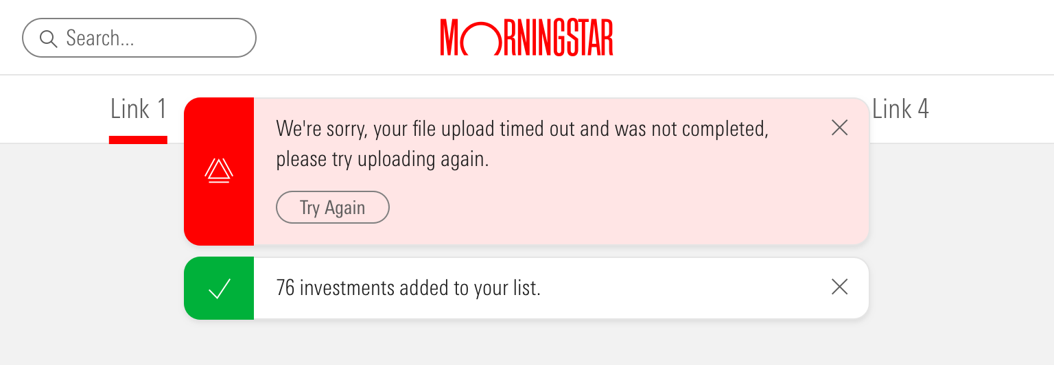
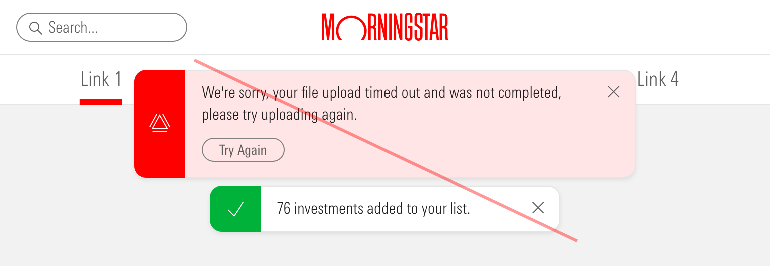
Guidelines
Use When
- Providing a user error, warning, success and informational messages about a page-level event or processes happening in the background
Don’t Use When
- Providing a user with a system-level message, like a network outage or browser incompatibility. Instead, use a Top Hat.
- Providing a user with a message related to a specific element on the current page, like a summary of errors in a form. Instead, use an Alert.
- Requiring a choice by the user, like “Save” or “Cancel”. Instead, use a Dialog.
- Needing to show paragraphs of text. Instead, use a Modal.
Visual Language
- Uses a drop shadow,
$mds-box-shadow-drop, to float in front of page content. - Apply tint to add extra emphasis or to increase contrast with page content.
Top Center Placement
Place notifications at the top center of the viewport to ensure maximum visibility. Consider using this placement for error, warning, and success notifications.
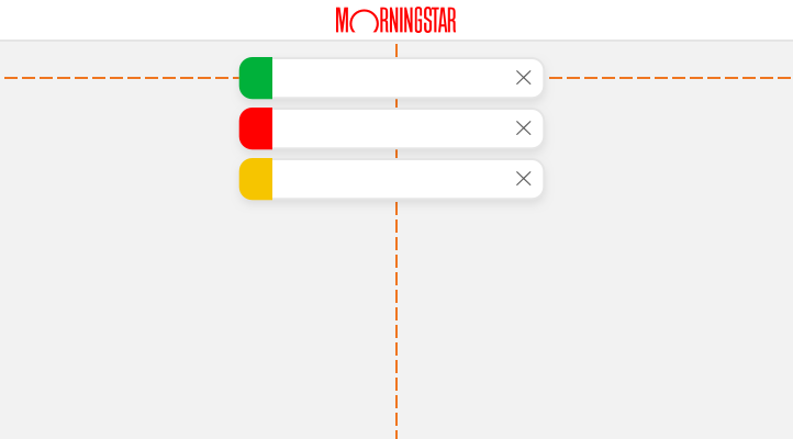
 Top center notification spacing.
- On pages with sticky Mastheads, always use the
mds-notification-enhanced--below-mastheadormds-notification-enhanced--below-masthead-tallmodifier class to position notifications below the Masthead, so as not to obscure branding.- Uses
$mds-space-2-x(16px) between the Masthead and notification.
- Uses
- When stacking, always place the most recent notification at the top and push other notifications down.
- Use
$mds-space-stack-1-x(8px) between notifications.
- Use
Bottom Right Placement
Place notifications at the bottom right corner of the viewport to avoid disrupting a user’s focus. Consider using this placement for informational notifications.
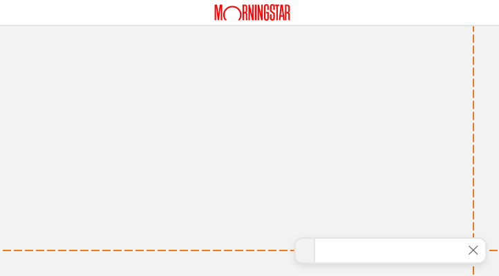
 Bottom right notification spacing.
- Always use
$mds-space-2-x(16px) to separate notifications from the edge of the browser window. - When stacking, always place the newest notification at the top.
- Use
$mds-space-stack-1-x(8px) between notifications.
- Use
Behaviors
- Notifications are fixed position and are unaffected by scrolling the underlying page.
- When dismissed or resolved, notifications fade out.
- Bottom right positioned notifications relinquish their space to any notifications stacked above.
Without Action
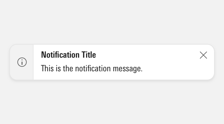
Contains a message only, may include a title and/or unordered list.
- Automatically dismisses after 5 seconds.
- Lengthen the timeout interval for longer notification messages.
- Dismiss at any time using the dismiss action.
With Action
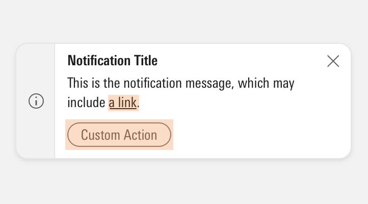
Contains message, and may include a link, custom action button, and/or unordered list. Use this behavior to ensure a user has an opportunity to act.
- Persists until a user clicks elsewhere on screen, after which the notification automatically dismisses after 5 seconds.
- Dismiss after a user clicks the custom action.
- Dismiss at any time using the dismiss action.
Editorial
- Keep titles three to five words if possible.
- For titles, use title case.
- Messages should tell the user what’s happening and whether they need to act to successfully keep moving through a task, if applicable. Warning alerts might tell a user what could happen if they don’t address what they’re being warned about.
- For messages, use full sentences with punctuation. Use sentence case.
- Unordered lists offer a structured format to present:
- Items needing resolution
- Guidelines to successful completion
- Ways to resolve problems
For additional editorial guidance, refer to Buttons and Errors documentation.
Accessibility
- Include the
role="alert"attribute on themds-notification-enhancedelement. - Include
role="alertdialog"when the notification also provides interactive controls, such as an “Undo” button, that provide feedback and dismiss the notification.
Code Reference
CSS Class References
|
Class |
Applies to |
Outcome |
|---|---|---|
|
|
|
Creates a wrapper to hold all notifications within a single location. |
|
|
|
Applies top padding to ensure that all notifications are below the Masthead. |
|
|
|
Applies top padding to ensure that notifications are below the Tall Masthead. |
|
|
|
Toggles visibility of a notification wrapper. |
|
|
|
Modifies the maximum width from 500px to 350px. |
|
|
|
Reduces text size, icon size, and internal padding. |
|
|
|
Positions the notification at the top center of the viewport. |
|
|
|
Positions the notification at the bottom right of the viewport. |
|
|
|
Adds padding to the right side of the body of the notification to accommodate the close icon. |
|
|
|
Dismisses the notification by animating a fade-out effect. |
|
|
|
Applies the green background color and the white icon color to the left side of the component. |
|
|
|
Applies the yellow background color and the black icon color to the left side of the component. |
|
|
|
Applies the red background color and the white icon color to the left side of the component. |
|
|
|
Applies the tinted background color to the body of the component. |

