Getting Started
The Morningstar Design System is a collection of brand, visual, UX, and technical standards built into a central library so that teams can quickly build high-quality, consistent experiences.
For Designers
The System is organized into three primary sections: Visual Language, Libraries, and About MDS. Exploring these sections will help familiarize you with Morningstar design principles and patterns, and show you which existing components you can use in your product.
Visual Language
Visual Language contains the critical building blocks of the look and feel of Morningstar products. Here, you will find details and guidelines on Color, Typography, Iconography, and Space, defined as reusable variables called Constants. Constants are threaded throughout MDS components to maintain a consistent visual style.
Libraries
Libraries are collections of pre-built components, concepts, and guidelines that solve common design challenges in Morningstar products. To ensure consistency and reusability, components are built using Constants defined in the Visual Language section, and are accompanied by detailed documentation and guidelines for use.
About MDS
About MDS includes a plethora of useful information on topics like Accessibility, Contributing to MDS, Reporting Bugs, and the MDS team’s Development Process.
Sketch Design Assets
This Sketch file contains visual language elements and pre-built designs for each MDS component, defined as reusable symbols.
Sketch Library Setup
The Craft Library has been retired because Sketch added a native library feature, allowing you to define any .sketch file as a library and access all of its symbols from any file. Library symbols aren't added to your file's symbols page, so your file stays lean and updates to the library file are automatically synced across all files.
By hosting an MDS Sketch Library in a OneDrive folder, we can share a single, centrally managed library of symbols that will automatically update as we add new components and styles to MDS.
Follow the below steps to set up the MDS Sketch Library on your machine:
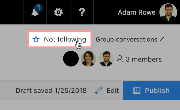
2. Go to the MDS Design Assets SharePoint page and click follow in the top right corner. This will add the group's shared files to your personal OneDrive page.
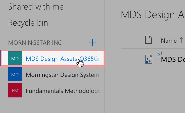
3. Head to your personal OneDrive page and click the MDS Design Assets group in the left navigation.
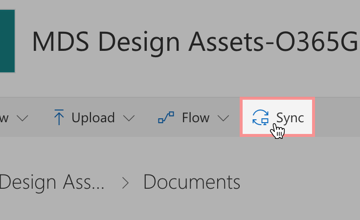
4. Click the Sync button in the toolbar to sync the MDS Design Assets folder to your machine. If you haven't installed OneDrive on your machine yet, you'll need to download the application through the App Store and follow the setup instructions.
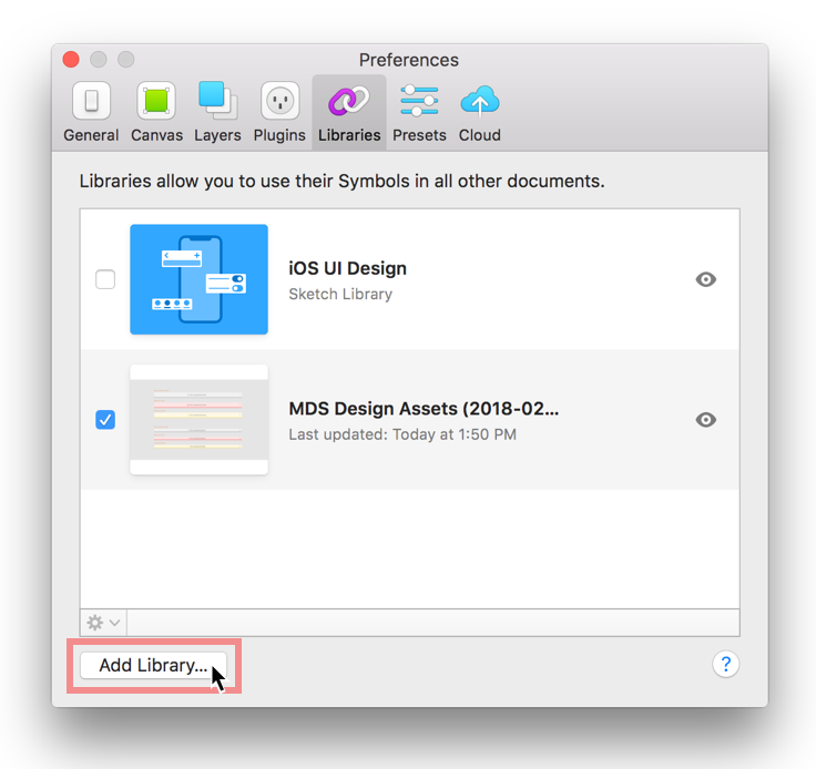
5. In Sketch, open the preferences pane and navigate to the Libraries tab. Click Add Library... in the lower left corner and select the MDS Sketch Library file in the local OneDrive folder you set up in the previous step.
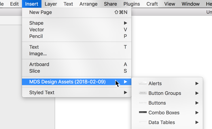
6. You're all set! You can now access all the MDS Sketch Library symbols in any file from the Insert menu.
Usage Tips
- If an update is available for the MDS Sketch Library, you will see a notification in the top right corner of Sketch. Click the message to review the updates and apply them to your files.
- If you double click a library symbol in your file you will see a dialog that says "This Symbol belongs to an external Library." Always choose
Unlink from Library. The shared MDS Sketch Library file is locked to prevent accidental editing. - To convert a library symbol into a folder with workable layers, right click the symbol and choose
Detach from Symbol.
Icon Creation Templates
Use these Adobe Illustrator templates when creating new icons for MDS.
For Engineers
Installing MDS
Teams adopting MDS should install MDS using Node package management (NPM).
Via NPM
Add an
.npmrcfile to your product (or update your existing one) with the following line:registry = https://msnexus.morningstar.com/content/repositories/npm-all/This will point your product to Morningstar‘s internal NPM server where the latest version of MDS can be retrieved.
Then, install MDS in your product via NPM:
npm install morningstar-design-system --save
Via Bower
MDS is also available via Bower.
-
Add a `.bowerrc` file to your product (or update your existing one) with the following:
{ "directory": "../../bower_components/", "analytics": false, "timeout": 120000, "registry": { "register": "https://msnexus.morningstar.com/repository/bower-internal/", "publish": "https://msnexus.morningstar.com/repository/bower-internal/", "search": [ "https://msnexus.morningstar.com/repository/bower-all/" ] } } -
Then, Install MDS in your product via Bower:
bower install morningstar-design-system --save
Manually
If you do not use NPM or Bower, install MDS by downloading a ZIP file containing the latest release. This process will be repeated each time you upgrade MDS.
Using CSS
The easiest way to include MDS styles is by adding a link to the precompiled mds_library.css file:
<link rel="stylesheet" href="/path/to/mds_library.css">
Font Paths
mds_library.css expects the MDS font files to be located at ../fonts. When adding mds_library.css to your product, place it in a directory at the same level as the directory containing the MDS fonts:
├── fonts
└── styles
    └── mds_library.css
If your build process automatically consumes the MDS fonts based on the relative path in mds_library.css, point your build process to:
node_modules/morningstar-design-system/dist/docs/assets/styles/mds_library.css
This path will work until a long-term solution is implemented in MDS v2.0.0.
Using SCSS
Use MDS source SCSS files to mix MDS constants and components with your own product‘s SCSS files.
Importing SCSS
Order is important when importing MDS component SCSS files. The System aims to limit dependencies between SCSS files, but some dependencies do exist.
@import 'node_modules/morningstar-design-system/src/styles/auto_generated/constants';

@import 'node_modules/morningstar-design-system/src/styles/shared/utils';
@import 'node_modules/morningstar-design-system/src/styles/shared/color';
@import 'node_modules/morningstar-design-system/src/styles/shared/fonts';
@import 'node_modules/morningstar-design-system/src/styles/shared/accessibility';
@import 'node_modules/morningstar-design-system/src/styles/shared/animation';
@import 'node_modules/morningstar-design-system/src/styles/shared/size';
@import 'node_modules/morningstar-design-system/src/styles/shared/bubbles';
@import 'node_modules/morningstar-design-system/src/styles/shared/typography';

@import 'node_modules/morningstar-design-system/src/styles/link/link';
@import 'node_modules/morningstar-design-system/src/styles/icon/icon';
@import 'node_modules/morningstar-design-system/src/styles/button/button';
@import 'node_modules/morningstar-design-system/src/styles/button_group/button_group';
@import 'node_modules/morningstar-design-system/src/styles/container/container';
@import 'node_modules/morningstar-design-system/src/styles/data_table/data_table';
@import 'node_modules/morningstar-design-system/src/styles/dialog/dialog';
@import 'node_modules/morningstar-design-system/src/styles/form/form';
@import 'node_modules/morningstar-design-system/src/styles/combo_box/combo_box';
@import 'node_modules/morningstar-design-system/src/styles/list_group/list_group';
@import 'node_modules/morningstar-design-system/src/styles/loader/loader';
@import 'node_modules/morningstar-design-system/src/styles/modal/modal';
@import 'node_modules/morningstar-design-system/src/styles/menu/menu';
@import 'node_modules/morningstar-design-system/src/styles/notification/notification_enhanced'; // @import 'node_modules/morningstar-design-system/src/styles/notification/notification'; // Use if you need to support older notification styles (pre 1.9.0)
@import 'node_modules/morningstar-design-system/src/styles/pagination/pagination';
@import 'node_modules/morningstar-design-system/src/styles/popover/popover';
@import 'node_modules/morningstar-design-system/src/styles/range_slider/range_slider';
@import 'node_modules/morningstar-design-system/src/styles/search_field/search_field';
@import 'node_modules/morningstar-design-system/src/styles/switch/switch';
@import 'node_modules/morningstar-design-system/src/styles/tooltip/tooltip';

@import 'node_modules/morningstar-design-system/src/styles/mds_library_print';
Overriding MDS Styles with SCSS
By controlling which SCSS files you @import into your product, you can control when and how you override the styles MDS provides. The MDS Core team expects products to override and modify imported SCSS files on an as-needed basis.
Font Asset Path
Override the default font asset path, ../fonts/, as needed by setting the $mds-font-asset-path variable before importing MDS fonts.
$mds-font-asset-path: 'my/path/to/fonts/';
@import 'node_modules/morningstar-design-system/src/styles/shared/fonts';
Applying Visual Style
Constants
MDS threads global variables, or Constants, throughout the component library for visual consistency. Use MDS constants as SCSS variables to apply the MDS Visual Language to your product‘s components.
- SCSS variables
node_modules/morningstar-design-system/src/styles/auto_generated/constants.scss
Icons
MDS uses an SVG icon sprite that contains all MDS Icons. The icon sprite is located at:
node_modules/morningstar-design-system/mds_icons.svg
Place the sprite in the webroot of your product to use an absolute path reference.
<svg class="mds-icon" aria-hidden="true">
    <use xlink:href="/your/path/to/mds_icons.svg#heart"> </use>
</svg>
The icon sprite uses a hash syntax to retrieve the correct icon (in the example above, the #heart icon). Refer to the Icons documentation for all of the icon sprite names.
IE 11 Support
The MDS icons depend on the svg4everybody polyfill for IE 11 compatibility.
Using Components
Details for implementing the HTML and CSS for components can be found on the individual component pages.
General Rules for Implementation
- When composing component markup in your product, structure it exactly like the component documentation examples.
- Any DOM structure that doesn’t match component examples may result in broken layouts and user interface bugs.
- MDS uses the BEM CSS methodology:
- If you choose to extend MDS components in your product, consider using the same naming convention.
- If your application framework has a specific convention for using JavaScript and/or creating and destroying elements within the DOM, use that convention.
External Dependencies
Stylesheets
The Morningstar Design System has no external stylesheet dependencies. All the styles required to render UI Components are contained in mds.css.
SCSS Compiler
A SCSS compiler is required when using the style constants available in the System. See the Using SCSS section for information about using .scss files in your project.
JavaScript
JavaScript provided as part of the Morningstar Design System is intended for demonstration purposes only. The Morningstar Design System team cannot provide technical support for issues arising from the use of mds.js.
All component markup and styles provided are intended for production use, and the MDS core team expects that any JavaScript necessary to create or manipulate components will be provided by product teams.
Three System UI Components require third-party JavaScript libraries in order to function:
- Icons: The SVG icons in the System depend on the svg4everybody polyfill for ie11 compatibility, version
^2.1.4. - Range Slider: The Range Slider UI Component depends on the the noUiSlider JavaScript library, version
^10.1.0 - Combo Box: The Combo Box UI Component depends on the Select2 JavaScript library, version
^4.0.3.

