Theming MDS
The Morningstar Design System (MDS) allows you to modify visual style and components to meet your product needs.
Create a new MDS theme from our theme starter kit.
About Themes
A new theme extends and overrides MDS. Every new theme includes MDS as a versioned dependency via Node Package Manager (npm). Themes can be included in a project as a dependency, rather than the project integrating MDS directly.
Integrating MDS Directly
- Integrating MDS directly into your product is covered in the Getting Started For Engineers documentation.
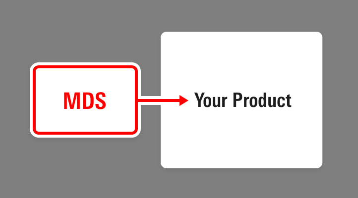 Integrating MDS directly into your Product
Using A Theme
- This doc details how to integrate MDS into a theme, which is then integrated into your product.
 Integrating MDS by using a theme
A new theme is established primarily through two types of overrides and extensions: constants and component definitions.
- Constants enable widespread revisions to color, typography, space, borders, shadows, and other properties of visual style.
- Components can also be extended and overridden within a theme. For example, MDS may have a button component with five variations, and a theme could remove two variations, alter a variation, and add three more custom variations.
Why Themes?
While the Morningstar visual language pervades most Morningstar experiences, some products diverge from those conventions, including HelloWallet and white-labelled Enterprise Components implementations.
The MDS Theme Starter Kit streamlines the process of altering the MDS visual language.
Setting up a Theme
Step 1: Clone the starter kit.
Clone the mds-theme-starter-kit repo from https://msstash.morningstar.com/projects/TECHSTD/repos/mds-theme-starter-kit/browse
git clone https://msstash.morningstar.com/projects/TECHSTD/repos/mds-theme-starter-kit/browse hello-wallet-design-systemRetaining the reference to the mds-theme-starter-kit git remote is not necessary. mds-theme-starter-kit is intended as a starting point, not a repo that will be reintegrated into your theme in the future.
Step 2: Build and run the theme locally.
Navigate to the root directory where the theme starter kit was cloned.
cd /Sites/hello-wallet-design-systemInstall dependencies.
npm installRun the default task to build the system and launch the local server.
gulp
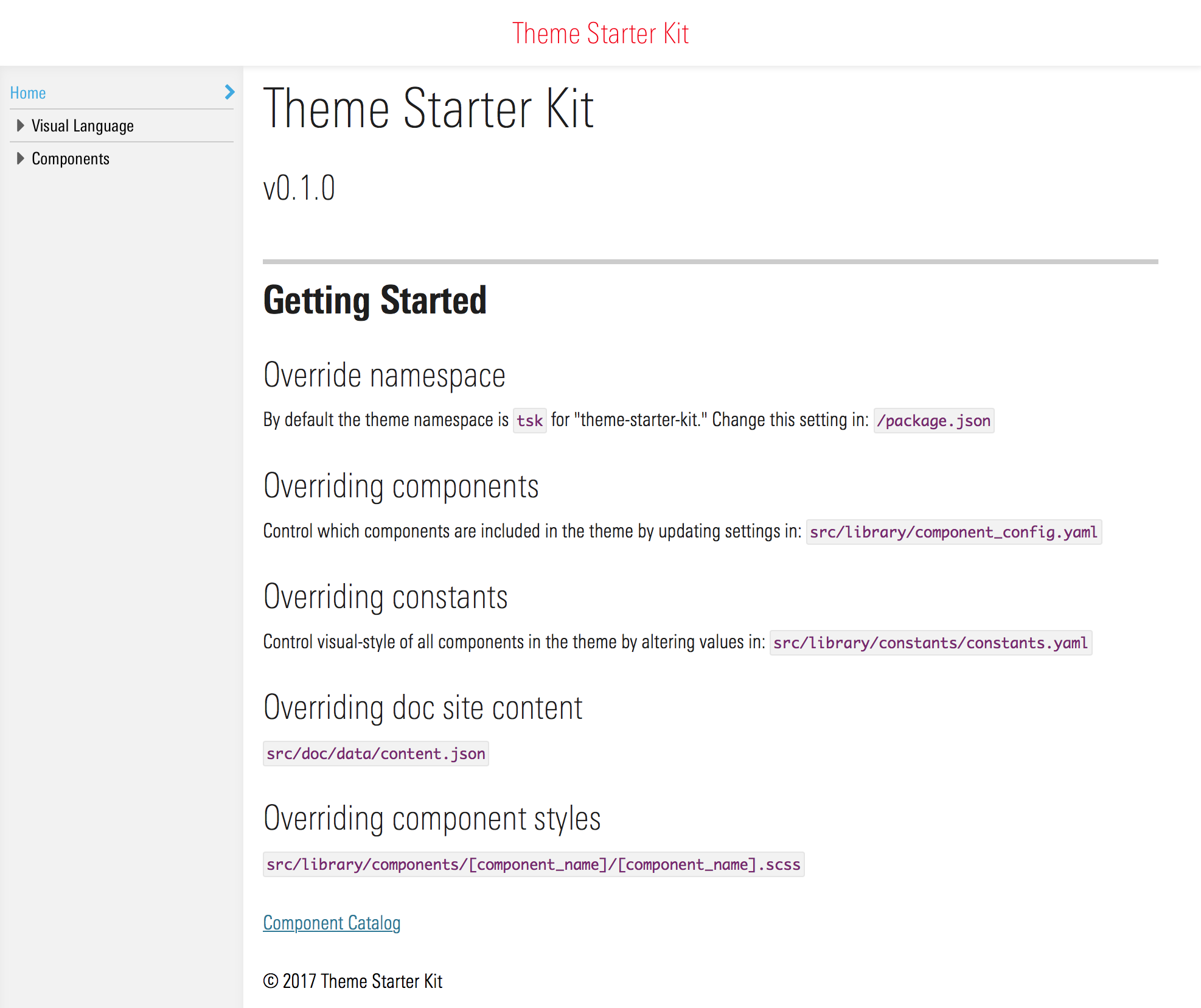
You should see the theme starter kit homepage:
Theme Customization
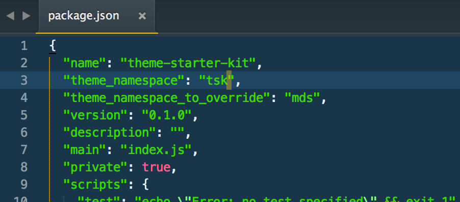
Step 1: Set the namespace.
By default, the starter kit namespaces all CSS class selectors and all SCSS variables with a tsk namespace. tsk stands for ”Theme Starter Kit“.
To override the theme namespace, change the value of the theme_namespace key in /package.json
Stop gulp and restart gulp.
If you receive a scss lint warning in the console:
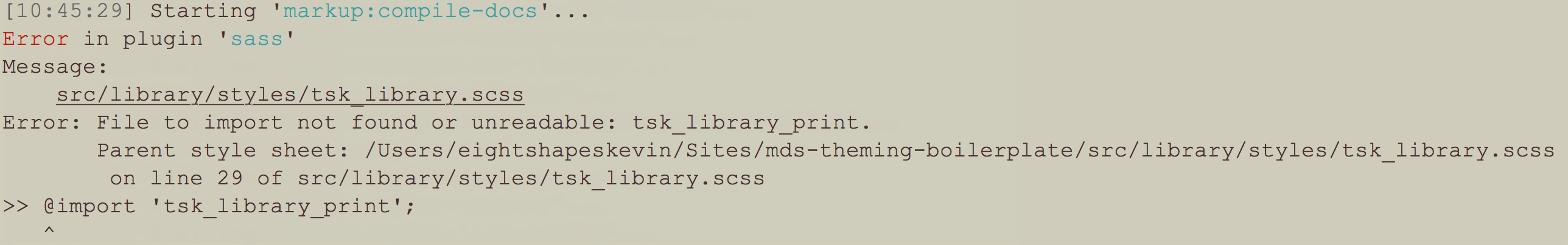
This can be resolved by deleting src/library/styles/tsk_library.scss. This is a compiled file created if you build the starter kit theme before changing the namespace. You should see a new file corresponding to your new namespace.)
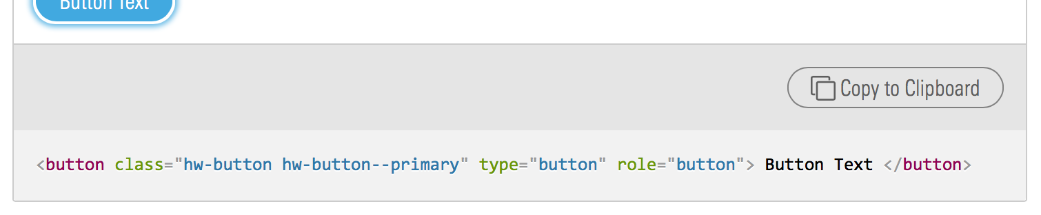
With gulp running, confirm that the namespace has successfully changed by navigating to the buttons doc page: http://localhost:3000/components/buttons.html. The code snippets on the doc page should render with the new namespace. In this case, the namespace has been changed to hw:
Step 2: Exclude unneeded components.
All MDS components are included in the starter kit. To explicitly exclude a component’s styles from a new theme, change the corresponding component flag to false within src/library/component_config.yaml
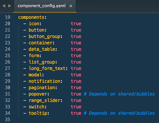
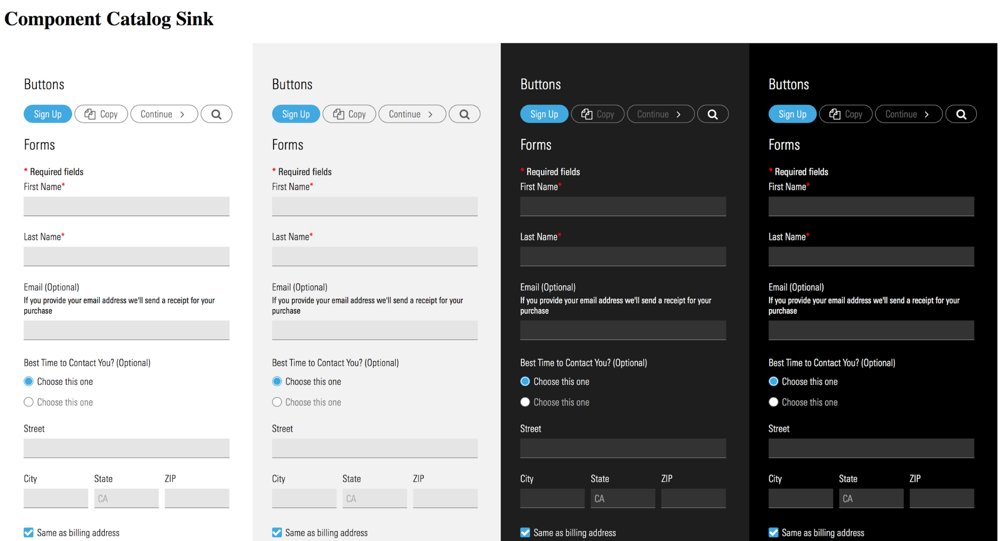
Changing a component flag to false within component_config.yaml will also exclude that component from the auto-generated component catalog visible at:
http://localhost:3000/sink-pages/components/index.html
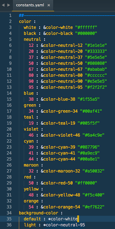
Step 3: Customize constants.
The visual style of the new theme is controlled by: src/library/constants/constants.yaml. To alter the theme’s visual style, add new key/value pairs or change the value of existing keys within this file. Removing keys from this file is not recommended and may result in scss compilation errors.
Step 4: Customize component style.
Use gulp override:component task to automatically generate scss files for your new theme. These files will override the default scss files within the MDS base.
Example: Changing Button Styles
Run gulp override:component
Answer the prompts in the command line:
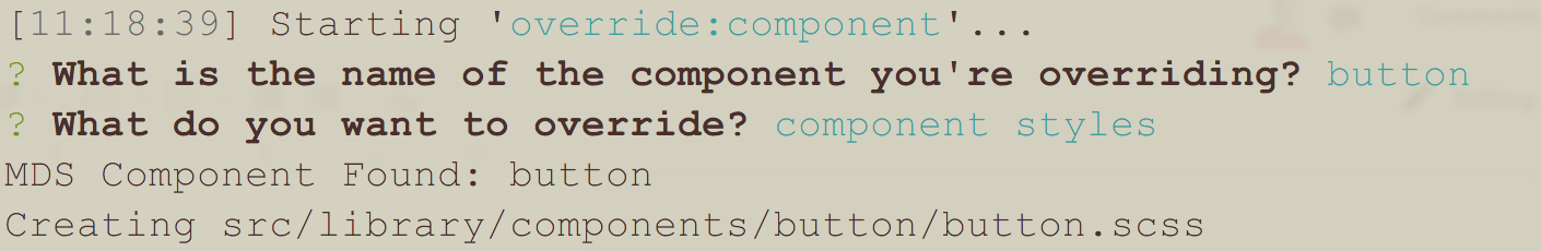
Make changes in the generated files to override the MDS base styles.
Step 5: Customize component markup.
Use gulp override:component task to automatically generate nunjucks (njk) files for your theme. These files will override the default njk files within the MDS base.
Example: Changing Button Markup
Run gulp override:component
Answer the prompts in the command line:
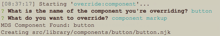
Make changes in the generated files to override the MDS base markup.
Step 6: Customize icons.
Add, remove, or update icon svgs in src/library/icons to change the theme’s icon set. The starter kit’’s icon doc page and the compiled theme_icon.svg will automatically update when svgs in src/library/icons are changed.
Step 7: Customize documentation.
The starter kit includes some basic doc site templates. Some of the content in these templates is controlled in /src/doc/data/content.json .
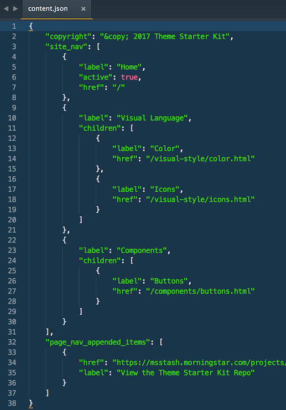
copyrightcontrols the text in the footer of the doc templates.site_navcontrols the global nav in the left side of the doc templates.page_nav_utility_linkscontrols the links at the bottom of the local nav in the doc templates:
Step 8: Creating a release.
The starter kit includes a gulp task to generate versioned docs and compiled assets for the new theme. Theme developers may want to release versions independent of the MDS release number. For example, a Hello Wallet theme may be on version 0.1.0 with a dependency on MDS version 1.0.0.
To generate a release, run the gulp release task from the root directory of the theme. This will do two things:
- Generate a version of your new theme’s doc site at:
/_site/v/0.1.0- where0.1.0is the current theme version defined in/package.json/_siteand all child directories are not in source control.
- Generate the latest version of compiled assets at:
/dist- The assets created in
/distwill be version stamped with the new theme name and the current version /distis in source control and is the directory intended for use by products that want to consume the new theme via NPM
For themes that chose to host their documentation, the gulp release task can be run by a build and deploy process to generate versioned docs with each release.
Implementing an MDS theme
The process and options available to integrate an MDS theme into another product are identical to the process and options available to integrate MDS directly. Refer to the MDS implementation Getting Started Guide for details.
Syncing With Later MDS Releases
The starter kit defines its MDS dependency in /package.json. To update to the latest version of MDS, change the hash on the end of the dependency URL to point to the version of MDS needed in your theme:

For example, to update from MDS 0.3.0 to MDS 1.0.0, change the hash to:
git+https://msstash.morningstar.com/scm/techstd/mds.git#v1.0.0After updating the hash, run:
npm update morningstar-design-systemto update your node_modules version of MDS.
Diffing constants and component_config
MDS’ constants.yaml and component_config.yaml files may contain changes when you upgrade to a new release. These changes are not automatically pulled into your theme, you will need to manually diff MDS’ version of both of these files against your theme’s versions to reconcile any new changes.
SCSS compilation errors may occur until the theme constants.yaml and component_config.yaml are reconciled with the latest MDS versions.