Charts Visual Language
Charts visualize complex data sets to aid comprehension and synthesize information.
Color
Color assigns meaning and order to create clarity and consistency across widely-used data visualizations.
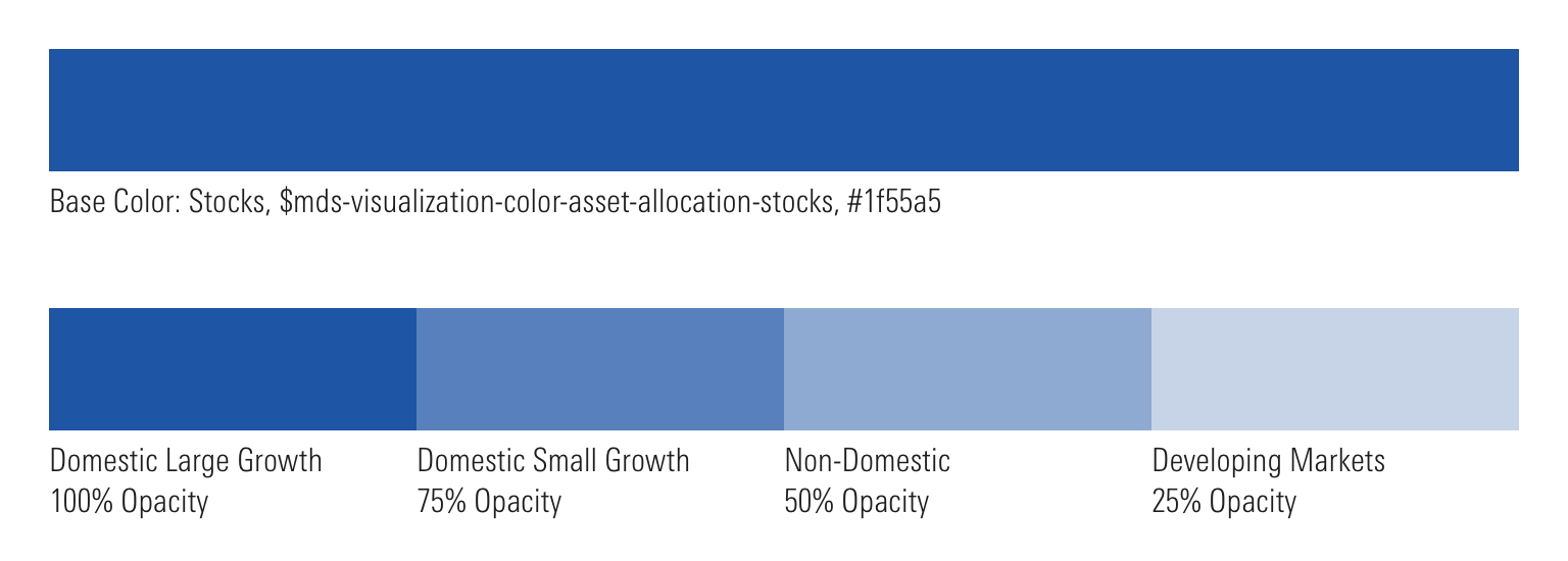
Asset Allocation
Use to tie data to asset classes.
-
Stocks$mds-visualization-color-asset-allocation-stocks#1f55a5
-
Bonds$mds-visualization-color-asset-allocation-bonds#ef7622
-
Real Estate$mds-visualization-color-asset-allocation-real-estate#a50032
-
Cash$mds-visualization-color-asset-allocation-cash#518428
-
Other$mds-visualization-color-asset-allocation-other#f5c400
-
Not Classified$mds-visualization-color-asset-allocation-not-classified#e5e5e5
- If a product does not use these exact terms when breaking down asset classes, use the color associated with the closest asset type. For example, Alternatives would use the color ascribed to Real Estate.
- When there are multiple, related asset classes which fall under the same broad asset class umbrella, use tints of the same asset allocation color to communicate that relationship.
- Create these tint groups with careful consideration to maximize the contrast between the tints in order to aid in legibility and accessibility, i.e., if you need four total colors, using intervals of 25% will allow you the greatest difference between tints, while still providing enough values.
- Never apply these colors to type, as they don’t meet Accessibility guidelines.
Correlation
Use to show positive or negative correlation within a Correlation Matrix.
-
Positive$mds-visualization-color-correlation-positive#1f55a5
-
Negative$mds-visualization-color-correlation-negative#ef7622
Super Sectors
Use to represent data relating to Morningstar Super Sectors.
-
Cyclical$mds-visualization-color-sector-cyclical#ef7622
-
Sensitive$mds-visualization-color-sector-sensitive#1f55a5
-
Defensive$mds-visualization-color-sector-defensive#518428
- Sectors that underlie a larger Super Sector should inherit the color of the Super Sector. For example, Basic Materials would use the color ascribed to Cyclical.
- Never apply these colors to type, as they don’t meet Accessibility guidelines.
Sustainability
Use to represent data related to the Morningstar Sustainability Rating.
-
Sustainability$mds-visualization-color-sustainability#1f55a5
Valuation
Use to represent under, fair, or over valuation.
-
Under$mds-visualization-color-valuation-under#00a8e1
-
Fair$mds-visualization-color-valuation-fair#e5efef
-
Over$mds-visualization-color-valuation-over#ef7622
- Never apply these colors to type, as they don’t meet Accessibility guidelines.
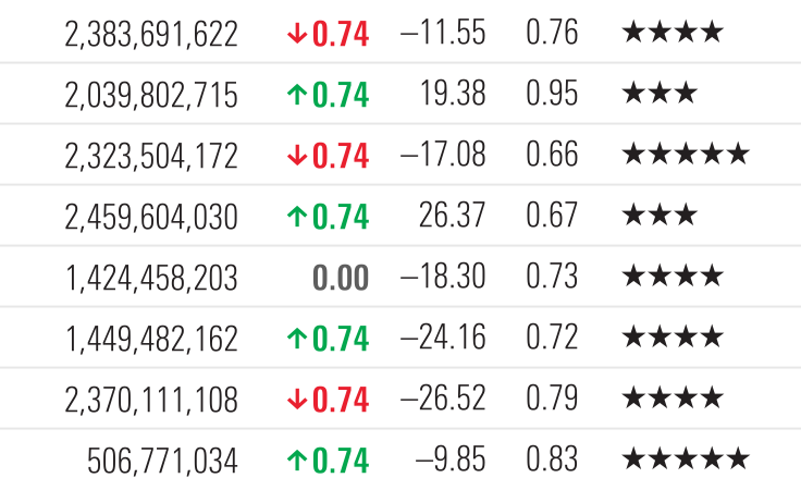
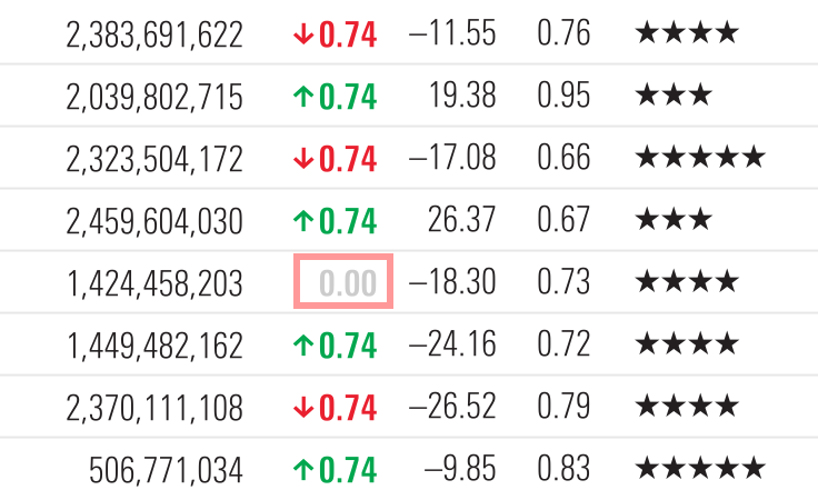
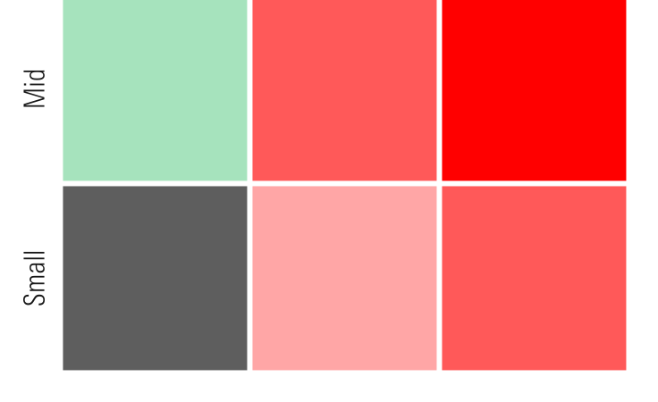
Performance
Use to show positive, neutral, or negative performance in both text and visualizations. The positive and negative colors are under evaluation for use in text, as they don’t meet Accessibility guidelines.
-
Positive$mds-visualization-color-performance-positive#00af41DNP
-
Neutral, Text$mds-visualization-color-performance-neutral-text#5e5e5eAA
-
Neutral, Chart$mds-visualization-color-performance-neutral-chart#ccccccDNP
-
Negative$mds-visualization-color-performance-negative#ff0000DNP
- Apply
$mds-font-weight-boldas the font weight to typography using performance colors.
Color Order Inside Charts
Use when there are no specific color meanings associated with a visualization.
-
1$mds-chart-color-1#1f55a5
-
2$mds-chart-color-2#a50032
-
3$mds-chart-color-3#f5c400
-
4$mds-chart-color-4#518428
-
5$mds-chart-color-5#00a8e1
-
6$mds-chart-color-6#6a4c9e
-
7$mds-chart-color-7#ef7622
-
8$mds-chart-color-8#005f5f
-
9$mds-chart-color-9#00af41
-
10$mds-chart-color-10#e60546
-
11$mds-chart-color-11#7d256f
-
12$mds-chart-color-12#c19c31
-
13$mds-chart-color-13#00beaf
-
14$mds-chart-color-14#ff3c00
-
15$mds-chart-color-15#89bd40
- Use colors in order, starting with
$mds-chart-color-1and ascending in order to$mds-chart-color-15. If there are more than 15 items, begin again with$mds-chart-color-1. - This color order is intended to be a default for when there are not specific color meanings assigned to the data. Designers may deviate from the default when color can be used to communicate meaning.
Anatomy
Charts are made up of four distinct structural elements: Y-axis, X-axis, Chart Area, and Legend. These modular pieces can be reconfigured based on the data being visualized. Charts should feature these elements in consistent, predictable places to brand them as Morningstar charts and ease interpretation. Reconfigurations of structural elements should be done to communicate meaning, i.e., placing a Y-Axis on the right for a Goal Based Chart, rather than for purely aesthetic reasons.
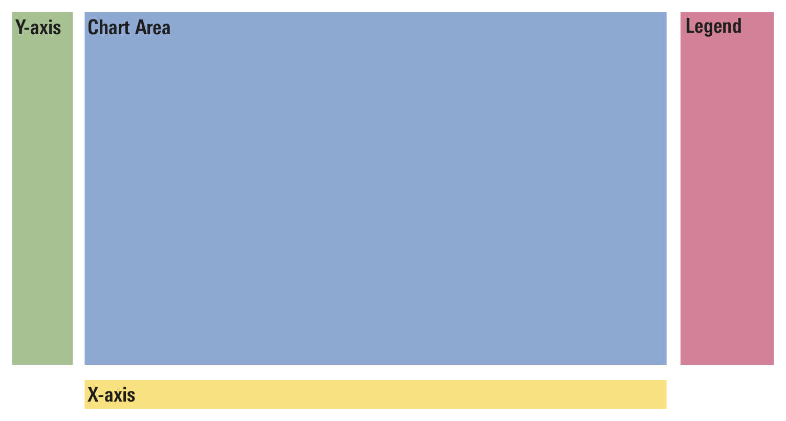 Default configuration of the four structural chart elements
Examples
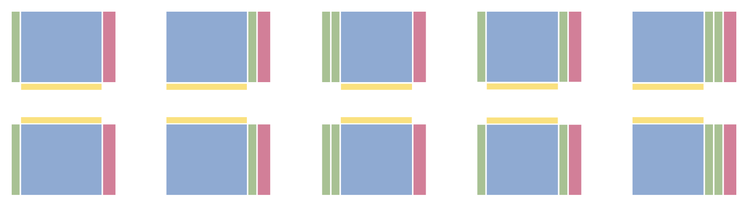 All of these configurations are technically possible. However, carefully consider whether or not deviation is necessary.
Editorial
- Aim for evenly spaced, rounded units (i.e., 10, 20, 30—not 6.5, 8.7, 10.3, etc.)
- Limit significant digits and use one or two decimal places in most instances.
- Label the starting point of axes.
- Use logarithmic, rather than linear, scale for price/growth charts.
- When appropriate, highlight relevant data and/or labels directly on charts to add richness, density, and precision.
- Use consistent formatting for dates and time periods.