Notifications (Deprecated)
Notifications highlight that an event has occurred.
This component is deprecated and will be removed in v2.0.
Please use the enhanced Notifications component for all new development.
Variations
Default
Use when relaying non-critical information pertaining to a user's action.
<div role="alert" class="mds-notification mds-notification--with-close-button mds-container--white ">
    <div class="mds-notification__message">Your report is being generated.</div>
    <button class="mds-button mds-notification__close-button mds-button--small mds-button--icon-only" type="button" role="button">
        <svg class="mds-icon mds-button__icon mds-button__icon--right">
            <use xlink:href="/assets/icons/mds_icons.svg#remove--s">
                <title>Close</title>
            </use>
        </svg>
    </button>
</div>- Automatically dismisses after 5 seconds.
- Lengthen the timeout interval for longer notification messages.
With Action
Use when the notification contains an “Undo” option, or a follow-up action via a button or link.
<div role="alertdialog" class="mds-notification mds-notification--with-close-button mds-container--white ">
    <div class="mds-notification__message">1,134 items have been deleted.
        <button class="mds-button mds-button--small" type="button" role="button"> Undo </button>
    </div>
    <button class="mds-button mds-notification__close-button mds-button--small mds-button--icon-only" type="button" role="button">
        <svg class="mds-icon mds-button__icon mds-button__icon--right">
            <use xlink:href="/assets/icons/mds_icons.svg#remove--s">
                <title>Close</title>
            </use>
        </svg>
    </button>
</div>- Persists until a user clicks elsewhere on screen, after which the notification automatically dismisses after 5 seconds.
- Dismiss after a user clicks the action, i.e., “Undo”.
Guidelines
Use When
- Displaying a success, error, or warning message.
- Notifying the user of a process happening in the background.
- Relaying information to a user without interrupting their current task.
Don't Use When
- Requiring a choice by the user, like “Save” or “Cancel”. Instead, use a Dialog.
- Needing to show paragraphs of text. Instead, use a Modal.
Behaviors
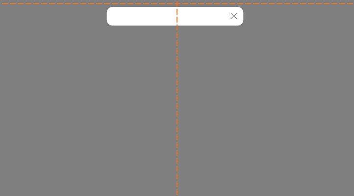
- Display at the top center edge of the browser. To display in other locations, coordinate with a System designer about options.
 Appropriate placement of a notification.
- Dismiss notifications at any time by clicking the close icon,
remove--s.
Editorial
- Use full sentences and punctuation.
- Keep it brief. Maybe a sentence, no more than two. Should be able to be read in 5 seconds.
- Use “!” sparingly when congratulating a user. Overuse is cheeky.
Accessibility
- Include the
role="alert"attribute on themds-notificationelement. - Include
role="alertdialog"when the notification also provides interactive controls, such as an “Undo” button, that provide feedback and dismiss the notification. - Dismiss notification at any time by clicking the close icon,
remove--s.
Code Reference
CSS Class References
|
Class |
Applies to |
Outcome |
|---|---|---|
|
|
|
Indicates the notification component to layout the block with close button, so that the notification text will not overlap the close button at the right. |
|
|
|
Indicates the notification is a popup. |
|
|
|
Hides the notification popup, will animate fade-in effect of notification upon removal of this class. |

