Button Groups
Button Groups join two or more buttons into a unified control, formerly called a segmented control.
Variations
Default
Use to create a mutually exclusive toggle. Buttons within the group follow the same visual and behavioral conventions as the secondary Button.
Default
Hover
Active
Focus
Press Ctrl + C to copy
<div class="mds-button-group">
    <button class="mds-button mds-button--secondary" type="button" role="button"> Cyclical </button>
    <button class="mds-button mds-button--secondary" type="button" role="button"> Defensive </button>
    <button class="mds-button mds-button--secondary" type="button" role="button"> Sensitive </button>
</div>
Disabled
Press Ctrl + C to copy
<div class="mds-button-group">
    <button class="mds-button mds-button--secondary" type="button" role="button"> Cyclical </button>
    <button class="mds-button mds-button--secondary" type="button" role="button"> Defensive </button>
    <button class="mds-button mds-button--secondary" type="button" disabled role="button"> Sensitive </button>
</div>
Full Width
Use when you want the button group to span the full width of its container.
Full Width
Press Ctrl + C to copy
<div class="mds-button-group mds-button-group--justify">
    <label class="mds-button__input-outer-wrapper" for="cyclical--72900">
        <input id="cyclical--72900" class="mds-button__input" type="radio" name="radio-colors-secondary" checked>
        <span for="cyclical--72900" class="mds-button mds-button--secondary" role="button"> Cyclical </span>
    </label>
    <label class="mds-button__input-outer-wrapper" for="defensive--9294">
        <input id="defensive--9294" class="mds-button__input" type="radio" name="radio-colors-secondary">
        <span for="defensive--9294" class="mds-button mds-button--secondary" role="button"> Defensive </span>
    </label>
    <label class="mds-button__input-outer-wrapper" for="sensitive--93354">
        <input id="sensitive--93354" class="mds-button__input" type="radio" name="radio-colors-secondary">
        <span for="sensitive--93354" class="mds-button mds-button--secondary" role="button"> Sensitive </span>
    </label>
</div>
With Icons
Use Icons to provide additional affordance to a button.
With Icons
Press Ctrl + C to copy
<div class="mds-button-group">
    <label class="mds-button__input-outer-wrapper" for="filter--84639">
        <input id="filter--84639" class="mds-button__input" type="radio" name="radio-mixed-secondary" checked>
        <span for="filter--84639" class="mds-button mds-button--secondary" role="button">
            <svg class="mds-icon mds-button__icon mds-button__icon--left" aria-hidden="true">
                <use xlink:href="/assets/icons/mds_icons.svg#filter--s"> </use>
            </svg>
            <span class="mds-button__text"> Filter </span>
        </span>
    </label>
    <label class="mds-button__input-outer-wrapper" for="upload--6154">
        <input id="upload--6154" class="mds-button__input" type="radio" name="radio-mixed-secondary">
        <span for="upload--6154" class="mds-button mds-button--secondary" role="button">
            <svg class="mds-icon mds-button__icon mds-button__icon--left" aria-hidden="true">
                <use xlink:href="/assets/icons/mds_icons.svg#upload--s"> </use>
            </svg>
            <span class="mds-button__text"> Upload </span>
        </span>
    </label>
    <label class="mds-button__input-outer-wrapper" for="search--25984">
        <input id="search--25984" class="mds-button__input" type="radio" name="radio-mixed-secondary">
        <span for="search--25984" class="mds-button mds-button--secondary" role="button">
            <svg class="mds-icon mds-button__icon mds-button__icon--left" aria-hidden="true">
                <use xlink:href="/assets/icons/mds_icons.svg#search--s"> </use>
            </svg>
            <span class="mds-button__text"> Search </span>
        </span>
    </label>
</div>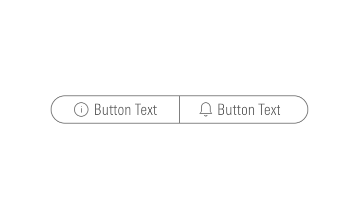
Sizing
Small
Medium
Large
Press Ctrl + C to copy
<div class="mds-button-group">
    <label class="mds-button__input-outer-wrapper" for="cyclical--40792">
        <input id="cyclical--40792" class="mds-button__input" type="radio" name="radio-colors-small-secondary" checked>
        <span for="cyclical--40792" class="mds-button mds-button--secondary mds-button--small" role="button"> Cyclical </span>
    </label>
    <label class="mds-button__input-outer-wrapper" for="defensive--38477">
        <input id="defensive--38477" class="mds-button__input" type="radio" name="radio-colors-small-secondary">
        <span for="defensive--38477" class="mds-button mds-button--secondary mds-button--small" role="button"> Defensive </span>
    </label>
    <label class="mds-button__input-outer-wrapper" for="sensitive--4530">
        <input id="sensitive--4530" class="mds-button__input" type="radio" name="radio-colors-small-secondary">
        <span for="sensitive--4530" class="mds-button mds-button--secondary mds-button--small" role="button"> Sensitive </span>
    </label>
</div>
Icon Only
Use to create toolbars.
Default
Hover
Focus
Press Ctrl + C to copy
<div class="mds-button-group mds-button-group--icon-only">
    <button class="mds-button mds-button--icon-only" type="button" role="button">
        <svg class="mds-icon mds-button__icon mds-button__icon--left" aria-hidden="true">
            <use xlink:href="/assets/icons/mds_icons.svg#bell-padless"> </use>
        </svg>
    </button>
    <button class="mds-button mds-button--icon-only" type="button" role="button">
        <svg class="mds-icon mds-button__icon mds-button__icon--left" aria-hidden="true">
            <use xlink:href="/assets/icons/mds_icons.svg#create-padless"> </use>
        </svg>
    </button>
    <button class="mds-button mds-button--icon-only" type="button" role="button">
        <svg class="mds-icon mds-button__icon mds-button__icon--left" aria-hidden="true">
            <use xlink:href="/assets/icons/mds_icons.svg#question-circle-padless"> </use>
        </svg>
    </button>
    <button class="mds-button mds-button--icon-only" type="button" role="button">
        <svg class="mds-icon mds-button__icon mds-button__icon--left" aria-hidden="true">
            <use xlink:href="/assets/icons/mds_icons.svg#person-padless"> </use>
        </svg>
    </button>
</div>
Disabled
Press Ctrl + C to copy
<div class="mds-button-group mds-button-group--icon-only">
    <button class="mds-button mds-button--icon-only" type="button" role="button">
        <svg class="mds-icon mds-button__icon mds-button__icon--left" aria-hidden="true">
            <use xlink:href="/assets/icons/mds_icons.svg#bell-padless"> </use>
        </svg>
    </button>
    <button class="mds-button mds-button--icon-only" type="button" role="button">
        <svg class="mds-icon mds-button__icon mds-button__icon--left" aria-hidden="true">
            <use xlink:href="/assets/icons/mds_icons.svg#create-padless"> </use>
        </svg>
    </button>
    <button class="mds-button mds-button--icon-only mds-button--disabled" type="button" disabled role="button">
        <svg class="mds-icon mds-button__icon mds-button__icon--left" aria-hidden="true">
            <use xlink:href="/assets/icons/mds_icons.svg#question-circle-padless"> </use>
        </svg>
    </button>
    <button class="mds-button mds-button--icon-only" type="button" role="button">
        <svg class="mds-icon mds-button__icon mds-button__icon--left" aria-hidden="true">
            <use xlink:href="/assets/icons/mds_icons.svg#person-padless"> </use>
        </svg>
    </button>
</div>
Small
Press Ctrl + C to copy
<div class="mds-button-group mds-button-group--icon-only">
    <button class="mds-button mds-button--icon-only mds-button--small" type="button" role="button">
        <svg class="mds-icon mds-button__icon mds-button__icon--left" aria-hidden="true">
            <use xlink:href="/assets/icons/mds_icons.svg#search--s"> </use>
        </svg>
    </button>
    <button class="mds-button mds-button--icon-only mds-button--small" type="button" role="button">
        <svg class="mds-icon mds-button__icon mds-button__icon--left" aria-hidden="true">
            <use xlink:href="/assets/icons/mds_icons.svg#heart--s"> </use>
        </svg>
    </button>
    <button class="mds-button mds-button--icon-only mds-button--small" type="button" role="button">
        <svg class="mds-icon mds-button__icon mds-button__icon--left" aria-hidden="true">
            <use xlink:href="/assets/icons/mds_icons.svg#pencil--s"> </use>
        </svg>
    </button>
</div>- Always include
aria-labelattributes to describe each button's intent. For example,<button aria-label="Close" onclick="myDialog.close()">X</button>. - For single icons, use the icon-only Button component.
- Consider pairing with a Tooltip to describe the icon’s underlying action.
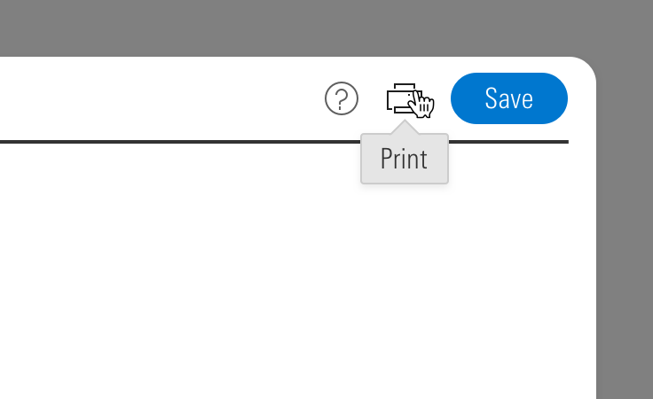 Icon-only Button Group paired with a tooltip.
- When pairing with a button, use a
mds-space-inline-xlspace, and vertically align middle the icon-only button group.- When pairing with a small button, use the small icon-only Button.
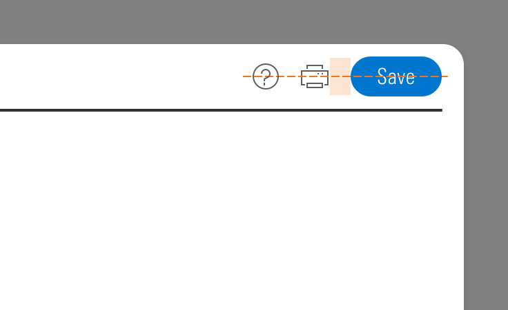 Icon-only Button Group alignment paired with a button.
Guidelines
Use When
- Toggling through content in an adjacent container.
- Switching units, currency, or increments.
Visual Style
- Always follows the same conventions as secondary Buttons.
Behaviors
- By default, the button group should start with its first item in the active state.
Editorial
- This component looks best when the content is balanced.
- Ideally, button labels should have the same number of words. Preferably one word each.
- When impossible, button labels should be within one word of each other, count wise.
- Do: Files / Forms & Reports
- Don't: Files / Market Commentary for Advisors / Reports
- See Buttons for more guidance.
Accessibility
- Include a
role="group"attribute for a default button group.- If a button group is used for navigation, set
role="navigation". - If a button group is being used as a toolbar, set
role="toolbar".
- If a button group is used for navigation, set
- Include an
aria-label="..."to describe the intention of the button group.- For example,
aria-label="View Toggle"could describe a button group set that changes the view of a content module below the button group.
- For example,
- See Buttons for more guidance.