Notifications
Notifications highlight that an event has occurred.
Variations
Default
Use when relaying non-critical information pertaining to a user's action.
Example
Default
Press Ctrl + C to copy
<div role="alert" class="mds-notification mds-notification--with-close-button mds-container--white ">
    <div class="mds-notification__message">Your report is being generated.</div>
    <button class="mds-button mds-notification__close-button mds-button--small mds-button--icon-only" type="button" role="button">
        <svg class="mds-icon mds-button__icon mds-button__icon--right">
            <use xlink:href="/assets/icons/mds_icons.svg#remove--s">
                <title>Close</title>
            </use>
        </svg>
    </button>
</div>- Automatically dismisses after 5 seconds.
- Lengthen the timeout interval for longer notification messages.
With Action
Use when the notification contains an “Undo” option, or a follow-up action via a button or link.
Example
Default
Press Ctrl + C to copy
<div role="alertdialog" class="mds-notification mds-notification--with-close-button mds-container--white ">
    <div class="mds-notification__message">1,134 items have been deleted.
        <button class="mds-button mds-button--small" type="button" role="button"> Undo </button>
    </div>
    <button class="mds-button mds-notification__close-button mds-button--small mds-button--icon-only" type="button" role="button">
        <svg class="mds-icon mds-button__icon mds-button__icon--right">
            <use xlink:href="/assets/icons/mds_icons.svg#remove--s">
                <title>Close</title>
            </use>
        </svg>
    </button>
</div>- Persists until a user clicks elsewhere on screen, after which the notification automatically dismisses after 5 seconds.
- Dismiss after a user clicks the action, i.e., “Undo”.
Guidelines
Use When
- Displaying a success, error, or warning message.
- Notifying the user of a process happening in the background.
- Relaying information to a user without interrupting their current task.
Don't Use When
- Requiring a choice by the user, like “Save” or “Cancel”. Instead, use a Dialog.
- Needing to show paragraphs of text. Instead, use a Modal.
Behaviors
- Display at the top center edge of the browser. To display in other locations, coordinate with a System designer about options.
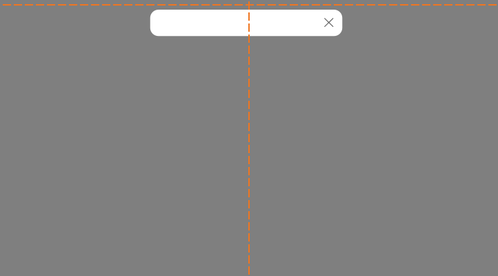 Appropriate placement of a notification.
- Dismiss notifications at any time by clicking the close icon,
remove--s.
Editorial
- Use full sentences and punctuation.
- Keep it brief. Maybe a sentence, no more than two. Should be able to be read in 5 seconds.
- Use “!” sparingly when congratulating a user. Overuse is cheeky.
Accessibility
- Include the
role="alert"attribute on themds-notificationelement. - Include
role="alertdialog"when the notification also provides interactive controls, such as an “Undo” button, that provide feedback and dismiss the notification. - Dismiss notification at any time by clicking the close icon,
remove--s.
Code Reference
CSS Class References
|
Class |
Applies to |
Outcome |
|---|---|---|
|
|
|
Indicates the notification component to layout the block with close button, so that the notification text will not overlap the close button at the right. |
|
|
|
Indicates the notification is a popup. |
|
|
|
Hides the notification popup, will animate fade-in effect of notification upon removal of this class. |