Menus
Menus offer a contextual set of options in a Popover.
Variations
Default
Use for a single-level menu of options.
Default
Press Ctrl + C to copy
<div class="mds-menu mds-menu--sticky">
    <div class="mds-popover__wrapper mds-popover--overlay-closable">
        <button class="mds-button mds-popover__target mds-button--secondary" type="button" role="button">
            <span class="mds-button__text"> Menu </span>
            <svg class="mds-icon mds-button__icon mds-button__icon--right" aria-hidden="true">
                <use xlink:href="/assets/icons/mds_icons.svg#caret-down--s"> </use>
            </svg>
        </button>
        <div class="mds-popover__overlay"></div>
        <div class="mds-popover mds-popover mds-popover--bottom-center mds-popover--width-l" role="tooltip">
            <header class="mds-popover__header">
                <h3 class="mds-popover__title"> Workbook </h3>
            </header>
            <div class="mds-popover__content">
                <ul class="mds-list-group">
                    <li class="mds-list-group__item ">
                        <a href="#" class="mds-list-group__link">
                            <span class="mds-list-group__item-label"> Create New </span>
                        </a>
                    </li>
                    <li class="mds-list-group__item ">
                        <a href="#" class="mds-list-group__link">
                            <span class="mds-list-group__item-label"> Open </span>
                        </a>
                    </li>
                    <li class="mds-list-group__item  mds-list-group__item--disabled">
                        <a href="#" class="mds-list-group__link">
                            <span class="mds-list-group__item-label"> Save </span>
                        </a>
                    </li>
                    <li class="mds-list-group__item ">
                        <a href="#" class="mds-list-group__link">
                            <span class="mds-list-group__item-label"> Save As </span>
                        </a>
                    </li>
                </ul>
            </div>
        </div>
    </div>
</div>- Construct using the List Group and Popover components.
- Menu items conform to the style and behavior of the List Group.
- Include a Popover header to clarify the purpose of the menu.
No Title
No Title
Press Ctrl + C to copy
<div class="mds-menu mds-menu--sticky">
    <div class="mds-popover__wrapper mds-popover--overlay-closable">
        <button class="mds-button mds-popover__target mds-button--secondary" type="button" role="button">
            <span class="mds-button__text"> Menu </span>
            <svg class="mds-icon mds-button__icon mds-button__icon--right" aria-hidden="true">
                <use xlink:href="/assets/icons/mds_icons.svg#caret-down--s"> </use>
            </svg>
        </button>
        <div class="mds-popover__overlay"></div>
        <div class="mds-popover mds-popover mds-popover--bottom-center mds-popover--width-l" role="tooltip">
            <div class="mds-popover__content">
                <ul class="mds-list-group">
                    <li class="mds-list-group__item ">
                        <a href="#" class="mds-list-group__link">
                            <span class="mds-list-group__item-label"> Create New </span>
                        </a>
                    </li>
                    <li class="mds-list-group__item ">
                        <a href="#" class="mds-list-group__link">
                            <span class="mds-list-group__item-label"> Open </span>
                        </a>
                    </li>
                    <li class="mds-list-group__item  mds-list-group__item--disabled">
                        <a href="#" class="mds-list-group__link">
                            <span class="mds-list-group__item-label"> Save </span>
                        </a>
                    </li>
                    <li class="mds-list-group__item ">
                        <a href="#" class="mds-list-group__link">
                            <span class="mds-list-group__item-label"> Save As </span>
                        </a>
                    </li>
                </ul>
            </div>
        </div>
    </div>
</div>- Avoid this construction unless the trigger includes text describing the menu purpose.
Single Selection
Include an icon to indicate a default or previously chosen item from a list of options.
Single Selection
Press Ctrl + C to copy
<div class="mds-menu mds-menu--sticky">
    <div class="mds-popover__wrapper mds-popover--overlay-closable">
        <button class="mds-button mds-popover__target mds-button--secondary" type="button" role="button">
            <span class="mds-button__text"> Menu </span>
            <svg class="mds-icon mds-button__icon mds-button__icon--right" aria-hidden="true">
                <use xlink:href="/assets/icons/mds_icons.svg#caret-down--s"> </use>
            </svg>
        </button>
        <div class="mds-popover__overlay"></div>
        <div class="mds-popover mds-popover mds-popover--bottom-center mds-popover--width-l" role="tooltip">
            <div class="mds-popover__content">
                <ul class="mds-list-group">
                    <li class="mds-list-group__item  mds-list-group__item--highlighted">
                        <a href="#" class="mds-list-group__link">
                            <span class="mds-list-group__item-label"> Create New </span>
                            <svg class="mds-icon mds-list-group__link-icon" aria-hidden="true">
                                <use xlink:href="/assets/icons/mds_icons.svg#check--s"> </use>
                            </svg>
                        </a>
                    </li>
                    <li class="mds-list-group__item ">
                        <a href="#" class="mds-list-group__link">
                            <span class="mds-list-group__item-label"> Open </span>
                        </a>
                    </li>
                    <li class="mds-list-group__item  mds-list-group__item--disabled">
                        <a href="#" class="mds-list-group__link">
                            <span class="mds-list-group__item-label"> Save </span>
                        </a>
                    </li>
                    <li class="mds-list-group__item ">
                        <a href="#" class="mds-list-group__link">
                            <span class="mds-list-group__item-label"> Save As </span>
                        </a>
                    </li>
                </ul>
            </div>
        </div>
    </div>
</div>- Always use the check icon,
check--s, to indicate selected item. - Use
mds-text-color-link-defaultfor selected-item text and$mds-interactive-color-primary-defaultfor selected-item icon. - Never use as a form element, instead use a Form radio button group or select.
Guidelines
Use When
- Creating a menu triggered from a button or text.
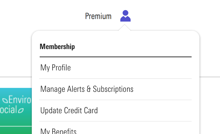 Membership menu inside Morningstar.com.
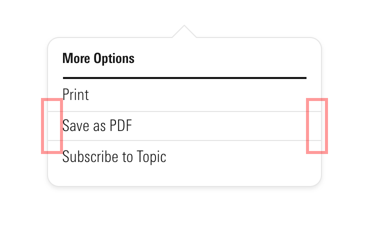
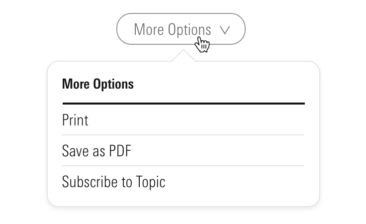
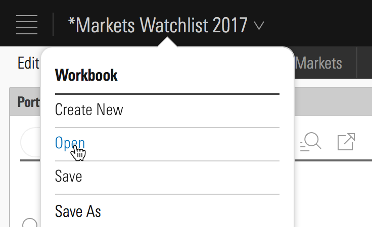 Workbook menu inside Direct Cloud.
- Creating a single-selection menu.
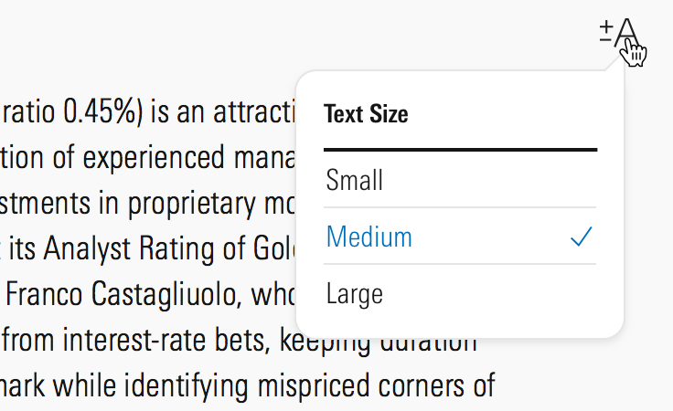
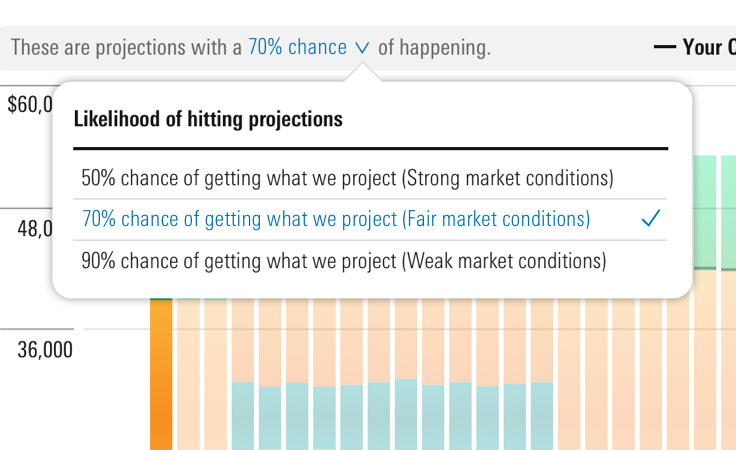 Menu showing likelihood of return on investment inside Retirement Manager.
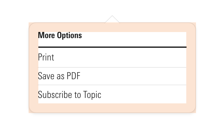
- Creating a menu of overflow options from a toolbar.
Don’t Use When
- Creating forms, instead use a Form radio button group or select.
Visual Language
Trigger Pairings
- Icon
Invoke a menu with an icon-only Button, omitting the down caret icon,caret-down--s.
 Down caret icon that launches Workbook menu inside Direct Cloud.
- Button
Invoke a menu with a Button only when a down caret icon,caret-down--s, is included to the right of the label.
 Invoke a menu with a Flat, No Background Button.
 Invoke a menu with a Secondary Button.
Behaviors
- Always trigger a menu on click, never on hover.
- Dismiss a menu by:
- Selecting an option.
- Pressing
escape. - Clicking outside the menu.
Editorial
- Title all menus, unless menu is launched from an explicitly worded button.
- Keep list items brief with a consistent wordcount—4 to 6 words at most.
- Similar to Links, list items should deliver exactly on their name.
- Don’t mix nouns and verbs. Choose one or the other.
- Do: Charts / Lines / Data instead
- Don't: Charts / Drawing / Data
- Keep a list of all commands in the active tense.
- Do: Open / Save / Copy / Print / Quit
- Do: Create a task / Share with a colleague / Print this report
Accessibility
As menu is simply a wrapper, the accessibility guidelines covered in Popovers and List Groups should be followed, with the following caveats:
- Change
role=”tooltip”torole=”menu”to present a list of actions,mds-list-group. - Add
role=”menuitem”to link items,mds-list-group__item. - Add the
aria-labelledby=”XXX”attribute, where ”XXX” represents the ID of a trigger button. - Add
tabindex=”-1”to both Popover,mds-popover, and List Group links item,mds-list-group__item.
Additionally, update the Button component that triggers the menu to change its behavior:
- Add
aria-haspopup=”true”to the trigger. - Add
aria-expanded=”false”to the trigger button and value is dynamically updated totruewhen menu is open. - Add
aria-controls=”XXX”to trigger button, where ”XXX” represents the ID of the Popover.
Code Reference
CSS Class References
Follow class reference sections in Popovers and List Groups.