Menus
- HTML/CSS Available
- Web Component Upcoming (MDS-6326)
- Last Updated
2.0.0
Menus offer a contextual set of options in a Popover.
Variations
Default
Use for a single-level menu of options.
<div class="mds-menu">
    <div class="mds-popover__wrapper mds-popover--overlay-closable mds-popover--overlay-dismissible">
        <button class="mds-button mds-popover__trigger mds-button--secondary" data-mds-popover="mds-popover--50423" aria-haspopup="true" aria-expanded="true" aria-controls="mds-popover--50423">
            <span class="mds-button__text"> Menu </span>
            <svg class="mds-icon mds-button__icon mds-button__icon--right" aria-hidden="true">
                <use xlink:href="/icons/mds.svg#caret-down--s">
                </use>
            </svg>
        </button>
        <div class="mds-popover__overlay"></div>
        <section id="mds-popover--50423" class="mds-popover mds-popover mds-popover--bottom-center mds-popover--width-200px" role="tooltip">
            <header class="mds-popover__header">
                <h2 class="mds-popover__title"> Workbook </h2>
            </header>
            <div class="mds-popover__content">
                <ul class="mds-list-group" role="menu">
                    <li class="mds-list-group__item " role="none">
                        <a href="#" class="mds-list-group__link" role="menuitem">
                            <span class="mds-list-group__item-text"> Create New </span>
                        </a>
                    </li>
                    <li class="mds-list-group__item " role="none">
                        <a href="#" class="mds-list-group__link" role="menuitem">
                            <span class="mds-list-group__item-text"> Open </span>
                        </a>
                    </li>
                    <li class="mds-list-group__item  mds-list-group__item--disabled" role="none">
                        <a href="#" class="mds-list-group__link" aria-disabled="true" role="menuitem">
                            <span class="mds-list-group__item-text"> Save </span>
                        </a>
                    </li>
                    <li class="mds-list-group__item " role="none">
                        <a href="#" class="mds-list-group__link" role="menuitem">
                            <span class="mds-list-group__item-text"> Save As </span>
                        </a>
                    </li>
                </ul>
            </div>
        </section>
    </div>
</div>- Construct using the List Group and Popover components.
- Menu items conform to the style and behavior of the List Group.
- Include a Popover header to clarify the purpose of the menu.
No Title
<div class="mds-menu">
    <div class="mds-popover__wrapper mds-popover--overlay-closable mds-popover--overlay-dismissible">
        <button class="mds-button mds-popover__trigger mds-button--secondary" data-mds-popover="mds-popover--97268" aria-haspopup="true" aria-expanded="true" aria-controls="mds-popover--97268">
            <span class="mds-button__text"> Menu </span>
            <svg class="mds-icon mds-button__icon mds-button__icon--right" aria-hidden="true">
                <use xlink:href="/icons/mds.svg#caret-down--s">
                </use>
            </svg>
        </button>
        <div class="mds-popover__overlay"></div>
        <section id="mds-popover--97268" class="mds-popover mds-popover mds-popover--bottom-center mds-popover--width-200px" role="tooltip">
            <div class="mds-popover__content">
                <ul class="mds-list-group" role="menu">
                    <li class="mds-list-group__item " role="none">
                        <a href="#" class="mds-list-group__link" role="menuitem">
                            <span class="mds-list-group__item-text"> Create New </span>
                        </a>
                    </li>
                    <li class="mds-list-group__item " role="none">
                        <a href="#" class="mds-list-group__link" role="menuitem">
                            <span class="mds-list-group__item-text"> Open </span>
                        </a>
                    </li>
                    <li class="mds-list-group__item  mds-list-group__item--disabled" role="none">
                        <a href="#" class="mds-list-group__link" aria-disabled="true" role="menuitem">
                            <span class="mds-list-group__item-text"> Save </span>
                        </a>
                    </li>
                    <li class="mds-list-group__item " role="none">
                        <a href="#" class="mds-list-group__link" role="menuitem">
                            <span class="mds-list-group__item-text"> Save As </span>
                        </a>
                    </li>
                </ul>
            </div>
        </section>
    </div>
</div>- Avoid this construction unless the trigger includes text describing the menu purpose.
Single Selection
Include an icon to indicate a default or previously chosen item from a list of options.
<div class="mds-menu">
    <div class="mds-popover__wrapper mds-popover--overlay-closable mds-popover--overlay-dismissible">
        <button class="mds-button mds-popover__trigger mds-button--secondary" data-mds-popover="mds-popover--76893" aria-haspopup="true" aria-expanded="true" aria-controls="mds-popover--76893">
            <span class="mds-button__text"> Menu </span>
            <svg class="mds-icon mds-button__icon mds-button__icon--right" aria-hidden="true">
                <use xlink:href="/icons/mds.svg#caret-down--s">
                </use>
            </svg>
        </button>
        <div class="mds-popover__overlay"></div>
        <section id="mds-popover--76893" class="mds-popover mds-popover mds-popover--bottom-center mds-popover--width-200px" role="tooltip">
            <div class="mds-popover__content">
                <ul class="mds-list-group" role="menu">
                    <li class="mds-list-group__item  mds-list-group__item--active" role="none">
                        <a href="#" class="mds-list-group__link" role="menuitem">
                            <span class="mds-list-group__item-text"> Option 1 </span>
                            <svg class="mds-icon mds-list-group__active-icon" aria-hidden="true">
                                <use xlink:href="/icons/mds.svg#check--s">
                                </use>
                            </svg>
                        </a>
                    </li>
                    <li class="mds-list-group__item " role="none">
                        <a href="#" class="mds-list-group__link" role="menuitem">
                            <span class="mds-list-group__item-text"> Option 2 </span>
                        </a>
                    </li>
                    <li class="mds-list-group__item  mds-list-group__item--disabled" role="none">
                        <a href="#" class="mds-list-group__link" aria-disabled="true" role="menuitem">
                            <span class="mds-list-group__item-text"> Option 3 </span>
                        </a>
                    </li>
                    <li class="mds-list-group__item " role="none">
                        <a href="#" class="mds-list-group__link" role="menuitem">
                            <span class="mds-list-group__item-text"> Option 4 </span>
                        </a>
                    </li>
                </ul>
            </div>
        </section>
    </div>
</div>- Always use the check icon,
check--s, to indicate selected item. - Use
$mds-text-color-link-defaultfor selected-item text and$mds-interactive-color-primary-defaultfor selected-item icon. - Never use as a form element, instead use a Form radio button group or select.
Sizing
Menus are built using List Groups and Popovers. The size of a menu is defined by the nested List Group and the width is defined by the nested Popover. Refer to the Sizing sections of the List Group and Popover component pages for the corresponding documentation.
Guidelines
Use When
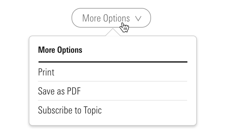
- Creating a menu triggered from a button or text.
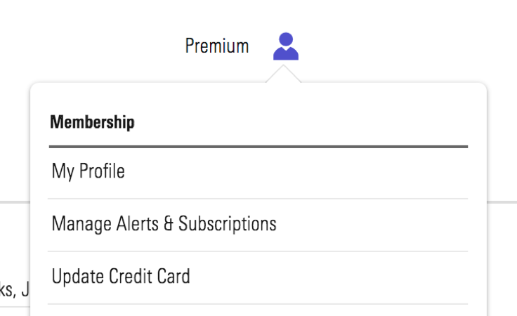 Membership menu inside Morningstar.com.
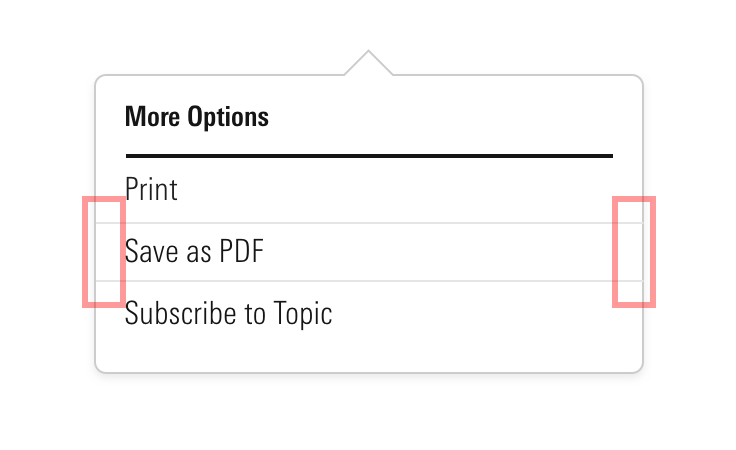
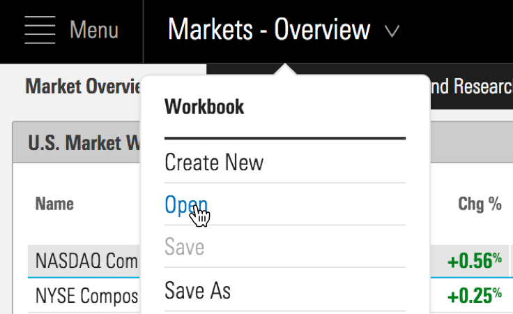 Workbook menu inside Direct Cloud.
- Creating a single-selection menu.
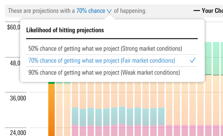 Menu showing likelihood of return on investment inside Retirement Manager.
- Creating a menu of overflow options from a toolbar.
Don’t Use When
- Creating forms, instead use a Form radio button group or select.
Visual Language
Trigger Pairings
- Icon
Invoke a menu with an icon-only Button, omitting the down caret icon,caret-down--s.
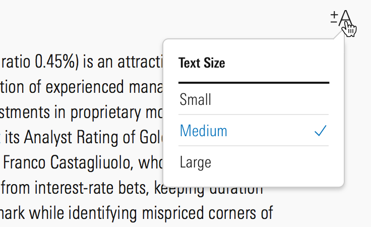 Font size icon that launches a sizing menu inside Direct Cloud.
- Button
Invoke a menu with a Button only when a down caret icon,caret-down--s, is included to the right of the label.
Invoke a menu with a Flat Button.
 Invoke a menu with a Secondary Button.
Behaviors
- Always trigger a menu on click, never on hover.
- Dismiss a menu by:
- Selecting an option.
- Pressing
escape. - Clicking outside the menu.
Editorial
- Title all menus, unless menu is launched from an explicitly worded button.
- Keep list items brief with a consistent wordcount—four to six words at most, if possible.
- Similar to Links, list items should deliver exactly on their name.
- Don’t mix nouns and verbs. Choose one or the other.
- Do: Charts / Lines / Data instead
- Don't: Charts / Drawing / Data
- Keep a list of all commands in the active tense.
- Do: Open / Save / Copy / Print / Quit
- Do: Create a task / Share with a colleague / Print this report
Related UX Patterns
Accessibility
- When creating the
mds-popover__titleof a Popover, teams should use the header tag (<h#>) which properly places the content within their product's information hierarchy.
As menu is simply a wrapper, the accessibility guidelines covered in Popovers and List Groups should be followed, with the following caveats:
- Change
role=”tooltip”torole=”menu”to present a list of actions,mds-list-group. - Add
role=”menuitem”to link items,mds-list-group__link. - Add the
aria-labelledby=”[Trigger Button ID]”attribute. - Add
tabindex=”-1”to both Popover,mds-popover, and List Group links item,mds-list-group__item.
Additionally, update the Button component that triggers the menu to change its behavior:
- Add
aria-haspopup=”true”to the trigger button. - Add
aria-expanded=”false”to the trigger button and dynamically update the value totruewhen menu is open. - Add
aria-controls=”[Popover ID]”to the trigger button.
Code Reference
CSS Class References
Follow class reference sections in Popovers and List Groups.