Top Hats
- HTML/CSS Available
- Web Component Beta
- Last Updated
2.11.0
Top Hats display a system-level message above a page’s masthead. There are three types: error, warning, or informational.
Top Hat
Anatomy
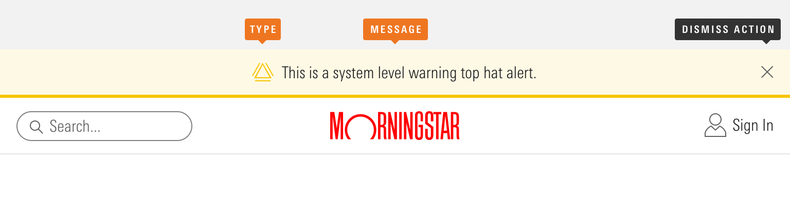
|
Name
|
Required
|
Description
|
|---|---|---|
|
Message |
Yes |
Top hat content. |
|
Type |
Yes |
Affects the color and icon associated with the top hat. Choose from error, warning, or informational. |
|
Dismiss Action |
No |
Enables the user to remove the top hat from view. |
Variations
Error
Use for system-level errors that prohibit work, such as a critical browser incompatibility or an internet-connectivity issue.
<diV class="mds-top-hat mds-top-hat--error" role="alert">
    <div class="mds-top-hat__body">
        <svg class="mds-icon mds-top-hat__icon" aria-hidden="true">
            <use xlink:href="/icons/mds.svg#alert">
            </use>
        </svg>
        <span class="mds-top-hat__message">No internet connection. Please check your local network.</span>
    </div>
</diV>
<mds-top-hat status="error" dismissible="false" role="alert">No internet connection. Please check your local network.</mds-top-hat>- Don’t allow an error to be dismissed. Instead, help a user understand how to fix the problem and dismiss the error automatically once it’s resolved.
Warning
Use to provide a system-level warning, such as a permissions or data issue, planned outages, or a non-critical browser incompatibility.
<diV class="mds-top-hat mds-top-hat--warning mds-top-hat--dismissible" role="alert">
    <div class="mds-top-hat__body">
        <svg class="mds-icon mds-top-hat__icon" aria-hidden="true">
            <use xlink:href="/icons/mds.svg#alert">
            </use>
        </svg>
        <span class="mds-top-hat__message">Service will be unavailable on Sunday, December 10th from 5–7 PM CST for scheduled maintenance. <a href='#'>More information</a>
        </span>
    </div>
    <button class="mds-button mds-button--small mds-button--icon-only mds-top-hat__dismiss-button" type="button">
        <svg class="mds-icon mds-button__icon mds-button__icon--right" aria-hidden="true">
            <use xlink:href="/icons/mds.svg#remove--s">
            </use>
        </svg>
    </button>
</diV>
<mds-top-hat status="warning" role="alertdialog">Service will be unavailable on Sunday, December 10th from 5–7 PM CST for scheduled maintenance. <a href='#'>More information</a>
</mds-top-hat>- Optionally, omit the dismiss action, and persist the warning until it is resolved.
Informational
Use to provide system-level information, such as an announcement about a new feature.
<diV class="mds-top-hat mds-top-hat--dismissible" role="alert">
    <div class="mds-top-hat__body">
        <svg class="mds-icon mds-top-hat__icon" aria-hidden="true">
            <use xlink:href="/icons/mds.svg#info-circle">
            </use>
        </svg>
        <span class="mds-top-hat__message">Welcome to the new Morningstar.com. <a href='#'>See What’s New</a>
        </span>
    </div>
    <button class="mds-button mds-button--small mds-button--icon-only mds-top-hat__dismiss-button" type="button">
        <svg class="mds-icon mds-button__icon mds-button__icon--right" aria-hidden="true">
            <use xlink:href="/icons/mds.svg#remove--s">
            </use>
        </svg>
    </button>
</diV>
<mds-top-hat role="alertdialog">Welcome to the new Morningstar.com. <a href='#'>See What’s New</a>
</mds-top-hat>Sizing
Sizing affects text size, icon size, and internal padding. Use small top hats when vertical space is limited or information density is desired. The default size is small and you can use modifier classes or props to make the top hat smaller.
<diV class="mds-top-hat mds-top-hat--small mds-top-hat--dismissible" role="alert">
    <div class="mds-top-hat__body">
        <svg class="mds-icon mds-top-hat__icon" aria-hidden="true">
            <use xlink:href="/icons/mds.svg#info-circle--s">
            </use>
        </svg>
        <span class="mds-top-hat__message">Top hat message, including <a href='#'>a link</a>.</span>
    </div>
    <button class="mds-button mds-button--small mds-button--icon-only mds-top-hat__dismiss-button" type="button">
        <svg class="mds-icon mds-button__icon mds-button__icon--right" aria-hidden="true">
            <use xlink:href="/icons/mds.svg#remove--s">
            </use>
        </svg>
    </button>
</diV>
<mds-top-hat size="small" role="alertdialog">Top hat message, including <a href='#'>a link</a>.</mds-top-hat>Use When
- Providing a user system-level errors, warnings and information.
Don’t Use When
- Providing a user with a message related to a page-level or out-of-view event, like completion of a report generation. Instead, use a Notification.
- Providing a user with a message related to a specific element on the current page, like a summary of errors in a form. Instead, use an Alert.
Visual Language
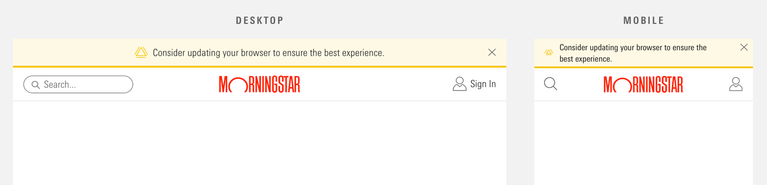 Top hat placement stays the same regardless of page width.
- Place above the page’s Masthead.
- Stretches horizontally to fill 100% of viewport width.
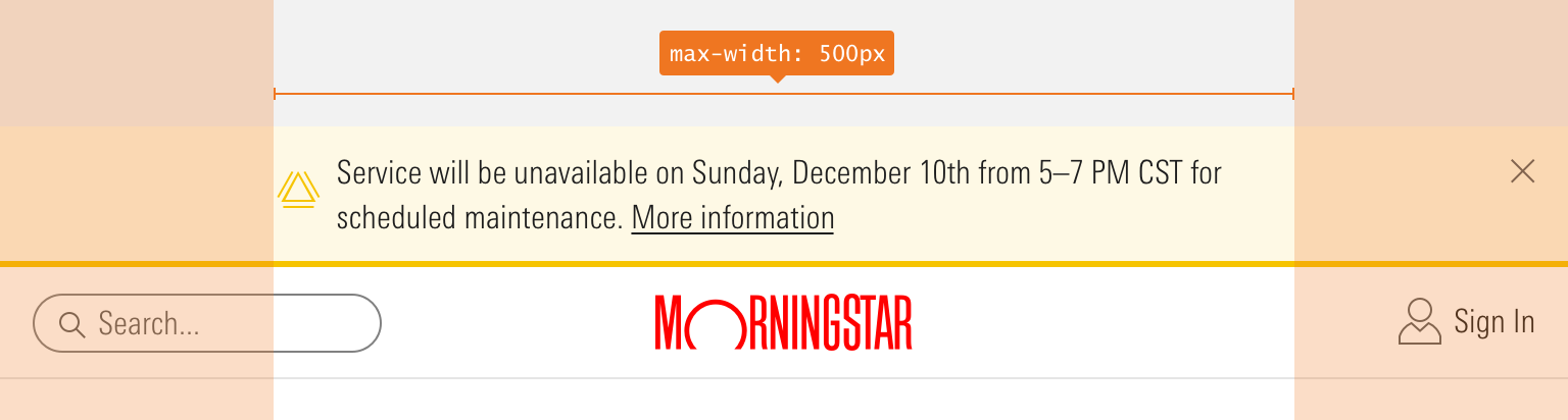 A maximum width for top hat message and icon is 500px. The top hat background spans the width of the page.
- To ensure content doesn’t exceed Typography line-length guidelines, top hats limit the maximum width of the message and icon to
500px.- The dismiss action can fall outside of this maximum content width.
Behaviors
- Never include a dismiss action in Errors. Instead, dismiss automatically once the error is resolved.
- When applicable, dismiss by clicking the Icon-Only Button with a close icon,
remove--s. - The top hat stays on the Masthead. If the Masthead sticks as a user scrolls down the page, then the top hat goes along for the ride.
- A page can only wear one kind of top hat at a time.
- When dismissed or resolved, top hats slide up and fade out, relinquishing their space.
Editorial
- Keep it brief—aim for fewer than 10 words.
- Use full sentences and punctuation. Use sentence case.
- Use figures instead of spelling out numbers.
- Top hats can include links. Don’t use “click here,” “tap this link,” etc., inside link copy. Link copy should be device agnostic—a user may not have a mouse with which to click or the capability to tap.
- Use “!” sparingly, as it conflicts with the informational icon, and is generally unnecessary.
Related UX Patterns
CSS
Class References
|
Class
|
Applies to
|
Outcome
|
|---|---|---|
|
|
|
Reduces text size, icon size, and internal padding. |
|
|
|
Adds padding to the right side of the body of the top hat to accommodate the close icon. |
|
|
|
Dismisses the top hat by animating fade-out and slide-up effects. |
|
|
|
Applies the yellow color to the component’s background, bottom border, and icon. |
|
|
|
Applies the red color to the component’s background, bottom border, and icon. |
Web Component
Props
|
Prop
|
Type
|
Validation
|
Default
|
Description
|
|---|---|---|---|---|
|
|
String |
— |
— |
A space-separated list of class names that will be appended to the default |
|
|
Boolean |
— |
|
When true, adds an icon-only dismiss button that allows the top hat to be dismissed. |
|
|
String |
— |
— |
The |
|
|
Boolean |
Only valid when |
|
When true, removes the top hat from the DOM after the dismiss animation completes. If false, top hat is simply hidden when dismissed, not removed. |
|
|
String |
— |
— |
Sets the |
|
|
String |
Enum: |
|
Alters the size of the top hat. |
|
|
String |
Enum: |
|
Sets the status of the top hat. |
|
|
String |
Required |
— |
The text that appears in the top hat. |
Slots
Default Slot
Any text or markup passed in between the <mds-top-hat></mds-top-hat> tags will be used as the top hat’s text. This can be overridden with the text prop.
Methods
|
Method Name
|
Description
|
|---|---|
|
|
The same method called internally when the icon-only dismiss button is clicked. Useful for programmatically calling |
Events
|
Event Name
|
Description
|
|---|---|
|
|
If |
|
|
If |
Usage Examples
Setting the text, size, and role:
<!-- Using Props -->
<mds-top-hat text="This is a sample top hat message." size="small" role="alertdialog"></mds-top-hat>
<!-- Using Slots -->
<mds-top-hat size="small" role="alertdialog"> This is a sample top hat message. </mds-top-hat>
Setting the text, variation, and role and suppressing the dismiss action:
<!-- Using Props -->
<mds-top-hat text="You don’t have an internet connection." status="error" dismissible="false" role="alert"></mds-top-hat>
<!-- Using Slots -->
<mds-top-hat status="error" dismissible="false" role="alert"> You don’t have an internet connection. </mds-top-hat>Implementation
- Use
role="alert"for top hats that do not contain an interactive element. - Use
role="alertdialog"when a top hat includes an interactive element, like a Link or dismiss button.- When triggered, assign
focusto the most relevant interactive element in the top hat.
- When triggered, assign