Alerts
updated
- HTML/CSS Available
- Web Component Available
- Last Updated
2.21.0
Alerts provide contextual information adjacent to items on the visible page. There are four types: error, warning, success, or informational.
Alert
Anatomy

|
Name
|
Required
|
Description
|
|---|---|---|
|
Message |
Yes |
Includes the core, most important alert content. |
|
Type |
Yes |
Affects the color and icon associated with the alert. Choose from error, warning, success or informational. |
|
Title |
No |
Briefly summarizes alert content. |
|
List |
No |
Helps structure content below a message element. |
|
Custom Action |
No |
Offers a follow-up action via secondary Button. |
|
Dismiss Action |
No |
Enables the user to remove the alert from view. |
Variations
Error
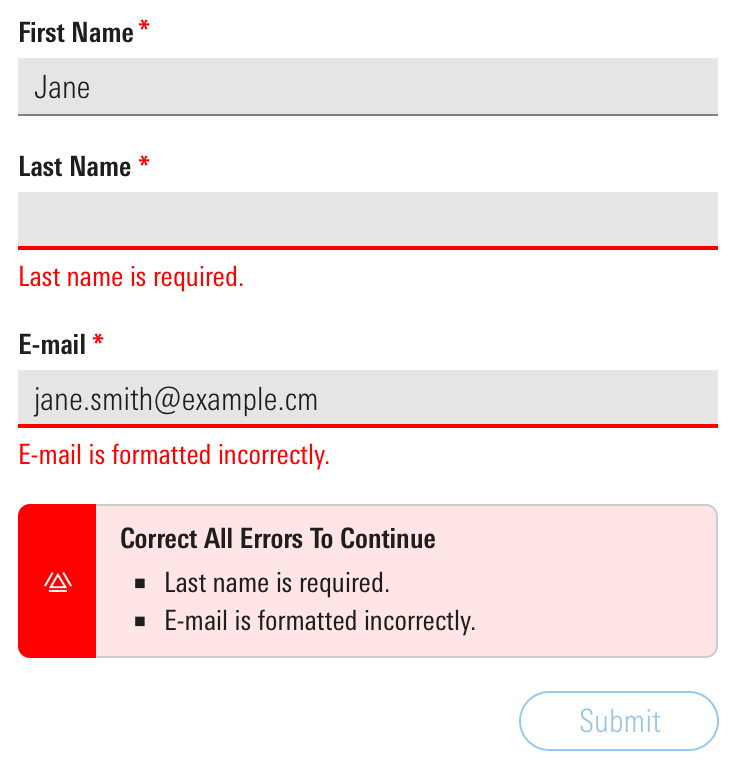
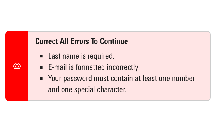
Use for errors and malfunctions that must be resolved before moving forward, such as a summary of errors to correct in a Form.
<div class="mds-alert mds-alert--error" role="alert">
    <div class="mds-alert__cell-icon">
        <svg class="mds-icon mds-alert__icon" aria-hidden="true">
            <use xlink:href="/icons/mds.svg#alert">
            </use>
        </svg>
    </div>
    <div class="mds-alert__cell-body">
        <aside class="mds-alert__content">
            <strong class="mds-alert__title">Form Error</strong>
            <p class="mds-alert__message">Please correct all errors to continue.</p>
            <ul class="mds-alert__list">
                <li class="mds-alert__list-item">Last Name is required.</li>
                <li class="mds-alert__list-item">E-mail is formatted incorrectly.</li>
            </ul>
        </aside>
    </div>
</div>
<mds-alert title="Form Error" variation="error" list='["Last Name is required.", "E-mail is formatted incorrectly."]' dismissible="false">
Please correct all errors to continue.
</mds-alert>- Consider tinting to add extra emphasis or to increase contrast with page content. Apply tint using a modifier class or prop.
- Consider using to offer a summary of multiple errors in a Form.
- Always pair error alerts with Field Errors to identify which fields are in error.
- Consider disabling the Form’s submit or save action until all errors are resolved. For more guidance on errors, see the Errors UX pattern.
 An error alert to summarize and echo errors in a Form, some of which may be out of view.


Warning
Use for a message requiring attention but not resolution in order to continue, such as noting data is not current or your password is about to expire.
<div class="mds-alert mds-alert--warning mds-alert--dismissible" role="alertdialog">
    <div class="mds-alert__cell-icon">
        <svg class="mds-icon mds-alert__icon" aria-hidden="true">
            <use xlink:href="/icons/mds.svg#alert">
            </use>
        </svg>
    </div>
    <div class="mds-alert__cell-body">
        <aside class="mds-alert__content">
            <strong class="mds-alert__title">You’re Saving More Than What the Government Allows</strong>
            <p class="mds-alert__message">We advise you to adjust your contribution amounts and/or place any overflow into the <a href='#'>Additional Savings</a> field below. The next item on your advice list will show you how to invest it.</p>
        </aside>
    </div>
    <button class="mds-button mds-button--small mds-button--icon-only mds-alert__dismiss-button" type="button">
        <svg class="mds-icon mds-button__icon mds-button__icon--right" aria-hidden="true">
            <use xlink:href="/icons/mds.svg#remove--s">
            </use>
        </svg>
    </button>
</div>
<mds-alert role="alertdialog" title="You’re Saving More Than What the Government Allows" variation="warning">
We advise you to adjust your contribution amounts and/or place any overflow into the <mds-link href="#">Additional Savings</mds-link> field below. The next item on your advice list will show you how to invest it.
</mds-alert>- Consider tinting to add extra emphasis or to increase contrast with page content. Apply tint using a modifier class or prop.
- Optionally, omit the dismiss action, and persist the warning until it’s resolved.
Success
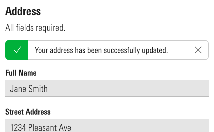
Use to communicate that an action has been successfully completed, such as saving changes in a Form.
<div class="mds-alert mds-alert--success mds-alert--dismissible" role="alertdialog">
    <div class="mds-alert__cell-icon">
        <svg class="mds-icon mds-alert__icon" aria-hidden="true">
            <use xlink:href="/icons/mds.svg#check">
            </use>
        </svg>
    </div>
    <div class="mds-alert__cell-body">
        <aside class="mds-alert__content">
            <p class="mds-alert__message">Your address has been successfully updated.</p>
        </aside>
    </div>
    <button class="mds-button mds-button--small mds-button--icon-only mds-alert__dismiss-button" type="button">
        <svg class="mds-icon mds-button__icon mds-button__icon--right" aria-hidden="true">
            <use xlink:href="/icons/mds.svg#remove--s">
            </use>
        </svg>
    </button>
</div>
<mds-alert role="alertdialog" variation="success">
Your address has been successfully updated.
</mds-alert>- Consider tinting to add extra emphasis or to increase contrast with page content. Apply tint using a modifier class or prop.
- Consider adding a timeout to success alerts, so they dismiss automatically.
- Use when providing feedback that a request or action has completed successfully. For example, updating profile information in a Form.
 A success alert providing feedback in a Form.
Informational
Use to provide context around a situation, such as rules around creating a compliant password, or a link to feature documentation or onboarding tips.
<div class="mds-alert mds-alert--dismissible" role="alertdialog">
    <div class="mds-alert__cell-icon">
        <svg class="mds-icon mds-alert__icon" aria-hidden="true">
            <use xlink:href="/icons/mds.svg#info-circle">
            </use>
        </svg>
    </div>
    <div class="mds-alert__cell-body">
        <aside class="mds-alert__content">
            <strong class="mds-alert__title">What’s New</strong>
            <p class="mds-alert__message">We’re building a new online experience with one goal in mind: to make the important investing work you do on our website easier and more intuitive.</p>
            <ul class="mds-alert__list">
                <li class="mds-alert__list-item">Today Page</li>
                <li class="mds-alert__list-item">Streamlined Navigation</li>
                <li class="mds-alert__list-item">Better Stock Investing</li>
                <li class="mds-alert__list-item">Our Picks Center</li>
            </ul>
            <button class="mds-button mds-button--small mds-button--secondary" type="button">
                Learn More
            </button>
        </aside>
    </div>
    <button class="mds-button mds-button--small mds-button--icon-only mds-alert__dismiss-button" type="button">
        <svg class="mds-icon mds-button__icon mds-button__icon--right" aria-hidden="true">
            <use xlink:href="/icons/mds.svg#remove--s">
            </use>
        </svg>
    </button>
</div>
<mds-alert role="alertdialog" title="What’s New" status="informational" list='["Today Page", "Streamlined Navigation", "Better Stock Investing", "Our Picks Center"]'>
We’re building a new online experience with one goal in mind: to make the important investing work you do on our website easier and more intuitive.
<mds-button slot="mds-alert-custom-action" size="small" variation="secondary"> Learn More </mds-button>
</mds-alert>Sizing
Sizing affects text size, icon size, and internal padding. The default size is medium, and you can use modifier classes or props to make the alert smaller or larger.
<div class="mds-alert mds-alert--small mds-alert--dismissible" role="alertdialog">
    <div class="mds-alert__cell-icon">
        <svg class="mds-icon mds-alert__icon" aria-hidden="true">
            <use xlink:href="/icons/mds.svg#info-circle--s">
            </use>
        </svg>
    </div>
    <div class="mds-alert__cell-body">
        <aside class="mds-alert__content">
            <strong class="mds-alert__title">Alert Title</strong>
            <p class="mds-alert__message">Alert message, including <a href='#'>a link</a>.</p>
            <ul class="mds-alert__list">
                <li class="mds-alert__list-item">List Item 1</li>
                <li class="mds-alert__list-item">List Item 2</li>
            </ul>
            <button class="mds-button mds-button--small mds-button--secondary" type="button">
                Take Action
            </button>
        </aside>
    </div>
    <button class="mds-button mds-button--small mds-button--icon-only mds-alert__dismiss-button" type="button">
        <svg class="mds-icon mds-button__icon mds-button__icon--right" aria-hidden="true">
            <use xlink:href="/icons/mds.svg#remove--s">
            </use>
        </svg>
    </button>
</div>
<mds-alert size="small" role="alertdialog" title="Alert Title" list='["List Item 1", "List Item 2"]'>
Alert message including <mds-link href="#">a link</mds-link>.
<mds-button slot="mds-alert-custom-action" size="small" variation="secondary"> Take Action </mds-button>
</mds-alert>Use When
- Providing a user contextual information or status of an action they’re trying to complete in a specific element on the visible page.
Don’t Use When
- Providing a user with a message related to a page-level or out-of-view event, like completion of a report generation. Instead, use a Notification.
- Providing a user with a system-level message, like a network outage or browser incompatibility. Instead, use a Top Hat.
- Attaching an error message to an Input. Instead, use a Field Error.
Visual Language
- Stretch horizontally to fill 100% of the container they are placed in.
- Always follow Typography line length guidelines when displaying alerts. Pair with another component, like a Form, or place in a fixed-width container to ensure alerts don't get too wide.
- Push other content down to make room for an alert on a page.
- Apply tint to add extra emphasis or to increase contrast with page content.
Behaviors
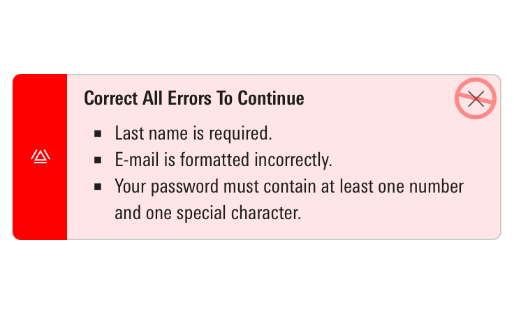
- Never include a dismiss action in errors. They can only be dismissed by resolving the error.
- When applicable, dismiss by clicking the Icon-Only Button with a close icon,
remove--s. - When dismissed or resolved, alerts slide up and fade out, relinquishing their space.
Editorial
- Keep titles three to five words if possible.
- For titles, use title case and capitalize prepositions of four letters or more.
- Messages should tell the user what’s happening and whether they need to act to successfully keep moving through a task, if applicable. Warning alerts might tell a user what could happen if they don’t address what they’re being warned about.
- For messages, use full sentences with punctuation. Use sentence case.
- Unordered lists offer a structured format to present:
- Items needing resolution
- Guidelines to successful completion
- Ways to resolve problems
For additional editorial guidance, refer to Buttons and Errors documentation.
Related UX Patterns
CSS
Class References
|
Class
|
Applies to
|
Outcome
|
|---|---|---|
|
|
|
Reduces text size, icon size, and internal padding. |
|
|
|
Adds padding to the right side of the body of the alert to accommodate the close icon. |
|
|
|
Dismisses the alert by animating fade-out and slide-up effects. |
|
|
|
Applies the green background color and the white icon color to the left side of the component. |
|
|
|
Applies the yellow background color and the black icon color to the left side of the component. |
|
|
|
Applies the red background color and the white icon color to the left side of the component. |
|
|
|
Applies the tinted background color to the body of the component. |
Web Component
Props
When setting props as attributes on a custom HTML element, use kebab-case instead of camelCase.
|
Prop
|
Type
|
Validation
|
Default
|
Description
|
|---|---|---|---|---|
|
|
String |
— |
— |
A space-separated list of class names that will be appended to the default |
|
|
String |
One of: |
— |
Sets the aria-live attribute. |
|
|
Boolean |
— |
|
If true, adds an icon-only dismiss button that allows the alert to be dismissed. |
|
|
String |
— |
|
Sets the |
|
|
Array |
— |
— |
Sets list content of the alert. |
|
|
Boolean |
Only valid when |
|
If true, removes the alert from the DOM after the dismiss animation completes. If false, alert is simply hidden when dismissed, not removed. |
|
|
String |
— |
— |
|
|
|
String |
One of: |
|
Alters the size of the alert. |
|
|
String |
Required |
— |
The text that appears in the alert. Can also be passed via the default slot. |
|
|
Boolean |
— |
|
If true, adds the tinted background color to the body of the alert. |
|
|
String |
— |
— |
Sets the title of the alert. |
|
|
String |
One of: |
|
Sets the variation of the alert. |
Slots
Default Slot
Pass text in between the <mds-alert></mds-alert> tags to set the alert’s text. This can be overridden with the text prop.
Named Slots
|
Slot Name
|
Description
|
|---|---|
|
|
Markup for elements that provide functionality related to the alert, like Buttons. |
Methods
|
Method Name
|
Description
|
|---|---|
|
|
A method which is also invoked internally when the icon-only dismiss button is clicked. Useful for programmatically calling |
Events
|
Event Name
|
Description
|
|---|---|
|
|
If |
|
|
If |
Usage Examples
Setting text. status, and size via props:
<mds-alert text="This is a sample alert message." status="error" size="small"></mds-alert>Setting title and list via props. Using the default slot for text content:
<mds-alert title="A list of alerts" list='["List item 1", "List item 2"]'>
    This is a sample alert message.
</mds-alert>
Setting dismissible via props. Using named slots for mds-alert-custom-action. Using the default slot for text content:
<mds-alert dismissible=false>
    This is a sample alert message.
    <mds-button slot="mds-alert-custom-action" size="small" variation="secondary"> Take Action </mds-button>
</mds-alert>Implementation
- Include the
role="alert"attribute on themds-alertelement. - Include the
role="alertdialog"attribute on themds-alertelement if alert provides interactive controls, such as a dismiss or custom action. - Add the
aria-invalid="true"attribute to an input that triggers an error alert. - Set focus to the alert’s dismiss or custom action when it’s triggered.
- When only visually hidden and not removed from the DOM, set an alert’s
tab-indexto-1and disable any contained interactive elements. - Use the
aria-live="assertive"attribute to interrupt the user’s workflow when an alert contains critical information, like an error. - Use the
aria-live="polite"attribute to wait until after the current content is read to announce an alert that contains non-critical information, like a warning, success, or informational. - Always give the
.mds-alert_titleelement a uniqueidand set it as the.mds-alertelement’saria-labelledbyattribute, for example:
<div class="mds-alert" aria-labelledby="warning1Title">
    ...
    <div class="mds-alert__title" id="warning1Title">
...- Always give the
.mds-alert_messageelement a uniqueidand set it as the.mds-alertelement’saria-describededbyattribute, for example:
<div class="mds-alert" aria-describedby=“warning1Desc”>
    ...
    <div class="mds-alert__message" id="warning1Desc">
        ...
Best Practices
When constructing an alert’s message, consider how it will be read by a screen reader:
- Write out dates, e.g., December 1, 2018 and not 12/1/2018.
- Avoid non-text symbols like “/” and “+”.
- When describing a date or time range use “to” instead of “–”.
Alerts should be used sparingly and only in instances that warrant removing the user from their current task. Too many alerts can be disorienting to users with cognitive issues.

