Layering
Layering in the Morningstar Design System is defined through a combination of z-index, overlays, and drop shadows. Use layering to focus the user’s attention on a task, provide temporary supplementary information, or define spatial relationships between content.
Z-index
Z-index is a CSS property that specifies the stack order of an element. An element with greater stack order is always in front of an element with a lower stack order. Z-index is defined within MDS through the following Constants:
|
Z-index
|
Constant
|
Use
|
Examples
|
|---|---|---|---|
|
|
|
Page content |
|
|
|
|
Sticky content |
Sticky page elements, like mastheads (and Popovers triggered from a masthead) and navigation |
|
|
|
Modal overlay |
Modal page overlay |
|
|
|
Modal content |
|
|
|
|
As needed |
Reserved for edge cases |
- Consider applying a custom
z-indexvalue when you compose layered components, e.g., Dialogs, Modals, Popovers, Notifications or Tooltips to meet your product requirements.
Overlays
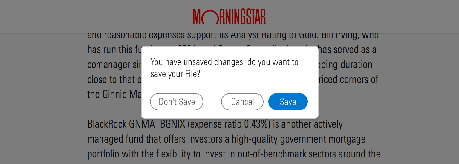
Overlays work in concert with Modals and Dialogs to temporarily obstruct a user’s access to the underlying page and focus their attention on the content above the overlay. Overlays use a shared class, .mds-overlay, to apply a combination of $mds-color-black and $mds-opacity-overlay to dim the underlying page without hiding it completely.
 Overlays focus attention on the content above the overlay by obstructing access to the underlying page.
Drop Shadows
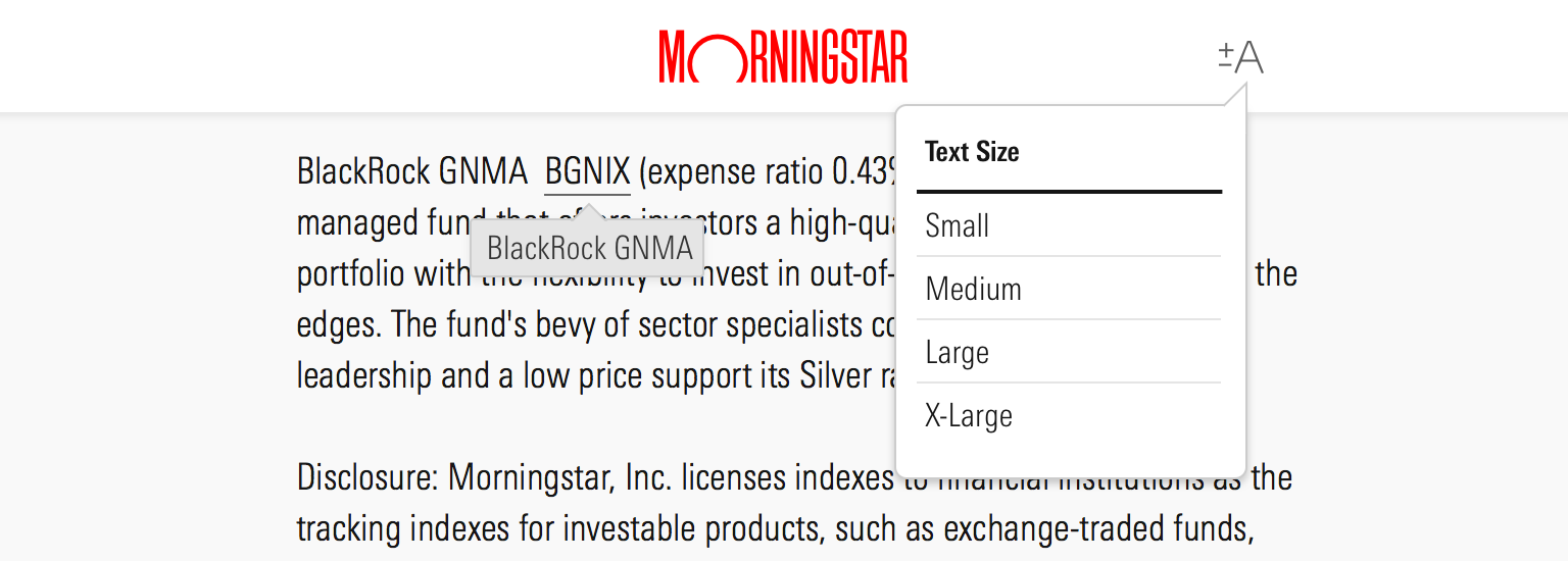
Drop shadows visually simulate layering by casting a shadow on objects that fall lower in the z-index. Drop shadows are defined by constants and applied to mastheads, Modals, Dialogs, Tooltips, Popovers, and Notifications.
|
Variable name
|
Value
|
|---|---|
|
|
|
 Drop shadows simulate layering by casting a shadow on objects with a lower z-index.

