Buttons
- HTML/CSS Available
- Web Component Available
- Last Updated
2.21.0
Buttons trigger interactions throughout the experience.
Button
Variations
Primary
Use for highest-priority actions that are required to complete the user’s task.
<!-- Default -->
<button class="mds-button mds-button--primary" type="button">
    Button Text
</button>
<!-- Disabled -->
<button class="mds-button mds-button--primary" type="button" disabled>
    Button Text
</button>
<!-- Default -->
<mds-button variation="primary"> Button Text </mds-button>
<!-- Disabled -->
<mds-button variation="primary" disabled> Button Text </mds-button>- Use a primary button only once per page.
Secondary
Use for non-critical actions.
<!-- Default -->
<button class="mds-button mds-button--secondary" type="button">
    Button Text
</button>
<!-- Disabled -->
<button class="mds-button mds-button--secondary" type="button" disabled>
    Button Text
</button>
<!-- Default -->
<mds-button variation="secondary"> Button Text </mds-button>
<!-- Disabled -->
<mds-button variation="secondary" disabled> Button Text </mds-button>- Use for most buttons triggering non-critical actions, such as back, cancel, adding or creating an object.
Flat
Use for tertiary actions.
<!-- Default -->
<button class="mds-button mds-button--flat" type="button">
    Button Text
</button>
<!-- Disabled -->
<button class="mds-button mds-button--flat" type="button" disabled>
    Button Text
</button>
<!-- Default -->
<mds-button variation="flat"> Button Text </mds-button>
<!-- Disabled -->
<mds-button variation="flat" disabled> Button Text </mds-button>With Icon
Add Icons to provide additional affordance or meaning to a button.
<button class="mds-button mds-button--primary" type="button">
    <svg class="mds-icon mds-button__icon mds-button__icon--left" aria-hidden="true">
        <use xlink:href="#open-new--s">
        </use>
    </svg>
    <span class="mds-button__text">
        Copy Document
    </span>
</button>
<button class="mds-button mds-button--secondary" type="button">
    <svg class="mds-icon mds-button__icon mds-button__icon--left" aria-hidden="true">
        <use xlink:href="#open-new--s">
        </use>
    </svg>
    <span class="mds-button__text">
        Copy Document
    </span>
</button>
<button class="mds-button mds-button--flat" type="button">
    <svg class="mds-icon mds-button__icon mds-button__icon--left" aria-hidden="true">
        <use xlink:href="#open-new--s">
        </use>
    </svg>
    <span class="mds-button__text">
        Copy Document
    </span>
</button>
<mds-button icon="open-new--s" variation="primary"> Copy Document </mds-button>
<mds-button icon="open-new--s" variation="secondary"> Copy Document </mds-button>
<mds-button icon="open-new--s" variation="flat"> Copy Document </mds-button>- Use left icons to emphasize meaning.
- Use right icons to imply directionality or to indicate a button will open a Menu.
Icon Only
Use for toolbars and displays where words won’t comfortably fit alongside icons.
<!-- Default -->
<button class="mds-button mds-button--icon-only" type="button" aria-label="User">
    <svg class="mds-icon mds-button__icon mds-button__icon--right" aria-hidden="true">
        <use xlink:href="#person-padless">
        </use>
    </svg>
</button>
<!-- Disabled -->
<button class="mds-button mds-button--icon-only mds-button--hover" type="button" disabled>
    <svg class="mds-icon mds-button__icon mds-button__icon--right">
        <use xlink:href="#person-padless">
            <title>User</title>
        </use>
    </svg>
</button>
<!-- Default -->
<mds-button variation="icon-only" icon="person-padless"> User </mds-button>
<!-- Disabled -->
<mds-button variation="icon-only" icon="person-padless" disabled> User </mds-button>- Only use when the Icon’s meaning is unambiguous.
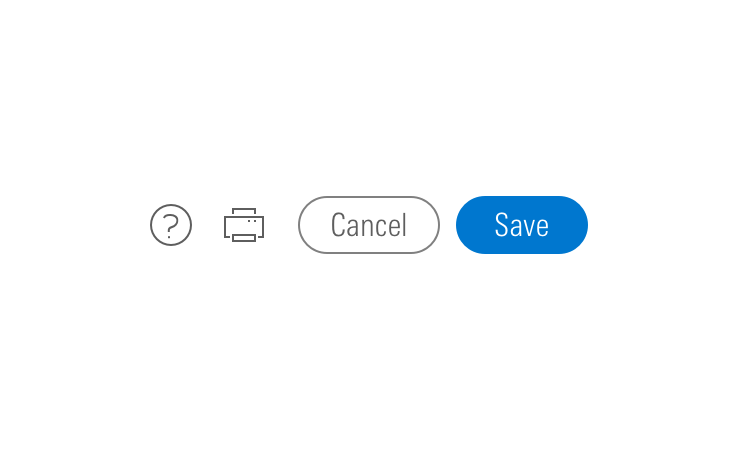
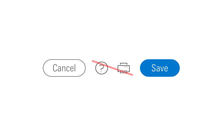
- For toolbars of multiple Icons use a Button Group.
- When pairing with a button, use an
$mds-space-inline-left-2-xspace and vertically align middle the icon-only button. - When pairing with a small button, use the small icon-only button.
Sizing
Configure button size and icon size independently within the button.
Button Size
Each button variation allows for small, medium, and large sizes. The default size is medium, and you can use modifier classes or props to make the button smaller or larger.
<button class="mds-button mds-button--small mds-button--primary" type="button">
    <span class="mds-button__text">
        Continue
    </span>
    <svg class="mds-icon mds-button__icon mds-button__icon--right" aria-hidden="true">
        <use xlink:href="#caret-right--s">
        </use>
    </svg>
</button>
<button class="mds-button mds-button--small mds-button--secondary" type="button">
    <span class="mds-button__text">
        Continue
    </span>
    <svg class="mds-icon mds-button__icon mds-button__icon--right" aria-hidden="true">
        <use xlink:href="#caret-right--s">
        </use>
    </svg>
</button>
<button class="mds-button mds-button--small mds-button--flat" type="button">
    <span class="mds-button__text">
        Continue
    </span>
    <svg class="mds-icon mds-button__icon mds-button__icon--right" aria-hidden="true">
        <use xlink:href="#caret-right--s">
        </use>
    </svg>
</button>
<button class="mds-button mds-button--small mds-button--icon-only" type="button">
    <svg class="mds-icon mds-button__icon mds-button__icon--right">
        <use xlink:href="#heart--s">
            <title>User</title>
        </use>
    </svg>
</button>
<mds-button icon-right="caret-right--s" variation="primary" size="small"> Continue </mds-button>
<mds-button icon-right="caret-right--s" variation="secondary" size="small"> Continue </mds-button>
<mds-button icon-right="caret-right--s" variation="flat" size="small"> Continue </mds-button>
<mds-button variation="icon-only" icon="heart--s" text="User" size="small"></mds-button>- Never apply
mds-button--largeorsize="large"to an icon-only button.
Icon Size
Icon size is predetermined and applied automatically to with icon and icon-only buttons. To avoid undesirable scaling of icon artwork, use the chart below to choose the correct icon size to use in your button.
|
Type
|
Small Button
|
Medium Button
|
Large Button
|
|---|---|---|---|
|
Primary |
|||
|
Secondary |
|||
|
Flat |
Small OR Default Icon* |
||
|
Icon Only |
— |
* Default size icon may be used within the medium flat button by applying the mds-button--flat-icon-m modifier class to the block level.
Use When
- Affording interaction to key behaviors and features.
- Confirming or submitting information entered into a Form.
- Cancelling an action.
- Resetting a form or dataset.
- Closing a container or section.
- Opening a Menu.
- Moving forward or backward through a wizard-type workflow.
- Creating an object within a group.
- Applying a non-critical action to a dataset.
Don′t Use When
- Displaying a collection of links to sections. Use Links instead.
- Linking to an external site. Use Links instead.
Visual Language

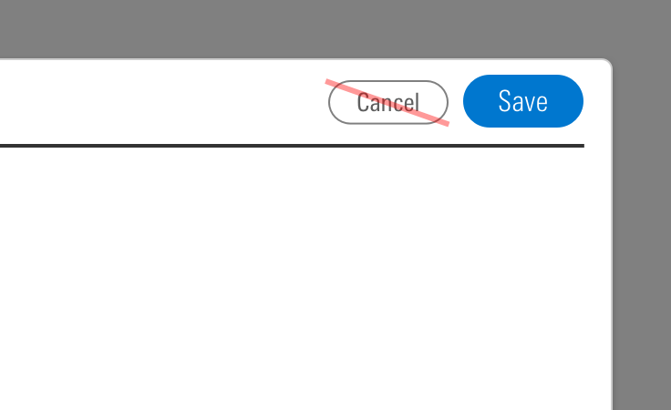
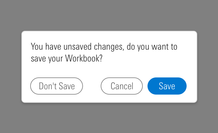
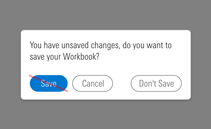
CSS
Class References
|
Class
|
Applies to
|
Outcome
|
|---|---|---|
|
|
|
Applies base button styles to an element. Always couple with a variant for semantics, though a standalone |
|
|
|
Shows primary button, to be coupled with |
|
|
|
Shows secondary button, to be coupled with |
|
|
|
Shows tertiary button, to be coupled with |
|
|
|
Applies the icon-only styles to a button element. Specifically, it removes the border strokes and background treatments found on primary and secondary buttons. |
|
|
|
Adjusts styling to render a small button. |
|
|
|
Adjusts styling to render a large button. |
|
|
|
Positions an icon to the left of a button label. |
|
|
|
Positions an icon to the right of a button label. |
|
|
|
Applies default size to the icon in a medium flat button. Never apply this class when using a small icon. |
Web Component
Props
When setting props as attributes on a custom HTML element, use kebab-case instead of camelCase.
|
Prop
|
Type
|
Validation
|
Default
|
Description
|
|---|---|---|---|---|
|
|
String |
— |
— |
A space-separated list of class names that will be appended to the default |
|
|
String |
— |
— |
A space-separated list of element |
|
|
Boolean |
Only valid when |
|
Sets the |
|
|
Boolean |
— |
|
If |
|
|
String |
— |
— |
If provided, overrides |
|
|
String |
One of: |
— |
A string containing a valid MDS icon name. If |
|
|
String |
One of: |
— |
A string containing a valid MDS icon name. When passed, this prop will render an icon to the right of the button’s text. |
|
|
String |
Required when |
— |
Sets the |
|
|
String |
One of: |
|
Alters the size of the button. |
|
|
String |
Required |
— |
The text that appears in the button. Can also be passed via the default slot. |
|
|
String |
One of: |
|
Sets the HTML element for the button. |
|
|
String |
Required when |
— |
Sets the |
|
|
String |
One of: |
|
Sets the button variation. |
Slots
Default Slot
Pass text in between the <mds-button></mds-button> tags to set the button’s text. This can be overridden with the text prop.
Additional Behaviors
Automatic aria-label for Icon-Only Buttons
Buttons using the icon-only variation will automatically use their text content as the element’s aria-label. Icon-only buttons without a text prop will trigger a validation warning.
Usage Examples
Setting size and variation via props. Using the default slot for text content:
<mds-button size="large" variation="primary"> Contact Us </mds-button>Setting variation, icon, and text via props:
<mds-button variation="icon-only" icon="bell" text="Notifications"></mds-button>Setting variation and icon via props. Using the default slot for text content:
<mds-button variation="secondary" icon="person-plus--s"> Add Client </mds-button>Setting icon and iconRight via props. Using the default slot for text content:
<mds-button icon="gear--s" icon-right="caret-down--s"> Settings </mds-button>Implementation Tips
Removing Inline-Block Space
When pairing buttons together, you’ll find that the extra space around inline-block elements makes it difficult to add precise spaces between them. Remove this space by adding font-size: 0; to the button’s parent container.
Browser Support
- This component uses a
box-shadowproperty to create an outline. Internet Explorer and Safari have known issues rendering these outlines when using the browser's zoom functionality. This visual defect doesn't affect the functionality of the component.
Best Practices
- Use a
<button>element type when displaying buttons. - An
<a>element cannot be triggered from aspacebarpress, only from anenterorreturnpress. - It is expected that a button can be triggered by pressing
spacebar,enter, orreturn.
Implementation
- Always include a
aria-labelattribute on the button tag to describe the button’s intent for icon-only buttons. See Iconography accessibility section.

