The Morningstar Design System is a collection of brand, visual, UX, and technical standards built into a central library so that teams can quickly build high-quality, consistent experiences.
Built in Vue, with a modular architecture and encapsulated styles, this release will change the way product teams consume and contribute to MDS, while remaining true to the mission that has guided MDS since its first release in 2017.
Beta components are available for internal testing purposes only, and are not supported for production use. For details, see the release announcement.

New constants, new documentation, and updated UI component interactions provide the foundation for animation in the Morningstar Design System.

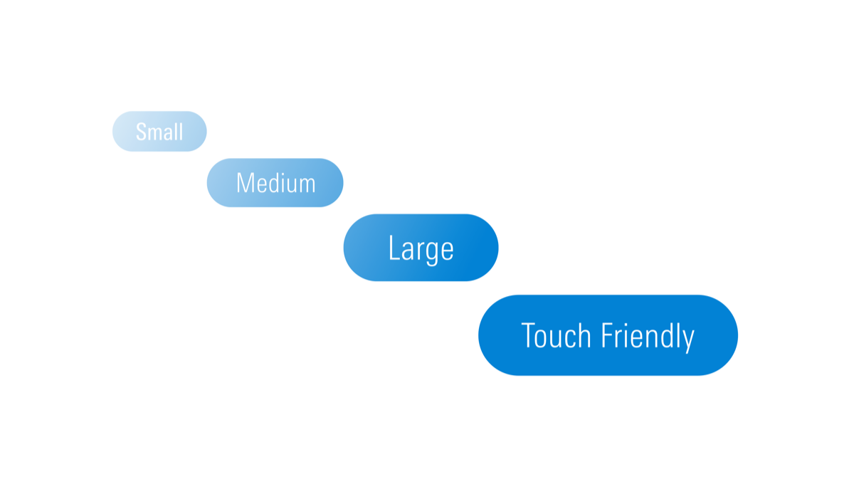
MDS now offers touch target-sized variations of many components—like Buttons, Forms, and List Groups—providing products with the parts to build accessible touch-screen experiences. See our release notes for a full list of supported components.

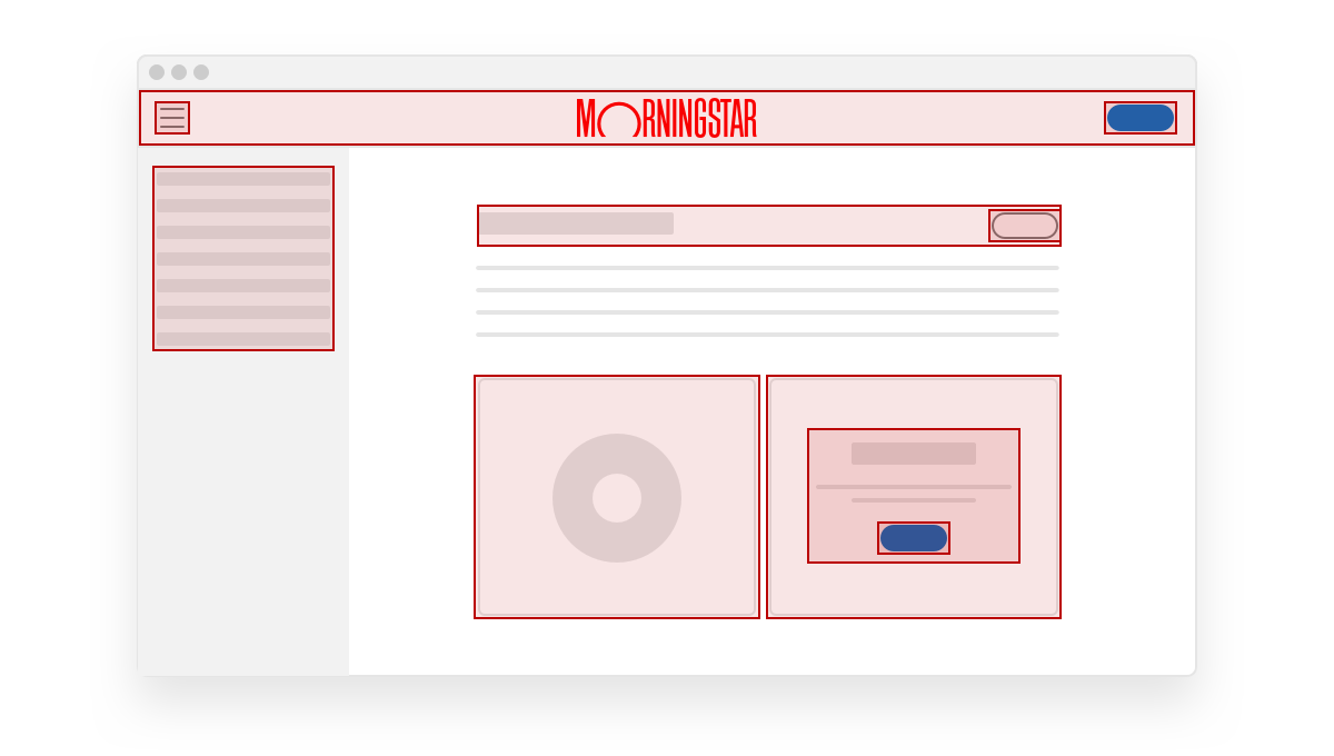
The MDS Coverage Tool allows product teams to assess their MDS adoption by highlighting MDS components used within an application. Click the button below to learn more.

- Complete
- In Progress
- Upcoming
|
Status
|
Item
|
|---|---|
| Coverage tool | |
| Component usage | |
| Stress-testing tool |
|
Status
|
Item
|
|---|---|
| MDS Components for Vue | |
| Component packaging | |
| Enhanced Data Table |
|
Status
|
Item
|
|---|---|
| Consolidate to single set of icons | |
| Refresh style (stroke width, etc.) | |
| Redesign selected icons |
|
Status
|
Item
|
|---|---|
| Establish working group | |
| Principles and objectives | |
| Road map & prioritization |

The Morningstar Design System is powered and improved by the teams that use it. We’d love to hear your feedback.

