Button Groups
Button Groups join two or more buttons into a unified control, formerly called a segmented control.
Variations
Default
Use to create a mutually exclusive toggle. Buttons within the group follow the same visual and behavioral conventions as the secondary Button.
Default
Hover
Active
Focus
Press Ctrl + C to copy
<div class="mds-button-group">
    <button class="mds-button mds-button--secondary" type="button"> Cyclical </button>
    <button class="mds-button mds-button--secondary" type="button"> Defensive </button>
    <button class="mds-button mds-button--secondary" type="button"> Sensitive </button>
</div>
Disabled
Press Ctrl + C to copy
<div class="mds-button-group">
    <button class="mds-button mds-button--secondary" type="button"> Cyclical </button>
    <button class="mds-button mds-button--secondary" type="button"> Defensive </button>
    <button class="mds-button mds-button--secondary" type="button" disabled> Sensitive </button>
</div>
Full Width
Use when you want the button group to span the full width of its container.
Full Width
Press Ctrl + C to copy
<div class="mds-button-group mds-button-group--justify">
    <label class="mds-button__input-outer-wrapper" for="cyclical--87662">
        <input id="cyclical--87662" class="mds-button__input" type="radio" name="radio-colors-secondary" checked>
        <span for="cyclical--87662" class="mds-button mds-button--secondary"> Cyclical </span>
    </label>
    <label class="mds-button__input-outer-wrapper" for="defensive--64205">
        <input id="defensive--64205" class="mds-button__input" type="radio" name="radio-colors-secondary">
        <span for="defensive--64205" class="mds-button mds-button--secondary"> Defensive </span>
    </label>
    <label class="mds-button__input-outer-wrapper" for="sensitive--57605">
        <input id="sensitive--57605" class="mds-button__input" type="radio" name="radio-colors-secondary">
        <span for="sensitive--57605" class="mds-button mds-button--secondary"> Sensitive </span>
    </label>
</div>
With Icons
Use Icons to provide additional affordance to a button.
With Icons
Press Ctrl + C to copy
<div class="mds-button-group">
    <label class="mds-button__input-outer-wrapper" for="filter--63628">
        <input id="filter--63628" class="mds-button__input" type="radio" name="radio-mixed-secondary" checked>
        <span for="filter--63628" class="mds-button mds-button--secondary">
            <svg class="mds-icon mds-button__icon mds-button__icon--left" aria-hidden="true">
                <use xlink:href="/icons/mds.svg#funnel--s"> </use>
            </svg>
            <span class="mds-button__text"> Filter </span>
        </span>
    </label>
    <label class="mds-button__input-outer-wrapper" for="upload--39368">
        <input id="upload--39368" class="mds-button__input" type="radio" name="radio-mixed-secondary">
        <span for="upload--39368" class="mds-button mds-button--secondary">
            <svg class="mds-icon mds-button__icon mds-button__icon--left" aria-hidden="true">
                <use xlink:href="/icons/mds.svg#upload--s"> </use>
            </svg>
            <span class="mds-button__text"> Upload </span>
        </span>
    </label>
    <label class="mds-button__input-outer-wrapper" for="search--20467">
        <input id="search--20467" class="mds-button__input" type="radio" name="radio-mixed-secondary">
        <span for="search--20467" class="mds-button mds-button--secondary">
            <svg class="mds-icon mds-button__icon mds-button__icon--left" aria-hidden="true">
                <use xlink:href="/icons/mds.svg#search--s"> </use>
            </svg>
            <span class="mds-button__text"> Search </span>
        </span>
    </label>
</div>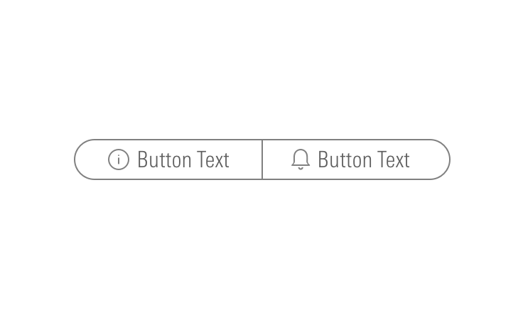
Icon Only
Use to create toolbars.
Default
Hover
Focus
Press Ctrl + C to copy
<div class="mds-button-group mds-button-group--icon-only">
    <button class="mds-button mds-button--icon-only" type="button">
        <svg class="mds-icon mds-button__icon mds-button__icon--left" aria-hidden="true">
            <use xlink:href="/icons/mds.svg#bell-padless"> </use>
        </svg>
    </button>
    <button class="mds-button mds-button--icon-only" type="button">
        <svg class="mds-icon mds-button__icon mds-button__icon--left" aria-hidden="true">
            <use xlink:href="/icons/mds.svg#create-padless"> </use>
        </svg>
    </button>
    <button class="mds-button mds-button--icon-only" type="button">
        <svg class="mds-icon mds-button__icon mds-button__icon--left" aria-hidden="true">
            <use xlink:href="/icons/mds.svg#question-circle-padless"> </use>
        </svg>
    </button>
    <button class="mds-button mds-button--icon-only" type="button">
        <svg class="mds-icon mds-button__icon mds-button__icon--left" aria-hidden="true">
            <use xlink:href="/icons/mds.svg#person-padless"> </use>
        </svg>
    </button>
</div>
Disabled
Press Ctrl + C to copy
<div class="mds-button-group mds-button-group--icon-only">
    <button class="mds-button mds-button--icon-only" type="button">
        <svg class="mds-icon mds-button__icon mds-button__icon--left" aria-hidden="true">
            <use xlink:href="/icons/mds.svg#bell-padless"> </use>
        </svg>
    </button>
    <button class="mds-button mds-button--icon-only" type="button">
        <svg class="mds-icon mds-button__icon mds-button__icon--left" aria-hidden="true">
            <use xlink:href="/icons/mds.svg#create-padless"> </use>
        </svg>
    </button>
    <button class="mds-button mds-button--icon-only mds-button--disabled" type="button" disabled>
        <svg class="mds-icon mds-button__icon mds-button__icon--left" aria-hidden="true">
            <use xlink:href="/icons/mds.svg#question-circle-padless"> </use>
        </svg>
    </button>
    <button class="mds-button mds-button--icon-only" type="button">
        <svg class="mds-icon mds-button__icon mds-button__icon--left" aria-hidden="true">
            <use xlink:href="/icons/mds.svg#person-padless"> </use>
        </svg>
    </button>
</div>- Always include
aria-labelattributes to describe each button's intent. For example,<button aria-label="Close" onclick="myDialog.close()">X</button>. - For single icons, use the icon-only Button component.
- Consider pairing with a Tooltip to describe the icon’s underlying action.
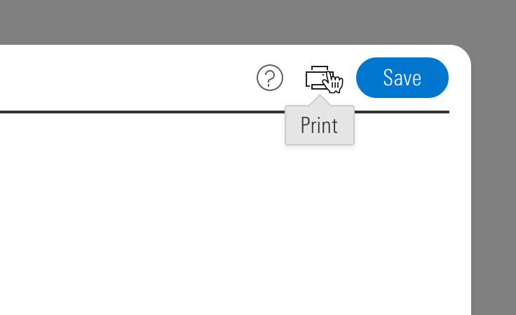 Icon-only Button Group paired with a tooltip.
- When pairing with a button, use a
$mds-space-inline-right-2-xspace, and vertically align middle the icon-only button group.- When pairing with a small button, use the small icon-only Button.
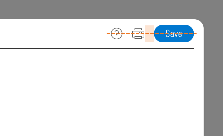 Icon-only Button Group alignment paired with a button.
Sizing
Small
Medium (Default)
Large
Press Ctrl + C to copy
<div class="mds-button-group">
    <label class="mds-button__input-outer-wrapper" for="cyclical--25630">
        <input id="cyclical--25630" class="mds-button__input" type="radio" name="small" checked>
        <span for="cyclical--25630" class="mds-button mds-button--secondary mds-button--small"> Cyclical </span>
    </label>
    <label class="mds-button__input-outer-wrapper" for="defensive--2906">
        <input id="defensive--2906" class="mds-button__input" type="radio" name="small">
        <span for="defensive--2906" class="mds-button mds-button--secondary mds-button--small"> Defensive </span>
    </label>
    <label class="mds-button__input-outer-wrapper" for="sensitive--89230">
        <input id="sensitive--89230" class="mds-button__input" type="radio" name="small">
        <span for="sensitive--89230" class="mds-button mds-button--secondary mds-button--small"> Sensitive </span>
    </label>
</div>
<br>
<br>
<div class="mds-button-group">
    <label class="mds-button__input-outer-wrapper" for="filter--6677">
        <input id="filter--6677" class="mds-button__input" type="radio" name="small-with-icon" checked>
        <span for="filter--6677" class="mds-button mds-button--secondary mds-button--small">
            <svg class="mds-icon mds-button__icon mds-button__icon--left" aria-hidden="true">
                <use xlink:href="/icons/mds.svg#funnel--s"> </use>
            </svg>
            <span class="mds-button__text"> Filter </span>
        </span>
    </label>
    <label class="mds-button__input-outer-wrapper" for="upload--25691">
        <input id="upload--25691" class="mds-button__input" type="radio" name="small-with-icon">
        <span for="upload--25691" class="mds-button mds-button--secondary mds-button--small">
            <svg class="mds-icon mds-button__icon mds-button__icon--left" aria-hidden="true">
                <use xlink:href="/icons/mds.svg#upload--s"> </use>
            </svg>
            <span class="mds-button__text"> Upload </span>
        </span>
    </label>
    <label class="mds-button__input-outer-wrapper" for="search--47960">
        <input id="search--47960" class="mds-button__input" type="radio" name="small-with-icon">
        <span for="search--47960" class="mds-button mds-button--secondary mds-button--small">
            <svg class="mds-icon mds-button__icon mds-button__icon--left" aria-hidden="true">
                <use xlink:href="/icons/mds.svg#search--s"> </use>
            </svg>
            <span class="mds-button__text"> Search </span>
        </span>
    </label>
</div>
<br>
<br>
<div class="mds-button-group mds-button-group--icon-only">
    <button class="mds-button mds-button--icon-only mds-button--small" type="button">
        <svg class="mds-icon mds-button__icon mds-button__icon--left" aria-hidden="true">
            <use xlink:href="/icons/mds.svg#search--s"> </use>
        </svg>
    </button>
    <button class="mds-button mds-button--icon-only mds-button--small" type="button">
        <svg class="mds-icon mds-button__icon mds-button__icon--left" aria-hidden="true">
            <use xlink:href="/icons/mds.svg#heart--s"> </use>
        </svg>
    </button>
    <button class="mds-button mds-button--icon-only mds-button--small" type="button">
        <svg class="mds-icon mds-button__icon mds-button__icon--left" aria-hidden="true">
            <use xlink:href="/icons/mds.svg#pencil--s"> </use>
        </svg>
    </button>
</div>
Icon Size
Icon size is predetermined and applied automatically. To avoid undesirable scaling of icon artwork, use the chart below to choose the correct icon size to use in your button group.
|
Type |
Small |
Medium |
Large |
|---|---|---|---|
|
Default |
|||
|
Icon Only |
N/A |
Guidelines
Use When
- Toggling through content in an adjacent container.
- Switching units, currency, or increments.
Visual Language
- Always follows the same conventions as secondary Buttons.
Behaviors
- By default, the button group should start with its first item in the active state.
Editorial
- This component looks best when the content is balanced.
- Ideally, button labels should have the same number of words. Preferably one word each.
- When impossible, button labels should be within one word of each other, count wise.
- Do: Files / Forms & Reports
- Don't: Files / Market Commentary for Advisors / Reports
- See Buttons for more guidance.
Related UX Patterns
Accessibility
- Include a
role="group"attribute for a default button group.- If a button group is used for navigation, set
role="navigation". - If a button group is being used as a toolbar, set
role="toolbar".
- If a button group is used for navigation, set
- Include an
aria-label="..."to describe the intention of the button group.- For example,
aria-label="View Toggle"could describe a button group set that changes the view of a content module below the button group.
- For example,
- See Buttons for more guidance.