Borders
Borders define space, establish hierarchy and structure content.
Separators
Separators are visual elements that break apart or contain space, i.e., rules between objects or outlines on objects.
Example
Variables
-
On White$mds-border-separator-on-whitesolid 1px #e5e5e5
-
On Light Gray$mds-border-separator-on-light-graysolid 1px #cccccc
-
On Dark Gray$mds-border-separator-on-dark-graysolid 1px #333333
-
On Black$mds-border-separator-on-blacksolid 1px #333333
Controls
Controls are a subset of UI components that facilitate interaction within the application, i.e., Secondary Buttons, Button Groups and the Search Field. Control borders are used to outline these components and are not intended for use as separators.
Example
Variables
-
On White$mds-border-control-on-all-backgroundssolid 1px #808080
-
On Light Gray$mds-border-control-on-all-backgroundssolid 1px #808080
-
On Dark Gray$mds-border-control-on-all-backgroundssolid 1px #808080
-
On Black$mds-border-control-on-all-backgroundssolid 1px #808080
Containers
Container borders create contrast between a layered component – such as a Popover or Dialog – and the background canvas on which it is layered.
Example
Variables
Layered components – Dialog, Modal, Notifications, and Popover – only use containers with white backgrounds. Therefore, layered components only have one border variable that works across all backgrounds.
-
On White$mds-border-container-on-all-backgroundssolid 1px #e5e5e5
-
On Light Gray$mds-border-container-on-all-backgroundssolid 1px #e5e5e5
-
On Dark Gray$mds-border-container-on-all-backgroundssolid 1px #e5e5e5
-
On Black$mds-border-container-on-all-backgroundssolid 1px #e5e5e5
Headers
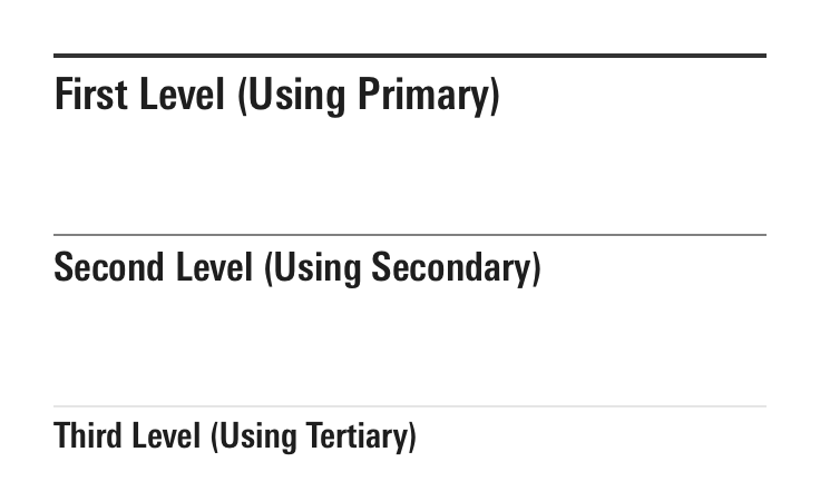
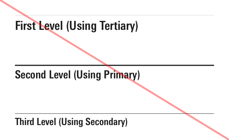
Header borders establish a clear hierarchy of content on a page by offering three variations: Primary, Secondary, and Tertiary. Use these variations to create a legible visual architecture which clearly communicates the organization of information.


Primary
Variables
-
On White$mds-border-header-primary-on-whitesolid 2px #333333
-
On Light Gray$mds-border-header-primary-on-light-graysolid 2px #1e1e1e
-
On Dark Gray$mds-border-header-primary-on-dark-graysolid 2px #e5e5e5
-
On Black$mds-border-header-primary-on-blacksolid 2px #e5e5e5
Secondary
Variables
-
On White$mds-border-header-secondary-on-whitesolid 1px #808080
-
On Light Gray$mds-border-header-secondary-on-light-graysolid 1px #808080
-
On Dark Gray$mds-border-header-secondary-on-dark-graysolid 1px #808080
-
On Black$mds-border-header-secondary-on-blacksolid 1px #808080
Tertiary
Variables
-
On White$mds-border-header-tertiary-on-whitesolid 1px #e5e5e5
-
On Light Gray$mds-border-header-tertiary-on-light-graysolid 1px #cccccc
-
On Dark Gray$mds-border-header-tertiary-on-dark-graysolid 1px #333333
-
On Black$mds-border-header-tertiary-on-blacksolid 1px #333333

