

Buttons
Buttons trigger interactions throughout the experience.
Button
Variations
Primary
Use for highest-priority actions that are required to complete the user’s task.
<button class="mds-button mds-button--primary" type="button" role="button"> Button Text </button><button class="mds-button mds-button--primary" type="button" disabled role="button"> Button Text </button>- Use a primary button only once per page, though an additional primary button can appear within Modals, Popovers, or Notifications when needed to signal critical actions.
Secondary
Use for non-critical actions.
<button class="mds-button mds-button--secondary" type="button" role="button"> Button Text </button><button class="mds-button mds-button--secondary" type="button" disabled role="button"> Button Text </button>- Use for most buttons triggering non-critical actions, such as back, cancel, adding or creating an object.
Flat
Use for tertiary actions.
Flat, No Background
Replaces Flat, Deprecated by reducing padding and removing rounded corners on left and right edges.
<button class="mds-button mds-button--flat-no-background" type="button" role="button"> Button Text </button><button class="mds-button mds-button--flat-no-background" type="button" disabled role="button"> Button Text </button>Flat, Deprecated, to be removed in v2.0.0.
Use Flat, No Background variation instead.
With Icon
Add Icons to provide additional affordance to a button.
<button class="mds-button mds-button--primary" type="button" role="button">
    <svg class="mds-icon mds-button__icon mds-button__icon--left" aria-hidden="true">
        <use xlink:href="/assets/icons/mds_icons.svg#open-new--s"> </use>
    </svg>
    <span class="mds-button__text"> Copy Document </span>
</button>
<button class="mds-button mds-button--secondary" type="button" role="button">
    <svg class="mds-icon mds-button__icon mds-button__icon--left" aria-hidden="true">
        <use xlink:href="/assets/icons/mds_icons.svg#open-new--s"> </use>
    </svg>
    <span class="mds-button__text"> Copy Document </span>
</button>
<button class="mds-button mds-button--flat-no-background" type="button" role="button">
    <svg class="mds-icon mds-button__icon mds-button__icon--left" aria-hidden="true">
        <use xlink:href="/assets/icons/mds_icons.svg#open-new--s"> </use>
    </svg>
    <span class="mds-button__text"> Copy Document </span>
</button>- Only place an Icon to the left of a button's label to emphasize meaning.
- Only place an Icon to the right of a button's label to trigger a Menu or imply directionality.
Icon Only
Use for toolbars and displays where words won't comfortably fit alongside icons.
<button class="mds-button mds-button--icon-only" type="button" role="button">
    <svg class="mds-icon mds-button__icon mds-button__icon--right">
        <use xlink:href="/assets/icons/mds_icons.svg#person-padless">
            <title>User</title>
        </use>
    </svg>
</button><button class="mds-button mds-button--icon-only mds-button--hover" type="button" disabled role="button">
<svg class="mds-icon mds-button__icon mds-button__icon--right">
<use xlink:href="/assets/icons/mds_icons.svg#person-padless">
<title>User</title>
</use>
</svg>
</button>- Only use when the Icon’s meaning is unambiguous.
- For toolbars of multiple Icons, use the Button Group component to ensure spacing between icons.
- Use with Icon
removeorremove--sto close Modals, Notifications, and Tooltip prompts. - Use with Icon
removeorremove--sto remove an item from a list.
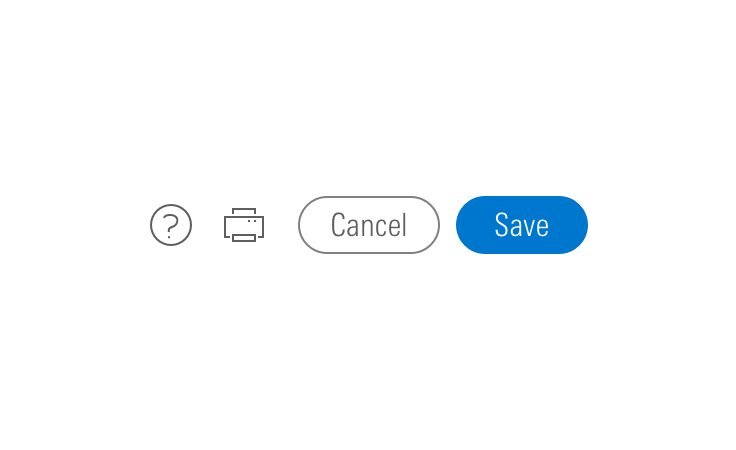
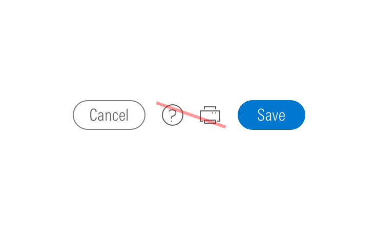
- When pairing with a button, use an
$mds-space-inline-left-xlspace and vertically align middle the icon-only button. - When pairing with a small button, use the small icon-only button.
Sizing
Configure button size and icon size independently within the button.
Button Size
Each button variation allows for small, medium, and large sizes. The default size is medium, and you can use modifier classes to make the button smaller (mds-button--small) or larger (mds-button--large).
<button class="mds-button mds-button--small mds-button--primary" type="button" role="button">
    <span class="mds-button__text"> Continue </span>
    <svg class="mds-icon mds-button__icon mds-button__icon--right" aria-hidden="true">
        <use xlink:href="/assets/icons/mds_icons.svg#caret-right--s"> </use>
    </svg>
</button>
<button class="mds-button mds-button--small mds-button--secondary" type="button" role="button">
    <span class="mds-button__text"> Continue </span>
    <svg class="mds-icon mds-button__icon mds-button__icon--right" aria-hidden="true">
        <use xlink:href="/assets/icons/mds_icons.svg#caret-right--s"> </use>
    </svg>
</button>
<button class="mds-button mds-button--small mds-button--flat-no-background" type="button" role="button">
    <span class="mds-button__text"> Continue </span>
    <svg class="mds-icon mds-button__icon mds-button__icon--right" aria-hidden="true">
        <use xlink:href="/assets/icons/mds_icons.svg#caret-right--s"> </use>
    </svg>
</button>
<button class="mds-button mds-button--small mds-button--icon-only" type="button" role="button">
    <svg class="mds-icon mds-button__icon mds-button__icon--right">
        <use xlink:href="/assets/icons/mds_icons.svg#heart--s">
            <title>User</title>
        </use>
    </svg>
</button>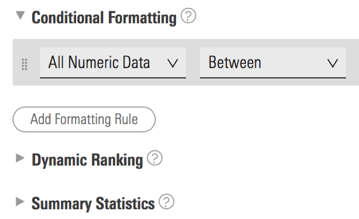
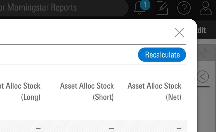
- Use small buttons in toolbars and Popover and Menu headers.
- Never apply the
mds-button--largeto an Icon-Only button.
Icon Size
Icon size depends on button type and size. In some cases, markup requires a modifier class to display the correct icon size based on a button’s size.
|
Type |
Small button |
Medium button |
Large button |
|---|---|---|---|
|
Primary |
Small Icon |
Small Icon |
Medium Icon |
|
Secondary |
Small Icon |
Small Icon |
Medium Icon |
|
Flat |
Small Icon |
Small OR Medium Icon |
Medium Icon |
|
Icon Only |
Small Icon |
Medium Icon |
N/A |
- By default, Primary, Secondary, and Flat buttons display a small icon.
- Apply the
.mds-button--icon-mclass to a large Primary, large Secondary, and large or medium Flat button to display a medium-sized icon. - Never use
--ssized icon SVGs when including.mds-button--icon-mto size the icon. - Never apply
.mds-button--icon-mto a medium or small Primary or Secondary button or small Icon-Only or Flat button. - The Icon-Only button applies the correct icon size based the button’s size. A medium-sized Icon-Only button displays a medium-sized icon, and a small-sized Icon-Only button displays a small-sized icon.
Guidelines
Use When
- Affording interaction to key behaviors and features.
- Confirming or submitting information entered into a Form.
- Cancelling an action.
- Resetting a form or dataset.
- Closing a container or section.
- Opening a Menu.
- Moving forward or backward through a wizard-type workflow.
- Creating an object within a group.
- Applying a non-critical action to a dataset.
Don′t Use When
- Displaying a collection of links to sections. Use Links instead.
- Linking to an external site. Use Links instead.
Visual Language

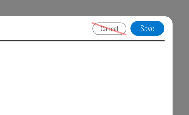
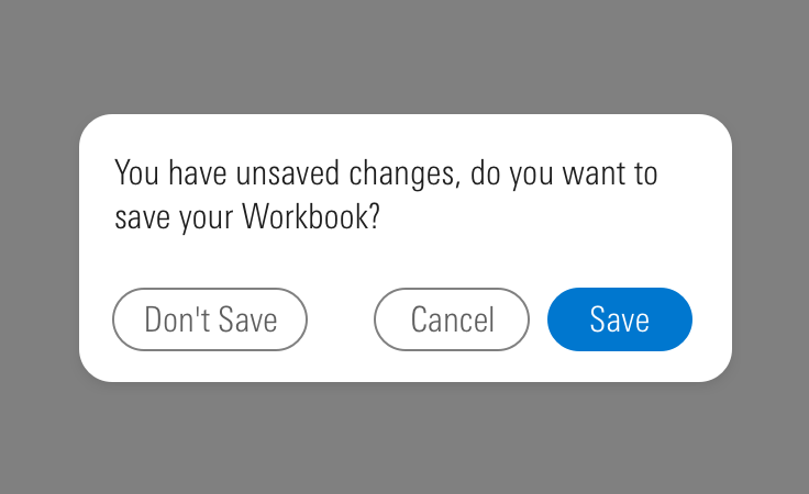
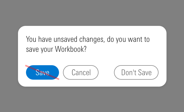
Editorial
- Label a button with a verb, like “Copy”, or verb-phrase, like “Copy Document”.
- Strive for short button labels that clearly describe an action.
- Avoid lengthy button labels that risk wrapping, particularly in responsive settings.
Accessibility
- Use a
<button>element type when displaying buttons. - Do not use
divorspanunless strictly required, such as when using the sort buttons in Data Tables. - An
<a>element cannot be triggered from aspacebarpress, only from anenterorreturnpress. - It is expected that a button can be triggered by pressing
spacebar,enter, orreturn. - Always include a
<title>tag on thesvgwithin an icon-only button to describe the button’s intent for icon-only buttons. See Iconography accessibility section.
Code Reference
CSS Class References
|
Class |
Applies to |
Outcome |
|---|---|---|
|
|
|
Applies base button styles to an element. Always couple with a variant for semantics, though a standalone |
|
|
|
Shows primary button, to be coupled with |
|
|
|
Shows secondary button, to be coupled with |
|
|
|
Shows tertiary button, to be coupled with |
|
|
|
Applies the icon-only styles to a button element. Specifically, it removes the border strokes and background treatments found on primary and secondary buttons. |
|
|
|
Adjusts styling to render a small button. |
|
|
|
Adjusts styling to render a large button. |
|
|
|
Positions an icon to the left of a button label. |
|
|
|
Positions an icon to the right of a button label. |
|
|
|
Sizes an icon as medium within a medium or large button. Always use for large Primary, Secondary and Flat buttons, medium Icon-Only buttons that need a medium-sized icon, and optionally for medium Flat buttons. Never use for other medium or small button types. |