

Tags
Tags provide contextualizing information, such as filtering criteria or object metadata.
Variations
Default
Use to display information that clarifies the content on the page, such as object metadata.
Default
Shared
Press Ctrl + C to copy
<div class="mds-tag"> Shared </div>- Tags can label items within components such as Data Tables and List Groups.
Examples
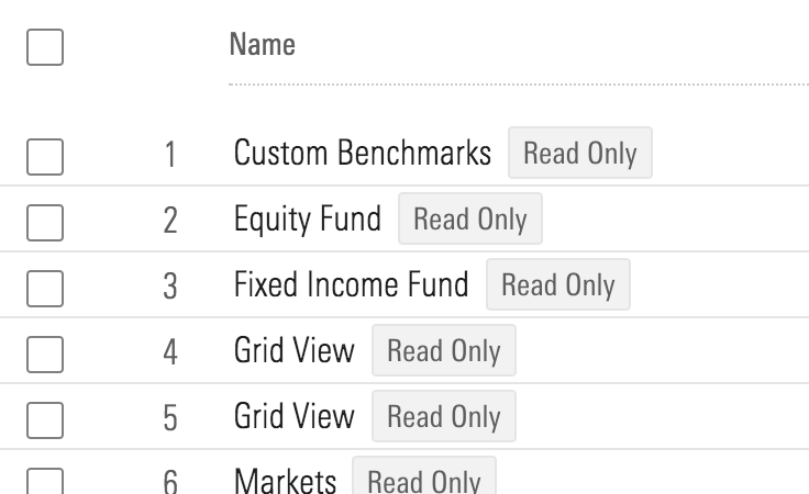 Tags providing permission related information.
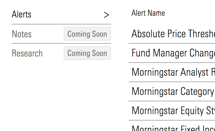 Tags marking the status of content.
Link
Use to enable the tag text to navigate to other pages or additional information.
Press Ctrl + C to copy
<a href="#" class="mds-tag mds-tag--link">Alphabet Inc</a>- Never intermingle default and link tags.
- Never use a link tag to trigger interactions other than navigating to other pages or additional information. Instead, use a Button.
- Link tags can be used to allow users to navigate to view other objects which are similarly labelled.
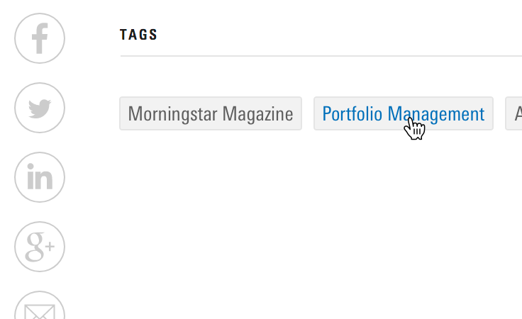 A group of linked tags on the Morningstar Blog.
Dismissible
Use to enable tags to be removed.
Dismissible
Equity
Press Ctrl + C to copy
<div class="mds-tag"> Equity
    <button class="mds-button mds-button--icon-only mds-tag--dismissible__button" type="button" role="button">
        <svg class="mds-icon mds-button__icon mds-button__icon--left">
            <use xlink:href="/assets/icons/mds_icons.svg#remove--s">
                <title>Dismiss Tag</title>
            </use>
        </svg>
    </button>
</div>- The dismissal action is tied only to the
remove-sicon within the tag.
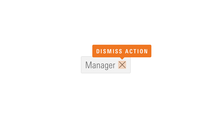
- Dismissible tags can be used to represent removable filtering criteria.


Sizing
Sizing affects text size and internal padding. The default size is small, and you can use a modifier class to make the tag larger (mds-tag--medium).
Small
Shared
Medium
Shared
Press Ctrl + C to copy
<div class="mds-tag"> Shared </div>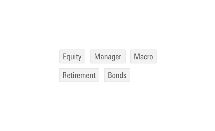
Guidelines
Use When
- Showing information which helps a user make sense of content on the page, such as filter parameters or object metadata.
Don′t Use When
- Creating an object whose primary function is triggering an interaction. Instead, use a Button.
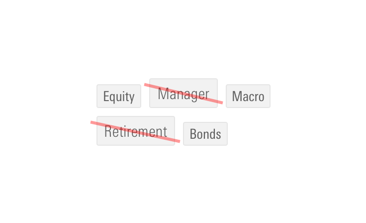
- Offering a description of an object that exceeds 3–5 words. Instead, consider using a Tooltip or Popover.
Visual Language
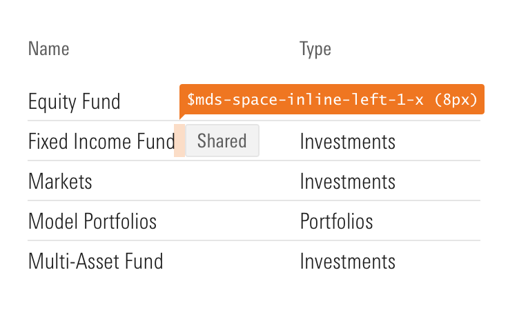
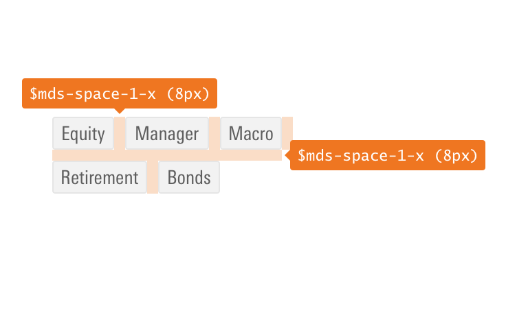
- Always use MDS inline spacing constants when spacing a tag from another element.
- Tags should utilize
$mds-space-1-x(8px) for both horizontal and vertical spacing. - When creating a group of tags, products will have to apply their own spacing between each tag.
Behaviors
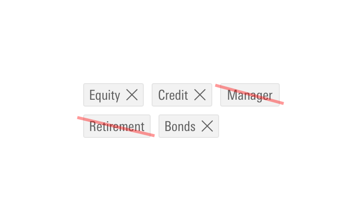
- When removed, fade the tag out and relinquish its space. Remaining tags should then fill the space as appropriate.
Editorial
- Strive for short tag labels that clearly describe an action.
- Always utilize title case.
- Avoid tag labels longer than 3–5 words, particularly in responsive settings.
- Always use consistent naming when using a tag to represent a parameter set somewhere else, i.e., if the filter setting is “Equity” the tag should read “Equity”.
Accessibility
- Always use an Icon Only Button for the dismiss action on a dismissible tag. This provides the required keyboard navigability.
- Always include a
titletag on the dismiss icon with appropriate text for screen readers like “Remove Tag” or “Dismiss Tag.” See the accessibility guidelines for MDS icons for more information.
- Always include a
Code Reference
CSS Class References
|
Class |
Applies to |
Outcome |
|---|---|---|
|
|
|
Increases text size and internal padding. |
|
|
|
Adds Link styling to tag text. |
|
|
|
Dismisses the alert by animating a fade-out effect. |