Color
Color is an integral aspect of conveying clear concise data. Our colors are optimized across four backgrounds, meeting or exceeding WCAG 2.0 Level AA Accessibility Guidelines.
Palettes
Neutrals
Our neutrals have been streamlined for on-screen use. They are organized by lightness value from Black (0) to White (100).
-
Black$mds-color-black#000000AAA
-
12$mds-color-neutral-12#1e1e1eAAA
-
20$mds-color-neutral-20#333333AAA
-
37$mds-color-neutral-37#5e5e5eAA
-
50$mds-color-neutral-50#808080AA18
-
67$mds-color-neutral-67#abababAAA
-
80$mds-color-neutral-80#ccccccAAA
-
90$mds-color-neutral-90#e5e5e5AAA
-
95$mds-color-neutral-95#f2f2f2AAA
-
White$mds-color-white#ffffffAAA
Feedback
Use feedback colors to reinforce user action. Color alone is not sufficient to meet WCAG 2.0 Level AA Accessibility Guidelines. An additional affordance, such as an Icon, must be included.
Errors
-
Error$mds-background-color-feedback-error#ff0000DNP
Always pair with mds-text-color-white when used as a background color.
Warnings
-
Warning$mds-background-color-feedback-warning#f5c400AAA
Always pair with mds-text-color-primary-on-light when used as a background color.
Backgrounds
Background colors work in pairs to establish visual hierarchy.
Primary
-
White$mds-background-color-default#ffffff
-
Black$mds-background-color-black#000000
Primary backgrounds always contain the product’s focal point. The user is doing most of their work on this background.
Secondary
-
Light Gray$mds-background-color-light#f2f2f2
-
Dark Gray$mds-background-color-dark#1e1e1e
Secondary backgrounds offer visual rest from primary backgrounds. They often contain auxiliary elements such as side navigation, card backgrounds, registration forms, or ad-unit containers.
The MDS site uses the secondary-background for the navigation on the left. The site’s content is contained in the primary-background area.
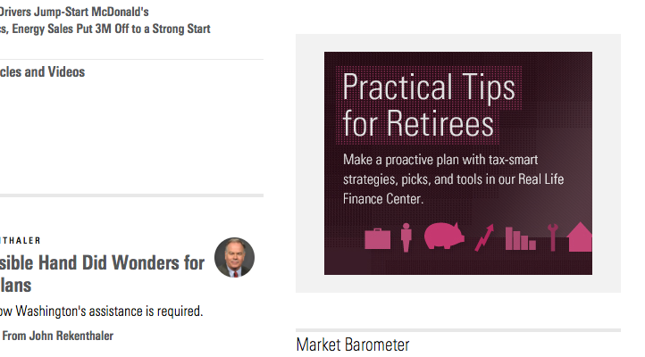
Morningstar.com uses the secondary-background to contain ad units. This helps separate ad units from editorial content.
Interactive
Use to establish interactivity and hierarchy between UI components (i.e., mds-button--primary versus mds-button).
-
Default$mds-interactive-color-primary-default#0077cfAA
-
Hover$mds-interactive-color-primary-hover#005ba1AA
-
Active$mds-interactive-color-primary-active#004376AAA
- Always pair with
$mds-text-color-primary-on-darkwhen used as a background color. - Never use
$mds-interactive-color-primary-defaultfor text, as this creates an optical imbalance with interactive objects.
Text
Text on any background color must have a minimum foreground-to-background contrast ratio of 4.5:1. This ensures compliance with WCAG 2.0 Level AA Accessibility Guidelines.
Brand logos and disabled text do not have a minimum contrast ratio. All other content, including placeholder text, must meet or exceed 4.5:1.
Primary
Use for fundamental text, such as body copy, Data Table cell data, and List Group items.
-
On White$mds-text-color-primary-on-light#1e1e1eAA
-
On Light$mds-text-color-primary-on-light#1e1e1eAA
-
On Dark$mds-text-color-primary-on-dark#ffffffAA
-
On Black$mds-text-color-primary-on-dark#ffffffAA
Secondary
Use for supportive text, such as placeholder text in Forms, Data Table column headers, and metadata.
-
On White$mds-text-color-secondary-on-light#5e5e5eAA
-
On Light$mds-text-color-secondary-on-light#5e5e5eAA
-
On Dark$mds-text-color-secondary-on-dark#abababAA
-
On Black$mds-text-color-secondary-on-dark#abababAA
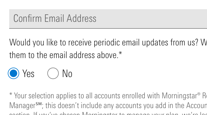
In this example, mds-text-color-secondary-on-light is used for text box placeholder text in Forms, as well as for the readout of disclosure information in small type (metadata).
Links
-
Link on White$mds-text-color-link-on-light#006fbaAA
-
Link on Light$mds-text-color-link-on-light#006fbaAA
-
Link on Dark$mds-text-color-link-on-dark#008ddeAA
-
Link on Black$mds-text-color-link-on-dark#008ddeAA
Error
Use to highlight errors. This color is under evaluation, as it doesn’t meet Accessibility benchmarks.
-
On White$mds-text-color-error-on-light#ff0000DNP
-
On Light$mds-text-color-error-on-light#ff0000DNP
-
On Dark$mds-text-color-error-on-dark#ff0000DNP
-
On Black$mds-text-color-error-on-dark#ff0000DNP
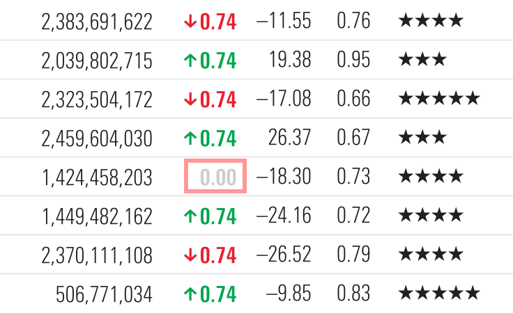
Disabled
Use to indicate components that cannot be used. Disabled components are exempt from minimum contrast ratios.
-
On White@include disabled-text()
-
On Light@include disabled-text()
-
On Dark@include disabled-text()
-
On Black@include disabled-text()
Use the @include disabled-text(text-color) mixin on a component to render the disabled text color.
Visualization & Charts
We assign specific meanings and orders to colors to create clarity and consistency across widely-used data visualizations.
Asset Allocation
Use to tie data to asset classes.
-
Local Stocks$mds-visualization-color-asset-allocation-local-stocks#1f55a5
-
Non-Local Stocks$mds-visualization-color-asset-allocation-non-local-stocks#8faad2
-
Bonds$mds-visualization-color-asset-allocation-bonds#ef7622
-
Real Estate$mds-visualization-color-asset-allocation-real-estate#a50032
-
Cash$mds-visualization-color-asset-allocation-cash#518428
-
Other$mds-visualization-color-asset-allocation-other#f5c400
-
Not Classified$mds-visualization-color-asset-allocation-not-classified#e5e5e5
- If a product does not use these exact terms when breaking down asset classes, use the color associated with the closest asset type. For example, Alternatives would use the color ascribed to Real Estate.
- Never apply these colors to type, as they don’t meet Accessibility guidelines.
Correlation
Use to show positive or negative correlation within a Correlation Matrix.
-
Positive$mds-visualization-color-correlation-positive#1f55a5
-
Negative$mds-visualization-color-correlation-negative#ef7622
Super Sectors
Use to represent data relating to Morningstar Super Sectors.
-
Cyclical$mds-visualization-color-sector-cyclical#ef7622
-
Sensitive$mds-visualization-color-sector-sensitive#1f55a5
-
Defensive$mds-visualization-color-sector-defensive#518428
- Sectors that underlie a larger Super Sector should inherit the color of the Super Sector. For example, Basic Materials would use the color ascribed to Cyclical.
- Never apply these colors to type, as they don’t meet Accessibility guidelines.
Sustainability
Use to represent data related to the Morningstar Sustainability Rating.
-
Sustainability$mds-visualization-color-sustainability#1f55a5
Valuation
Use to represent under, fair, or over valuation.
-
Under$mds-visualization-color-valuation-under#00a8e1
-
Fair$mds-visualization-color-valuation-fair#e5efef
-
Over$mds-visualization-color-valuation-over#ef7622
- Never apply these colors to type, as they don’t meet Accessibility guidelines.
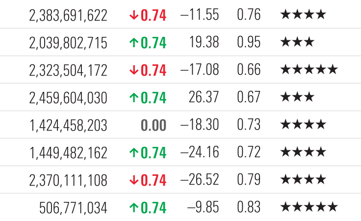
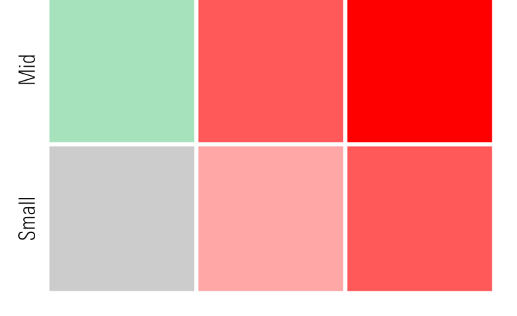
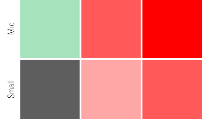
Performance
Use to show positive, neutral, or negative performance in both text and visualizations. The positive and negative colors are under evaluation for use in text, as they don’t meet Accessibility guidelines.
-
Positive$mds-visualization-color-performance-positive#00af41DNP
-
Neutral, Text$mds-visualization-color-performance-neutral-text#5e5e5eAA
-
Neutral, Chart$mds-visualization-color-performance-neutral-chart#ccccccDNP
-
Negative$mds-visualization-color-performance-negative#ff0000DNP
- Apply
$mds-font-weight-boldas the font weight to typography using performance colors.
Color Order Inside Charts
Use when there are no specific color meanings associated with a visualization.
-
1$mds-chart-color-1#1f55a5
-
2$mds-chart-color-2#a50032
-
3$mds-chart-color-3#f5c400
-
4$mds-chart-color-4#518428
-
5$mds-chart-color-5#00a8e1
-
6$mds-chart-color-6#6a4c9e
-
7$mds-chart-color-7#ef7622
-
8$mds-chart-color-8#005f5f
-
9$mds-chart-color-9#00af41
-
10$mds-chart-color-10#e60546
-
11$mds-chart-color-11#7d256f
-
12$mds-chart-color-12#c19c31
-
13$mds-chart-color-13#00beaf
-
14$mds-chart-color-14#ff3c00
-
15$mds-chart-color-15#89bd40
- Use colors in order, starting with
$mds-chart-color-1and ascending in order to$mds-chart-color-15. If there are more than 15 items, begin again with$mds-chart-color-1. - This color order is intended to be a default for when there are not specific color meanings assigned to the data. Designers may deviate from the default when color can be used to communicate meaning.
Borders
Borders define and structure content.
Separators
-
On White$mds-border-separator-defaultsolid 1px #e5e5e5
-
On Light$mds-border-separator-on-lightsolid 1px #cccccc
-
On Dark$mds-border-separator-on-darksolid 1px #333333
-
On Black$mds-border-separator-on-darksolid 1px #333333
Controls
-
On White$mds-border-control-defaultsolid 1px #808080
-
On Light$mds-border-control-defaultsolid 1px #808080
-
On Dark$mds-border-control-defaultsolid 1px #808080
-
On Black$mds-border-control-defaultsolid 1px #808080
Accessibility
Color contrast refers to the difference between foreground and background. The World Wide Web Consortium established specific color-contrast ratios for achieving compliance. The guidelines are split into three levels: A, AA, and AAA. The organizational benchmark for Morningstar products is Level AA.
The color decisions shared here reflect an adherence to a contrast ratio of at least 4.5:1. When possible, we recommend a ratio near 5.5:1, just to be safe. Never use any combinations that do not meet Level AA Guidelines.
Rating |
Description |
|---|---|
|
AAA
|
Passes Level AAA Guidelines at all sizes. Minimum contrast ratio ≥ 7.0:1. |
|
AA
|
Passes Level AA Guidelines at all sizes. Minimum contrast ratio ≥ 4.5:1. |
|
AA18
|
Passes Level AA Guidelines only at ≥18px type size or bold weight. Minimum contrast ratio ≥ 3.0:1. |
|
DNP
|
Does not pass Level AA Guidelines. Do not use. |
The table above is reproduced from W3C’s Web Content Accessibility Guidelines 2.0.
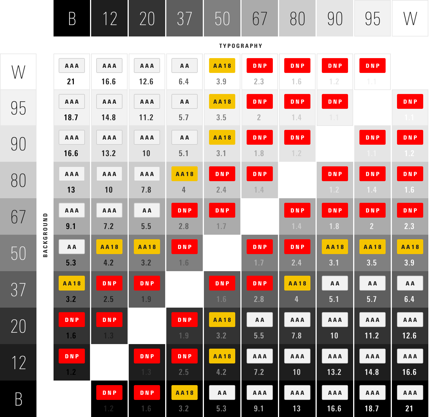
Neutrals Color Contrast Matrix
Subtlety and refinement are integral to our visual language, however, ensuring that our content is legible takes precedent. The successes and failures below guided System color decisions.