
Dialogs
Dialogs elicit a response or reveal critical information without losing the context of the underlying page.
Variations
Default
Use to communicate critical information.
Example
Default
Press Ctrl + C to copy
<div role="dialog" class="mds-dialog ">
    <span class="mds-dialog__message">You have uploaded an incorrect file type, please only upload .xls files.</span>
    <div class="mds-dialog__action-buttons">
        <div class="mds-dialog__cancel-resolve-buttons-holder">
            <button class="mds-button mds-dialog__cancel-button" type="button" role="button"> Cancel </button>
        </div>
    </div>
</div>- Dismiss a dialog by:
- Clicking secondary Button.
- Pressing the
escapekey. - Clicking outside the dialog.
With Primary Action
Use to communicate critical information that presents the user with a choice.
Example
With Primary Action
Press Ctrl + C to copy
<div role="dialog" class="mds-dialog ">
<span class="mds-dialog__message">Turning off logic mode will remove all parentheses and change the connection between all widgets back to “and”. Are you sure you want to proceed?</span>
<div class="mds-dialog__action-buttons">
<div class="mds-dialog__cancel-resolve-buttons-holder">
<button class="mds-button mds-dialog__cancel-button" type="button" role="button"> Cancel </button>
<button class="mds-button mds-dialog__resolve-button mds-button--primary" type="button" role="button"> Continue </button>
</div>
</div>
</div>- Place the primary Button at the bottom right of the dialog.
- Use to communicate critical information that requires confirmation or when a user’s action would result in data loss.
- Requires intentional confirmation or cancellation. This dialog cannot be dismissed by pressing the
escapekey or by clicking outside of the dialog.
With Third Action
Example
With Third Action
Press Ctrl + C to copy
<div role="dialog" class="mds-dialog ">
    <span class="mds-dialog__message">Your Workbook contains unsaved data, do you want to save your changes?</span>
    <div class="mds-dialog__action-buttons">
        <button class="mds-button mds-dialog__reject-button" type="button" role="button"> Don't save </button>
        <div class="mds-dialog__cancel-resolve-buttons-holder">
            <button class="mds-button mds-dialog__cancel-button" type="button" role="button"> Cancel </button>
            <button class="mds-button mds-dialog__resolve-button mds-button--primary" type="button" role="button"> Save </button>
        </div>
    </div>
</div>- Place the primary Button at the bottom right of the dialog.
- Place the opposite of the primary action at the bottom left of the dialog.
With Input
Example
With Input
Press Ctrl + C to copy
<div role="dialog" class="mds-dialog ">
    <span class="mds-dialog__message">Do you want to save this workbook?
        <p> </p>
        <label for='mds-dialog-example-input' class='mds-form__label'>Name</label>
        <input class="mds-form__input" type="text" id="mds-dialog-example-input" placeholder="Name Untitled Workbook"> </span>
    <div class="mds-dialog__action-buttons">
        <button class="mds-button mds-dialog__reject-button" type="button" role="button"> Don't save </button>
        <div class="mds-dialog__cancel-resolve-buttons-holder">
            <button class="mds-button mds-dialog__cancel-button" type="button" role="button"> Cancel </button>
            <button class="mds-button mds-dialog__resolve-button mds-button--primary" type="button" role="button"> Save </button>
        </div>
    </div>
</div>- Include additional Form elements to gather relevant information.
Guidelines
Use When
- Displaying content critical to a workflow, or when requiring an action or confirmation before proceeding.
- Alerting a user that their action would result in data loss.
- Asking the user to save a state or modification.
Don't Use When
- Displaying non-critical information that doesn’t need to interrupt a workflow. Instead, use a Notification.
- Gathering information or requiring the user to complete a task. Instead, use a Modal.
Visual Language
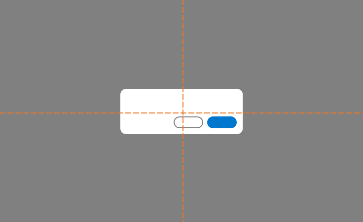
- Center dialogs horizontally and vertically in the viewport.
 Appropriate centering of a dialog.
- Use a page overlay (
$mds-color-black,$mds-opacity-overlay) to partially block out the underlying page and focus attention on the dialog contents.
Editorial
- Aim for brief expressions of cause and effect. Try for no more than 2 sentences.
- In a non-judgemental way, tell the user why their action failed, if relevant, and what they can do to resolve their error. Don’t leave them hanging.
- If there’s more than 2 sentences of information to relay, consider using a Modal.
- When stating opposite actions in nearby buttons, try to use the same root verb, i.e., Don’t Save / Cancel / Save.
Accessibility
- Include
role=”dialog”in.mds-dialogelement attributes. - Include an
aria-describedbyattribute with.mds-dialog. - The
aria-describedbyattribute should but used to describe the content of the dialog. - Include at least one focusable element, this will usually be a button.
- Prevent access to other elements of the page by storing the reference of last focused page element and
tabIndexstatus for all elements. Then, remove the page element’s tab group and focus status. - Limit tab order to loop only through dialog elements while a dialog is open.
- Restore the underlying page's tab order when a dialog is closed.
- Restore the focus state for the last focused item before the dialog was opened, which will likely be the trigger that initiated the
.mds-dialog.
Code Reference
CSS Class References
|
Class |
Applies to |
Outcome |
|---|---|---|
|
|
|
Indicates that the dialog is a popup. |
|
|
|
Fades out the |
|
|
|
Fades out the page overlay with animation. |
JavaScript Considerations
- The dialog is usually integrated into the system / framework code, such as React, Angular, etc., or in-house JavaScript framework. Hence, we encourage teams to implement their own dialog JavaScript. MDS provides interactive dialog examples strictly for documentation and reference.
- The dialog will block all other interactions on the page. Therefore, attach the dialog popup container just before the end of the page