Modals gather information, complete a subtask, or provide additional information without losing the context of an underlying page.
Use when displaying information that does not require a user action, such as a read-only document or a supplemental video.
<div class="mds-modal mds-modal--static" tabindex="-1">
    <section role="dialog" aria-labelledby="title-modal-1" class="mds-modal__container" data-id="modal-1" aria-hidden="true" data-mds-modal-size="m" data-mds-modal-primary="false">
        <div class="mds-modal__inner">
            <header class="mds-modal__header">
                <div class="mds-modal__actions">
                    <button class="mds-button mds-button--icon-only" type="button" data-mds-modal-close role="button">
                        <svg class="mds-icon mds-button__icon mds-button__icon--left">
                            <use xlink:href="/assets/icons/mds_icons.svg#question-circle">
                                <title>Help</title>
                            </use>
                        </svg>
                    </button>
                    <button class="mds-button mds-button--icon-only" type="button" data-mds-modal-close role="button">
                        <svg class="mds-icon mds-button__icon mds-button__icon--left">
                            <use xlink:href="/assets/icons/mds_icons.svg#print">
                                <title>Print</title>
                            </use>
                        </svg>
                    </button>
                    <button class="mds-button mds-button--icon-only" type="button" data-mds-modal-close role="button">
                        <svg class="mds-icon mds-button__icon mds-button__icon--left">
                            <use xlink:href="/assets/icons/mds_icons.svg#remove">
                                <title>Close</title>
                            </use>
                        </svg>
                    </button>
                </div>
                <h1 class="mds-modal__title" id="title-modal-1"> Dismissible Modal </h1>
            </header>
            <div class="mds-modal__body">
                <div class="mds-long-form-text">
                    <p>I am a dismissible modal that displays non-essential information.</p>
                </div>
            </div>
        </div>
    </section>
</div>remove, within the header, on the right.remove.escape.<div class="mds-modal mds-modal--static" tabindex="-1">
<section role="dialog" aria-labelledby="title-modal-1" class="mds-modal__container" data-id="modal-1" aria-hidden="true" data-mds-modal-size="m" data-mds-modal-primary="false">
<div class="mds-modal__inner">
<header class="mds-modal__header mds-modal__header--no-title">
<div class="mds-modal__actions">
<button class="mds-button mds-button--icon-only" type="button" data-mds-modal-close role="button">
<svg class="mds-icon mds-button__icon mds-button__icon--left">
<use xlink:href="/assets/icons/mds_icons.svg#question-circle">
<title>Help</title>
</use>
</svg>
</button>
<button class="mds-button mds-button--icon-only" type="button" data-mds-modal-close role="button">
<svg class="mds-icon mds-button__icon mds-button__icon--left">
<use xlink:href="/assets/icons/mds_icons.svg#print">
<title>Print</title>
</use>
</svg>
</button>
<button class="mds-button mds-button--icon-only" type="button" data-mds-modal-close role="button">
<svg class="mds-icon mds-button__icon mds-button__icon--left">
<use xlink:href="/assets/icons/mds_icons.svg#remove">
<title>Close</title>
</use>
</svg>
</button>
</div>
<h1 class="mds-modal__title" id="title-modal-1"> Dismissible Modal </h1>
</header>
<div class="mds-modal__body">
<div class="mds-long-form-text">
<p>I am a modal that displays non-essential information and has no title.</p>
</div>
</div>
</div>
</section>
</div>remove, within the header, on the right.remove.escape.Use when a task must be completed, such as entering data and then saving or confirming.
<div class="mds-modal mds-modal--static" tabindex="-1">
    <section role="dialog" aria-labelledby="title-modal-1" class="mds-modal__container" data-id="modal-1" aria-hidden="true" data-mds-modal-size="m" data-mds-modal-primary="true">
        <div class="mds-modal__inner">
            <header class="mds-modal__header">
                <div class="mds-modal__actions">
                    <button class="mds-button mds-button--icon-only" type="button" data-mds-modal-close role="button">
                        <svg class="mds-icon mds-button__icon mds-button__icon--left">
                            <use xlink:href="/assets/icons/mds_icons.svg#question-circle">
                                <title>Help</title>
                            </use>
                        </svg>
                    </button>
                    <button class="mds-button mds-button--icon-only" type="button" data-mds-modal-close role="button">
                        <svg class="mds-icon mds-button__icon mds-button__icon--left">
                            <use xlink:href="/assets/icons/mds_icons.svg#print">
                                <title>Print</title>
                            </use>
                        </svg>
                    </button>
                    <button class="mds-button " type="button" data-mds-modal-close role="button"> Cancel </button>
                    <button class="mds-button mds-button--primary" type="button" data-mds-modal-close role="button"> Save </button>
                </div>
                <h1 class="mds-modal__title" id="title-modal-1"> Action-is-Required Modal </h1>
            </header>
            <div class="mds-modal__body">
                <div class="mds-long-form-text">
                    <p>I am a modal that requires a user to take an action.</p>
                </div>
            </div>
        </div>
    </section>
</div>escape or clicking outside the modal.$mds-color-black with $mds-opacity-overlay, which partially blocks out the underlying page to focus attention on the modal content.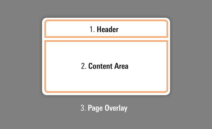 Anatomy of modal components.
 Place additional icons to the left.
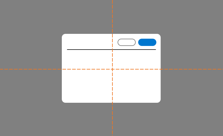 Modal alignment in viewport.
Use title case for titles. (This means capitalize prepositions and conjunctions of four or more letters and all primary words.)
role=”dialog” to separate content from the rest of the page.aria-labelledby attribute in the same element as the dialog role. This attribute references associated title markup to describe the modal and is the first item read by screen readers. Limit title length and avoid being too descriptive (i.e., “Do you want to save this?”); instead, use the aria-describedby attribute, mentioned next.aria-describedby attribute for a more thorough description of the modal. For example, “You have made changes. What would you like to do?”aria-hidden=”true” attribute if the modal is hidden although present in DOM.| Class | Applies to | Outcome |
|---|---|---|
|
|
|
Small modal with maximum width of |
|
|
|
Medium (default) width of modal, max width of |
|
|
|
Large modal width of |
|
|
|
Invokes overlay and triggers visibility of modal. |
|
|
|
Starts animation of the modal. |
|
|
|
Opacity increased to |
|
|
|
Removes header borders and margins. |