

Iconography
Icons enhance Morningstar products by visually communicating actions, status, and feedback. The Morningstar Design System provides SVG icons to create user interfaces and controls.
Default Size
- Display default icons at 23px × 23px.
- Set
widthandheightin CSS using the$mds-size-icon-mConstant.
Small Size
- Display small icons at 15px × 15px.
- Set the
widthandheightof small icons using the$mds-size-icon-sConstant. - Use
smallicons within components such as Buttons and Form text boxes to provide additional affordance to the action.
How to Use
MDS references icons via an svg icon sprite with the following syntax:
<svg class="mds-icon">
    <use xlink:href="/assets/icons/mds_icons.svg#heart">
        <title>heart</title>
    </use>
</svg>
Accessibility
- Include
<title>if no text is provided in the same context level. For example, icon-only Button. - Add ARIA
aria-hidden=”true”attribute or omit<title>if relevant text is available. For example, Button with icon.
Design Approach
Icon Grid
Simple, clear, and consistent icons require the rigor of underlying grid.
- Default icons are built on a 23px x 23px grid: Icons Template Default (Current Version, 1.0)
- Small icons are built on a 15px x 15px grid: Icons Template Small (Current Version, 1.0)
- Always horizontally and vertically center icons within the pixel grid.
Construction & Visual Style
Icons use simple geometric shapes and 1-pixel strokes.
gear icon.
The gear icon is an excellent example of a complex icon that is derived from simple geometric shapes. The grid guides the positioning of the shapes. Once on the grid, those shapes are refined and combined. Removing what isn’t necessary allows the icon’s essential form to shine through.
When designing a new icon, always consider it in the context of the entire icon family. For example, the gear icon is more complex than others, but following our construction and style guidelines allow it to harmoniously pair with others.
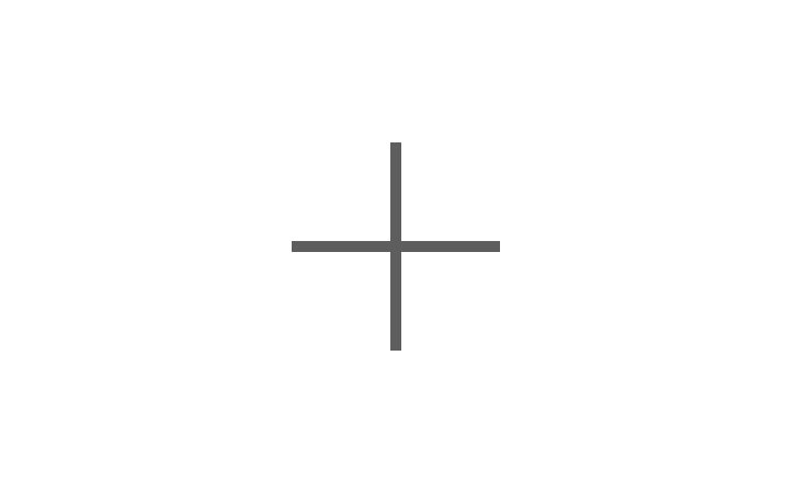
Do use right angles, a consistent 1-pixel stroke, and square terminals.

Don‘t use an inconsistent stroke and rounded terminals.
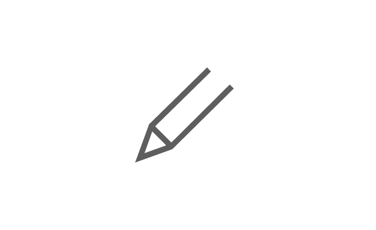
Do use minimal detail to reduce the icon to its essential form.
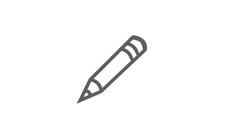
Don‘t add superfluous detail to the icon from.
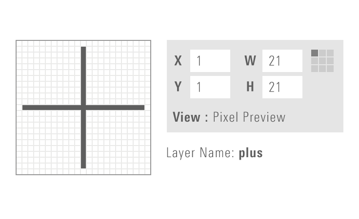
Do enable “Pixel Preview” and “Snap to Grid” when creating new icons.
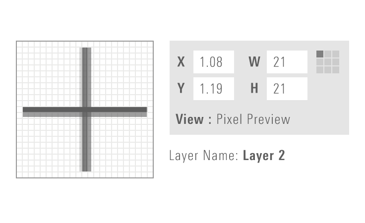
Don‘t place artwork off the pixel grid when creating new icons.
Saving Icon Artwork as SVG
To ensure that icon artwork is optimized to work with the MDS iconography system, always take the following steps when saving individual icons as files.
1. Create your artwork using the appropriate Adobe Illustrator icon template file. Place your icon on the Artwork layer and make sure to save a pre-production version of your file.
2. In the Layers palette, delete all but the Artwork layer.
3. Outline all strokes, and use the Unite option in the Shape Modes section of the Pathfinder tool to convert the icon to a compound shape.
4. Select the compound shape and set the fill to solid black #000000.
5. Save as an SVG.
Deselect the following in the "SVG Options" dialog:
- Preserve Illustrator Editing Capabilities
- Responsive (Under "More Options")
6. Optimize the SVG using SVGOMG:
- Upload your pre-optimized SVG
- Leave all settings at their default
- Save your optimized SVG
7. Confirm that the SVG file contains no irrelevant code by opening the .svg file in any text editor. It should not contain any references to Adobe Illustrator, hex codes, or class or id names. For example:
<svg xmlns="http://www.w3.org/2000/svg" width="23" height="23" viewBox="0 0 23 23">
    <path d="M20 19.3l-4.9-4.9c1.2-1.3 1.9-3.1 1.9-5 0-4-3.4-7.4-7.5-7.4S2 5.4 2 9.5 5.4 17 9.5 17c1.9 0 3.6-.7 4.9-1.8l4.9 4.9.7-.8zM3 9.5C3 5.9 5.9 3 9.5 3S16 5.9 16 9.5 13.1 16 9.5 16 3 13.1 3 9.5z" />
</svg>
The icon artwork is now ready for use in MDS.
Code Reference
CSS Class References
| Class | Applies to | Outcome |
|---|---|---|
|
|
|
Scales icon down to 15px x 15px. |
Mixin Reference
@include icon-height-removal()Use to vertically center an icon without influencing overall vertical spacing, particularly when cropping text to cap height and baseline using the mds-text-crop mixin.
Custom Icons
Custom Icons Not in MDS
If your product team uses custom icons that are not included in MDS, you should implement them within your own application using the same SVG sprite method as the System. To ensure that your custom icons are optimized for the MDS, use the saving icon artwork as SVG process.
Adding Custom Icons to MDS
If you believe that custom icons in your product should be added to MDS, first identify one or more additional teams that have a need for the icon. Ensure that your custom icon follows our design approach and prepare your icon artwork using the saving icon artwork as SVG process.
Submit the icon to be added to MDS by speaking to Jonathan Duncan, the iconography segment owner, or by emailing [email protected]. Once the new icon has been reviewed, the System team will work with you to include the new icon in an upcoming release.