Tooltips
Tooltips provide a short description of a page element or control.
Variations
Default
Use to provide a short description of an object without a label.
<div class="mds-tooltip__wrapper">
    <button class="mds-button mds-button--icon-only" type="button" aria-describedby="tooltip1">
        <svg class="mds-icon mds-button__icon mds-button__icon--right">
            <use xlink:href="/icons/mds.svg#person-padless">
                <title>My Account</title>
            </use>
        </svg>
    </button>
    <div id="tooltip1" class="mds-tooltip mds-tooltip--default mds-tooltip--width-m mds-tooltip--right-center mds-tooltip--sticky" role="tooltip" aria-hidden="false" aria-labelledby="tooltiptext1">
        <div class="mds-tooltip__text " id="tooltiptext1"> My Account </div>
    </div>
</div>- Triggered by hovering over an object.
- Use to describe the action of an icon-only button.
- Use to reveal the full text of truncated data.
- Use to reveal the purpose of a menu that has a dynamic title.
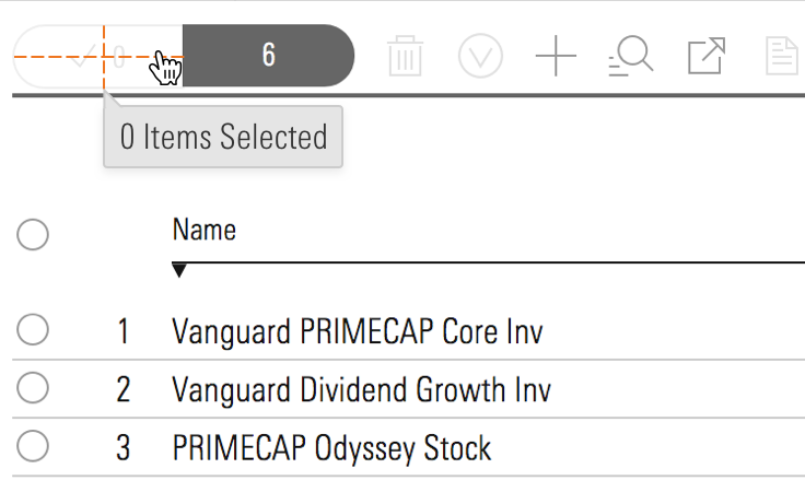
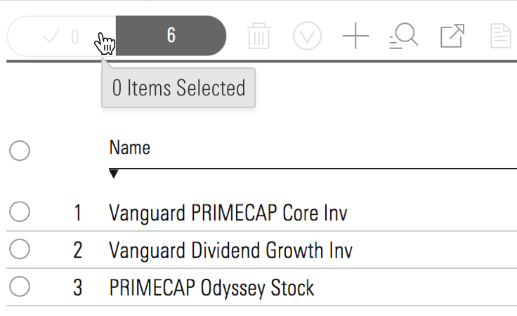
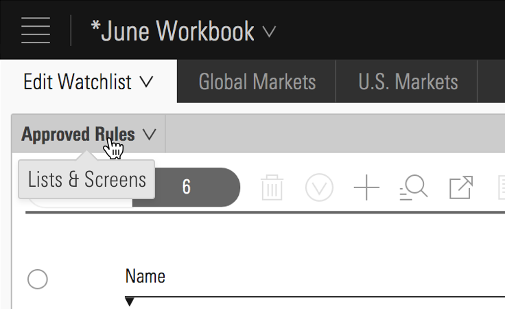 Lists & Screens menu inside Direct Cloud.
Prompt
Use to temporarily direct attention to an object or functionality.
<div class="mds-tooltip__wrapper">
    <button class="mds-button mds-button--icon-only mds-tooltip__target mds-tooltip__target--block" type="button" aria-describedby="tooltip2">
        <svg class="mds-icon mds-button__icon mds-button__icon--right">
            <use xlink:href="/icons/mds.svg#plus">
                <title>Add list</title>
            </use>
        </svg>
    </button>
    <div id="tooltip2" class="mds-tooltip mds-tooltip--prompt mds-tooltip--width-l mds-tooltip--sticky mds-tooltip--closable mds-tooltip--right-center" role="tooltip" aria-hidden="false" aria-labelledby="tooltiptext2">
        <div class="mds-tooltip__text " id="tooltiptext2"> Your list is empty. Add some investments to get started. </div>
        <div class=" mds-tooltip__close-button">
            <button class="mds-button mds-button--small mds-button--icon-only">
                <svg class="mds-icon mds-button__icon">
                    <use xlink:href="/icons/mds.svg#remove--s">
                        <title>Close</title>
                    </use>
                </svg>
            </button>
        </div>
    </div>
</div>- Dismissable by clicking close icon,
remove--s.
Error
Use to direct attention to an error.
<div class="mds-tooltip__wrapper">
    <button class="mds-button mds-button--primary" type="button" disabled aria-describedby="tooltip3"> Submit </button>
    <div id="tooltip3" class="mds-tooltip mds-tooltip--error mds-tooltip--width-l mds-tooltip--sticky mds-tooltip--right-center" role="tooltip" aria-hidden="false" aria-labelledby="tooltiptext3">
        <div class="mds-tooltip__text " id="tooltiptext3"> There is a problem. Please correct all errors before submitting. </div>
    </div>
</div>- Dismissable by correcting error.
- Not commonly used. For inline errors, please see errors in Forms.
Tooltip Positioning
There are 12 possible positions. Choose one that keeps the tooltip’s content in the viewport. For all positioning options see CSS Class References.
<div class="mds-tooltip__wrapper">
    <button class="mds-button " type="button" aria-describedby="tooltip4"> Right Center </button>
    <div id="tooltip4" class="mds-tooltip mds-tooltip--default mds-tooltip--width-m mds-tooltip--right-center" role="tooltip" aria-hidden="true" aria-labelledby="tooltiptext4">
        <div class="mds-tooltip__text " id="tooltiptext4"> Right Center </div>
    </div>
</div><div class="mds-tooltip__wrapper">
<button class="mds-button " type="button" aria-describedby="tooltip5"> Right Bottom </button>
<div id="tooltip5" class="mds-tooltip mds-tooltip--default mds-tooltip--width-m mds-tooltip--right-bottom" role="tooltip" aria-hidden="true" aria-labelledby="tooltiptext4">
<div class="mds-tooltip__text " id="tooltiptext4"> Right Bottom </div>
</div>
</div>Sizing
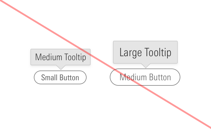
Sizing affects the text size and internal spacing. The default size is medium, and you can use a modifier class to make the tooltip smaller (mds-tooltip--small) or larger (mds-tooltip--large).
<div class="mds-tooltip__wrapper">
    <button class="mds-button mds-button--icon-only" type="button" aria-describedby="small-tooltip">
        <svg class="mds-icon mds-button__icon mds-button__icon--right">
            <use xlink:href="/icons/mds.svg#person-padless">
                <title>User Account</title>
            </use>
        </svg>
    </button>
    <div id="small-tooltip" class="mds-tooltip mds-tooltip--default mds-tooltip--small mds-tooltip--width-m mds-tooltip--right-center mds-tooltip--sticky" role="tooltip" aria-hidden="false" aria-labelledby="false">
        <div class="mds-tooltip__text " id="false"> My Account </div>
    </div>
</div>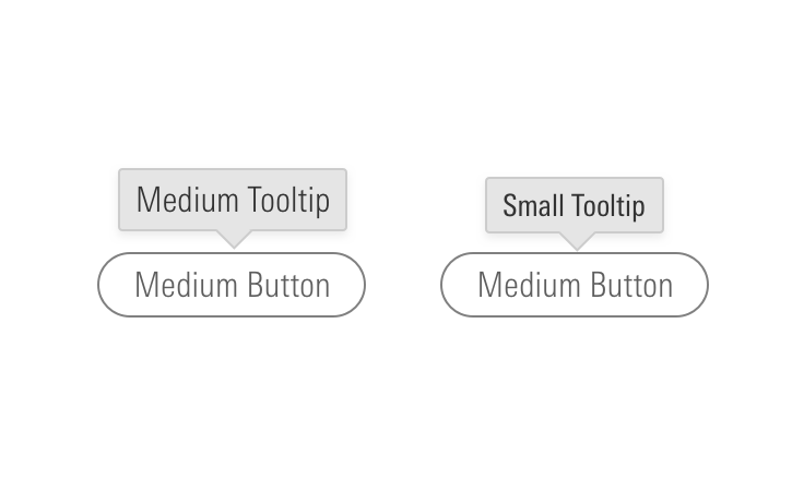
Guidelines
Use When
- Providing a short description of a page element or control.
Don’t Use When
- Providing a description longer than 10 words. Instead, use a Popover.
Visual Language
Editorial
- Keep it brief, using fewer than 10 words.
- End full sentences with a period. Using “&” is OK. No “!”.
- Don’t spell out numbers: Use 12, not twelve.
Accessibility
- If the tooltip’s target element is an
.mds-text__anchor, or an.mds-button, the tooltip should show on focus and hide on blur. - Use all standard MDS
role=””attributes on.mds-tooltip_targetas appropriate. - Always use
role=”tooltip”on the.mds-tooltipelement. - Use
aria-hidden="true"to prevent screenreaders from reading hidden tooltips. Change value tofalsewhen tooltip is visible. - Tooltip trigger element should have a
aria-describedbyattribute which references to the ID of the associated tooltip. - Add
aria-labelledbyto tooltip to associate full content of a tooltip.
Code Reference
CSS Class References
|
Class |
Applies to |
Outcome |
|---|---|---|
|
|
|
This class initializes a |
|
|
|
This class is always applied to a |
|
|
Any block, or inline-block element, most likely a |
This class should be on the immediate parent of the tooltip’s target element, and it must wrap the target and the tooltip itself. If the tooltip is triggered on hover, this is the element on which that hover is triggered. |
|
|
Any inline, block, or inline-block element |
This is used to enable showing/hiding the tooltip on keyboard focus of a focusable tooltip target element. For example, if the tooltip target is an |
|
|
|
Sets background color, drop shadow and text styling for a default tooltip. |
|
|
|
Adjusts styling to render a small tooltip. |
|
|
|
Adjusts styling to render a large tooltip. |
|
|
|
Sets background color, drop shadow and text styling for a prompt tooltip. |
|
|
|
Sets background color, drop shadow and text styling for an error tooltip. |
|
|
|
Gives a tooltip padding space to account for a close button. |
|
|
|
This is the hook set onto an anchor inside of an |
|
|
Any block, inline-block, or inline element |
Changes cursor to (?) symbol on hover indicating help information. |
|
|
|
Aligns tooltip to the top center of the invoking element. |
|
|
|
Aligns tooltip to the top right of the invoking element. |
|
|
|
Aligns tooltip to the top left of the invoking element. |
|
|
|
Aligns tooltip to the bottom center of the invoking element. |
|
|
|
Aligns tooltip to the bottom right of the invoking element. |
|
|
|
Aligns tooltip to the bottom left of the invoking element. |
|
|
|
Aligns tooltip to the right center of the invoking element. |
|
|
|
Aligns tooltip to the right top of the invoking element. |
|
|
|
Aligns tooltip to the right bottom of the invoking element. |
|
|
|
Aligns tooltip to the left center of the invoking element. |
|
|
|
Aligns tooltip to the left top of the invoking element. |
|
|
|
Aligns tooltip to the left bottom of the invoking element. |
JavaScript Considerations
Engineers should use their own JavaScript libraries and implementations that most appropriately fit within the requirements for their applications and environments.