Buttons
updated
- HTML/CSS Available
- Web Component In Progress
- Last Updated
2.10.0
Buttons trigger interactions throughout the experience.
Button
Variations
Primary
Use for highest-priority actions that are required to complete the user’s task.
<button class="mds-button mds-button--primary" type="button"> Button Text </button><mds-button variation="primary">Button Text</mds-button><button class="mds-button mds-button--primary" type="button" disabled> Button Text </button><mds-button variation="primary" disabled>Button Text</mds-button>- Use a primary button only once per page, though an additional primary button can appear within Modals, Popovers, or Notifications when needed to signal critical actions.
Secondary
Use for non-critical actions.
<button class="mds-button mds-button--secondary" type="button"> Button Text </button><mds-button variation="secondary">Button Text</mds-button><button class="mds-button mds-button--secondary" type="button" disabled> Button Text </button><mds-button variation="secondary" disabled>Button Text</mds-button>- Use for most buttons triggering non-critical actions, such as back, cancel, adding or creating an object.
Flat
Use for tertiary actions.
<button class="mds-button mds-button--flat" type="button"> Button Text </button><mds-button variation="flat">Button Text</mds-button><button class="mds-button mds-button--flat" type="button" disabled> Button Text </button><mds-button variation="flat" disabled>Button Text</mds-button>With Icon
Add Icons to provide additional affordance to a button.
<button class="mds-button mds-button--primary" type="button">
    <svg class="mds-icon mds-button__icon mds-button__icon--left" aria-hidden="true">
        <use xlink:href="/icons/mds.svg#open-new--s">
        </use>
    </svg>
    <span class="mds-button__text"> Copy Document </span>
</button>
<button class="mds-button mds-button--secondary" type="button">
    <svg class="mds-icon mds-button__icon mds-button__icon--left" aria-hidden="true">
        <use xlink:href="/icons/mds.svg#open-new--s">
        </use>
    </svg>
    <span class="mds-button__text"> Copy Document </span>
</button>
<button class="mds-button mds-button--flat" type="button">
    <svg class="mds-icon mds-button__icon mds-button__icon--left" aria-hidden="true">
        <use xlink:href="/icons/mds.svg#open-new--s">
        </use>
    </svg>
    <span class="mds-button__text"> Copy Document </span>
</button>
<mds-button icon="open-new--s" variation="primary">Copy Document</mds-button>
<mds-button icon="open-new--s" variation="secondary">Copy Document</mds-button>
<mds-button icon="open-new--s" variation="flat">Copy Document</mds-button>- Only place an Icon to the left of a button's label to emphasize meaning.
- Only place an Icon to the right of a button's label to trigger a Menu or imply directionality.
Icon Only
Use for toolbars and displays where words won't comfortably fit alongside icons.
<button class="mds-button mds-button--icon-only" type="button">
    <svg class="mds-icon mds-button__icon mds-button__icon--right">
        <use xlink:href="/icons/mds.svg#person-padless">
            <title>User</title>
        </use>
    </svg>
</button>
<mds-button icon="person-padless" icon-title="User"></mds-button><button class="mds-button mds-button--icon-only mds-button--hover" type="button" disabled>
<svg class="mds-icon mds-button__icon mds-button__icon--right">
<use xlink:href="/icons/mds.svg#person-padless">
<title>User</title>
</use>
</svg>
</button><mds-button icon="person-padless" icon-title="User" disabled></mds-button>- Only use when the Icon’s meaning is unambiguous.
- For toolbars of multiple Icons, use the Button Group component to ensure spacing between icons.
- Use with Icon
removeorremove--sto close Modals, Notifications, and Tooltip prompts. - Use with Icon
removeorremove--sto remove an item from a list.
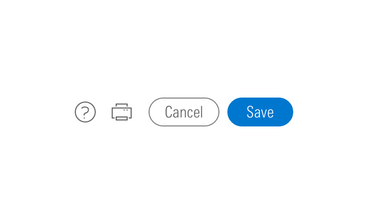
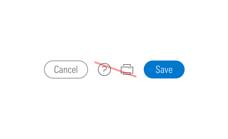
- When pairing with a button, use an
$mds-space-inline-left-2-xspace and vertically align middle the icon-only button. - When pairing with a small button, use the small icon-only button.
Sizing
Configure button size and icon size independently within the button.
Button Size
Each button variation allows for small, medium, and large sizes. The default size is medium, and you can use modifier classes to make the button smaller (mds-button--small) or larger (mds-button--large).
<button class="mds-button mds-button--small mds-button--primary" type="button">
    <span class="mds-button__text"> Continue </span>
    <svg class="mds-icon mds-button__icon mds-button__icon--right" aria-hidden="true">
        <use xlink:href="/icons/mds.svg#caret-right--s">
        </use>
    </svg>
</button>
<button class="mds-button mds-button--small mds-button--secondary" type="button">
    <span class="mds-button__text"> Continue </span>
    <svg class="mds-icon mds-button__icon mds-button__icon--right" aria-hidden="true">
        <use xlink:href="/icons/mds.svg#caret-right--s">
        </use>
    </svg>
</button>
<button class="mds-button mds-button--small mds-button--flat" type="button">
    <span class="mds-button__text"> Continue </span>
    <svg class="mds-icon mds-button__icon mds-button__icon--right" aria-hidden="true">
        <use xlink:href="/icons/mds.svg#caret-right--s">
        </use>
    </svg>
</button>
<button class="mds-button mds-button--small mds-button--icon-only" type="button">
    <svg class="mds-icon mds-button__icon mds-button__icon--right">
        <use xlink:href="/icons/mds.svg#heart--s">
            <title>User</title>
        </use>
    </svg>
</button>
<mds-button icon-right="caret-right--s" variation="primary" size="small">Continue</mds-button>
<mds-button icon-right="caret-right--s" variation="secondary" size="small">Continue</mds-button>
<mds-button icon-right="caret-right--s" variation="flat" size="small">Continue</mds-button>
<mds-button icon="heart--s" icon-title="User" size="small"></mds-button>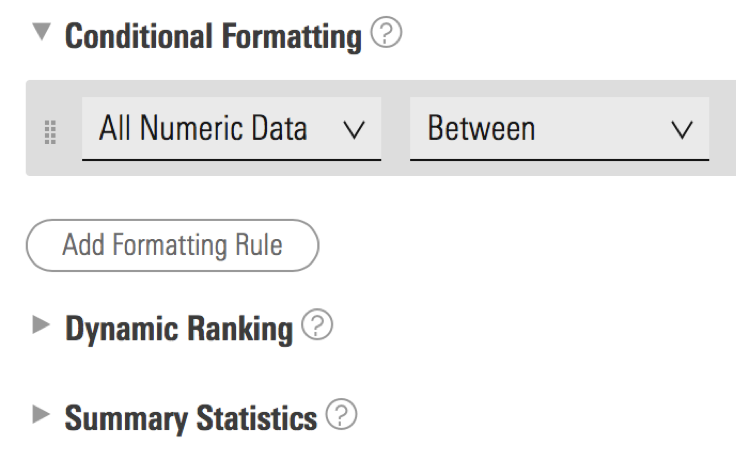
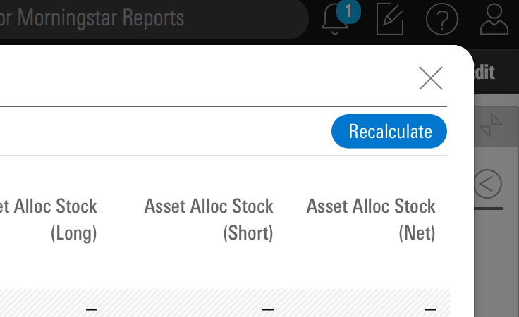
- Use small buttons in toolbars and Popover and Menu headers.
- Never apply
mds-button--largeto an icon-only button.
Icon Size
Icon size is predetermined and applied automatically to with icon and icon-only buttons. To avoid undesirable scaling of icon artwork, use the chart below to choose the correct icon size to use in your button.
| Type | Small Button | Medium Button | Large Button |
|---|---|---|---|
|
Primary |
|||
|
Secondary |
|||
|
Flat |
Small OR Default Icon* |
||
|
Icon Only |
— |
* Default size icon may be used within the medium flat button by applying the mds-button--flat-icon-m modifier class to the block level.
Use When
- Affording interaction to key behaviors and features.
- Confirming or submitting information entered into a Form.
- Cancelling an action.
- Resetting a form or dataset.
- Closing a container or section.
- Opening a Menu.
- Moving forward or backward through a wizard-type workflow.
- Creating an object within a group.
- Applying a non-critical action to a dataset.
Don′t Use When
- Displaying a collection of links to sections. Use Links instead.
- Linking to an external site. Use Links instead.
Visual Language
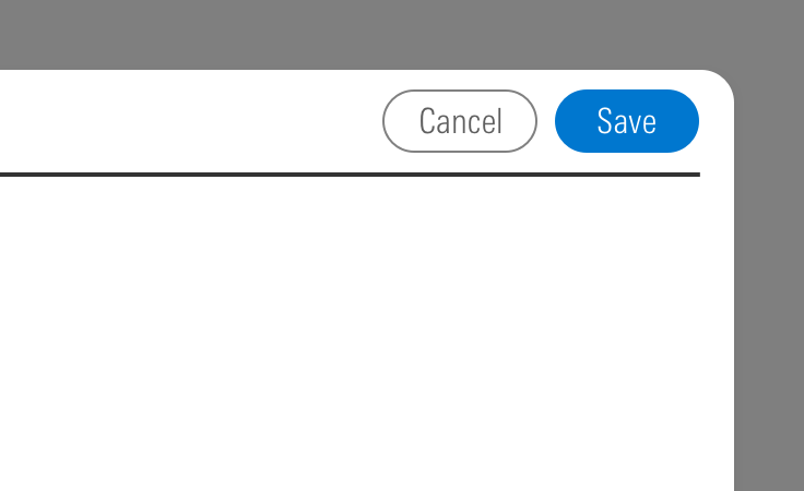

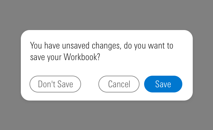
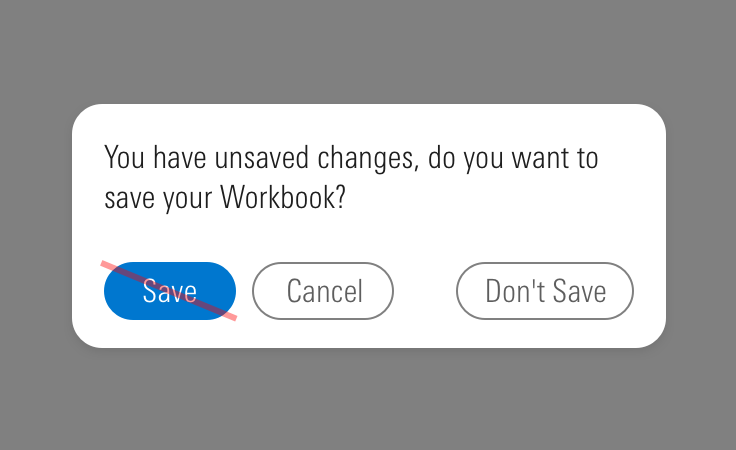
CSS
Class References
|
Class |
Applies to |
Outcome |
|---|---|---|
|
|
|
Applies base button styles to an element. Always couple with a variant for semantics, though a standalone |
|
|
|
Shows primary button, to be coupled with |
|
|
|
Shows secondary button, to be coupled with |
|
|
|
Shows tertiary button, to be coupled with |
|
|
|
Applies the icon-only styles to a button element. Specifically, it removes the border strokes and background treatments found on primary and secondary buttons. |
|
|
|
Adjusts styling to render a small button. |
|
|
|
Adjusts styling to render a large button. |
|
|
|
Positions an icon to the left of a button label. |
|
|
|
Positions an icon to the right of a button label. |
|
|
|
Applies default size to the icon in a medium flat button. Never apply this class when using a small icon. |
Web Component
Props
| Prop | Type | Validation | Default | Description |
|---|---|---|---|---|
|
|
String |
–– |
–– |
A space-separated list of element |
|
|
String |
Required for icon-only buttons |
–– |
Content to describe the button. Use with icon-only buttons. |
|
|
Boolean |
Conditional based on |
|
Sets the |
|
|
String |
–– |
–– |
A space-separated list of class names that will be appended to the default |
|
|
Boolean |
–– |
|
If |
|
|
String |
–– |
–– |
If provided, overrides |
|
|
String |
Enum: |
–– |
A string containing a valid MDS icon name. If |
|
|
String |
–– |
–– |
A title describing the icon. Icon-only buttons must include a title to be accessible. |
|
|
String |
Enum: |
–– |
A string containing a valid MDS icon name. When passed, this prop will render an icon to the right of the button's text. |
|
|
String |
Conditional based on |
–– |
A title describing the right icon. |
|
|
String |
–– |
–– |
The |
|
|
String |
Conditional based on |
|
The |
|
|
String |
Enum: |
|
Alters the size of the button. |
|
|
String |
Required |
–– |
The text that appears on the button. Can also be passed via the default slot. |
|
|
String |
Enum: |
|
Sets the HTML element for the button. |
|
|
String |
Conditional based on |
none |
The |
|
|
String |
Enum: |
|
Sets the button variation. |
- Use kebab-case when setting props in HTML. For example,
iconRightTitlewould be written asicon-right-title.
Slots
Default Slot
Any text or markup passed in between the <mds-button></mds-button> tags will be used as a button's text content.
Named Slots
| Slot Name | Description |
|---|---|
|
|
Assigning |
|
|
Assigning |
Additional Behaviors
Automatic ID generation
If type is checkbox | radio and no value is provided for the id prop the component will automatically generate one for you.
Automatic <title> Creation for Icon-Only Buttons
To comply with accessibility guidelines icon-only buttons must have a <title> present in the icon’s SVG that provides screen reader accessible text. Use the iconTitle prop to set this text. If an icon only button is invoked without providing an iconTitle the component will automatically use the icon’s name as a title.
Usage Examples
Creating a button and modifying its size and variation:
<!-- Using Props -->
<mds-button text="Contact Us" size="large" variation="secondary"></mds-button>
<!-- Using Slots -->
<mds-button size="large" variation="secondary"> Contact Us </mds-button>
Creating an icon-only button with a descriptive title:
<!-- Using Props -->
<mds-button icon="bell" icon-title="notifications"></mds-button>
<!-- Using Slots -->
<mds-button>
    <mds-icon slot="icon" name="bell" title="notifications"></mds-icon>
</mds-button>
Creating a button with an icon:
<!-- Using Props -->
<mds-button icon="person-plus--s" text="Add Client"></mds-button>
<!-- Using Slots -->
<mds-button>
    <mds-icon slot="icon" name="person-plus--s"></mds-icon> Add Client
</mds-button>
Creating a button with a left and right icon:
<!-- Using Props -->
<mds-button icon="gear--s" text="Settings" icon-right="caret-down--s"></mds-button>
<!-- Using Slots -->
<mds-button>
    <mds-icon slot="icon" name="gear--s"></mds-icon> Settings <mds-icon slot="icon-right" name="caret-down--s"></mds-icon>
</mds-button>
Browser Support
- This component uses a
box-shadowproperty to create an outline. Internet Explorer and Safari have known issues rendering these outlines when using the browser's zoom functionality. This visual defect doesn't affect the functionality of the component.
Best Practices
- Use a
<button>element type when displaying buttons. - An
<a>element cannot be triggered from aspacebarpress, only from anenterorreturnpress. - It is expected that a button can be triggered by pressing
spacebar,enter, orreturn.
Implementation
- Always include a
<title>tag on thesvgwithin an icon-only button to describe the button’s intent for icon-only buttons. See Iconography accessibility section.

