Links
updated
- HTML/CSS Available
- Web Component In Progress
- Last Updated
2.8.0
Links navigate to other pages or additional information.
Variations
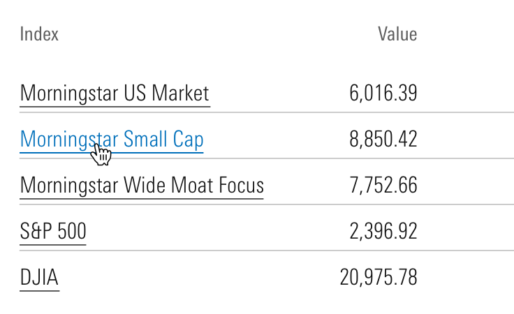
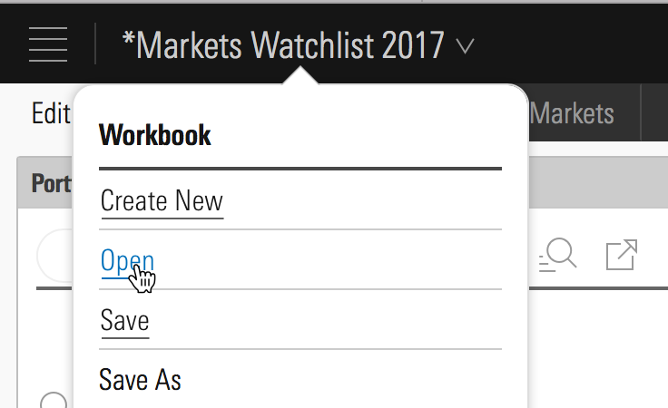
Default
Use in most cases.
<a href="#" class="mds-link">Link Text</a><mds-link href="#">Link Text</mds-link>- Use in body text, ordered, and unordered lists.
- Never use when horizontal rules separate multiple links, i.e., Data Tables. Instead, use either No Underline or In Data Table variation.
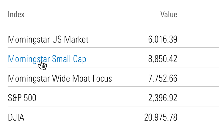
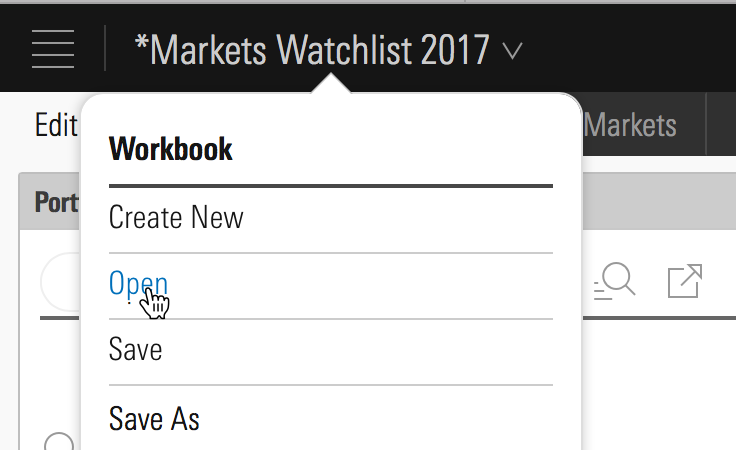
No Underline
Use to avoid visual clutter.
<a href="#" class="mds-link mds-link--no-underline">Link Text</a><mds-link href="#" underline="false">Link Text</mds-link>- No-underline links do not meet all accessibility benchmarks and should be used only in cases where the interactivity of a link is strongly implied by its context.
- Use in cases where horizontal rules separate multiple links. For example, the List Group uses this variation to create its links.
- Use for links within Data Tables when the interactivity of the link is implied by its context.
In Data Table
Use to highlight links within Data Tables.
<a href="#" class="mds-link mds-link--data-table">Link Text</a><mds-link href="#" in-data-table="true">Link Text</mds-link>- Meets all accessibility benchmarks.
- Use when the interactivity of links within a Data Table may not be immediately apparent to a user.
- Avoid using this variation outside of Data Tables.
Use When
- Leading a user to another page.
- Signaling email functionality by styling the address itself.
Don’t Use When
- Submitting or confirming an action. Instead, use a Button.
Visual Language
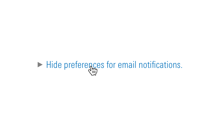
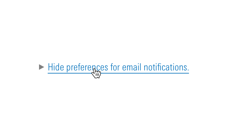
Behaviors
- Always open links in the same window unless requirements dictate otherwise, for example:
- Opening a PDF document.
- When opening a link in the same window will interrupt a user’s workflow.
Editorial
- Link copy should convey what we will deliver once the link is clicked, for example:
- Links can be questions that we will answer, or they can be declarative, for example:
- When a link opens a Modal or secondary workspace, consider using the words in the link as the header for the modal.
- Underline just the relevant words in a sentence or paragraph, for example:
- Want to see our Privacy Policy?
- Don’t use “click here,” “tap this link,” etc., inside link copy. Link copy should be device agnostic—a user may not have a mouse with which to click or the capability to tap.
CSS
Class References
|
Class |
Applies to |
Outcome |
|---|---|---|
|
|
Any link element |
Adds default, visited, hover, and focus styles to a link. |
|
|
|
Removes the underline from link styles. |
|
|
|
Prevents visited styles from being applied after a link is visited. |
|
|
|
Removes the underline and swaps the link's default and hover styles. |
Mixin Reference
Use this mixin to add link styles to any element. Set $underline to false to hide underlines. Set $visited-styles to false to prevent a color change after a link is visited.
@include mds-link($underline: true, $visited-styles: true)When combining header typography heading and link mixins, always include the link mixin mds-link first. This avoids conflicting line-height declarations.
[.my-custom-style] {
    @include mds-link;
    @include mds-level-1-heading;
}
Web Component
Props
| Prop | Type | Validation | Default | Description |
|---|---|---|---|---|
|
|
String |
–– |
–– |
Accessible text describing the purpose of the link. |
|
|
String |
–– |
–– |
A space-separated list of class names that will be appended to the default |
|
|
String |
–– |
–– |
If |
|
|
String |
Required |
|
Destination for the link. If the link opens in a new window, use the |
|
|
String |
–– |
–– |
The |
|
|
Boolean |
–– |
|
If |
|
|
String |
–– |
–– |
If set, adds |
|
|
String |
Required |
–– |
The text of the link. Can also be passed in via the default slot. |
|
|
Boolean |
–– |
|
If |
|
|
Boolean |
–– |
|
If |
- Use kebab-case when setting props in HTML. For example,
inDataTablewould be written asin-data-table.
Slots
Default Slot
Any text or markup passed in between the <mds-link></mds-link> tags will be used as the link’s content. This slot can accept plain text, or a combination of text and any tags where appropriate. If no content is passed in via the slot and the text prop is empty, the link content will be “undefined”.
Usage Examples
Setting text and href and suppressing visited styling:
<!-- Using Props -->
<mds-link text="Contact Us" href="contact-us.html" visited-styling="false"></mds-link>
<!-- Using Slots -->
<mds-link href="contact-us.html" visited-styling="false"> Contact Us </mds-link>Implementation
- Always include an
hrefattribute for a link. - Always include an
aria-labelattribute to describe the intent of a link.- For links that activate a download, explicitly state this action within the
aria-label, including the file-type and file-size. - For links that force the user to leave the current window or tab, explicitly state this action within the
aria-label.
- For links that activate a download, explicitly state this action within the
- Combine adjacent image and text links into the same
<a>element. - Don't embed critical information within CSS. Screen readers do not recognize CSS.
Best Practices
- Never apply the
mds-linkclass or mixin to an element other than<a>. - Never suppress focus styles for a link.
Editorial
- An
aria-labelshould be clear and concise, using fewer than 100 characters will increase user comprehension. - An
aria-labelshould make sense out of context and clearly inform a user of what action will be taken if the link is selected. Don't rely on surrounding context to inform link content. - Don't use redundant wording within ARIA labels. An
aria-labelon an anchor tag automatically informs the user an element is a link. Words such as, “link”, “links”, or “go to” are repetitive and unnecessary. - Don't write
aria-labeltext in all caps. Most screen readers read all cap text one letter at a time. - Never use URLs in link text, screen readers dictate URLs letter by letter. Instead of including developer.morningstar.com in the
aria-label, include “Morningstar Developer Site”. - Never use dashes, mathematical characters or emoticons in place of the actual word within an
aria-label. These symbols are not recognized by most assistive technology.
<a href="#" aria-label="Opportunity plus Instinct equals Profit"></a>
<a href="#" aria-label="Opportunity + Instinct = Profit"></a>
<a href="#" aria-label="16 to 17 years"></a>
<a href="#" aria-label="16 – 17 years"></a>
<a href="#" aria-label="Portfolio Report Information from January 1st, 2018 to April 30th, 2018">Portfolio Report Information 1/1/18–4/30/18</a>
<a href="#" aria-label="Portfolio Report Information 1/1/18–4/30/18">Portfolio Report Information 1/1/18–4/30/18</a>

